Appearance
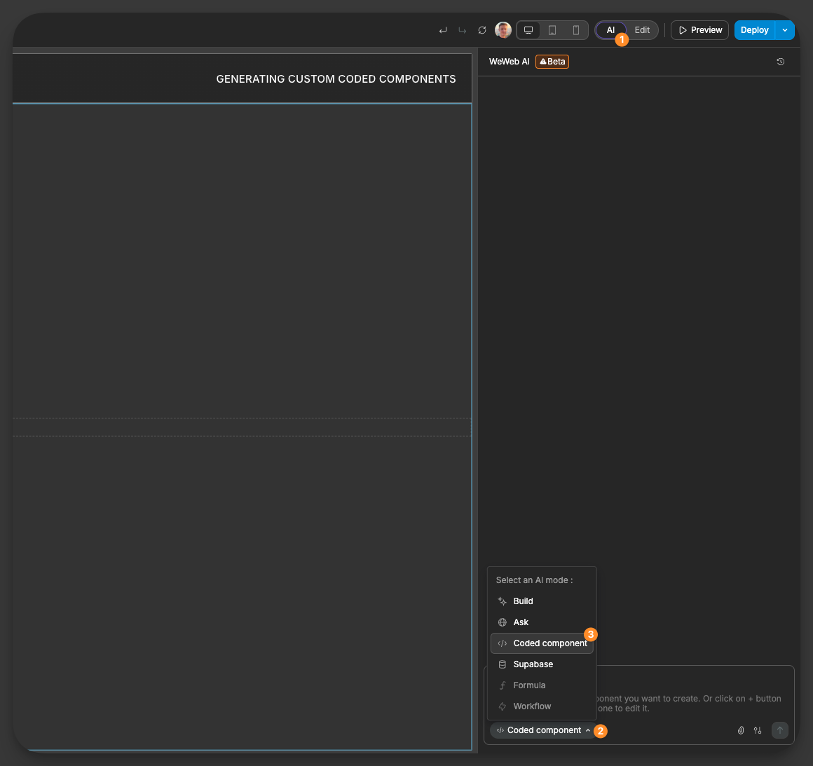
Generating Custom Coded Components
WeWeb's AI allows you to generate fully customized components with code, giving you deeper flexibility than standard elements while maintaining the visual editing experience. With custom coded components, you can implement specific libraries, create unique interactions, and extend WeWeb's capabilities to match your exact requirements.
Features
- AI-Powered Generation: Create complex components by describing what you need in natural language
- External Library Support: Incorporate libraries not natively available in WeWeb (e.g., Highcharts, specific UI frameworks)
- Complete Customization: Control every aspect of your component through editable properties
- Interactive Elements: Add custom triggers, actions, and exposed variables
- Component Forking: Clone and modify existing components to extend their functionality
Using AI to generate components
The easiest way to create a custom component is by describing what you need in Build mode:
- Open the
Agentspanel and keepBuildselected
- Describe the component you want to create, including:
- Desired functionality
- Required libraries
- Properties you want to control
- Interactions you need
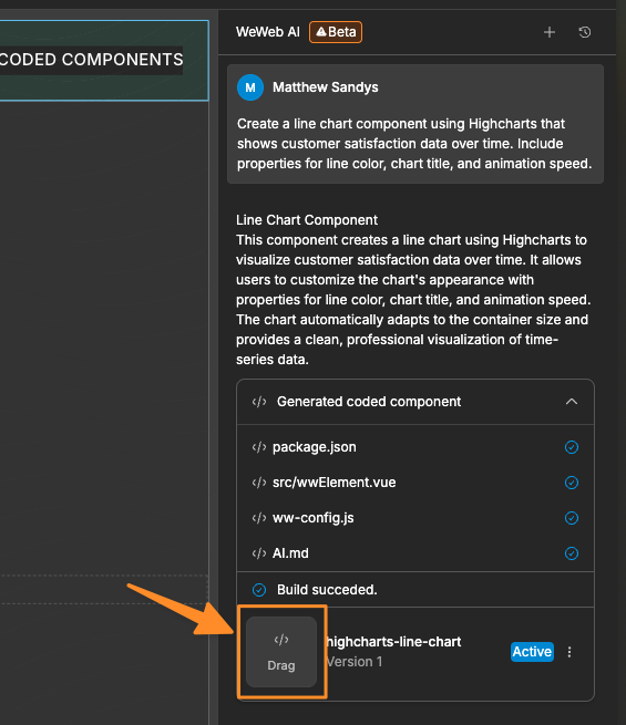
- AI generates the component and adds it to your available components. To place the generated component onto your page, drag it onto the page directly from the chat interface:
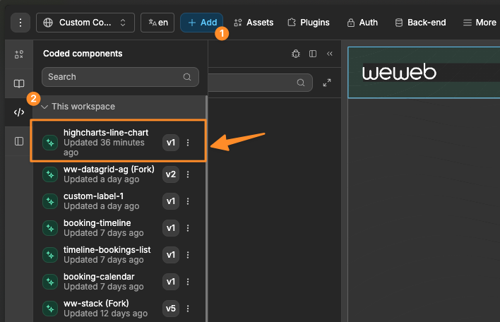
Or, alternatively, drag it from the Coded components menu of the Add Element.
Updating an existing component
To change the code of a component you already have, use Edit with AI from Add Element → Coded components, from the code editor, or from a chat artifact. WeWeb AI switches to Edit component mode. Describe the changes you want, and AI updates the component source.
You can also open a component's code from the chat artifact menu using Edit with AI.
TIP
Open WeWeb AI Settings from the adjustments icon in the chat input area. The Custom coded components option controls whether Build mode can create or edit custom coded components. It is enabled by default.
Example Prompts
Here are examples of effective prompts for creating custom components:
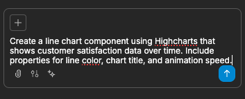
Create a line chart component using Highcharts that shows customer satisfaction data over time. Include properties for line color, chart title, and animation speed.Create a skeleton loader component with properties for base color, wave color, animation speed, and shape (rectangle or circle). Make sure it has a background fill to cover content beneath it.Understanding Component Architecture
Custom coded components in WeWeb have four key elements that can be fully customized:
1. Properties
Properties allow you to control your component's appearance and behavior directly from the WeWeb editor:
- Settings Properties: Control functional aspects (data sources, behavior)
- Style Properties: Adjust visual aspects (colors, sizes, animations)
When generating a component, specify the properties you want to control:
Create a custom progress bar with properties for:
- Progress value (0-100)
- Bar color
- Background color
- Border radius
- Animation speed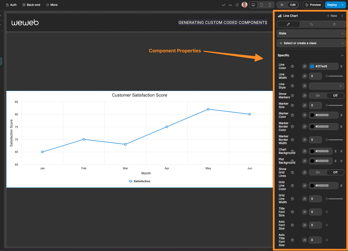
2. Workflow Triggers
Triggers allow your component to initiate workflows when specific events occur:
- User Interactions: Clicks, hovers, selections
- Data Changes: Value updates, selections
- State Changes: Loading states, error conditions
Example of requesting specific triggers:
Create a custom image carousel with workflow triggers for:
- On image change
- On image click
- When carousel reaches the end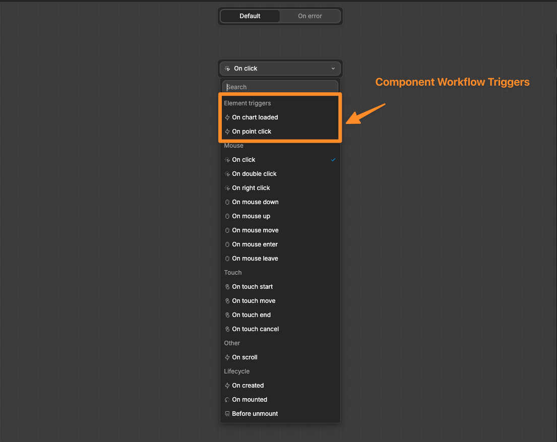
3. Component Actions
Actions let you execute functionality in the component from other elements on your page via workflows. An action could be something such as:
- Workflow Execution: Trigger workflows of the component
- State Changes: Updating internal states of the component
- Data Manipulation: Modify data displayed inside the component
Example of requesting specific actions:
Create a custom map component with actions for:
- Center on specific coordinates
- Change zoom level
- Toggle point of interest visibility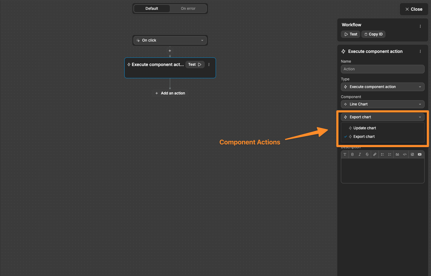
4. Exposed Variables
Variables expose component data to be used elsewhere in your app:
- Selected Values: Currently selected items
- Component States: Loading states, current positions
- Processed Data: Calculated results
Example of requesting specific variables:
Create a date range picker that exposes variables for:
- Selected start date
- Selected end date
- Number of days in selection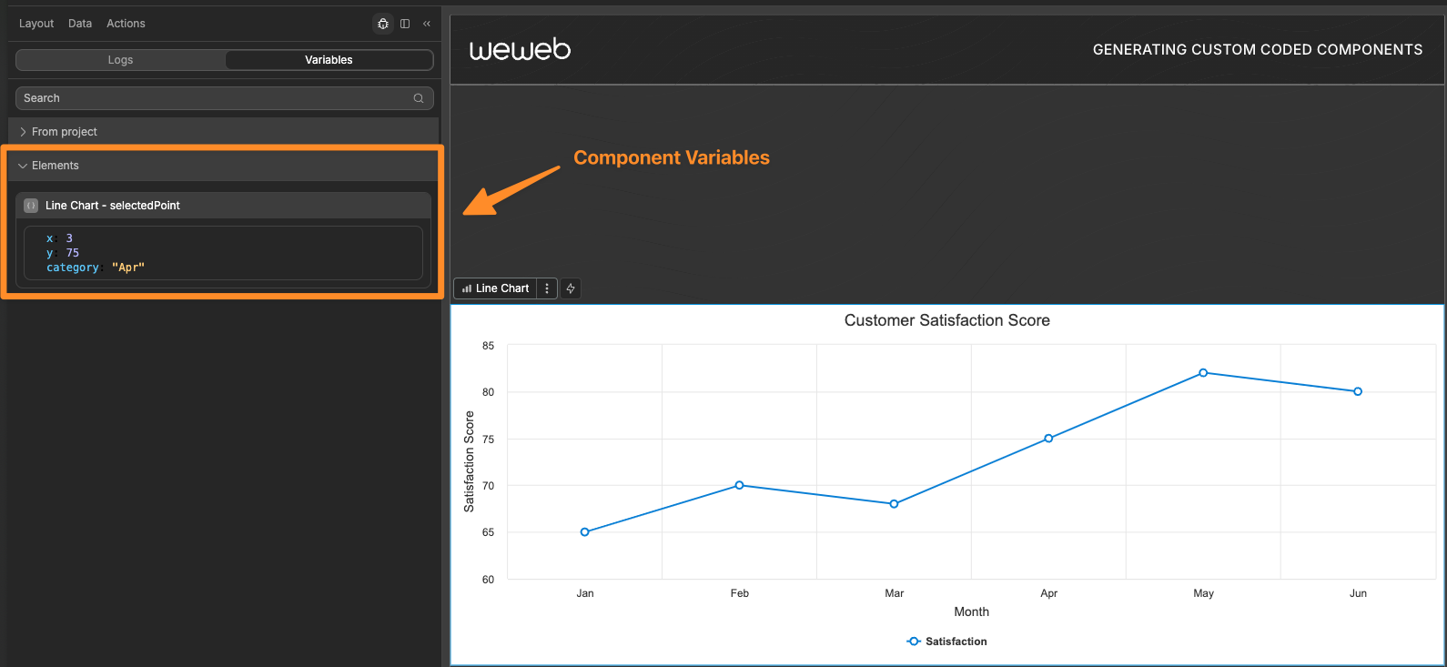
Forking Components
Forking allows you to create a clone of an existing component, which you can then modify the functionality of while maintaining the core behavior.
When to Fork Components
Fork a component when you need to:
- Add features not available in the original component
- Modify the core behavior of a component
- Create specialized versions of standard components
How to Fork a Component
There are two ways to fork components:
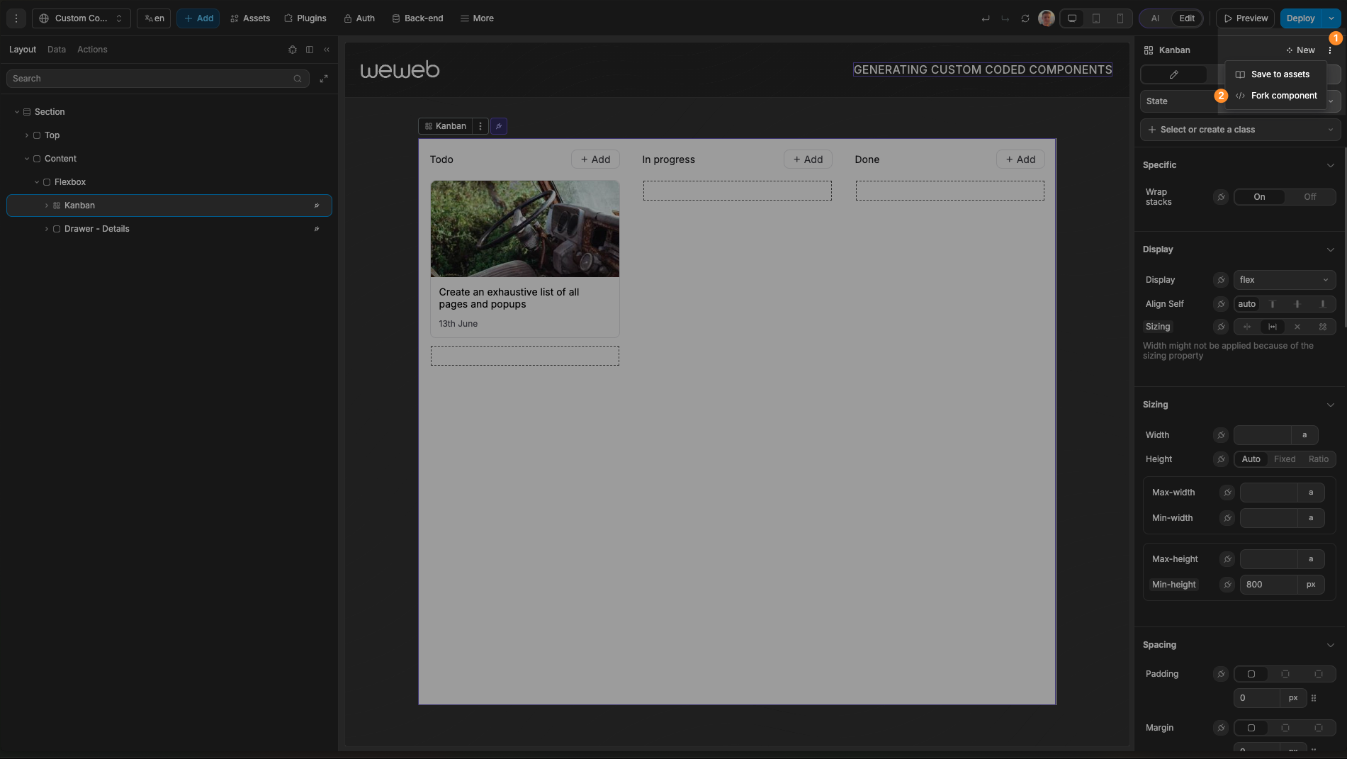
- With a coded component selected on the page, open the component actions menu in the top-right area of the editor and choose
Fork component
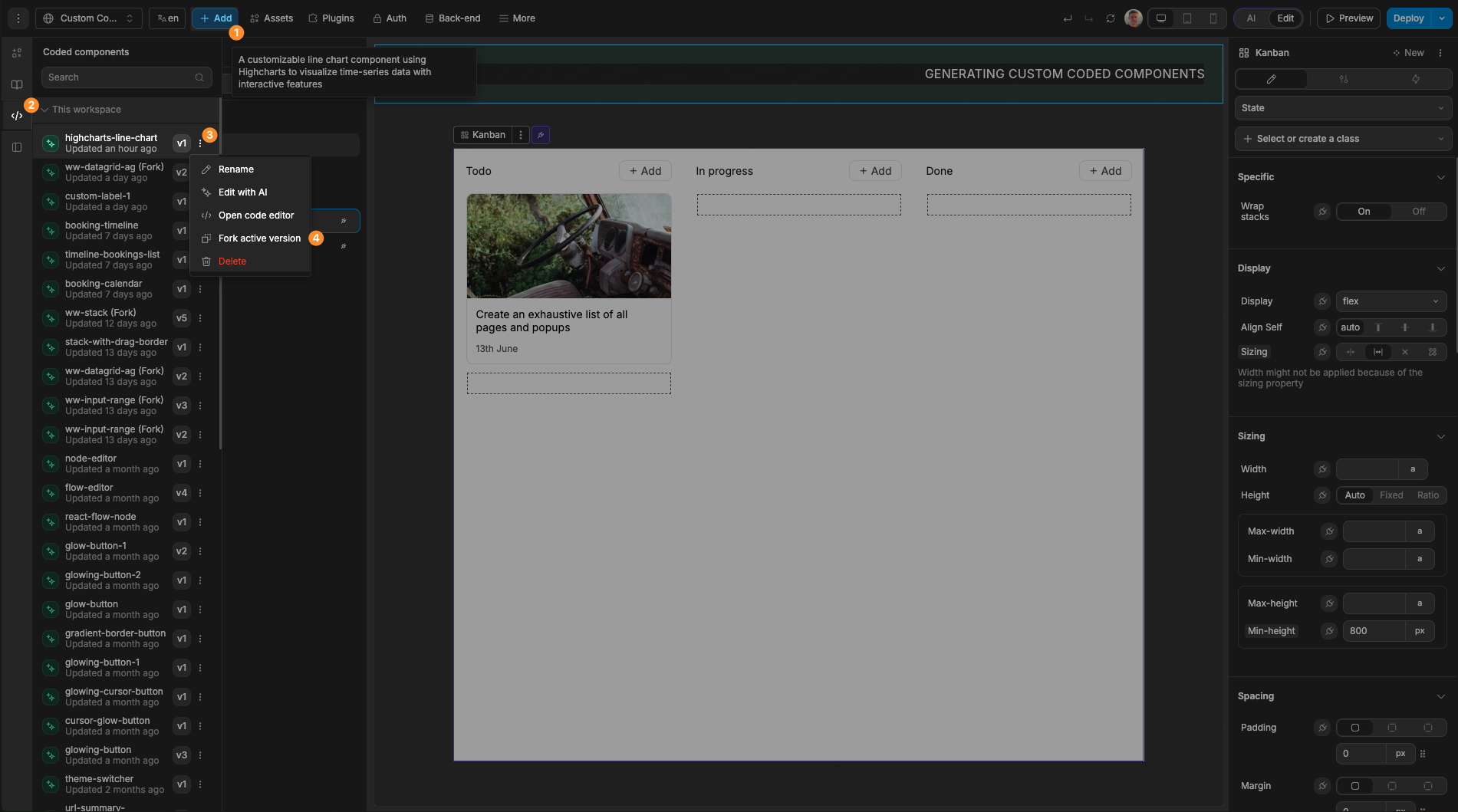
- In the
Add Element, openCoded components, open a component's menu, and chooseFork active version
Example Fork Scenario
Enhanced Reorder List
Imagine you are using the native Reorder List component and you want to apply a custom border color to the dragged item. This is not possible via the native component, however, you could fork the Reorder List and ask AI to add this ability.
Here is a short demo: