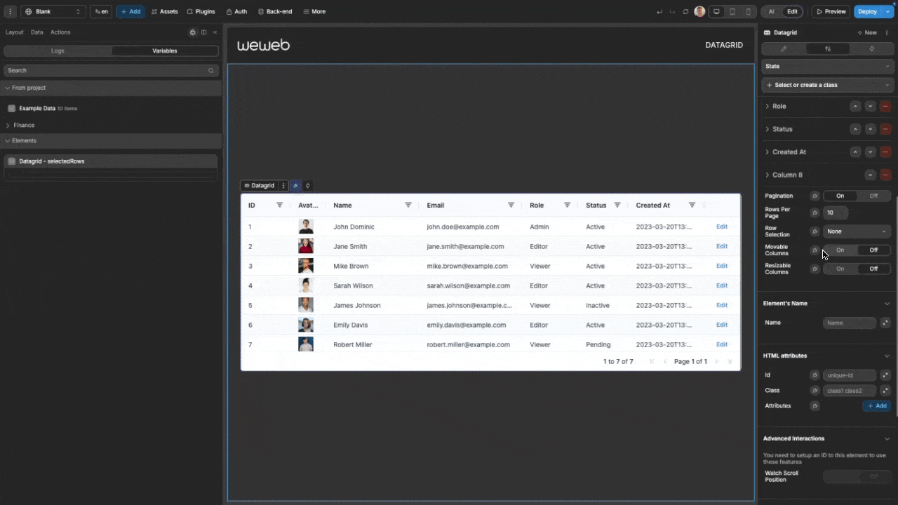
Datagrid (Advanced)
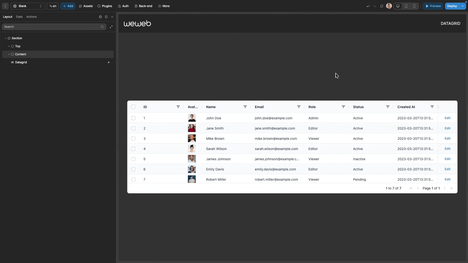
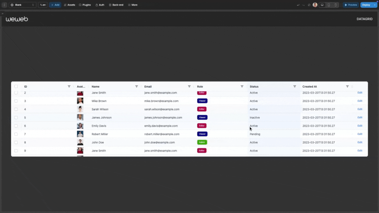
The advanced datagrid component allows you to display and interact with structured data in a tabular format. Built on the AG Grid framework, it offers high-performance rendering with advanced features like sorting, filtering, pagination, and cell editing. You can fully customize its appearance and behavior to meet your specific requirements.
Features
- High-Performance Rendering: Efficiently handles large datasets with virtual scrolling
- Advanced Sorting & Filtering: Helps users quickly find and organize data
- Row Selection: Single or multiple row selection with full event handling
- Interactive Cell Editing: Edit data directly within the grid with validation
- Custom Cells: Add your own UI components to grid cells
- Pagination: Traditional page-based navigation for structured data review
- Column Management: Resize, reorder, and pin columns as needed
- Comprehensive Styling: Extensive appearance customization for all grid elements
Getting Started
Using AI
The quickest way to set up the datagrid is by using AI.
- First, ensure you have a variable or collection with your data ready.
- Ask AI: "Create a datagrid that uses
{{insert your data}}". Make sure you pass in your data as context in the chat.
- Continue refining and customizing your datagrid by asking AI for specific modifications:
- "Add an action column with an 'Edit' button"
- "Enable multiple row selection on the datagrid"
- "Make the email column wider and show the status column with color indicators"
- "Add pagination showing 5 rows per page"
Manual Setup
- Add the datagrid to your page from the
Addpanel - Configure the data source:
- Click the
Dataproperty and select a variable or collection - Set a unique row ID formula (typically using the primary key of your data)
- Click
Generate Columnsto create columns based on your data structure
- Click the
- Customize columns as needed through the properties panel
- Configure appearance settings in the Style panel
- Add workflows to handle interactions like row selection or action buttons
TIP
When binding data to the datagrid, it is optimal for your data to be an array of objects, as this will allow the automatic generation of columns.
If you are unsure what an 'array of objects' means, please refer to our guide on understanding variables: Variables Guide.
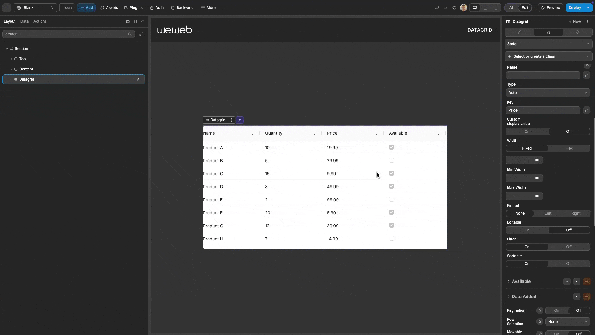
Column Configuration
The datagrid organizes your data into columns that can be extensively customized.
Column Types
| Type | Best For |
|---|---|
| Text | String data |
| Number | Numeric values |
| Boolean | True/false values |
| Date | Date strings |
| Image | Image URLs |
| Action | Interactive buttons |
| Custom | Complex elements |
Custom Display Formatting
For Text, Number, Boolean, and Date columns, you can customize how values are displayed without changing the underlying data:
- Select a column in the properties panel
- Toggle on
Custom display value - Create a formula that transforms the raw value into your desired format
Interactive Features
Cell Editing
Enable users to edit data directly in the grid:
- Select a column in the properties panel
- Toggle on
Editable
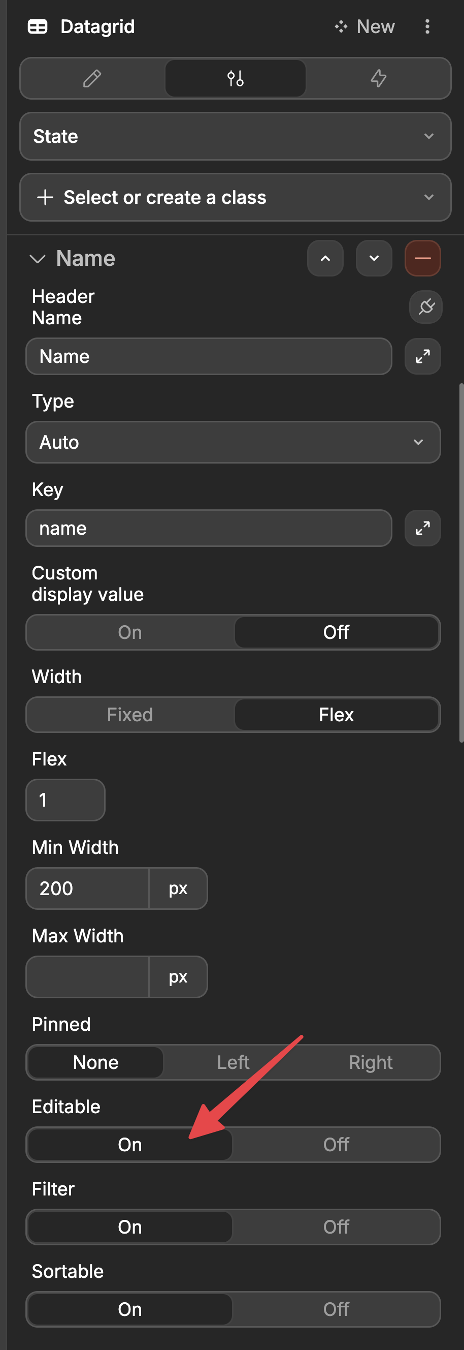
- Users can now double-click a cell to edit its content
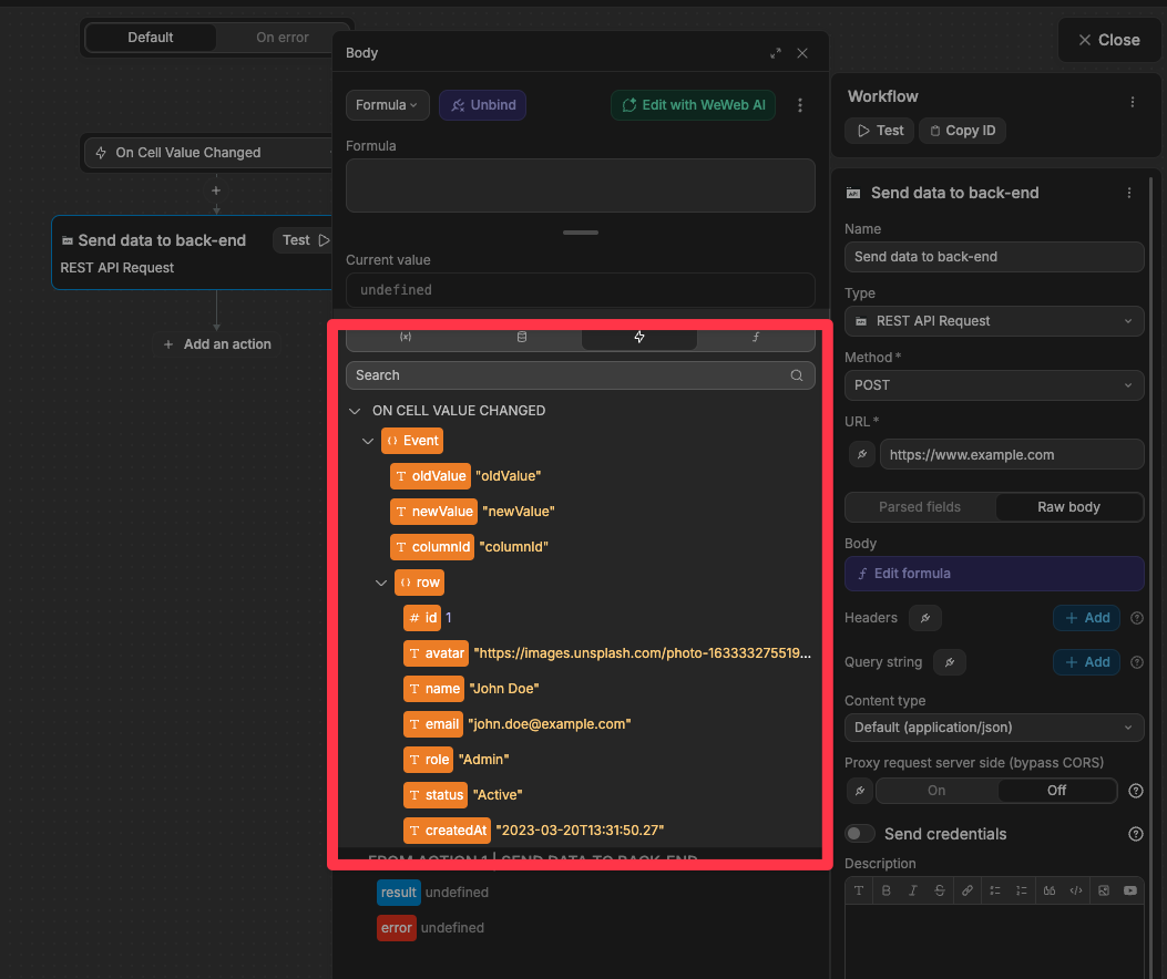
- Create a workflow on the datagrid using the
On Cell Value Changedtrigger
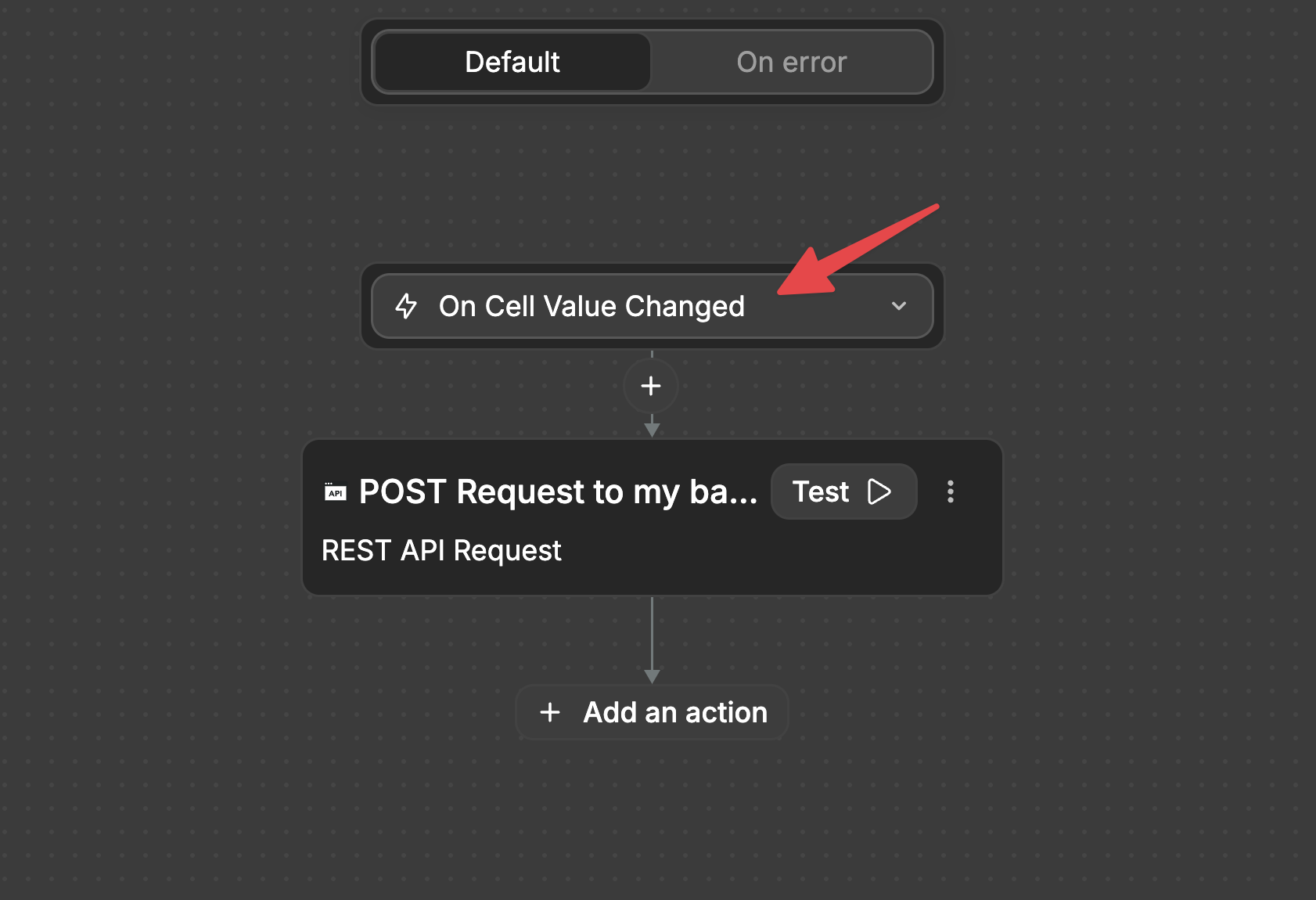
- In your workflow, you'll have access to:
- The old value
- The new value
- Which column was changed
- The complete row data
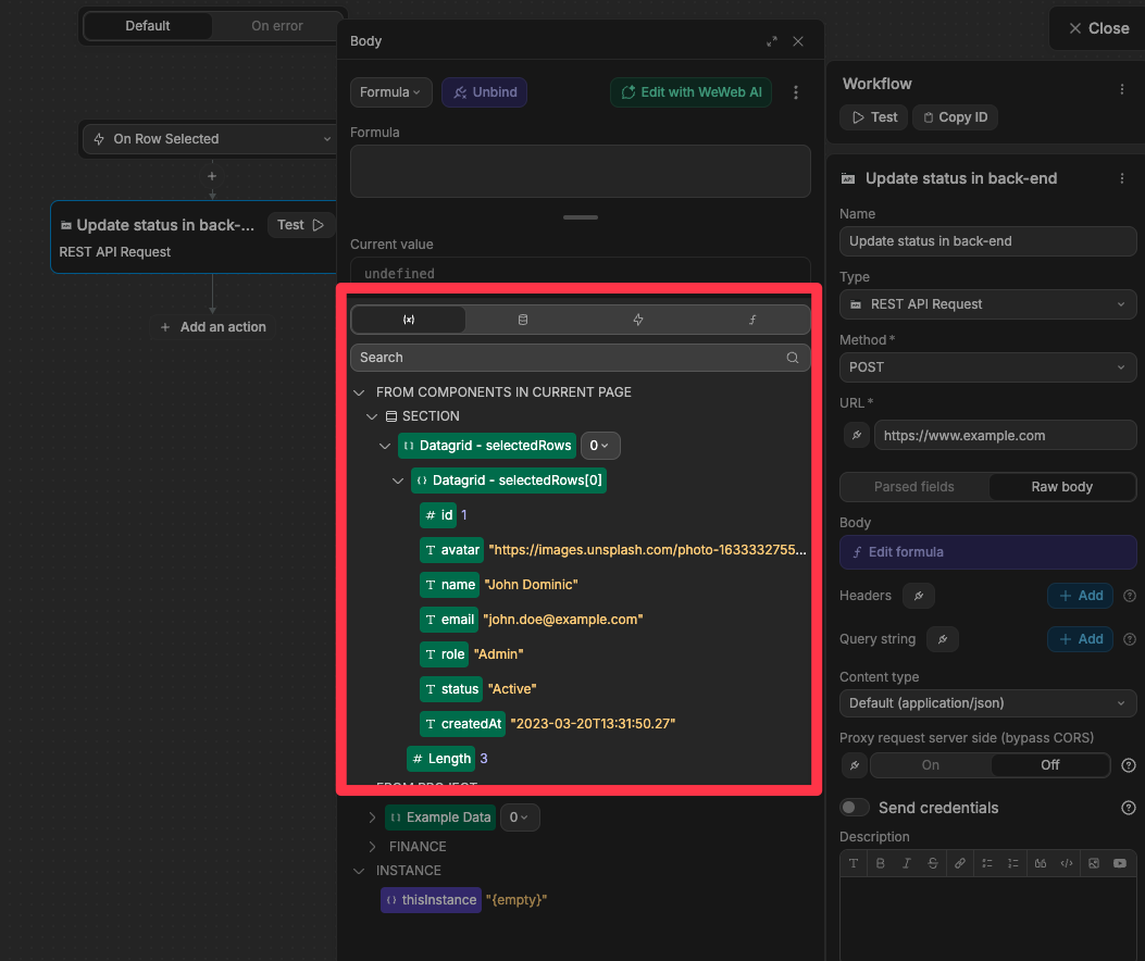
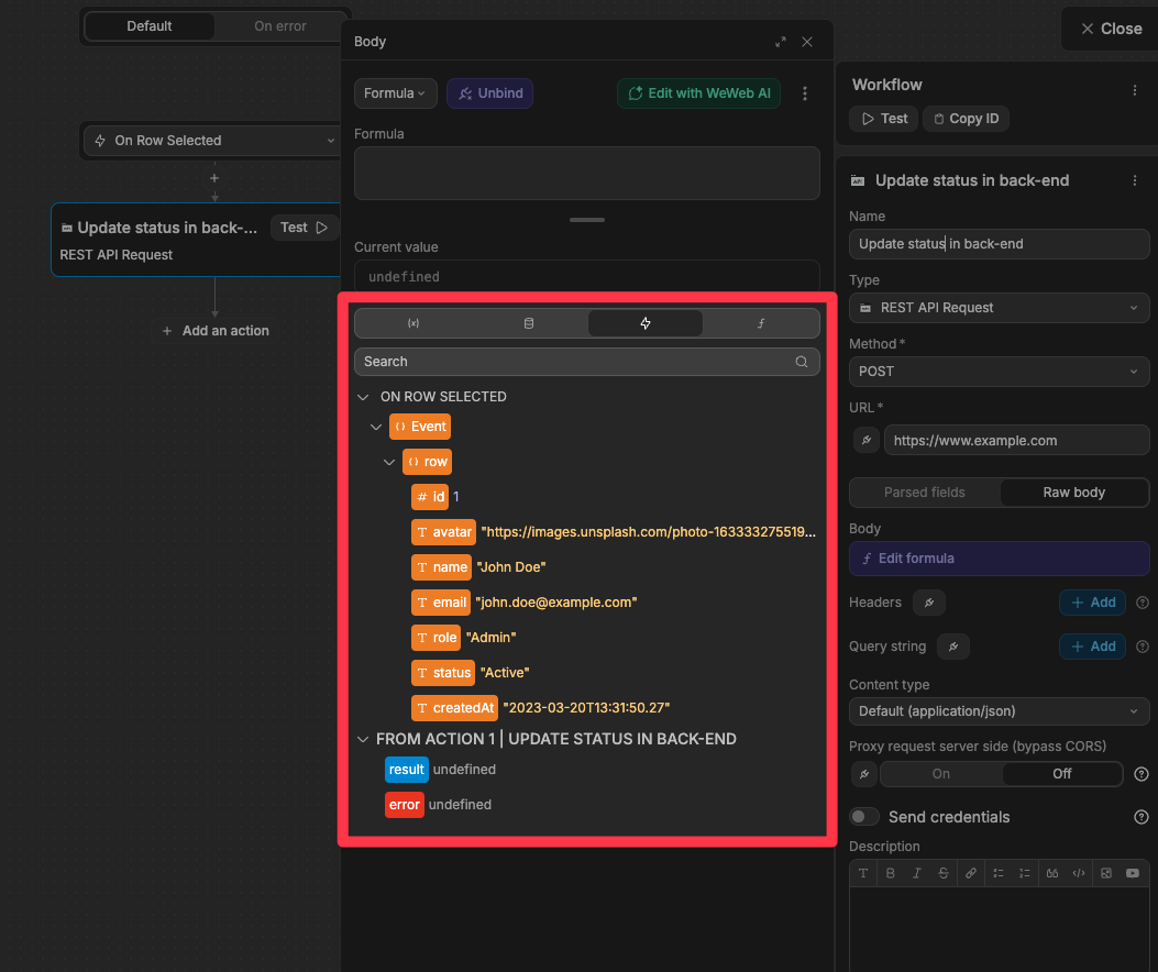
Row Selection
Allow users to select one or multiple rows:
- In the datagrid properties, set
Row Selectionto eitherSingleorMultiple - Users can now select rows by clicking on them
- Create workflows for selection events:
On Row Selected: Triggered when a row is selectedOn Row Deselected: Triggered when a row is deselected
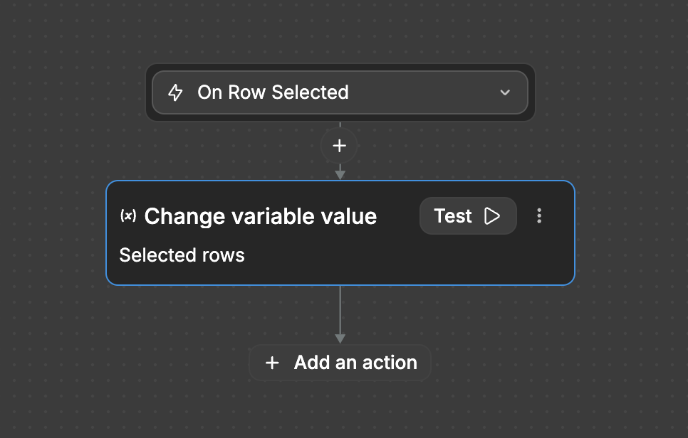
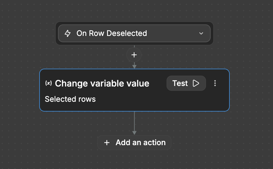
- Access all currently selected rows via the exposed
selectedRowsvariable OR access only the data of the row that triggered theOn Row SelectedorOn Row Deselectedevent
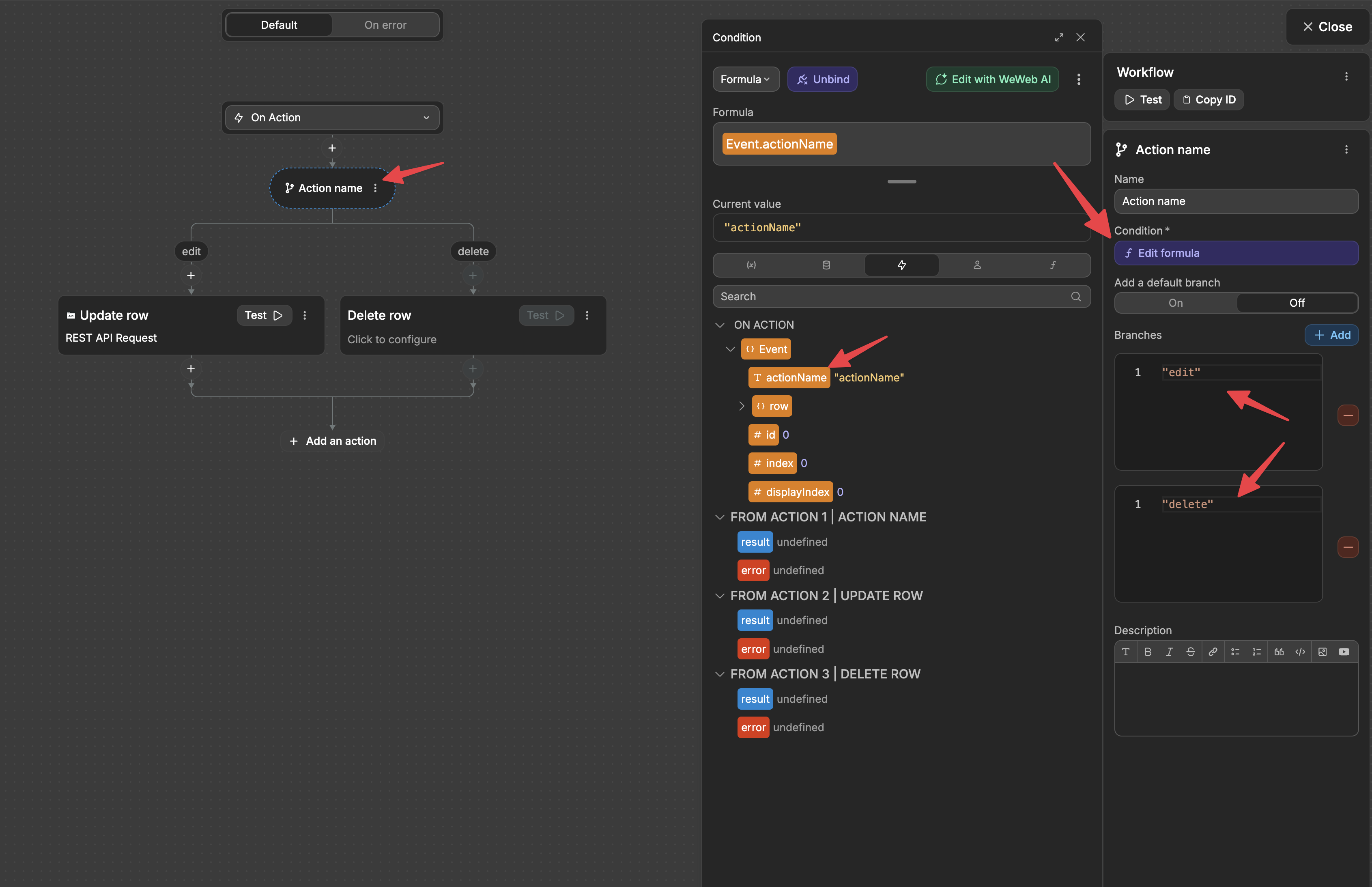
Action Buttons
Add interactive buttons to each row of your datagrid:
- Add a new column with type set to
Action - Configure:
- Action Name: Identifier for the action (used in workflows)
- Action Label: Text displayed on the button
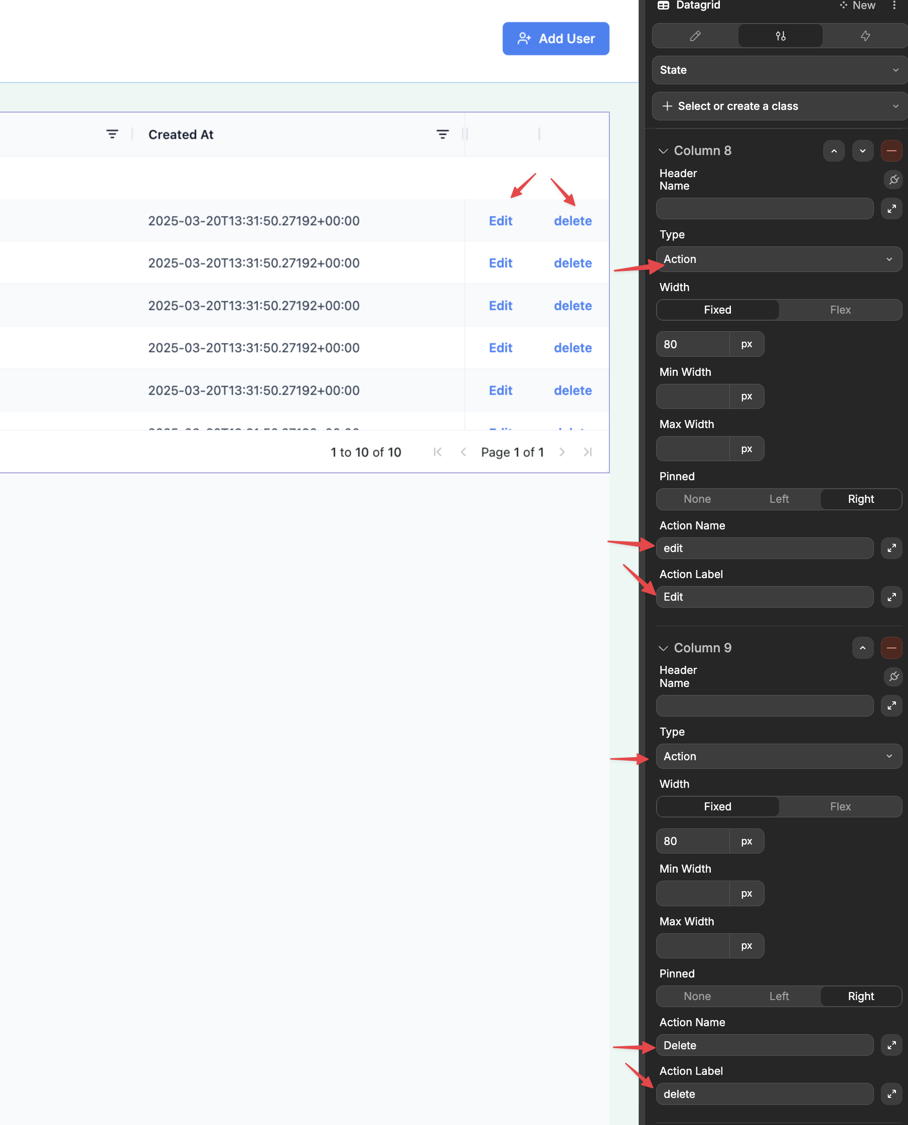
- Create a workflow on the datagrid using the
On Actiontrigger - In your workflow, you'll have access to:
- Which action was triggered
- The complete row data
Custom Cell Content
Create completely custom cell rendering:
- Add a column with type set to
Custom - A Dropzone appears on the canvas where you can add any UI elements
- Drag and drop elements into this dropzone to create your custom cell appearance
- These elements will have access to the cell value and the entire row data
Managing Large Datasets
The datagrid provides two approaches to handling large amounts of data:
Virtual Scrolling (Default)
By default, the datagrid uses virtual scrolling to efficiently render large datasets:
- Only visible rows are rendered in the DOM
- Rows load dynamically as users scroll
- Provides smooth performance even with thousands of rows
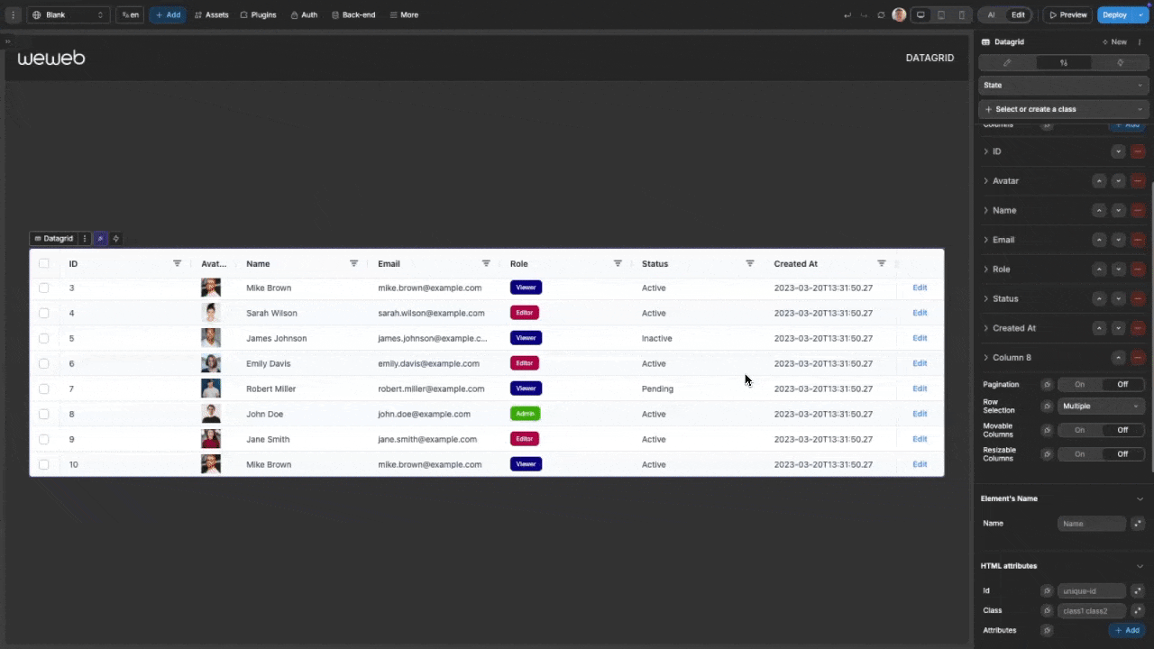
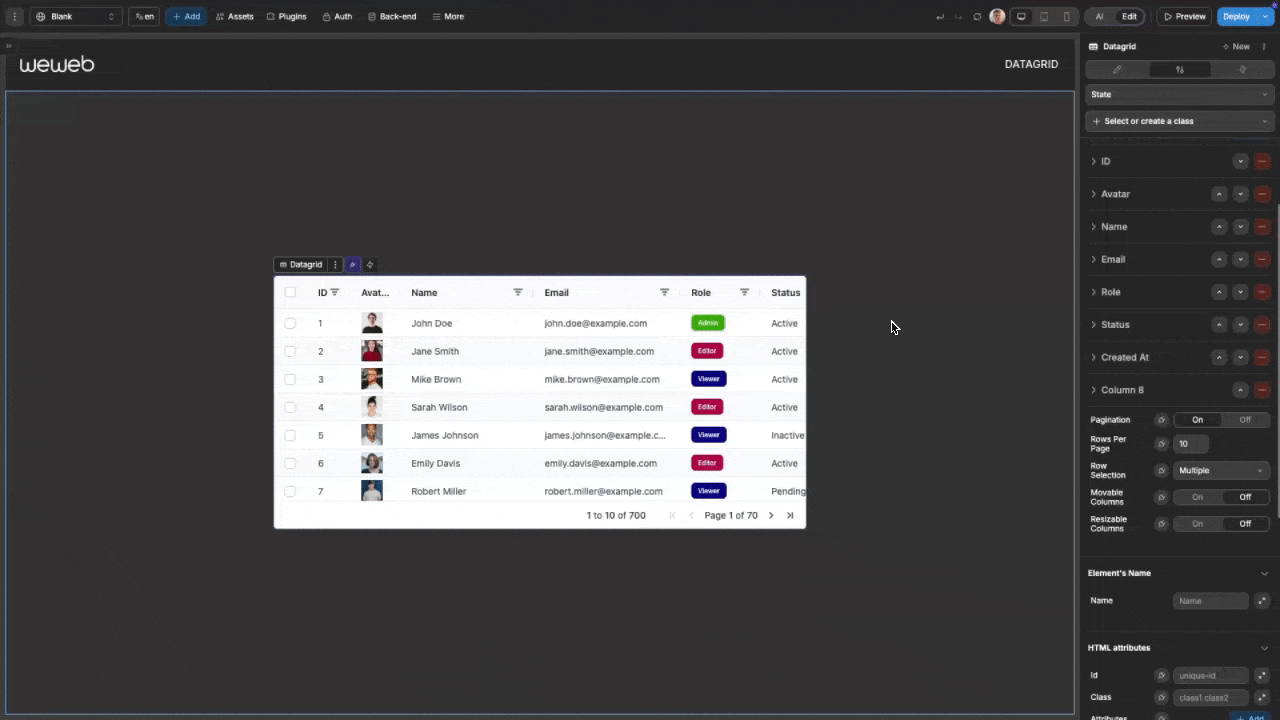
Pagination
For a more traditional approach to large datasets:
- Toggle on
Paginationin the datagrid properties - Set the desired number of rows per page (default: 10)
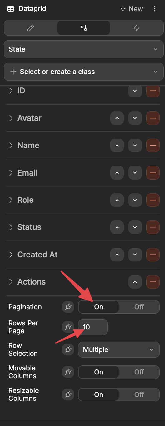
The datagrid will now display page navigation controls, and users can browse through pages of data.
Advanced Usage
Dynamic Column Definition
For programmatically defining columns, bind the columns property to a variable with this structure:
javascript
[
    {
        "headerName": "Name",
        "cellDataType": "text",
        "field": "name",
        "width": "200px",
        "sortable": true
    },
    {
        "headerName": "Price",
        "cellDataType": "number",
        "field": "price",
        "width": "100px",
        "sortable": true
    },
    {
        "headerName": "In Stock",
        "cellDataType": "boolean",
        "field": "inStock",
        "width": "100px"
    },
    {
        "headerName": "Product Image",
        "cellDataType": "image",
        "field": "thumbnail",
        "imageWidth": "50px",
        "imageHeight": "50px"
    },
    {
        "headerName": "Actions",
        "cellDataType": "action",
        "field": "edit",
        "actionName": "editRow",
        "actionLabel": "Edit"
    }
]
Column Width Strategies
The datagrid offers two approaches to handling column widths:
Fixed Width: Set a specific pixel width for the column
- Good for consistent layouts
- Best for columns with predictable content length
Flex Width: Distribute available space proportionally
- Adapts to different screen sizes
- Set flex values to control relative proportions
Column Pinning
For tables with many columns, pin important columns to ensure they stay visible:
- Set the
Pinnedproperty to eitherLeftorRight - Pinned columns remain fixed while users scroll horizontally
- Useful for ID columns, status indicators, or action buttons
Example Use Cases
- Product Catalog: Display products with images, pricing, inventory status, and edit/view actions
- User Management: List users with filterable columns for roles, status, and registration dates
- Financial Dashboard: Present financial data with custom number formatting and row selection
- Task Tracker: Show tasks with status indicators, due dates, and action buttons
- Data Analysis: Enable sorting and filtering for data exploration with visual indicators
Forking
While the DataGrid component offers extensive built-in customization options, there may be cases where you need functionality beyond what's natively available. In these situations, you can fork the component and modify it to meet your specific requirements.
If you are unsure how to fork an element, you can learn more in the dedicated documentation.
Forking Example: Custom Pagination Styling
One reason to fork the DataGrid would be to create styling properties not available in the standard component. For example, you might want to be able to change the styling of the pagination.
To do so, you could fork the datagrid, then edit with AI and pass in the following prompt:
I want to edit this forked datagrid so that I can change the styling of the paginationThe AI will then add new styling properties to control the appearance of different aspects of the pagination: 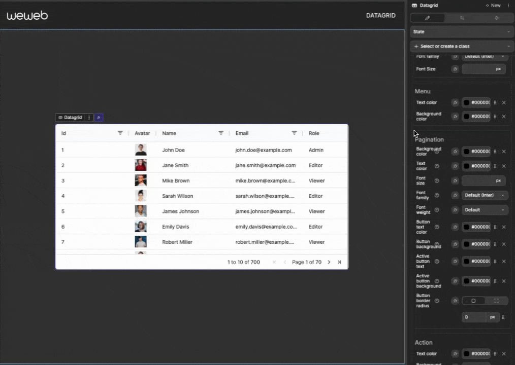
Properties Reference
Settings Properties
| Property | Options/Type | Description |
|---|---|---|
| Data | Collection/Array | The data to display in the grid |
| Unique Row ID | Formula | What to use for the Unique ID of each row |
| Columns | Array | Configuration for each column in the grid |
| Row Selection | None, Single, Multiple | Determines how users can select rows |
| Pagination | Boolean | Enable/disable pagination for large datasets |
| Rows Per Page | Number | Number of rows to display per page (when pagination is enabled) |
| Movable Columns | Boolean | Allow users to reorder columns via drag and drop |
| Resizable Columns | Boolean | Allow users to adjust column widths |
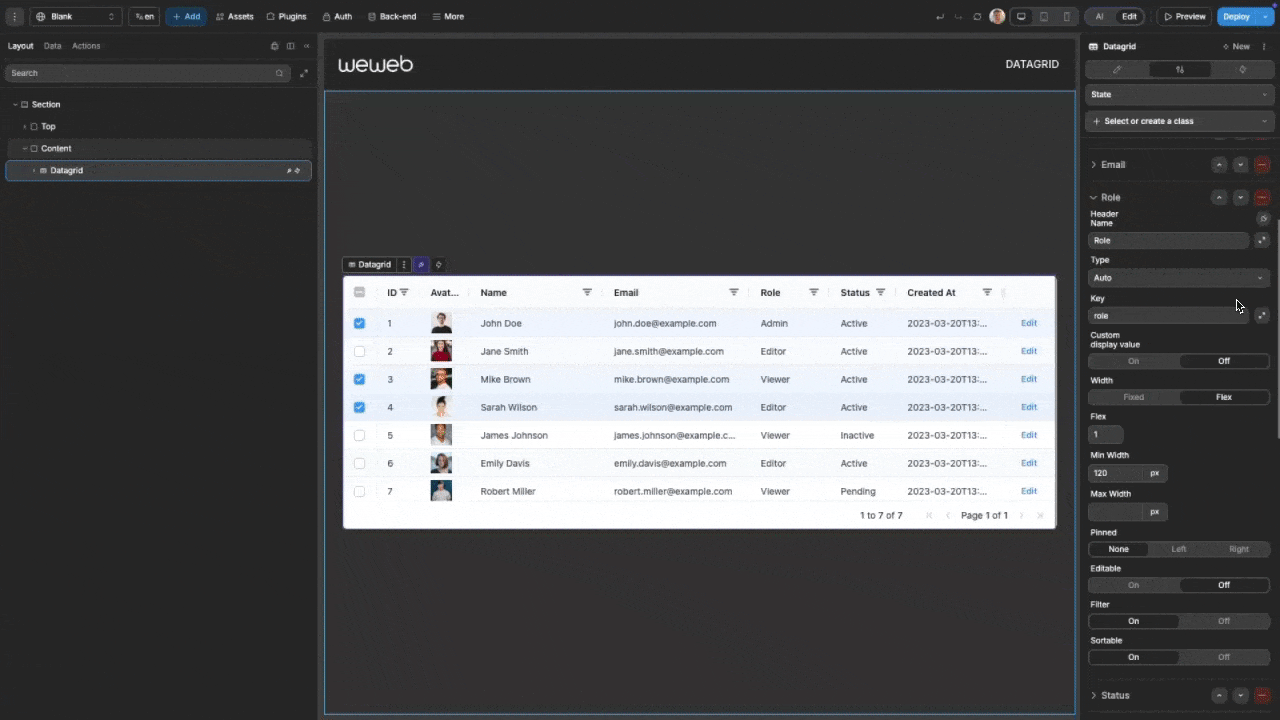
Column Properties
Each column in the datagrid can be configured with these properties:
| Property | Options/Type | Description |
|---|---|---|
| Header Name | Text | The title displayed at the top of the column |
| Type | Text, Number, Boolean, Date, Image, Action, Custom | The type of data in this column |
| Key | Text | The field name from your data source |
| Width | Fixed/Flex | Column width approach (fixed pixel width or flexible) |
| Min Width | Pixels | Minimum column width |
| Max Width | Pixels | Maximum column width |
| Filter | Boolean | Enable/disable filtering for this column |
| Sortable | Boolean | Enable/disable sorting for this column |
| Pinned | None, Left, Right | Pin the column to the edge of the grid |
| Editable | Boolean | Allow users to edit cell values |
| Custom Display | Boolean | Use a formula to format how values are displayed |
Image Column Properties
| Property | Description |
|---|---|
| Image Width | Width of the displayed image |
| Image Height | Height of the displayed image |
Action Column Properties
| Property | Description |
|---|---|
| Action Name | Identifier for the action (used in workflows) |
| Action Label | Text displayed on the button |
Styling Properties
General
| Property | Description |
|---|---|
| Height Mode | Choose between Fixed height or Auto (based on content) |
| Grid Height | Set the height of the grid when using Fixed mode |
| Text Color | Global text color for the grid |
| Border Color | Color of grid borders |
Header
| Property | Description |
|---|---|
| Background Color | Set the background color of the header row |
| Text Color | Set the color of header text |
| Font Weight | Control the boldness of header text |
| Font Size | Adjust the size of header text |
| Font Family | Choose the font for header text |
Row
| Property | Description |
|---|---|
| Background Color | Set the background color of rows |
| Alternate Color | Set the color for alternating rows |
| Hover Color | Set the background color when hovering over rows |
| Vertical Padding Scale | Adjust vertical spacing in rows (0-5) |
| Selected Background Color | Highlight color for selected rows |
Column
| Property | Description |
|---|---|
| Hover Highlight | Toggle column highlight effect on hover |
| Hover Color | Set the color for the column hover effect |
Cell
| Property | Description |
|---|---|
| Text Color | Set the color of cell text |
| Font Family | Choose the font for cell text |
| Font Size | Adjust the size of cell text |
Menu
| Property | Description |
|---|---|
| Text Color | Set the color of text in filter menus |
| Background Color | Set the background color of filter menus |
Action
| Property | Description |
|---|---|
| Text Color | Set the color of action button text |
| Background Color | Set the background color of action buttons |
| Padding | Add space around action button text |
| Border | Set the border style for action buttons |
| Border Radius | Control the roundness of action button corners |
| Font Settings | Configure typography for action buttons |
Event Triggers
The datagrid component provides events you can use to trigger workflows:
| Event | Description | Payload |
|---|---|---|
| On Action | Triggered when an action button is clicked | { actionName, row, id, index, displayIndex } |
| On Cell Value Changed | Triggered after a cell value is edited | { oldValue, newValue, columnId, row } |
| On Row Selected | Triggered when a row is selected | { row } |
| On Row Deselected | Triggered when a row is deselected | { row } |
Example Event Payloads
On Action
javascript
{
  actionName: "edit",
  row: {
    id: 42,
    name: "Product A",
    price: 29.99,
    inStock: true
  },
  id: 42,
  index: 5,
  displayIndex: 2
}
On Cell Value Changed
javascript
{
  oldValue: 29.99,
  newValue: 24.99,
  columnId: "price",
  row: {
    id: 42,
    name: "Product A",
    price: 24.99,
    inStock: true
  }
}
On Row Selected / On Row Deselected
javascript
{
  row: {
    id: 42,
    name: "Product A",
    price: 29.99,
    inStock: true
  }
}
Exposed Variables
The datagrid component exposes the following variables for use in your application:
| Variable | Description |
|---|---|
| selectedRows | Array |