Appearance
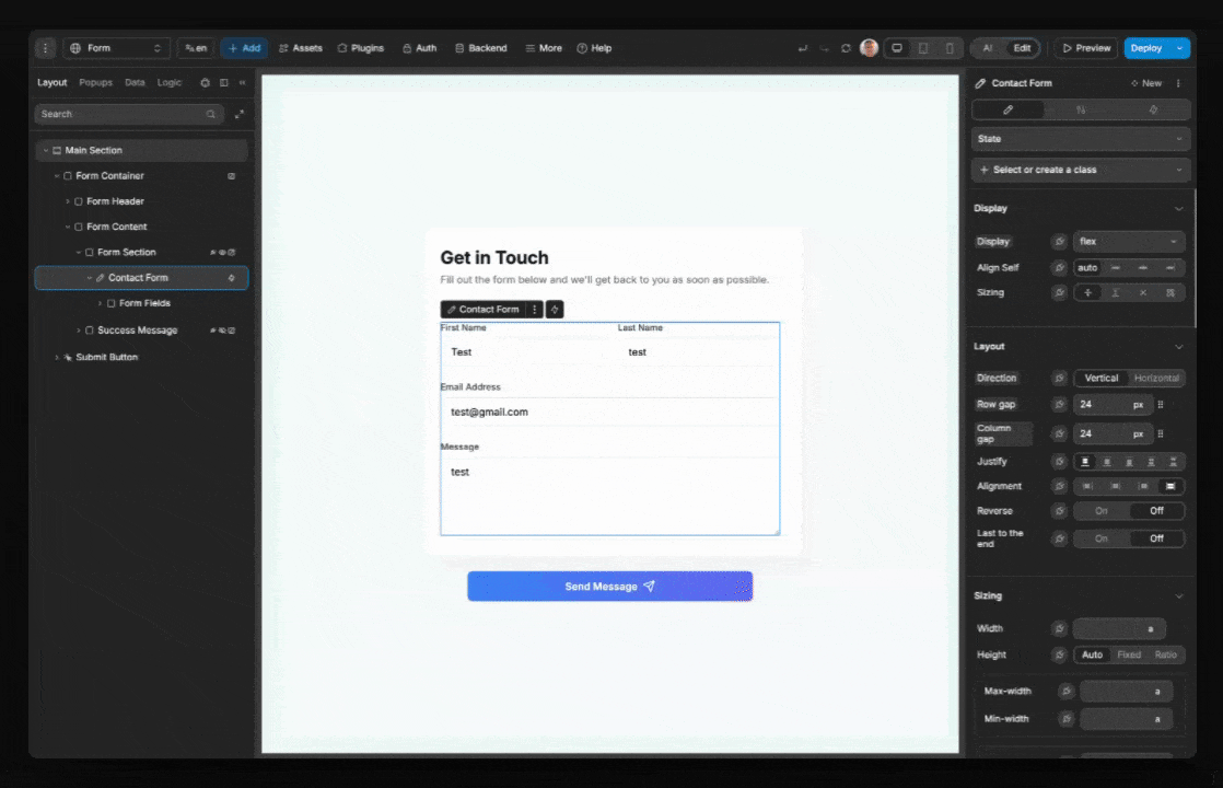
Form container
Forms are the backbone of user interaction in web applications. Form containers in WeWeb provide powerful tools to collect and validate user information. Whether you're building checkout flows, job applications, or product configurators, WeWeb's forms help you create effective user experiences while ensuring data integrity.
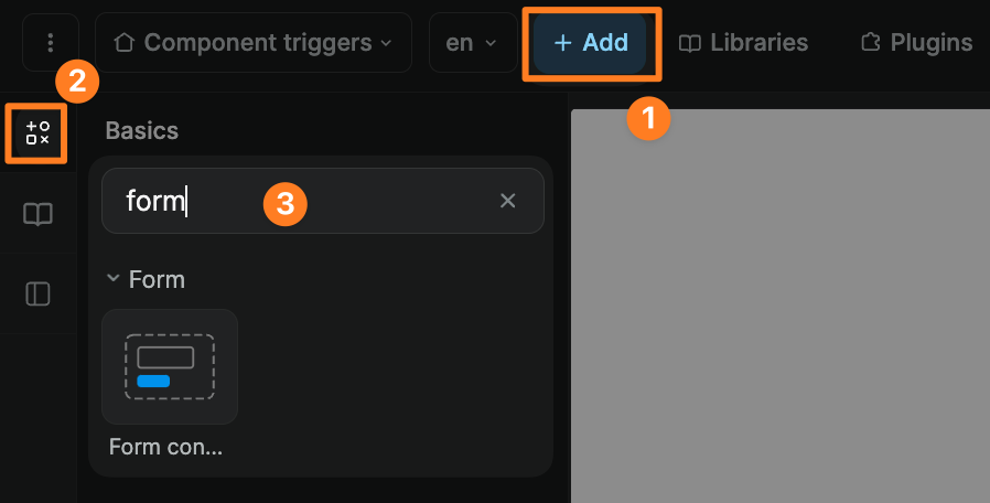
Add a form container
To add a form container in WeWeb, go to Add > Basics and search for "form":
Understanding form variables
When you add a form container to your page, you'll have access to these variables:
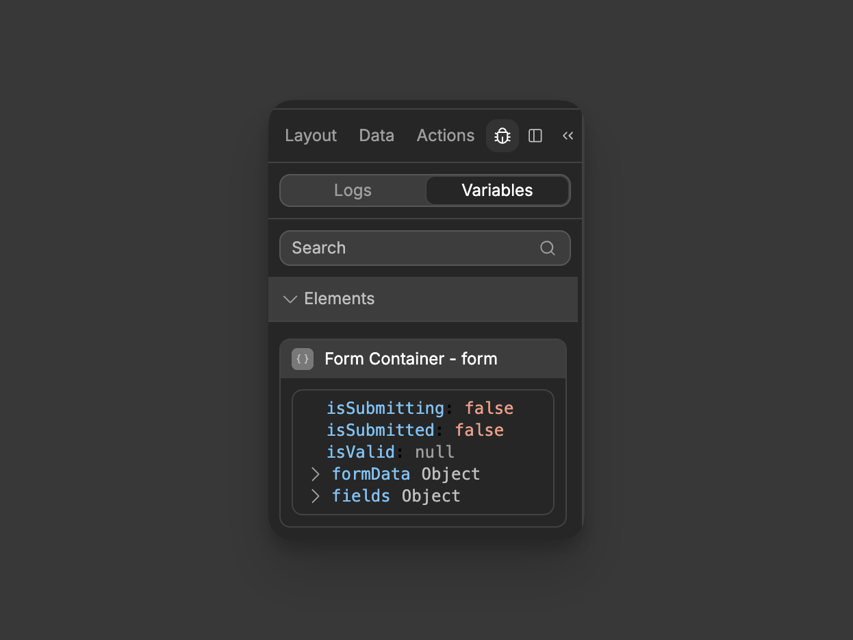
isSubmitting
This variable tells you if the form is currently in the process of being submitted. It will be:
falseWhen the form is idletrueDuring the brief moment when a user has clicked submit and the form is processing
This is useful for showing loading states or preventing double submissions.
TIP
isSubmitting does not change automatically. You must manually set it to true when processing starts and false when processing ends using the Set form state action in your workflow.
isSubmitted
This variable indicates whether the form has been submitted at least once. It will be:
falseWhen the form hasn't been submitted yettrueAfter the form has been submitted, regardless of whether the submission was successful
You can use this to show different content or messages after a user has attempted to submit the form.
TIP
isSubmitted needs to be manually set. The form won't automatically update this value after submission - you need to set it to true yourself using the Set form state action after a successful submission.
isValid
This variable tells you about the current validation state of your form. It reflects whether all form fields meet their validation requirements. See the Form validation section for more details on how this variable works.
formData
This is an object that contains all the current values from your form fields. For example, if you have fields named "email" and "password", you might see:
json
{
  "email": "user@example.com",
  "password": "example1"
}
fields
This is an object that contains information about each form field, including their validation states:
json
{
  "email": {
    "value": "user@example.com",
    "isValid": true
  },
  "password": {
    "value": "example1",
    "isValid": true
  }
}
formData vs fields
When building forms in WeWeb, you'll encounter multiple variables that might seem redundant but serve distinct purposes. Understanding these variables helps create more robust form experiences.
How form input variables work together
- Input-level variables: Each input generates its own variable (e.g.,
Input - value)
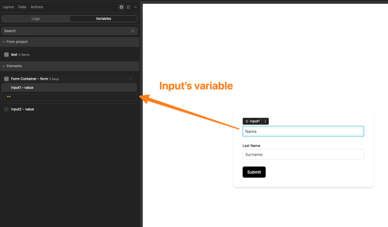
- Form container provides two ways to access input data:
formData.fieldNameDirectly accesses input values (e.g.,formData.email)fields.fieldNameProvides both values and validation info (e.g.,fields.email.value,fields.email.isValid)
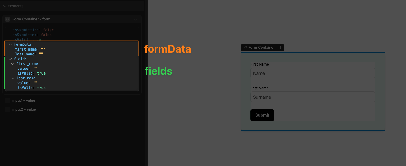
Understanding the difference between formData and fields
While formData and fields may seem similar, they serve different purposes:
formData Object:
- Direct key-value pairs of your form inputs
- Simple access to field values without any extra properties
- Ideal for API submissions and data processing
- Example:
formData.email= "user@example.com"
fields Object:
- Contains both values and validation info
- Provides field-level validation status
- Enables field-specific error handling
- Example:
fields.email.value= "user@example.com",fields.email.isValid= true
Common form variable naming patterns
For a form with a text field named "title", you'll typically see these variables:
formData.title          // Direct value
fields.title.value      // Same value with validation context
fields.title.isValid    // Field-level validation status
The crucial role of input names
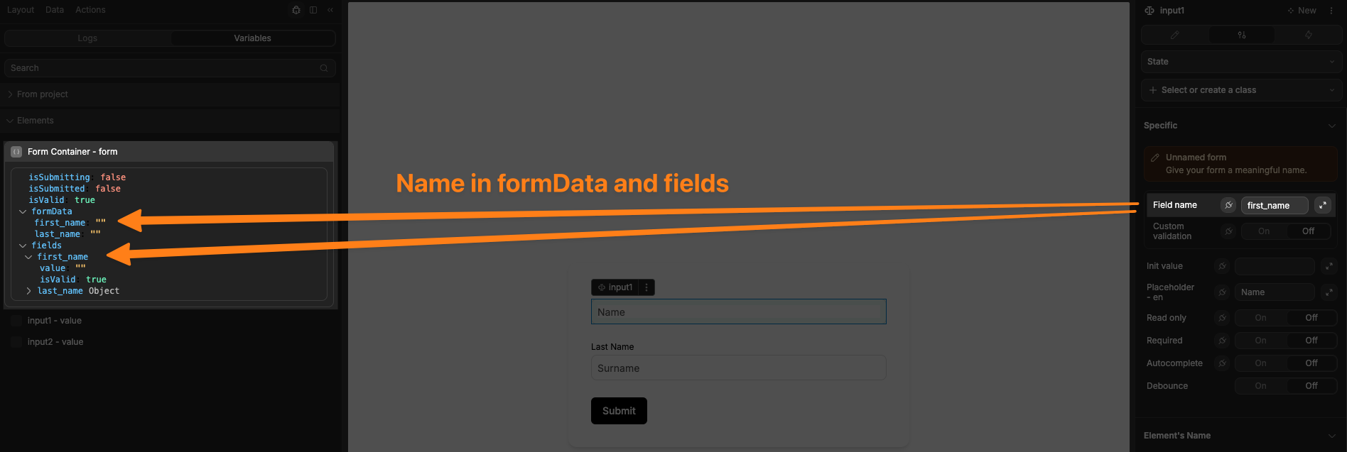
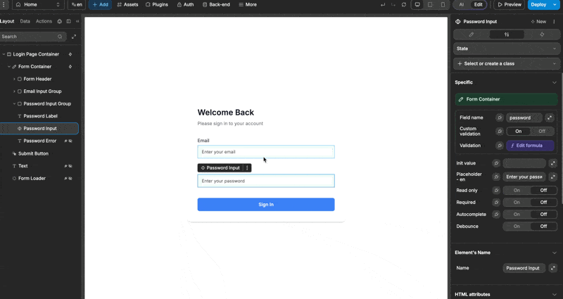
Every form input in WeWeb has a Field name field in its settings panel that plays a critical role in how form data is organized and accessed:
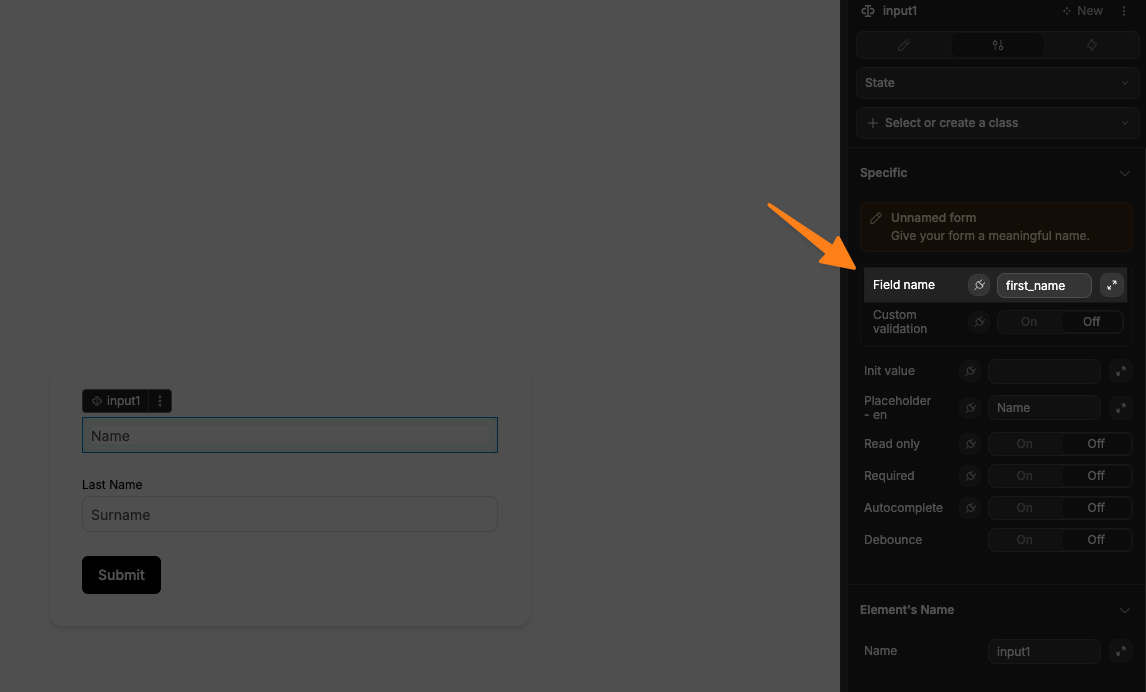
This name serves several important purposes:
- Unique identifier: The name becomes the key used to store and access the input's value in both
formDataandfieldsobjects
- API submission: When submitting to a backend API, the field name determines the property names in your request payload
- Form validation: Error messages and validation states are tracked by field name
- Relationship with formData: The form container uses this name to create the structure of the
formDataobject
WARNING
Make sure the Field name you give the inputs of your form container are unique. If they are not, then the inputs will override one another in the form's data.
When a field's name is not explicitly set in the settings, WeWeb falls back to using the element's name, like so:
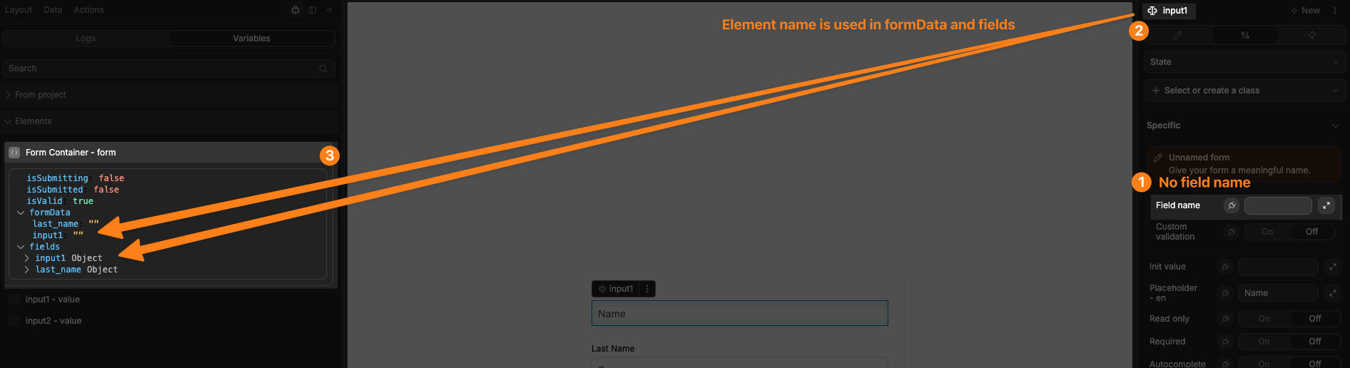
TIP
Name your fields to match your database column names or API expected parameters to simplify data handling. If your API expects email_address as a parameter, explicitly name your input field email_address for consistency rather than relying on the element name.
Component-specific variables
Different input types may expose additional specialized variables. For example:
File Upload:
value: Array of uploaded files with metadata (name, size, type, etc.)status: Array with upload status information for each file
Select Dropdown:
value: The currently selected value (or array of values for multi-select)
Form validation
Form validation is the process of checking if information entered into a form meets certain rules or requirements before it can be submitted.
Form validation states
The form container tracks validation at both the form level and for individual fields:
Form-level validation (isValid):
trueWhen all required fields are filled and all validation rules are metfalseWhen any required field is empty or any validation rule fails
Field-level validation (fields.fieldName.isValid):
trueWhen the field meets its specific validation requirementsfalseWhen the field fails its specific validation requirements
You can use these validation states to:
- Enable/disable the submit button until all fields are valid
- Show form-level or field-specific error messages
- Highlight invalid fields with visual indicators
- Display success indicators for valid fields
- Trigger conditional visibility of elements or sections
The global isValid variable is directly connected to all field-level validation results. Your form is only considered valid when every individual field's isValid is true.
Common types of validation methods
- Required field: ensures essential fields aren't left blank
- Data format: checks inputs match patterns (emails need @, phone numbers need correct digits)
- Length: verifies text meets character limits (minimum password length, maximum descriptions)
- Range: confirms numbers fall within acceptable ranges (age limits, reasonable quantities)
- Comparison: checks relationships between fields (password confirmation matches, dates are sequential)
- Regular expression: uses pattern matching for complex formats (postal codes, credit cards)
- Custom logic: implements business rules (username availability, promotion code validity)
Validation in action
Each input field in your form has its own entry in the fields object that includes both its value and validation state:
json
{
  "email": {
    "value": "user@example.com",
    "isValid": true  // This field passes validation
  },
  "password": {
    "value": "ex",
    "isValid": false  // This field fails validation (too short)
  }
}
You can use the field-level isValid property to provide targeted feedback:
- Show an error message directly below a specific field
- Highlight invalid fields with a red border or background
- Display a checkmark icon next to correctly filled fields
- Enable/disable specific related fields based on validation status
Validation timing settings
The Validation property in the Settings tab controls when validation happens:
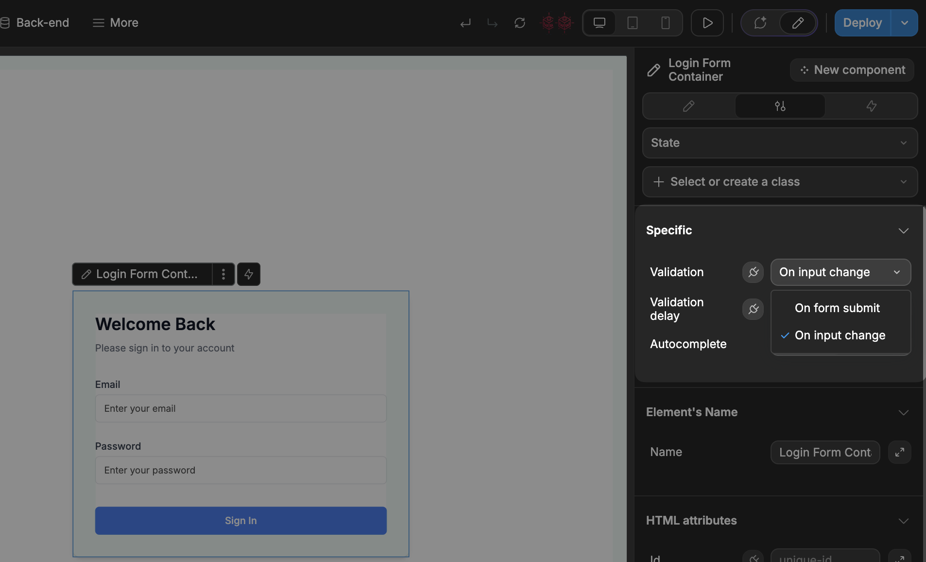
On input change: Both fieldisValidvalues and the form'sisValidupdate as you type. This will enable theValidation delaypropertyOn form submit: TheisValidvalues only update when the submit button is clicked
For example, with "On input change," a text field requiring at least 10 characters immediately sets its isValid to false if the input is too short, which in turn makes the form's overall isValid false. With "On form submit," validation happens only when the user attempts to submit.
This system helps ensure data is correct before submission while giving you control over when users see validation messages.
Password validation example
In this example, we show an error message when a password is too long:
- Set form validation to "On input change" so validation happens while typing
- Add an error message text element below the password field
- Configure the error message's visibility to show only when the password field's
isValidisfalse - Set up the password field's validation rule: "is password smaller than 6 characters"
This creates immediate feedback where the error message automatically appears when the password is too short and disappears when it's valid, all without requiring the user to submit the form.
TIP
Validation delay vs input debounce
The Validation delay property creates a waiting period before running form validation checks. Its purpose is to optimize performance and improve user experience by preventing unnecessary validation processing during rapid typing. This ensures validation only runs after the user has likely finished entering their data.
This is similar to the Debounce property of the Input element.
Debounce serves a similar purpose but for workflows that run on input changes. It creates a pause between when a user interacts with an input and when the associated workflow triggers. This prevents workflows from executing too frequently during typing, which helps:
- Prevent excessive API calls or database queries
- Reduce server load for resource-intensive operations
- Make your application more responsive by batching changes
- Improve performance when inputs trigger complex calculations
Both features prevent your application from becoming sluggish due to too many simultaneous operations, with Validation delay focused on form validation processing and Debounce focused on workflow execution.
On Submit Validation Error Trigger
The On submit validation error trigger activates when a form is submitted but fails validation.
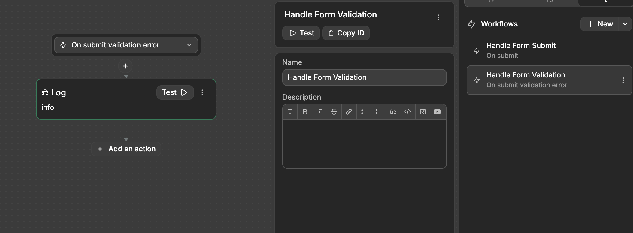
While the standard On submit trigger only runs when all validation passes, this specialized trigger provides a way to handle validation failures.
This allows you to create custom error handling workflows that display helpful messages, log specific validation issues, or guide users on how to correct their input.
Autocomplete
- Form autocomplete: enables browser suggestions for all fields based on previously entered information.
- Input-level autocomplete: allows field-specific control over suggestions, letting you enable or disable autocomplete for individual fields regardless of the form-level setting.
WARNING
These form controls only handle frontend validation that happens in the user's browser. Always implement backend validation too:
- Frontend validation improves user experience by providing immediate feedback
- Backend validation is essential for security since frontend validation can be bypassed
- Always validate submitted data on your server regardless of frontend validation
- Never trust data that comes from the client side, even if it passed frontend validation
For complete security, implement the same validation rules on both frontend and backend.
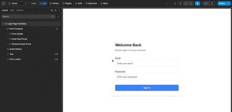
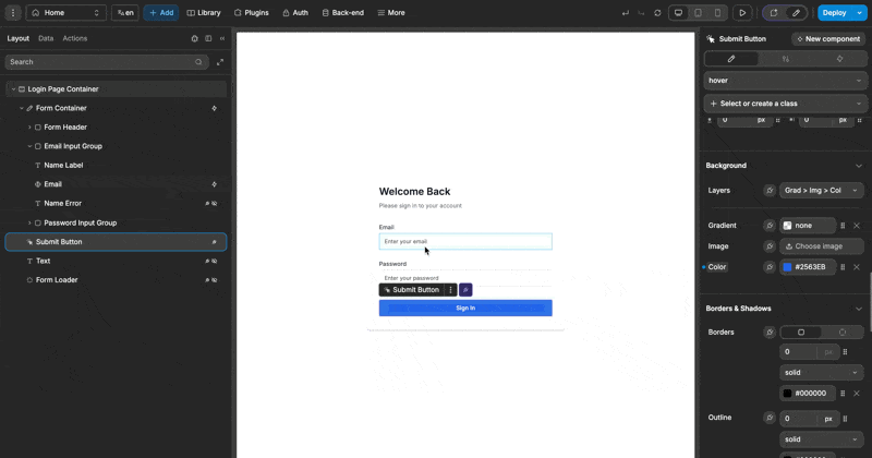
Submit a form
To allow users to submit the form, you'll need to add a workflow.
WARNING
For the form to be validated properly when the user submits it, the workflow should be on the Form container element itself, not on the button
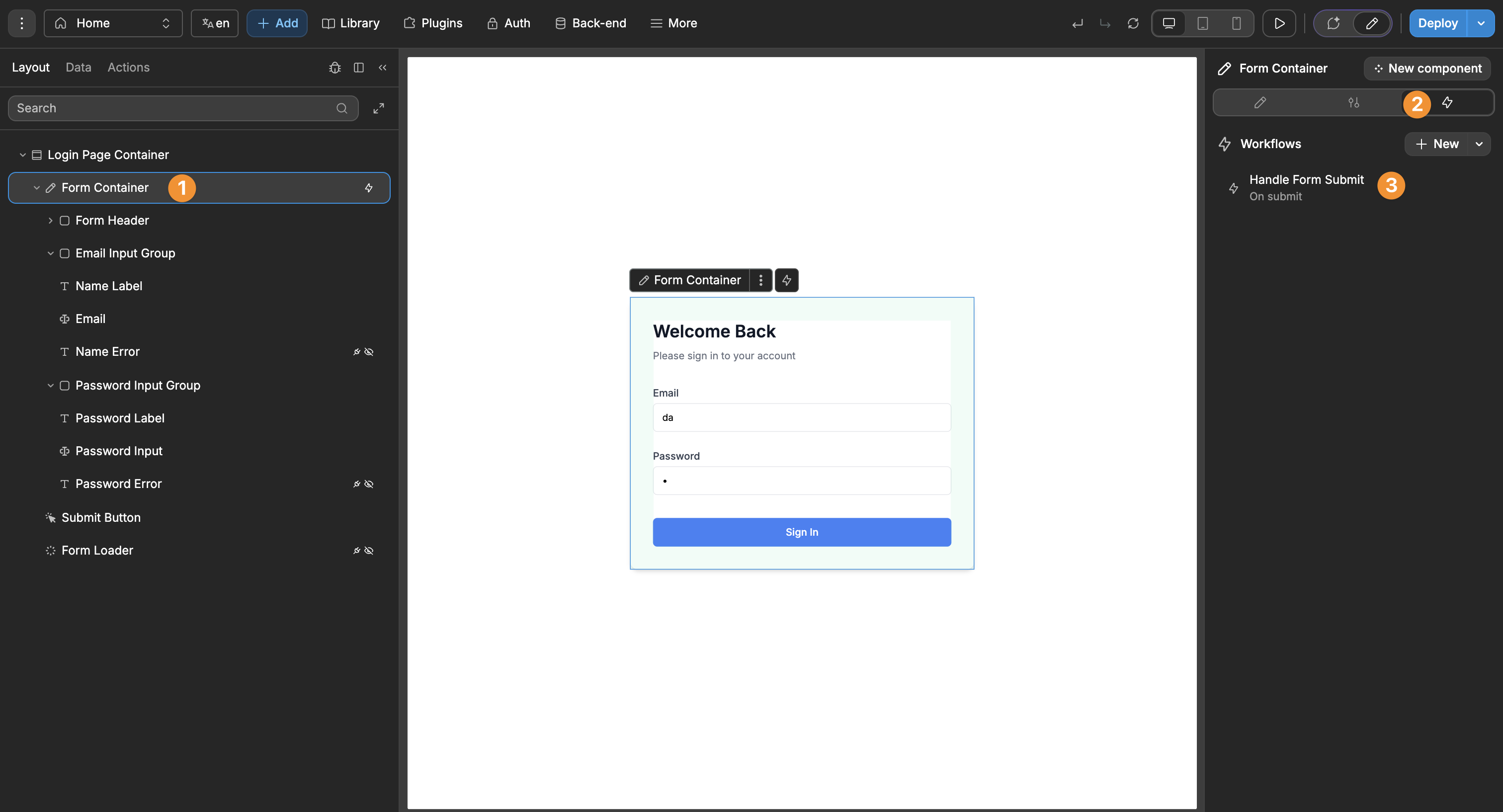
TIP
Looking at the Layout Tree on the left in the example above, notice the lightning icon next to the Form container element. There's no such icon next to the Submit button element. This shows us we added the workflow on the correct element. This follows standard web form practices where submission is managed by the form rather than individual buttons, ensuring expected behavior for users.
The form submission workflow should be triggered On submit.
Workflow actions
When creating workflows within the Form container, two specialized actions become available:
Set form stateSubmit form
These actions can be used not only in workflows attached to the form itself, but also in workflows attached to any element inside the form container (like buttons, inputs, or custom components).
Set form state
Controls form submission status variables:
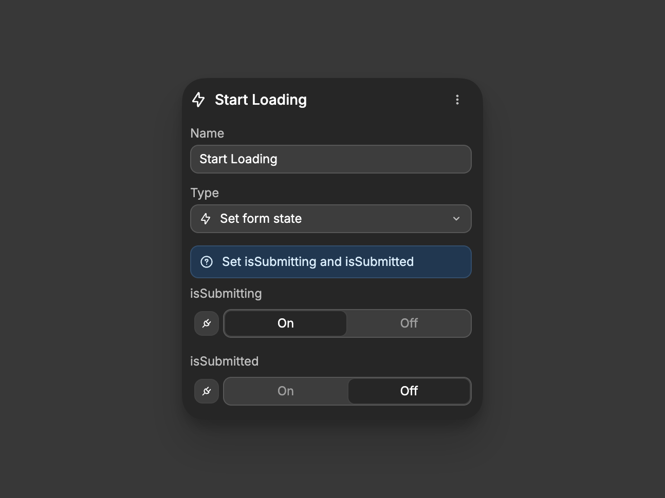
isSubmitting: Toggle loading state (On/Off)isSubmitted: Toggle submission status (On/Off)
Use to manage loading indicators, create multi-step forms, or reset form state.
Submit form
Programmatically submits the form, which:
- Runs all form validation
- Triggers the form's submission process
- Sets both submission variables appropriately
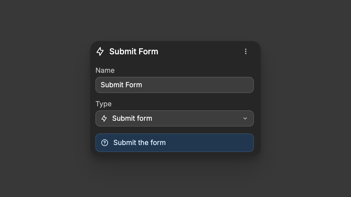
Use for custom submission triggers or conditional submission logic.
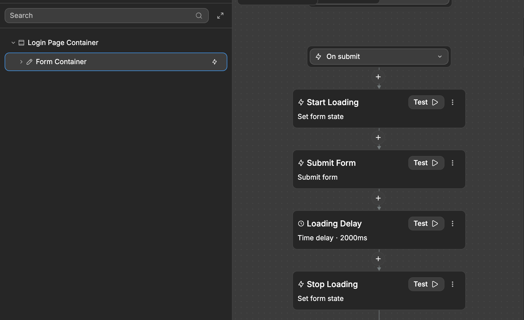
A practical workflow sequence for form submission:
- ⚡ On submit: user clicks the submit button
- Set
isSubmittingtoOn: show loading spinner - API call: send form data to your database (or simply add the
Time delayaction to simulate processing) - Check API response:
- If successful: set
isSubmittedtoOn, show success message - If error: keep
isSubmittedOff, show error message
- Set
isSubmittingtoOff: hide loading spinner
This simple flow provides feedback throughout the submission process while handling both success and error cases in a user-friendly way:
Submitting forms with external buttons
Sometimes you may need to submit a form using a button that's located outside the form container.
To submit a form with an external button, you need to connect the button to the form using HTML form attributes:
Step 1: Give your form an ID
- Select your Form Container element
- In the
Settingspanel, find theidfield - Enter a unique identifier for your form (e.g., "contact-form", "signup-form")
Step 2: Configure the external button
- Select the button that should submit the form
- In the
Settingspanel, make sure the button'sTypeisSubmit Button - Also in the
Settings panel, add an attribute - The name of the attribute should be
form, and the value should be the id you assigned to your form - Now, on click, the button will trigger the submission of your given form
TIP
This technique uses standard HTML form attributes (form), making it accessible and following web standards. The external button will trigger the form's validation and submission workflow just as if it were inside the form container.
WARNING
Make sure the id you assign to the form is unique on the page. If multiple forms share the same id, the button may not work as expected.
Form input states
To improve your web app's accessibility and user experience, it's best practice to add states to form inputs. States help provide visual feedback to users based on form conditions.
A common example is disabling the submit button until all form fields are valid:
In the example above, we're using the form's isValid property to control the submit button's disabled state. When the form validation fails, the button remains disabled, preventing submission attempts with invalid data.
You can apply similar state controls to highlight invalid fields, show success indicators, or create other interactive elements that respond to the form's validation state.
Learn more about adding states in WeWeb.