Appearance
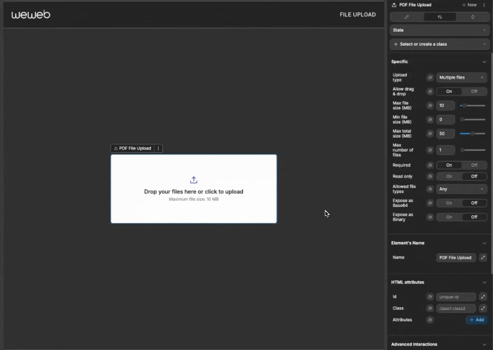
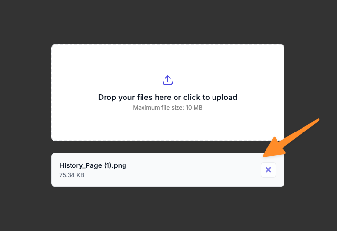
File Upload New
The File Upload element provides an intuitive way for users to upload files in your application. It supports both single and multiple file uploads with interactive drag-and-drop functionality, file validation, and extensive customization options to match your design system.
Features
- Single or Multiple File Uploads: Easily configure for accepting one file or multiple files
- Drag-and-Drop Support: Intuitive interface with animated visual feedback
- File Validation: Configure size limits and file type restrictions
- Visual Customization: Extensive styling options for all component elements
- Upload Progress: Built-in visual progress indicator
- Accessibility: Fully accessible with ARIA attributes and keyboard navigation
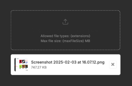
- File Preview: Displays file information with size and upload progress
- Base64 and Binary Formats: Option to expose file contents in Base64 or binary formats
- Responsive Design: Adapts to container size and different screen dimensions
Getting Started
Using AI
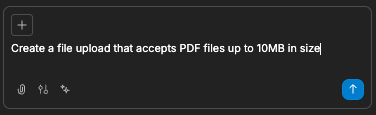
The quickest way to set up the file upload is by using AI.
- Ask AI to add the file upload. Make sure to specify:
- Specific styling requirements
- Settings you would like applied:
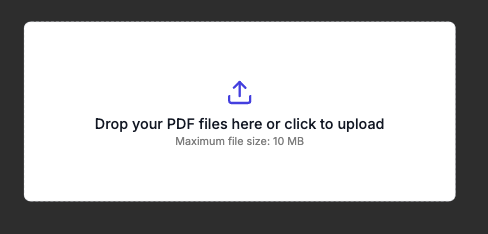
- The AI will then create your styled file upload:
- Continue refining your file upload by asking AI for specific modifications:
- "Make the file upload accept multiple image files"
- "Add a custom label to the file upload"
- "Change the border style to solid with a blue color"
- "Show upload progress with a green progress bar"
Manual Setup
- Add the file upload to your page from the
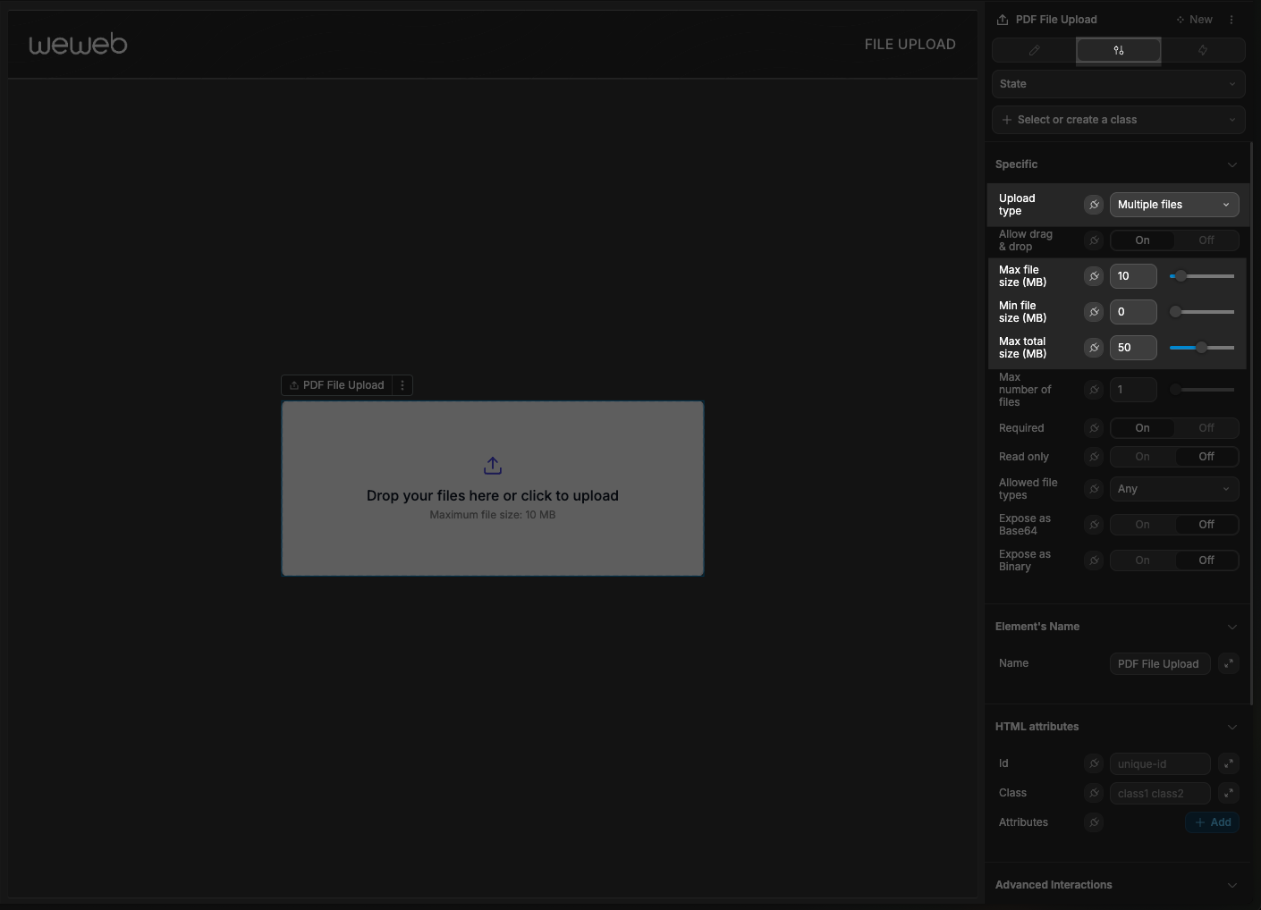
Add Element - Configure basic settings:
- Set upload type to single or multiple files
- Configure file size limits (maximum and minimum)
- Set allowed file types
- Enable or disable drag and drop
- Customize appearance through the style panel
- Add workflows to handle file uploads and validation errors
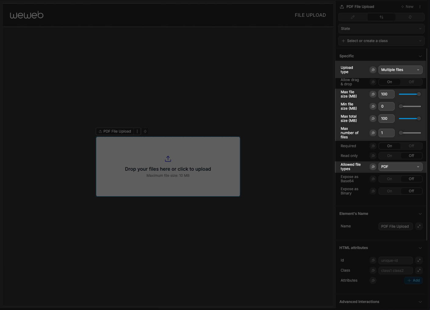
Basic Configuration
Upload Types
The file upload supports two primary modes:
| Mode | Description | Use Case |
|---|---|---|
| Single File | Accepts only one file at a time | Profile photos, document submissions |
| Multiple Files | Accepts multiple files | Photo galleries, batch document processing |
File Validation
Control what files users can upload:
- File Size Limits:
- Set maximum file size (default: 10MB)
- Set minimum file size (default: 0MB)
- For multiple uploads, configure maximum total size (default: 50MB)
- File Type Restrictions:
- Choose from preset file types (Images, Videos, PDF, CSV, etc.)
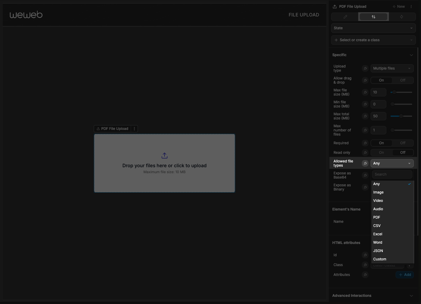
- Create custom extensions list (e.g.,
.docx, .pptx, .txt)
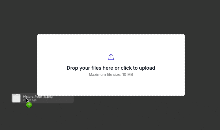
Drag and Drop
Enable intuitive file uploads:
- Set
Allow drag & dropto On - Users can drag files from their file explorer to the upload area
- Visual feedback appears as users drag over the component
Handling Uploads
When a user attempts to upload a file, the element:
- Provides visual feedback with drag animations
- Validates the file to ensure it meets the configured constraints
- Once uploaded, displays file information (name, size, type)
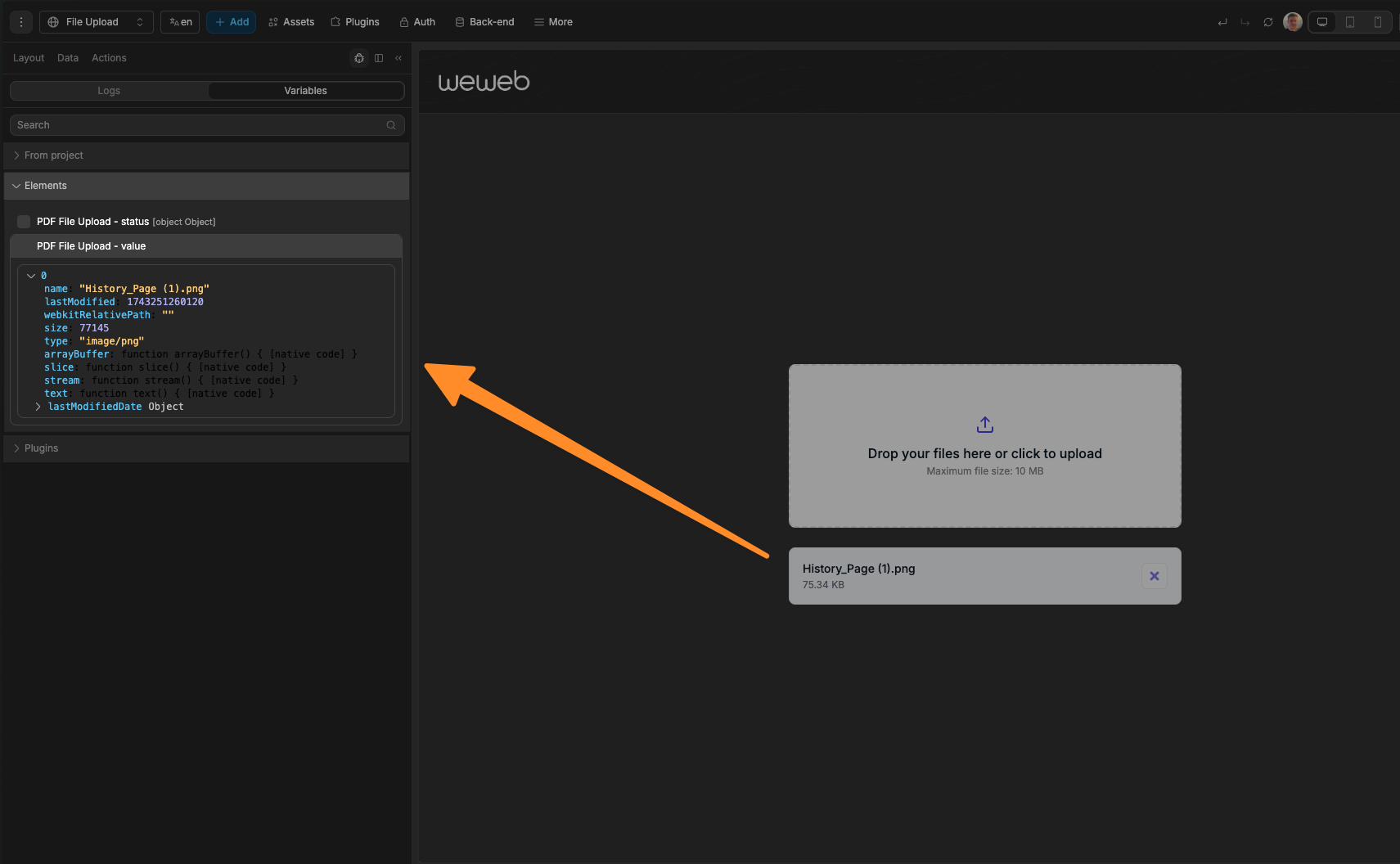
- Makes file data available through exposed variables
- Triggers workflow events allowing for further manual logic
Storing Uploads
On the backend
Ultimately, to correctly store uploaded files, you will likely need to save them in your backend.
As an example, imagine you had UI where the user's upload files and press a save button when done, like so
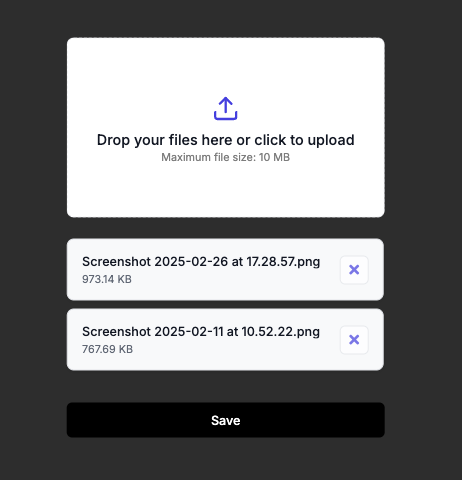
The steps to be taken would be the following:
Have a workflow created on the save button to send the files and appropriately set any state variables (like loaders).
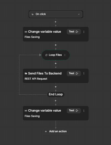
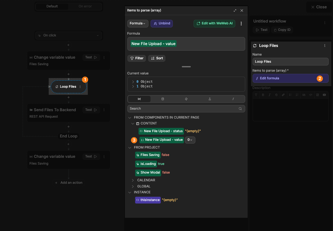
Inside the workflow, loop the files uploaded:
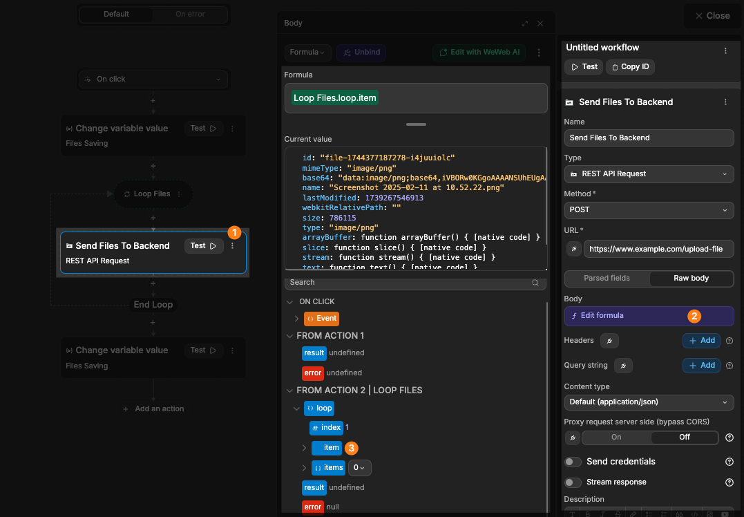
And for each file in the loop, send it to the backend for upload:
TIP
In the example above, we looped the files because our file upload was set to allow multiple files. If your file upload is set to only allow single files, then you would not need to perform any looping.
On the frontend
You have the ability to store uploaded files into the WeWeb CDN, however, this is recommended to only be used for initial testing/MVPs.
To do so, you simply need the following:
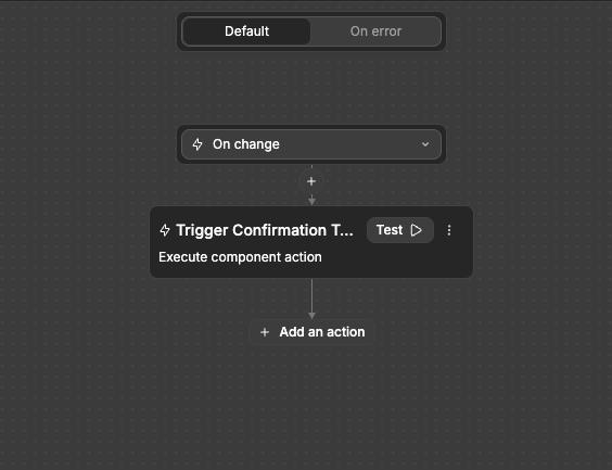
Have a workflow created on the file upload element with the
On changetrigger.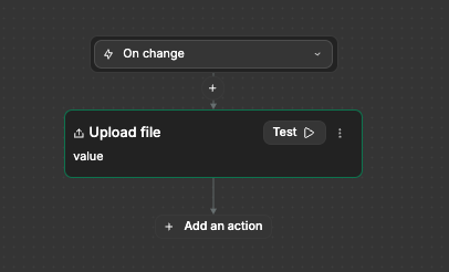
Inside the workflow, have an
Upload fileaction linking to the file upload element: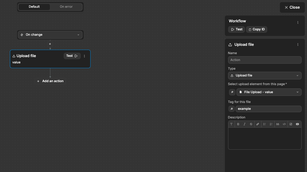
The files will then be stored in the
User Storagetab of theAuthmenu: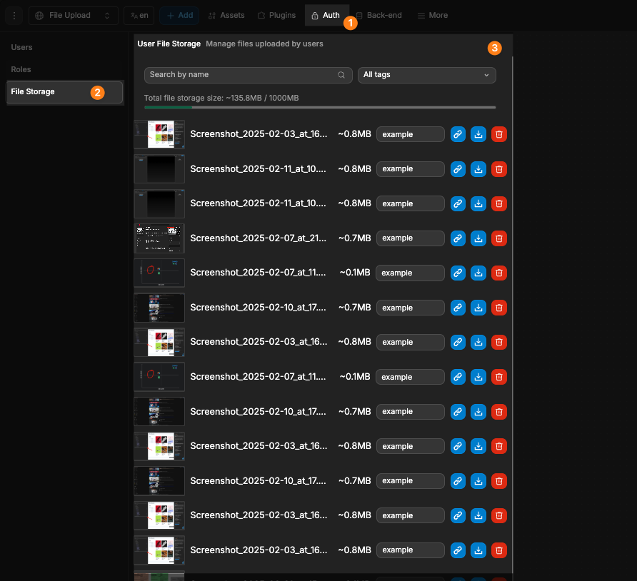
Advanced Options
Exposing File Content
For client-side processing, access file contents directly:
Base64 Encoding:
- Toggle
Expose as Base64to include base64-encoded file data - Useful for image previews or browser-based processing
- Toggle
Binary Format:
- Toggle
Expose as Binaryto include binary file data - Useful for advanced file manipulation like editing media or reading file metadata in detail.
- Toggle
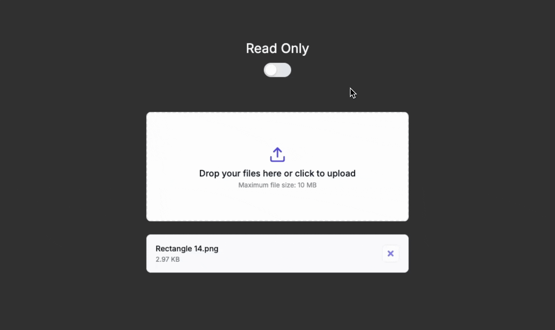
Read-Only Mode
Present files without allowing changes:
- Set
Read onlyto On - Users can view uploaded files but cannot add or remove files
- Useful for review states or displaying previously uploaded content
Required Validation
Ensure users provide necessary files:
- Set
Requiredto On - File will be required as part of form submission
Example Use Cases
User Profile Photo Upload
Configure a single file upload for profile photos:
- Set upload type to
Single file - Set allowed file types to
Image - Set maximum file size to
5MB - In the workflow, use the base64 data for preview
- Send the file to your server for storage
Document Management System
Create a multi-file document uploader:
- Set upload type to
Multiple files - Set allowed file types to
PDF, Word, Excelor use custom extensions - Set maximum total size to
50MB - Add progress indicators and file management options
- Process uploads in batches
Image Gallery Upload
Build an image gallery uploader:
- Set upload type to
Multiple files - Set allowed file types to
Image - Enable base64 encoding for image previews
- Create a workflow to display uploaded images in a gallery
- Add file name display and size information
Best Practices
Do:
- Provide clear instructions about file requirements
- Set appropriate file size limits based on your application needs
- Use the error event to provide helpful feedback
Don't:
- Set unnecessarily restrictive file size limits
- Use only generic error messages
- Forget to handle uploaded files on your server
Forking
While the file upload element offers extensive built-in customization options, there may be cases where you need functionality beyond what's natively available. In these situations, you can fork the element and modify it to meet your specific requirements.
If you are unsure how to fork an element, you can learn more in the dedicated documentation.
Forking Example: Custom File Preview
One reason to fork the File Upload would be to add custom preview functionality:
I want to add image preview thumbnails to this forked file upload componentThe AI will then add image preview capabilities:
Properties Reference
Settings
| Property | Options/Type | Description |
|---|---|---|
| Upload Type | Single file, Multiple files | Determines if one or multiple files can be uploaded |
| Allow drag & drop | Boolean | Enable/disable drag and drop functionality |
| Max file size (MB) | Number | Maximum allowed file size |
| Min file size (MB) | Number | Minimum allowed file size |
| Required | Boolean | Makes the file upload field required |
| Read only | Boolean | Makes the component read-only |
| Allowed file types | Any, Image, Video, Audio, PDF, CSV, Excel, Word, JSON, Custom | Preset file type filters |
| Custom extensions | Text | Comma-separated list of allowed file extensions |
| Expose as Base64 | Boolean | Include base64-encoded file data |
| Expose as Binary | Boolean | Include binary file data |
Styling
The File Upload component offers extensive styling options to match your application's design. These settings are organized into different sections in the Style tab.
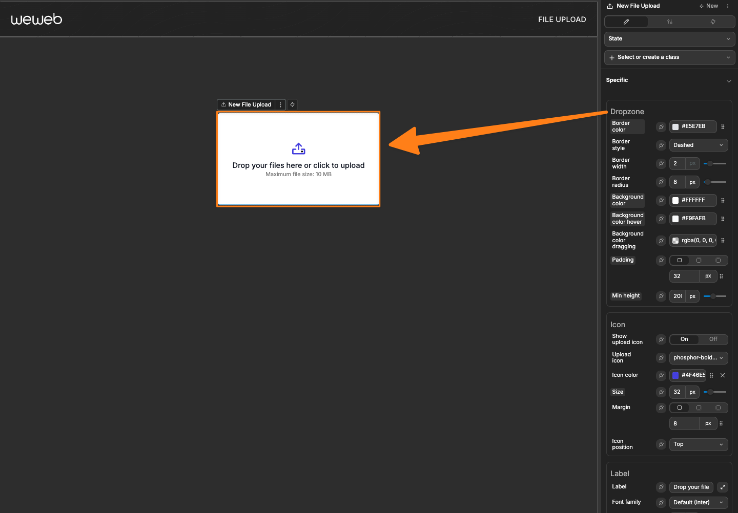
Dropzone
The Dropzone section controls the appearance of the main drop area where users will drag files:
| Property | Description |
|---|---|
| Border color | Set the color of the dropzone border |
| Border style | Choose between Solid, Dashed, Dotted, etc. |
| Border width | Adjust the thickness of the border (in pixels) |
| Border radius | Control the roundness of the dropzone corners |
| Background color | Set the background color of the dropzone |
| Padding | Add space between the dropzone border and its contents |
| Min height | Set the minimum height of the dropzone |
TIP
Using a dashed border with a light background color creates a visual cue that helps users identify the dropzone area.
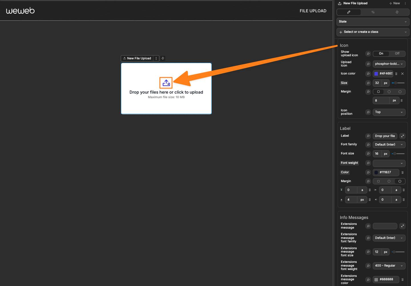
Icon
The Icon section customizes the upload icon that appears in the dropzone:
| Property | Description |
|---|---|
| Show upload icon | Toggle the visibility of the upload icon |
| Upload icon | Select which icon to display from the library |
| Icon color | Set the color of the icon |
| Size | Adjust the size of the icon (in pixels) |
| Margin | Control the space around the icon |
| Icon position | Choose where the icon appears (Top, Left, Right, Bottom) |
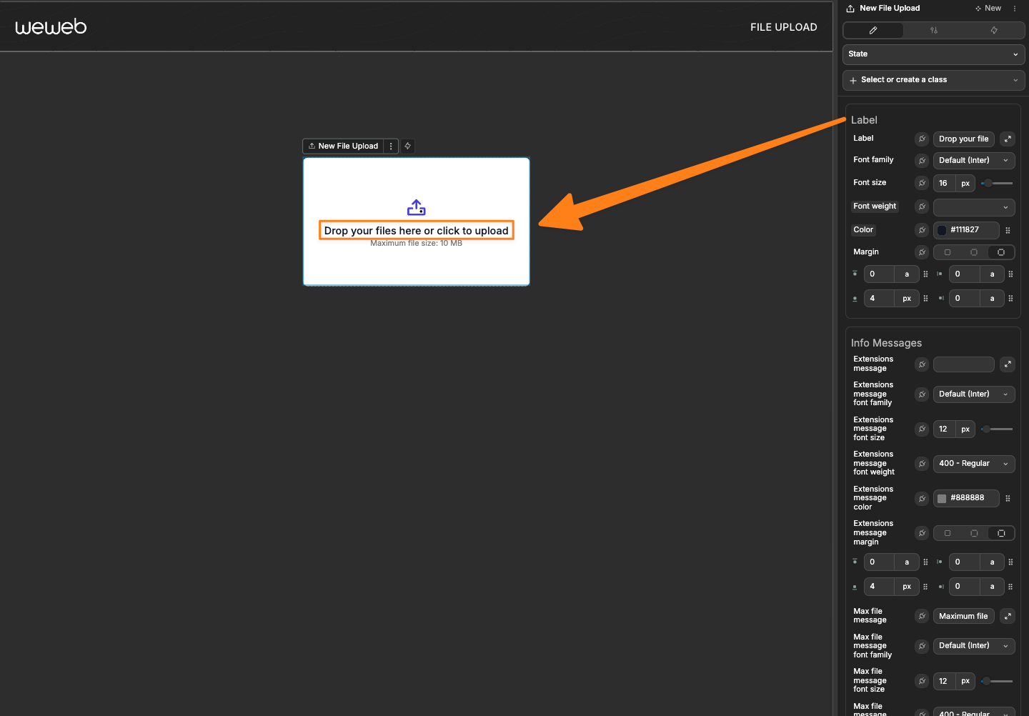
Label
The Label section controls the appearance of the primary text that appears in the dropzone:
| Property | Description |
|---|---|
| Label | Set the text displayed in the dropzone (e.g., "Drop files here") |
| Font family | Choose the font for the label text |
| Font size | Adjust the size of the label text (in pixels) |
| Font weight | Set the boldness of the text |
| Color | Change the color of the label text |
| Margin | Control the space around the label text |
TIP
Clear instructions in the label text help users understand what to do with the dropzone.
Info Messages
The Info Messages section controls the appearance of informational texts like file type restrictions:
| Property | Description |
|---|---|
| Extensions message | Customize the text that shows allowed file types |
| Extensions message font family | Choose the font for the extensions message |
| Extensions message font size | Set the size of the extensions message text |
| Extensions message font weight | Control the boldness of the extensions message |
| Extensions message color | Set the color of the extensions message |
| Extensions message margin | Control the space around the extensions message |
| Max file message | Customize the text that shows maximum file size |
| Max file message font family | Choose the font for the max file size message |
| Max file message font size | Set the size of the max file size message |
| Max file message font weight | Control the boldness of the max file size message |
| Max file message color | Set the color of the max file size message |
| Max file message margin | Control the space around the max file size message |

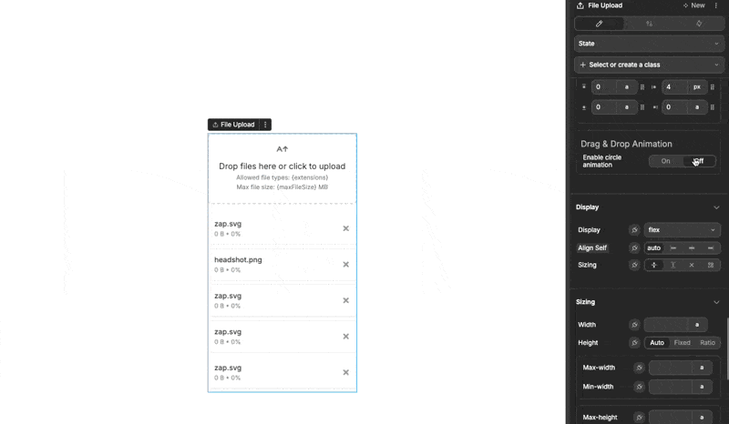
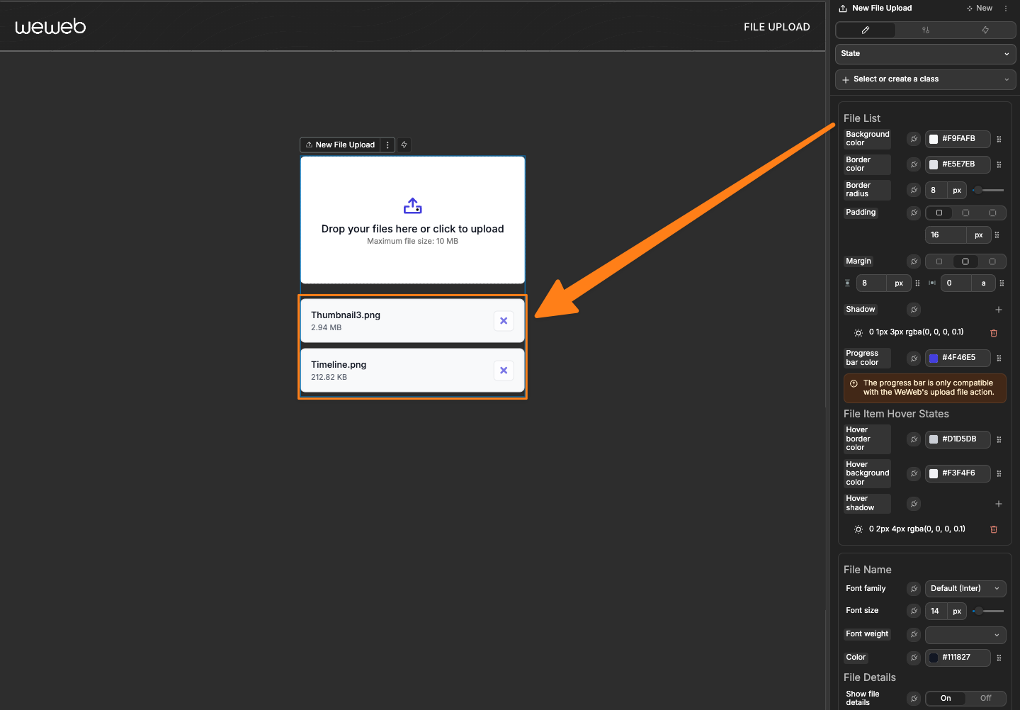
File List
The File List section controls how the list of uploaded files appears:
| Property | Description |
|---|---|
| Background color | Set the background color of the file list container |
| Border color | Set the color of the border around the file list |
| Border radius | Control the roundness of the file list corners |
| Padding | Add space inside the file list container |
| Margin | Control the space around the file list container |
| Shadow | Add a shadow effect to the file list container |
| Progress bar color | Sets color of progress bar shown when using Upload file workflow action |
File Item Hover States
| Property | Description |
|---|---|
| Hover border color | Set the border color when hovering over a file item |
| Hover background color | Set the background color when hovering over a file item |
| Hover shadow | Add a shadow effect when hovering over a file item |
File Name
| Property | Description |
|---|---|
| Font family | Choose the font for file names |
| Font size | Set the size of file name text |
| Font weight | Control the boldness of file names |
| Color | Set the color of file name text |
File Details
| Property | Description |
|---|---|
| Show file details | Toggle the visibility of file details (size, type) |
| Font family | Choose the font for file details |
| Font size | Set the size of file details text |
| Font weight | Control the boldness of file details |
| Color | Set the color of file details text |
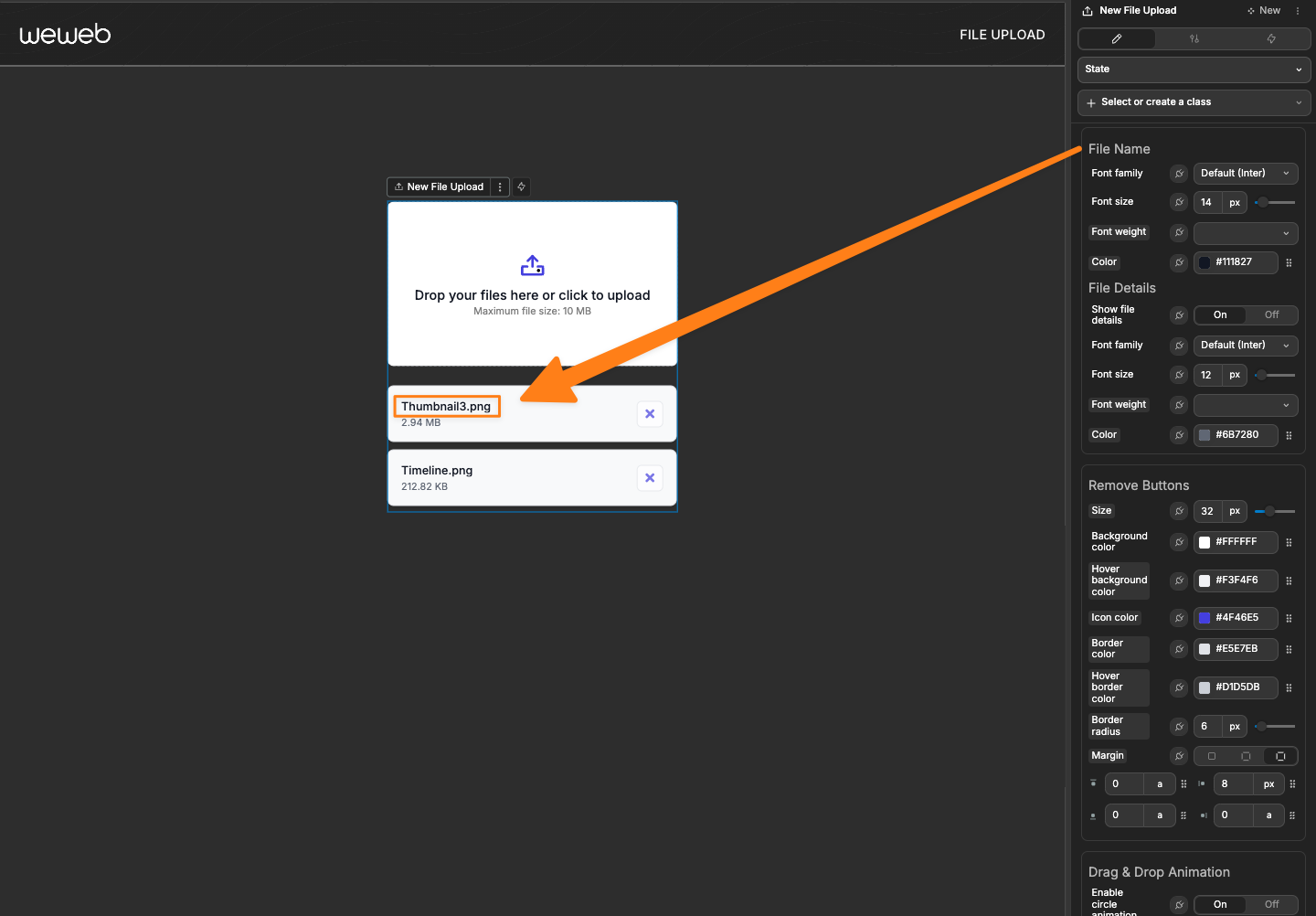
Remove Buttons
The Remove Buttons section controls the appearance of the file removal buttons:
| Property | Description |
|---|---|
| Size | Set the size of action buttons |
| Background color | Set the background color of action buttons |
| Hover background color | Set the background color when hovering over buttons |
| Icon color | Set the color of icons within the buttons |
| Border color | Set the color of the border around buttons |
| Hover border color | Set the border color when hovering over buttons |
| Remove button hover color | Set the hover color specifically for the remove button |
| Border radius | Control the roundness of button corners |
| Margin | Control the space around buttons |
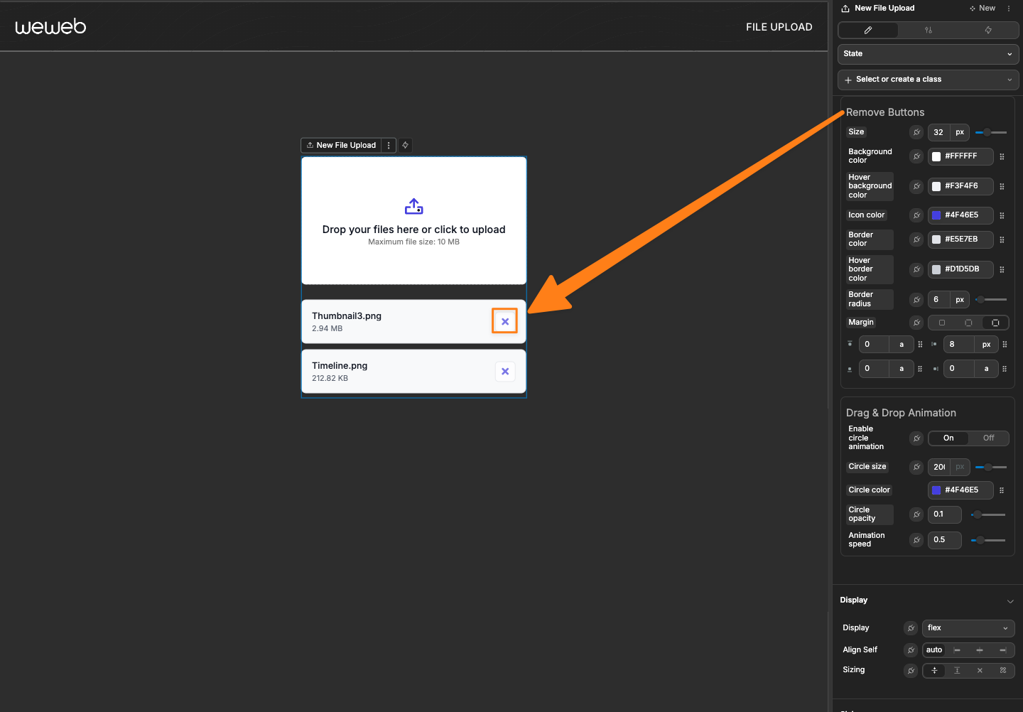
Drag & Drop Animation
The Drag & Drop Animation section controls the visual feedback when files are dragged over the dropzone:
| Property | Description |
|---|---|
| Enable circle animation | Toggle the circular animation when dragging files |
| Circle size | Set the size of the animation circle |
| Circle color | Set the color of the animation circle |
| Circle opacity | Control the transparency of the animation circle |
| Animation speed | Adjust how fast the animation plays |
TIP
A subtle animation provides helpful visual feedback to users when they're dragging files over the dropzone.
Event Triggers
| Event | Description | Payload |
|---|---|---|
| On change | Triggered when files are added or removed | { value: fileArray } |
| On init value change | Triggered when initial value changes | { value: fileArray } |
| On error | Triggered when file validation fails | { code: errorCode, data: errorData } |
Example Event Payloads
On change
javascript
{
  value: [
    {
      name: "document.pdf",
      size: 1258000,
      type: "application/pdf",
      extension: "pdf",
      id: "file-1647889433265-x8f2j9s"
    }
  ]
}
Use this event to:
- Save uploaded files to a database
- Process files for further use
- Update UI based on uploaded content
On init value change
javascript
{
  value: [
    {
      name: "document.pdf",
      size: 1258000,
      type: "application/pdf",
      extension: "pdf",
      id: "file-1647889433265-x8f2j9s"
    }
  ]
}
On error
javascript
{
  code: "MAX_SIZE_EXCEEDED",
  data: {
    message: "File size (15.5 MB) exceeds the maximum allowed size (10 MB)",
    fileName: "large-file.zip",
    fileSize: 16252880,
    fileType: "application/zip",
    constraint: "MAX_SIZE"
  }
}
Use this event to:
- Show custom error messages
- Guide users on how to resolve validation issues
- Log upload attempts
Handling File Uploads vs Deletions
The On change event is triggered in two different scenarios:
- When a user adds a file (by dragging or selecting)
- When a user deletes a file (by clicking the delete button)
Since both actions trigger the same event, you may need to differentiate between them in your workflows. Here's how to handle this:
Using Conditions to Differentiate Actions
To prevent upload workflows from running when a file is deleted:
- Add a condition in your
On changeworkflow using thePass through conditionorTrue/False Splitaction - Check if files exist in the uploader's value:
javascript
//Check if there are any files in the file upload
fileUploader.value.length > 0- Only run upload-related actions (like uploading to a storage service) when this condition is true
This pattern ensures that:
- Upload workflows only run when files are actually present
- Delete actions don't trigger unnecessary upload processes
- Your application handles both scenarios appropriately
TIP
For more complex scenarios, you could also compare the previous and current file count, or track specific file IDs to determine exactly what changed in the uploader.
Component Actions
| Action | Description | Parameters |
|---|---|---|
| Clear Files | Clears all uploaded files | None |
Exposed Variables
| Variable | Type | Description |
|---|---|---|
| value | Array | List of all files uploaded |
| status | Array | List of the upload status of all files (will only populate if the files are being uploaded to the frontend via the Upload file workflow action |
Frequently Asked Questions
How do I prevent my upload workflow from running when a file is deleted?
When using the file uploader with an "On change" workflow to upload files to a storage service, you may notice that the same workflow triggers when users delete files. This happens because both adding and removing files count as "change" events.
To solve this problem:
- Add a condition in your
On changeworkflow using thePass through conditionorTrue/False Splitaction - Check if files exist in the uploader's value:javascript
fileUploader.value.length > 0 - Only run your upload actions when this condition is true
This ensures that your upload workflows only run when files are actually present, and prevents unnecessary processes when files are deleted.
How do I reset the file uploader after a successful upload?
To clear all files from the file uploader after processing them:
- Use the "Clear Files" component action at the end of your workflow
- This will reset the uploader to its initial empty state, ready for new uploads
Can I limit the file uploader to specific file types?
Yes, you can restrict which file types users can upload:
- In the Settings panel, find "Allowed file types"
- Choose from preset options like Image, Video, PDF, etc.
- Or select "Custom" to specify extensions manually (e.g., .docx, .xlsx)
This prevents users from uploading incompatible file formats and improves your application's data quality.