

Appearance
Paginator
The Paginator element adds page numbers and previous and next arrows below a list, so users can browse the records of a table view one page at a time. Each time a user changes page, WeWeb retrieves only the records of that page from your backend. Your app stays fast, even when your table holds thousands of records.
Use it for any list that can grow long: a product catalog, a list of orders, search results, or a directory of contacts.
Getting started
- In the
Data & APItab, set how many records your table view returns per page. See how to set the number of rows per page → - In the
Interfacetab, display the records of the table view in a list on your page. - Add the
Paginatorelement below the list fromAdd Element. You'll find it underNavigation. - Select the Paginator and choose your table view in
Source. See how to connect the paginator →
USING AI
You can also ask AI to add pagination to your list. Tell it which list or table view to paginate, how many records you want per page and how the page numbers should look. For example: "Paginate the contacts list with 20 contacts per page, and make the current page number bold".
Set the number of rows per page
The paginator splits a table view into pages of the size you set on the view itself. Without it, the view returns all its records at once, and the paginator shows a single page.
To set it:
- In the
Data & APItab, open your table and select the tab of your view - Click on
Pagination - Type a number in
Rows per page, or pick one of the suggested values - Click on
Save
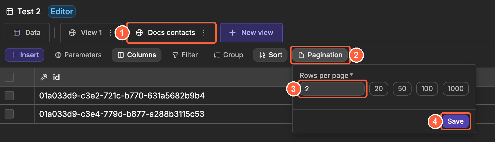
The same view can be used in several places of your app. Changing its Rows per page changes the number of records it returns everywhere it is used.
Connect the paginator to a table view
To connect the paginator to the view your list displays:
- Select the Paginator and click on
Source - Choose the table
- Choose the view
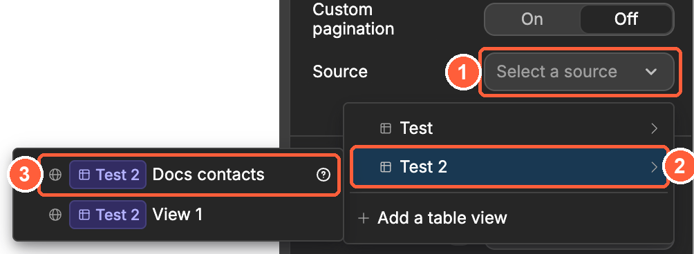
The paginator now shows one number per page. In the example below, the view returns 5 contacts with 2 rows per page, so the paginator shows 3 pages:
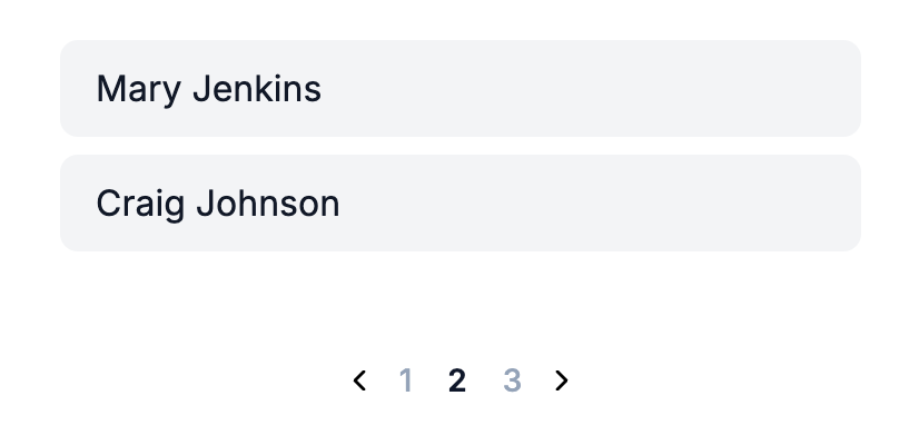
When a user clicks on a page number or an arrow, the paginator retrieves the records of that page from your backend and your list updates. You don't need to add a workflow for this.
ONLY THE CURRENT PAGE IS LOADED
The browser only receives the records of the page the user is looking at. Records from other pages stay in your backend until the user asks for them.
Paginate a grouped view
If your view groups its records, Paginate lets you choose what the paginator moves through:
View: the groups of the first levelGroup contents: the content of one group. BindGroupto that group: the paginator then pages through its subgroups or, for a group of the last level, its records
Learn more about grouped views →
Views that can't be used as a source
Some views from an integration can't be paginated this way, because the service they come from doesn't support it:
- Views from Xano, HTTP Request or Google Sheets can't be used as
Source. Use custom pagination instead, with the paging options of your endpoint. - Views from Airtable don't give a total number of records, so the paginator can't show page numbers. Use a
Load morebutton with theTable View: Load moreaction instead.
Custom pagination
With Custom pagination turned on, the paginator doesn't retrieve the pages itself. You tell it how many records there are, and you load each page yourself. Use it when your view can't be used as Source, for example a view on a Xano endpoint that has its own paging options.
- Create a variable, for example
offset, of typeNumberwith0as default value. It stores the number of records to skip before the current page. - Select the Paginator and turn on
Custom pagination. - Bind its three settings:
Total items: the total number of records, as sent back by your endpointItems per page: the fixed number of records per page. Don't bind it to the number of records you received: the last page often holds fewer records than the others.Offset: youroffsetvariable
- Add a workflow on the Paginator that triggers
On change, with two actions:Change variable value, to setoffsetto theoffsetsent by the eventTable View: Fetch, to retrieve your view again, with its paging parameter bound tooffset
What your endpoint expects depends on your backend. Some expect an offset, others a page number: the On change event sends both, along with the number of records per page and the total. See the data sent by the event →
Style the page numbers
The Paginator contains three elements that you can select in the Layout Tree and style like any other element:
Text: the page numbersIcon: the previous arrowIcon: the next arrow
The Text element already has an active state, which applies to the number of the current page. To change how the current page looks, select Text, choose active in State, then change its style.
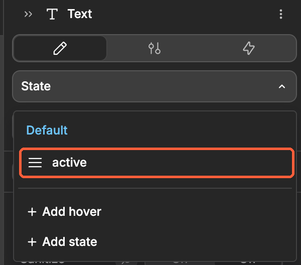
The previous arrow is hidden on the first page, and the next arrow on the last page. In the editor, both arrows always show, so you can style them.
Example use cases
- Product catalog: show 24 products per page and let shoppers move through the catalog
- Order history: show the 10 latest orders first, and older ones on the next pages
- Search results: paginate the results of a view filtered by a search input
- Admin list: browse thousands of users without loading them all in the browser
- Grouped pipeline: page through the deals of one stage in a grouped view
Best practices
Do:
- Set
Rows per pageon the view before you connect the paginator - Keep the page size the same for every list that uses the view, or create a separate view for each list
- Give the current page a clear
activestyle so users know where they are - Show a loading state on the list while the next page loads
Don't:
- Add a Paginator next to a Data Grid: the Data Grid has its own pagination and needs all the records of its view
- Set
Rows per pageon a view displayed in a Data Grid - Build your own page buttons and offset variables when the view can be used as
Source
Forking
While the Paginator element offers the settings most lists need, there may be cases where you need functionality beyond what's natively available. In these situations, you can fork the element and modify it to meet your specific requirements.
If you are unsure how to fork an element, you can learn more in the dedicated documentation.
Forking example: jump to a page
One reason to fork the Paginator would be to let users type the page they want to go to. To do so, you could fork the Paginator, then edit it with AI and pass in the following prompt:
Add a small input next to the page numbers where users can type a page number and press Enter to go to that pageProperties reference
Settings
| Property | Options/Type | Description |
|---|---|---|
| Custom pagination | boolean | When on, you set the total, page size and offset yourself instead of choosing a Source |
| Source | table view | The view to paginate. Hidden when Custom pagination is on |
| Paginate | View, Group contents | What the paginator moves through when the source is a table view: the groups of the first level, or the content of one group |
| Group | object | The group to paginate. Shown when Paginate is set to Group contents |
| Total items | number | The total number of records. Shown when Custom pagination is on |
| Items per page | number | The number of records per page. Shown when Custom pagination is on |
| Offset | number | The number of records to skip before the current page. Shown when Custom pagination is on |
Styling
This element does not have any styling props of its own. Style the Text and Icon elements inside it, as explained in Style the page numbers.
Event triggers
| Event | Description | Payload |
|---|---|---|
| On change | Triggered when a user goes to another page | page, offset, limit, total |
Example event payloads
On change
When a user goes to page 2 of a view with 5 records and 2 rows per page:
javascript
{
  "page": 2,
  "offset": 2,
  "limit": 2,
  "total": 5
}page: the number of the new page, starting at 1offset: the number of records before that pagelimit: the number of records per pagetotal: the total number of records
Exposed variables
This element does not expose any variables.
Component actions
This element does not have any component actions.
Frequently asked questions
Why does my paginator only show one page?
Your view probably has no Rows per page set, so it returns all its records at once. Open the view in the Data & API tab, click on Pagination and set Rows per page.
Can I change the page from a workflow?
Yes. Use the Table View: Change page action: choose your view in Table View and set Offset to the number of records to skip. For example, with 20 rows per page, an offset of 40 shows page 3.
Why can't I choose my view in Source?
The service behind the view doesn't support this kind of pagination, as with Xano, HTTP Request or Google Sheets. Use custom pagination with the paging options of your endpoint.
I use collections in an older project. Where are the instructions?
The Paginator still works with collections in older projects. Learn how to paginate a collection →
CONTINUE LEARNING
The paginator works hand in hand with views. Learn how to filter, sort and group the records your list displays.