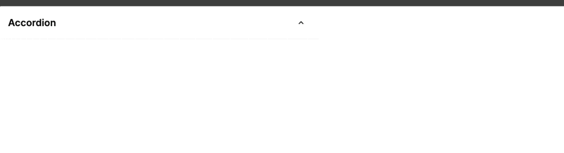
Skip to content

Updating visuals

If you see any images containing outdated UI, please bear with us.

We are updating all content as quickly as possible to mirror our new UI.

Accordion

The Accordion element lets you reveal or hide content behind a clickable header. You can design one layout for the closed state, another for the opened state, and a separate content area, which makes it useful for FAQs, settings panels, product details, and any interface where you want to keep a page easy to scan.

Features

  • Separate closed and opened headers: show different text, icons, or layouts depending on whether the accordion is open
  • Built-in click behavior: the accordion already handles opening and closing when the header area is clicked
  • Animated content reveal: the content area opens and closes with a built-in height transition
  • Bindable initial state: use Init value to decide whether the accordion starts opened or closed
  • Exposed state variable: use the value variable in formulas, conditions, and workflows

Getting started

Using AI

The quickest way to set up an accordion is by using AI:

  1. Ask AI to add an Accordion element and describe:
    • The text you want in the closed header
    • The text or icon change you want in the opened header
    • The content you want hidden inside the accordion
    • Whether it should start opened or closed
  2. Ask AI to style both header states so they feel connected, for example with a chevron icon that points down when closed and up when opened.
  3. Keep refining with follow-up prompts like:
    • "Make the opened header background slightly darker than the closed header"
    • "Add a chevron icon on the right and rotate it in the opened state"
    • "Put a short summary in the header and full details in the content area"

Manual setup

  1. Add the Accordion element to your page from the Add panel.
  2. Set Init value to On if you want it to start opened, or leave it Off if you want it closed by default.
  3. Click Toggle edition while building the element. This shows all three editable areas:
    • closed
    • opened
    • content
  4. Add the elements you want inside each area:
    • Build your closed header in closed
    • Build your opened header in opened
    • Add the hidden content in content
  5. Switch to preview to test the interaction. In edit mode, the accordion is there for building, not for normal clicking.

Building the accordion states

The accordion is made of three separate areas:

AreaWhat it does
closedthis is the header users see before they open the accordion
openedthis is the header users see after they open it
contentthis is the content that becomes visible when the accordion is open

Because closed and opened are separate layouts, you can make small changes between them, such as:

  • Changing the icon direction
  • Changing the label from "Show details" to "Hide details"
  • Changing the background or border
  • Adding extra summary text only when the accordion is open

Keeping both header states consistent

Since the two header states are built separately, it is usually best to design one first, duplicate the structure, and then only change what needs to look different. This helps you avoid small spacing or alignment differences between the two states.

Clicking behavior

The whole header area is clickable by default. You do not need to add your own click logic just to open or close the accordion.

CLICKING IS ALREADY HANDLED

The accordion already manages its open and closed state for you. In most cases, you should not add extra click workflows to the header just to make it expand.

Working with the open state

The accordion exposes a value variable that tells you whether it is open:

javascript
true/false

Use this variable when you want other parts of your page to react to the accordion state. For example, you can:

  • Show helper text only when the accordion is open
  • Change another element on the page when the accordion opens
  • Use conditions in workflows after the accordion changes state

If you bind Init value to a variable or formula, the accordion can also be controlled from outside the element.

Example use cases

FAQ answers

Use one short question in closed, show a slightly different version in opened, and place the answer in content.

  1. Add the question text to both header states
  2. Change the icon or label in the opened version
  3. Add the full answer in content

Product details

Use the header to show a short summary like "Shipping and returns", then reveal the full policy in the content area.

  1. Add a simple label and icon in the header
  2. Keep Init value set to Off
  3. Place the longer explanation in content

Settings panels

Use the header to show the section name, then place toggles, inputs, or helper text in the content area.

  1. Add the section title in both header states
  2. Place your form elements inside content
  3. Use the open state to keep long settings pages easier to scan

Step-by-step instructions

Use the header as a short step title and the content area for the detailed instructions.

  1. Add a short title in the header
  2. Add instructions, links, or buttons in content
  3. Repeat with multiple accordions to create a clean help section

Best practices

Do:

  • Keep the closed and opened headers visually similar so the change feels clear and intentional
  • Use simple labels like "Show details" and "Hide details" when the content is not obvious
  • Keep important actions inside content instead of in the clickable header area
  • Test the accordion in preview so you can confirm the interaction feels right

Don't:

  • Build two very different header layouts unless the change is intentional
  • Add separate click logic just to open or close the accordion
  • Place important inputs or buttons in the header if accidental toggling would be a problem
  • Rely only on icon changes if your users may need clearer text cues

Forking

While the Accordion element already gives you separate closed, opened, and content areas, there may be cases where you want deeper control over its behavior. In those cases, you can fork the element and change how it works.

If you are unsure how to fork an element, you can learn more in the dedicated documentation.

Properties reference

Settings

PropertyOptions/TypeDescription
Init valuebooleansets whether the accordion starts opened (true) or closed (false)

Styling

This element does not have any styling props.

Style the accordion by adding and styling elements inside the closed, opened, and content areas.

Event triggers

EventDescriptionPayload
changetriggered when a user clicks the header area and the accordion changes state{ domEvent, value }
initValueChangetriggered when the bound Init value changes from outside the element{ value }

Example event payloads

change

javascript
{
  domEvent: {
    type: "click"
  },
  value: true
}

initValueChange

javascript
{
  value: false
}

Exposed variables

VariableTypeDescription
valuebooleanthe current open or closed state of the accordion

Example variable values

value

javascript
true

Component actions

This element does not have any component actions.

Frequently asked questions

Why doesn’t the accordion open while I’m editing it?

In edit mode, the accordion is focused on helping you build the closed, opened, and content areas. Switch to preview to test the normal open and close behavior.

Do I need to add a click workflow to make it open?

No. The accordion already opens and closes when the header area is clicked. Only add workflows if you want to react to that change, not to recreate it.

How do I show a different icon when the accordion is open?

Build one icon in the closed area and another in the opened area. Since these are separate layouts, you can change the icon, text, color, or spacing between states.

Can I open the accordion from a variable?

Yes. Bind Init value to a boolean value. When that value changes, the accordion updates and emits the initValueChange event.

How do I close other accordion elements when one opens?

Yes. You can do this with the ready-made accordion element.

Each accordion exposes a value variable. When an accordion is open, its value is true. When it is closed, its value is false.

To keep only one accordion open at a time:

  1. Add a workflow that runs when an accordion changes
  2. Check whether the accordion that was clicked is now open
  3. If it is open, set the value of the other accordion elements to false

This works well when you have a small number of accordions on the page. If you have many accordions, you may prefer a shared variable-based setup so you only manage the open state in one place.

Why does clicking inside the header also toggle the accordion?

The whole header area is clickable. If you place other interactive elements inside that area, clicking them can also open or close the accordion. If that would be confusing, move those elements into content instead.

CONTINUE LEARNING

If you want another way to reveal content from a compact trigger, the Dropdown element is a good next step.

Learn more about Dropdown →