Appearance
Skeleton Loader New
The Skeleton Loader component provides visual placeholders that mimic your content's layout during loading states. These animated placeholders improve perceived performance and reduce user frustration by indicating that content is loading.
Getting Started
Using AI
The quickest way to set up skeleton loaders is by using AI:
- First, think about which content areas you want to show loading states for
- Ask AI: "Create skeleton loaders for my user profile page" or "Add skeleton loaders to my product cards"
- Continue refining your skeleton loaders by asking AI for specific modifications:
- "Make the skeleton loaders use the pulse animation"
- "Create a skeleton layout for my article list with title and description"
- "Add rounded corners to match my card design"
- "Create a skeleton for a circular profile picture with two text lines"
Manual Setup
- Add a Skeleton Loader component to your page using the
Add Element(search for "skeleton" or "loader") - Style the component to match the dimensions and shape of your content (width, height, border radius)
- Choose an animation type that matches your design aesthetic
Animation Types
The Skeleton Loader component offers three animation types via the Animation Type property:
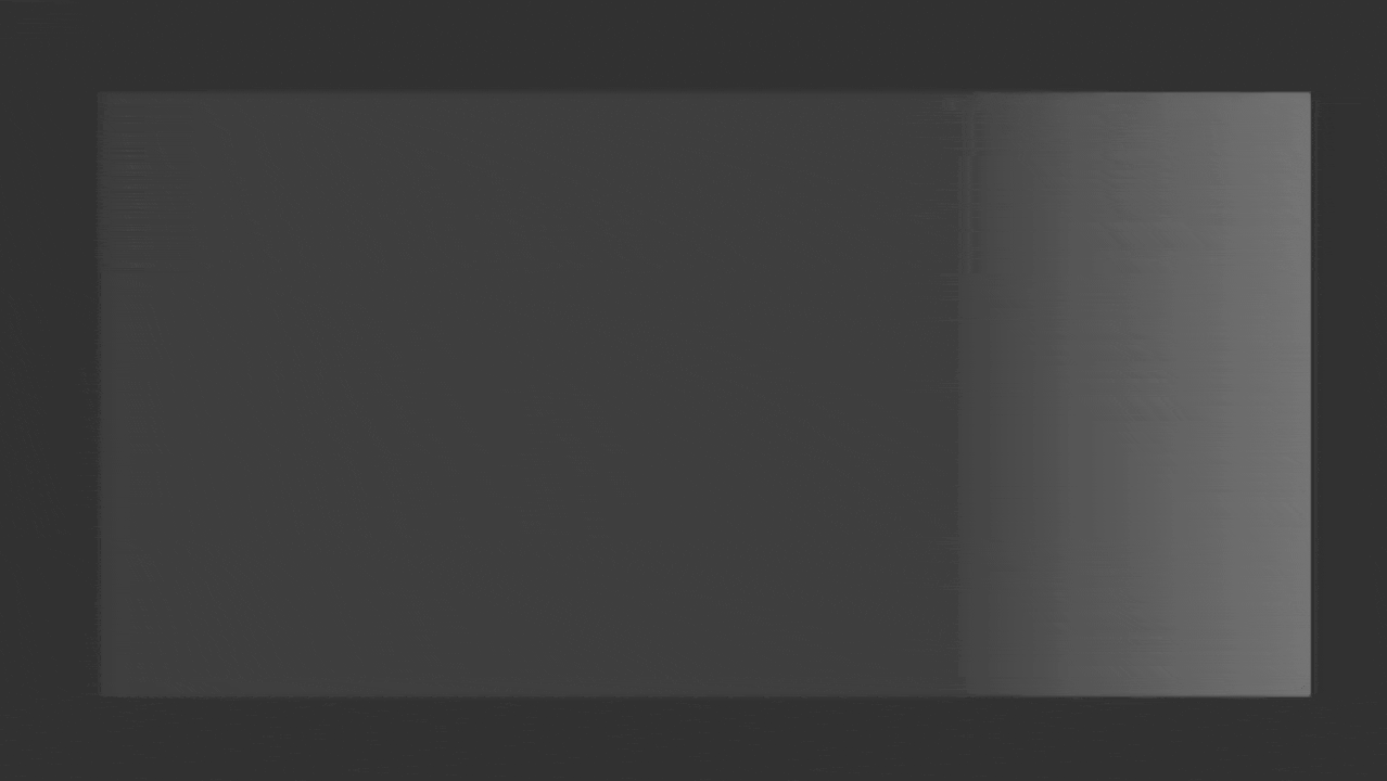
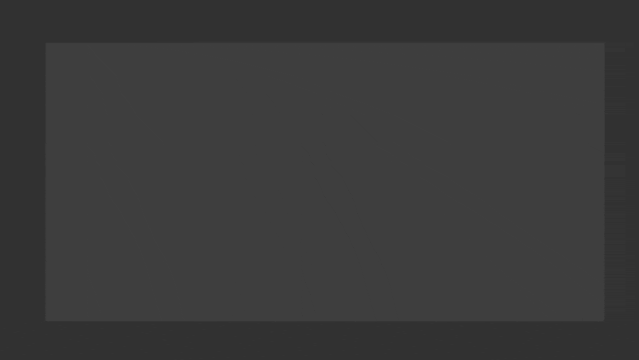
- Wave - A subtle highlight that moves from left to right across the element
- Pulse - A gentle fading in and out effect
WARNING
The pulse animation requires you to set a background color on the Skeleton Loader for it to appear correctly.
- Shimmer - A light reflection that sweeps across the element
Styling Your Skeleton Loader
For the Skeleton Loader to be effective, it's essential to style it properly using the standard styling properties. Here are the key properties to consider:
Essential Styling Properties
| Property | Description |
|---|---|
| Width | Set the width to match your content (can be fixed or responsive) |
| Height | Set the height to match your content |
| Background Color | Choose a light gray color that contrasts with your background (e.g., #E0E0E0) |
| Position | In most cases, you will want the position to be Absolute so that it covers the desired content |
WARNING
Without a proper width, height and background color set, your Skeleton Loader may not be visible.
Covering Existing Content
To create a loading state that covers existing content (like product images or cards that are already rendered):
- Place the Skeleton Loader in the same container as the elements you want to cover
- Give the Skeleton Loader a position of
Absolute, with atopposition of 0 andleftposition of 0 - Set the
widthandheightof the Skeleton Loader to 100% to fully cover the content - Set the
z-axisvalue of the Skeleton Loader to be higher than the contents you want to cover
What these positioning properties do:
| Property | What it does |
|---|---|
| Position: Absolute | This means the element (in this case the Skeleton Loader) ignores the position of the other elements in the container and positions itself relative to the container |
| Top: 0, Left: 0 | Anchors the element to the top-left corner of the container |
| Width/Height: 100% | Makes the element expand to fill the entire width and height of the container |
| Z-axis | Controls stacking order - the higher the value, the higher the element will be in the visual stack |
TIP
If your container has a border radius and the Skeleton Loader does not seem to match it, then ensure either your container's overflow is set to hidden, or your Skeleton Loader also has the same border radius set as the container.
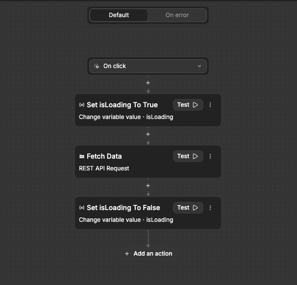
Conditionally Showing Skeleton Loaders
To show Skeleton Loaders only during loading states:
- Create a boolean variable (e.g.,
isLoading) to use for controlling the display
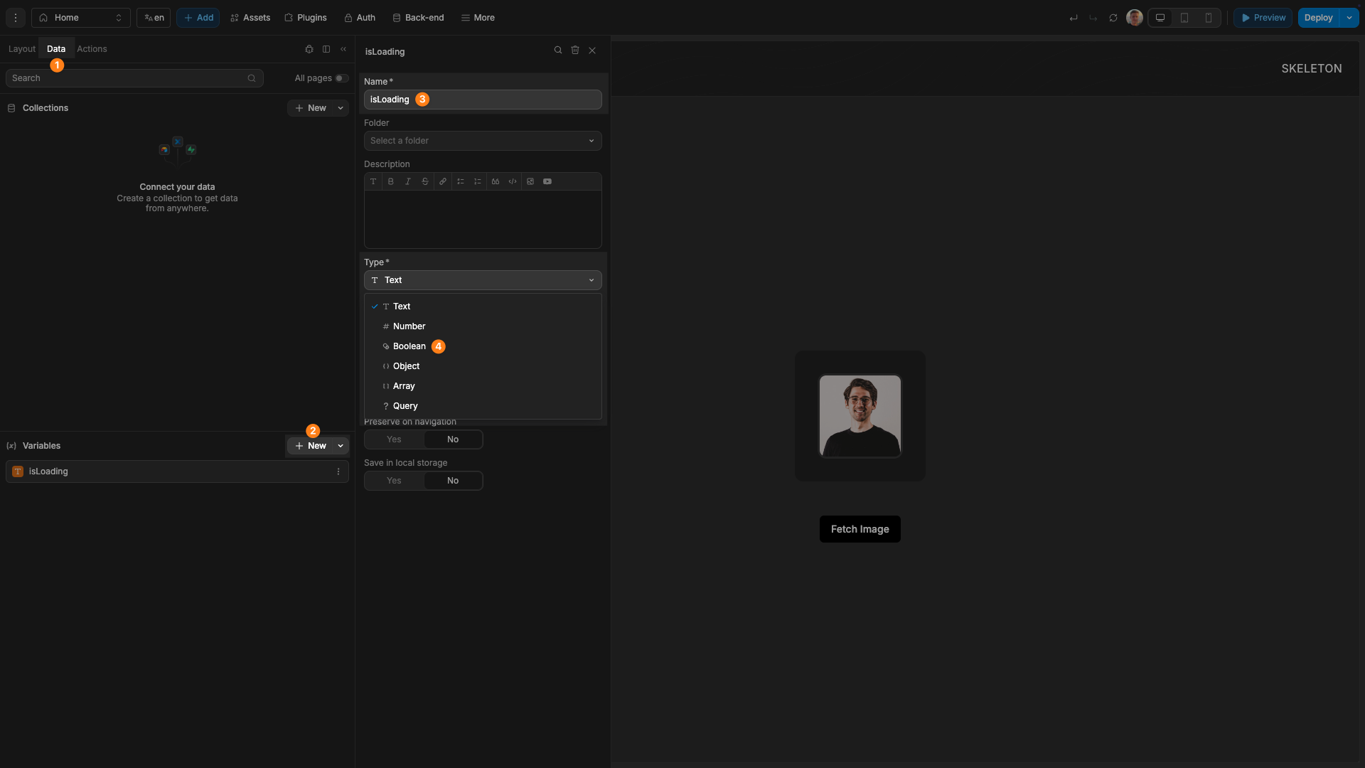
- Bind the Skeleton Loader's display to this variable
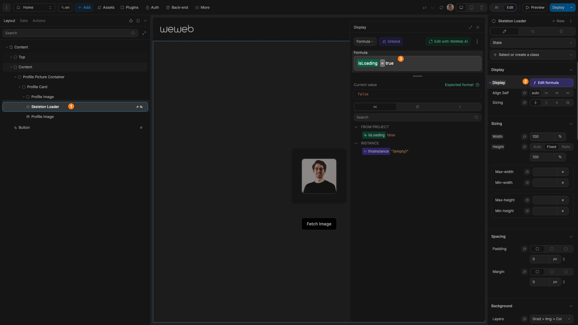
- Set up logic to appropriately change the value of this variable when needed
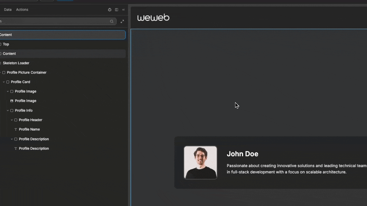
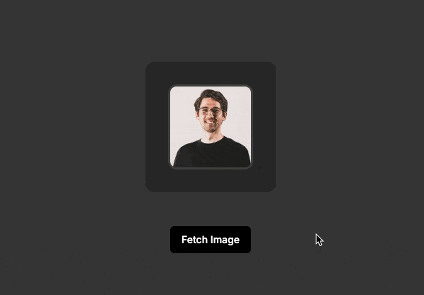
Once everything is set up, the Skeleton Loader will display only during loading, like this:
Usage Examples
Text Content Loader
To create a placeholder for text content:
- Place the Skeleton Loader in a container with the text element
- Give the Skeleton Loader a position of
Absolute, with atopposition of 0 andleftposition of 0 - Set the
widthandheightof the Skeleton Loader to 100% to fully cover the text - Set the
z-axisvalue of the Skeleton Loader to be higher than that of the text element

Card Loader
To create a placeholder for multiple elements in a card:
- Place the Skeleton Loader in a container with one of the desired elements to cover
- Give the Skeleton Loader a position of
Absolute, with atopposition of 0 andleftposition of 0 - Set the
widthandheightof the Skeleton Loader to 100% to fully cover the text - Set the
z-axisvalue of the Skeleton Loader to be higher than that of the card or image - Duplicate the Skeleton Loader and place in containers with all needed elements
TIP
You can easily create a container for an element by pressing ⌘ + G with the element selected in the editor. This is useful if you need the element to be in a container so you can place a Skeleton Loader alongside it. 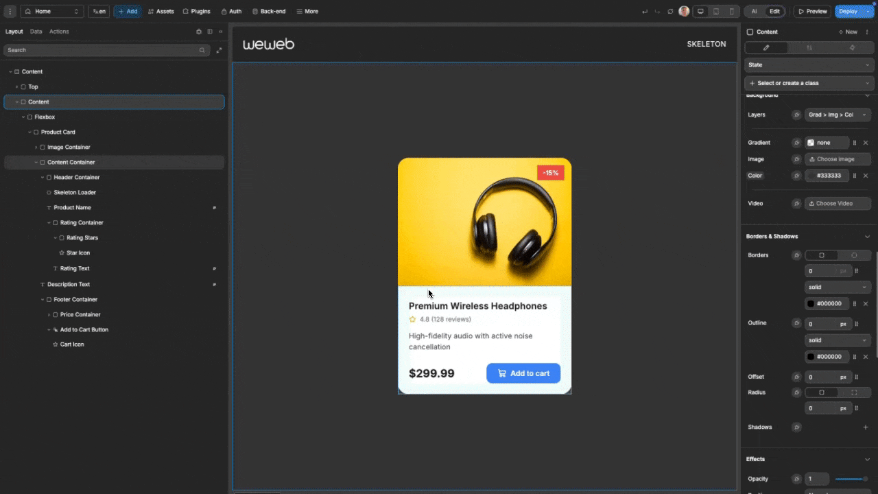
Best Practices
Do:
- Match the skeleton's dimensions and shape to your actual content
- Use subtle, consistent animations across your interface
- Group related skeleton elements to mirror your content structure
- Display skeletons immediately when loading begins
Don't:
- Use bright or high-contrast colors for skeleton elements
- Mix different animation types in the same loading context
- Make animations too fast or distracting
- Keep skeletons visible for too long (aim for <2 seconds when possible)
Common Use Cases
- Article or blog post loading screens
- Product card loading in e-commerce
- Social media feed item placeholders
- Profile information loading
- Form field placeholders during data retrieval
- Dashboard widget loading states
Forking
While the Skeleton Loader component offers flexibility through its animation types and styling options, there may be cases where you need functionality beyond what's natively available. In these situations, you can fork the component and modify it to meet your specific requirements.
If you are unsure how to fork an element, you can learn more in the dedicated documentation.
Forking Example: Custom Animation Type
One common reason to fork the Skeleton Loader is to create a specialized animation type not available in the standard component. For example, you might want to create a "Bounce" animation that adds a subtle up-and-down movement.
Here's how you can use AI to help with this process:
Modify this forked Skeleton Loader to add a 'Bounce' animation type that adds a subtle vertical movement effectForking Example: Changing Animation Speed
Another useful customization is having the ability to control the speed of the animation.
Here's an example prompt for this:
Update this forked Skeleton Loader to add a property for controlling the animation speedProperties
Settings
| Property | Options | Description |
|---|---|---|
| Animation Type | Wave, Pulse, Shimmer | Choose the style of loading animation |