Appearance
(Deprecated) Alert Deprecated
WARNING
This version of the alert element has now been deprecated. To view documentation for the current dialog element (which includes modal, alert, and sheet functionality), please refer here.
On this page, you'll learn:
- How to add alerts / notifications on your app
- How to customize and trigger the alerts
How to add alerts on your app
To add alerts to a page, go to Add> Layout and drop it anywhere on your page:

Also import the section's variables and workflows so that you'll be able to use the alerts from the get-go.

Once dropped, you can find the alert section in the Layout Tree.

As you can see, the alert is bound to a configuration variable. This variable is the alert's current state, telling it how and what to display. Edit the display option to false to make the alert stop appearing by default:

It also comes with a workflow called Display Alert which we'll use later to trigger an alert.
How to customize and trigger the alerts
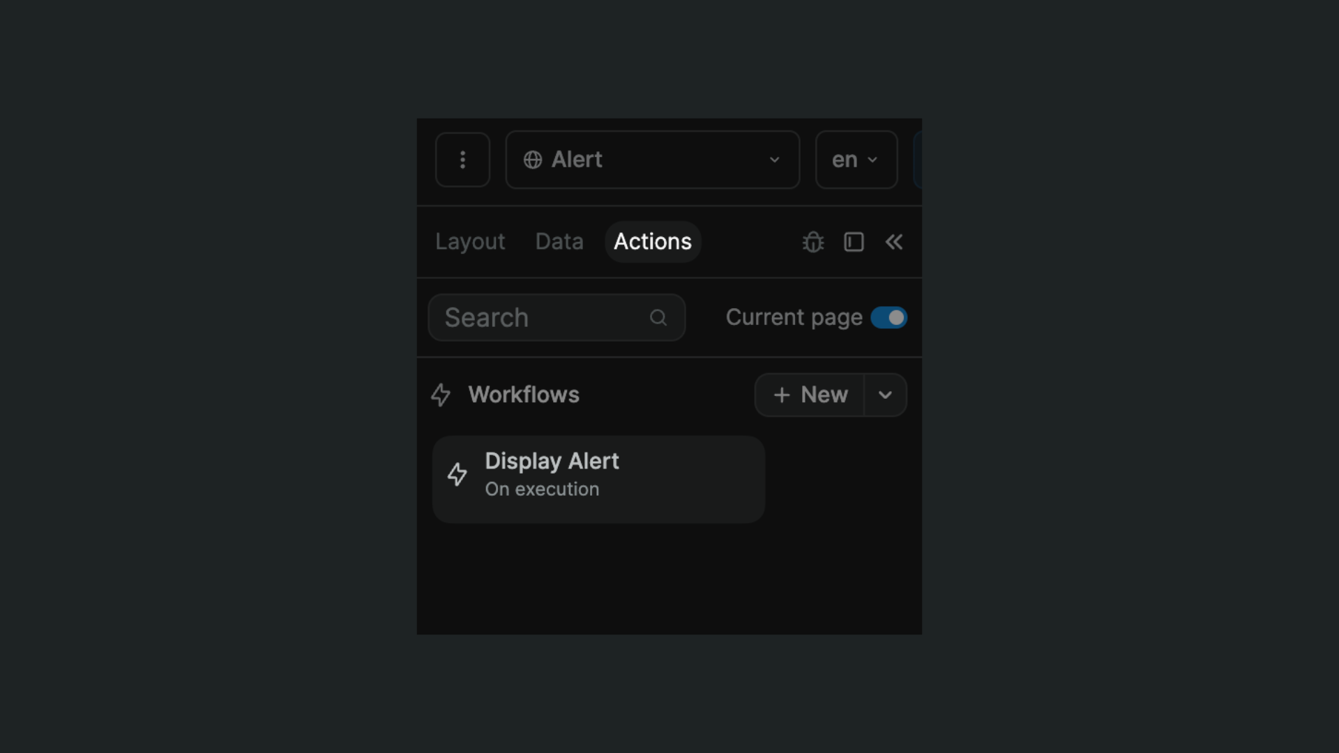
To trigger an alert from a workflow, choose the Execute workflow action and then the Display Alert workflow:


In this action, they're several options you can use to trigger the alert and customize it:
- "Type": the type/color of the alert. It could be: "info" (blue), "warning" (yellow), "error" (red), "success" (green), "info-neutral" (grey)
- "Title": the alert's title
- "Description": the text that'll appear in the bulk of the alert
- "Cta": whether or not to display a call to action
- "Cta text": the text of the call to action "cta link": the link the call to action leads to
- "Display": whether of not to display the alert. To trigger it, switch this value to "true"
- "Delay (ms)": how many milliseconds the alert will display before to disappear (best practice is 3000 to 5000ms, so 3 to 5 seconds).
Here's a visual explanation of the fields:
