Appearance
Dialog (Modal, Alert, Sheet)
A dialog or popup is an overlay element that appears above your page content to focus user attention. It creates a dedicated interaction space for forms, confirmations, or additional content.
The Dialog element can be configured into three UI patterns:
- Modal window - centered overlay for forms and detailed content
- Alert dialog - focused overlay for confirmations and notifications
- Sheet element - full-width/height panel that slides in from any screen edge
Here is a video of how it works:
Getting Started
- Add a Dialog element to your page
- Preview your Dialog by clicking 'Toggle dialog' in the side panel
- Customize the appearance and behavior through Dialog properties
Opening & closing dialogs from anywhere
By default, the Dialog element will open when you click on it, but you can also choose from where and when you want this behavior to happen. To do so, you need to use component actions.
- Disable the
Triggerproperty of your Dialog:
- Create a custom trigger:
- Select any element you want to use as a trigger
- Add a workflow to this element (typically on click)
- Use
Execute component workflowin the workflow - Select your Dialog and choose
Open,Close, orToggle
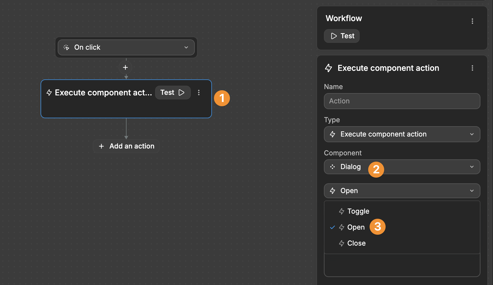
When you click the element you selected, it will open the Dialog:
TIP
Dialog control uses component actions instead of boolean variables. You can trigger your Dialog from any workflow, not just clicks. Examples include:
- On page load
- On mouse enter
- On double click
- After form submission
Learn more about workflow triggers in our Triggers documentation.
Properties
Type & Position
| Property | Options | Description |
|---|---|---|
| Type | Modal, Sheet, None | Modal: Overlay window with flexible positioning. Sheet: Full-width/height panel on screen edges. None: Unstyled base for custom designs. |
| Sheet Position | Left, Right, Bottom, Top | When using Sheet type, choose which screen edge it appears from |
| Modal Position | Left, Center, Right, Custom | Position your Modal horizontally on screen |
| Modal Alignment | Top, Center, Bottom | Align your Modal vertically on screen |
| Custom Position (X,Y) | Custom values | Set exact coordinates when using Custom position |
Animation
| Property | Options | Description |
|---|---|---|
| Animation | None, Fade, Zoom in, Slide in | Choose how your dialog appears |
| Direction | Left, Right, Top, Bottom | Choose slide direction when using Slide in animation |
| Duration | Custom value | Set how long the animation takes |
| Easing | Linear, Ease in, Ease out, Ease in out | Control how smooth the animation feels |
Interaction Settings
| Property | Options | Description |
|---|---|---|
| Prevent scrolling | On/Off | Control if users can scroll the page behind an open dialog |
| Escape key to close | On/Off | Allow closing the dialog with Escape key |
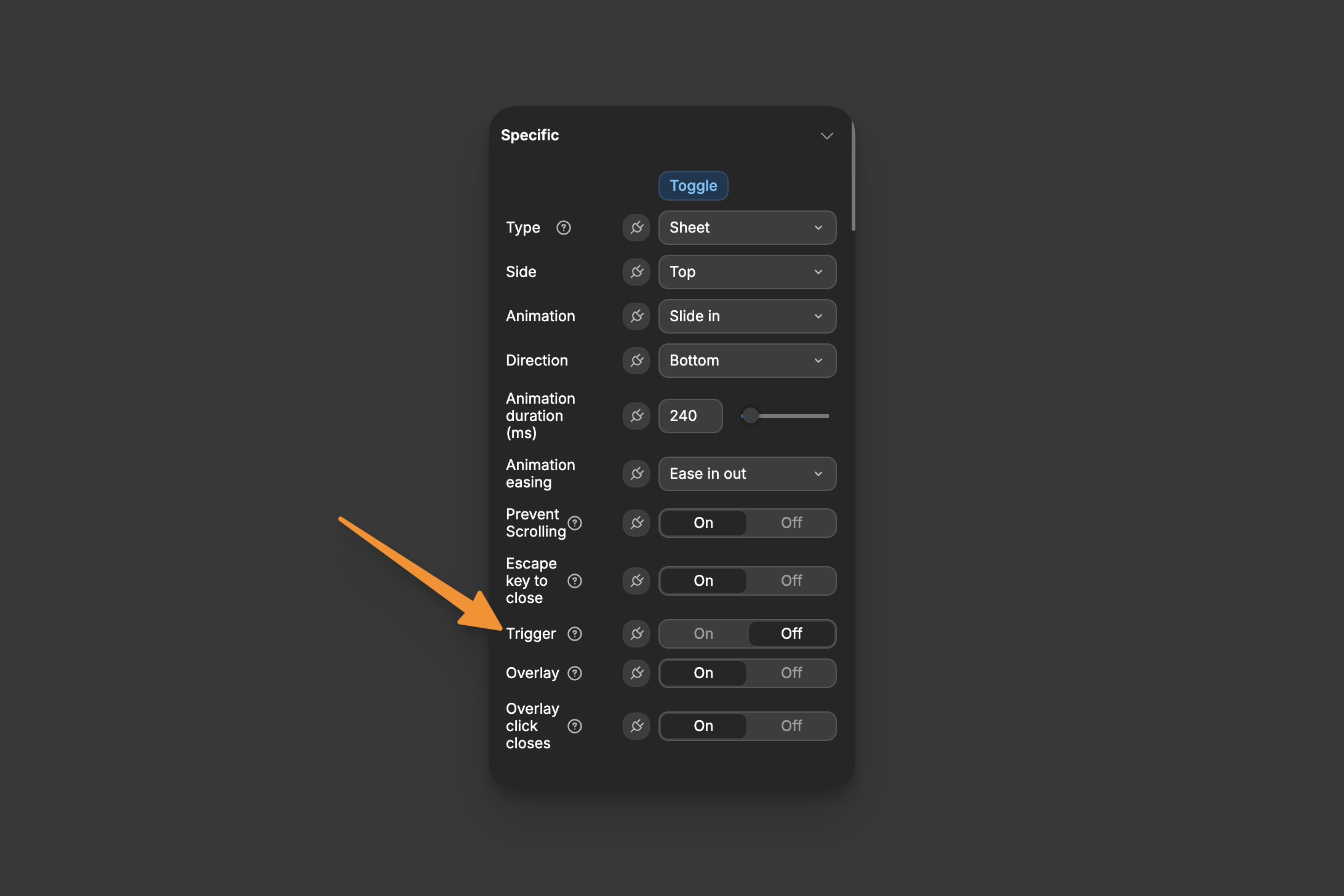
| Trigger | On/Off | Show/hide the default opening trigger |
| Trigger click closes | On/Off | Control if clicking the trigger closes an open dialog |
| Overlay | On/Off | Add a background overlay behind the dialog |
| Overlay click closes | On/Off | Close the dialog when clicking the overlay |
| Click outside closes | On/Off | Close the dialog when clicking outside it |
| Modal | On/Off | Allow/prevent interactions with content behind the dialog |
TIP
We recommend experimenting with these properties to see their visual effects in action.
TIP
You can place the Dialog anywhere. To ensure the overlay covers the whole screen, enable the Z axis property for the Dialog.
Retrieving data from form inputs
When you place a Dialog containing form inputs inside a repeating group, the inputs will lose their values due to how WeWeb handles state.
In this example, we placed a Dialog with a form input inside a repeating group and entered the value "Hello":
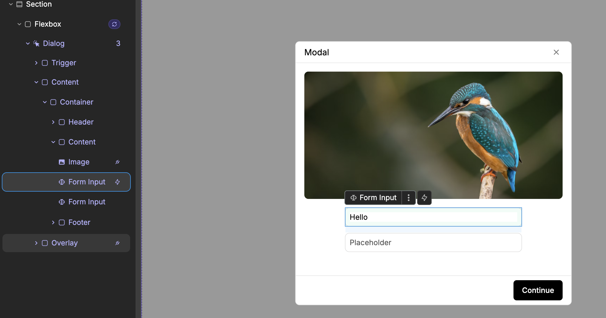
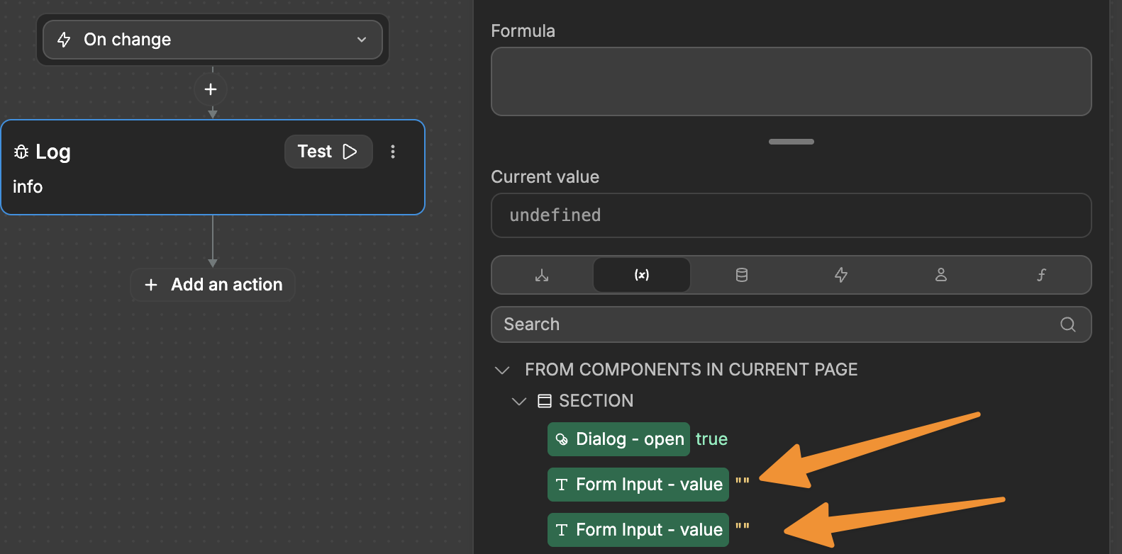
When accessing the Variables tab, no value is found:
To fix this, you can either:
- Place the Dialog outside the repeating group (recommended)
Or store the input values manually:
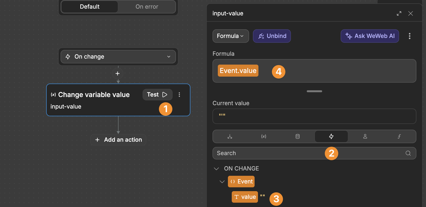
- Add an
On changeworkflow to your input - Capture the input value from the
Eventstab - Save it to a variable