

Appearance
Kanban
The Kanban element shows your records as cards, sorted into columns. Users can drag a card from one column to another, for example to move a task from To do to Done. Each column groups the records that share the same value in one of their fields, such as a status.
Use it for any process that goes through stages: a task board, a sales pipeline, a hiring process, or a support queue.
Getting started
- Add the
Kanbanelement to your page fromAdd Element. You'll find it underData>Display. See what the element comes with → - Bind
Itemsto the records of a table view, then chooseItem keyandStacked by. See how to display your records → - Add one stack per column in
Stacks. See how to set the columns → - Add a workflow
On item movedto save the new column of a card. See how to save the moves →
USING AI
You can also ask AI to build a Kanban board. Tell it which table view to use, which field holds the column of each record, and which columns you want. For example: "Add a Kanban that shows the tasks of my All tasks view in three columns, To do, In progress and Done, based on their status field".
Add the Kanban to a page
When you drop the Kanban on the page, WeWeb asks if you want to import variables:
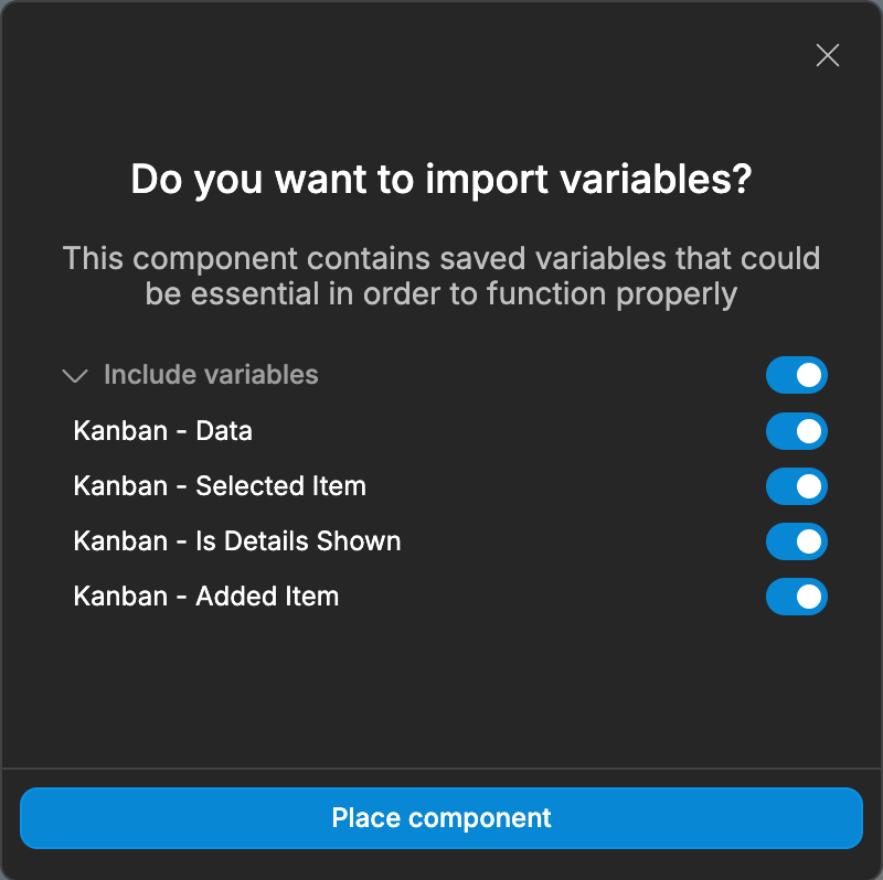
These variables hold example data, so you can see how the Kanban works before you connect your own records:
Kanban - Data: the example cardsKanban - Selected Item: the card the user clickedKanban - Is Details Shown: whether the details panel is openKanban - Added Item: the card the user is adding
The Kanban comes with a details panel, Drawer - Details, and an Add button in each column. They use these variables. If you don't need them, turn off Include variables and delete these parts. To save the cards added with the Add button in your table, see Add a card to a column.
Display your records
Select the Kanban element inside the Kanban container, then set up its Specific settings:
- Bind
Itemsto the records of your table view - In
Item key, choose a field that is unique to each record, such asid. InStacked by, choose the field that tells which column the record goes in, such asstatus - In
Stacks, add one stack per column, with aLabeland aValue
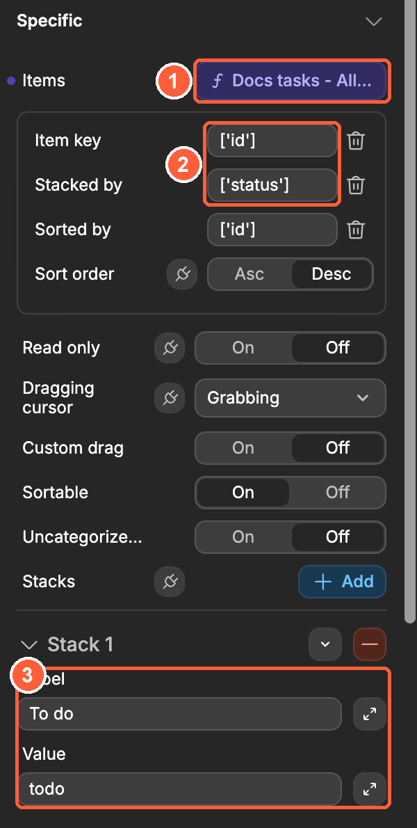
Item key and Stacked by only appear once Items is bound to a list of records.
To sort the cards inside each column, choose a field in Sorted by, then pick Asc or Desc in Sort order. When Sorted by is set, the cards of a column always show in that order.
Set the columns
Each stack in Stacks is a column of the Kanban:
Label: the title shown at the top of the column, for exampleTo doValue: the value a record must have in itsStacked byfield to show in this column, for exampletodo
The value must match exactly, including capital letters. If the status of a record is Todo and the value of the stack is todo, the record doesn't show in the column.
You can also bind Stacks to a list, for example the records of another table view. Label and Value then let you choose which field of the list holds the title and the value of each column.
Records whose value matches no stack don't show in the Kanban. To show them anyway, turn on Uncategorized stack: the Kanban adds a column for them.
Design the cards and columns
The Kanban element contains a Column element, repeated once per stack. In the Layout Tree, Column has three areas:
Item: the card, repeated once per record of the columnHeader: the top of the column, with its titleFooter: the bottom of the column, empty by default
Style them like any other element. To show the fields of a record on its card, bind the elements inside Item to Item > data > the field, for example Item.data.name. Inside Header, Item.data is the stack, with its label, its value and its items.

Save the new column of a card
When a user drops a card in another column, the Kanban shows it there right away, but your table doesn't change. To save the move, add a workflow on the Kanban that updates the record.
The example below uses the Update Row API Endpoint that WeWeb creates with each table when the Create API endpoints to access or update table data toggle is on.
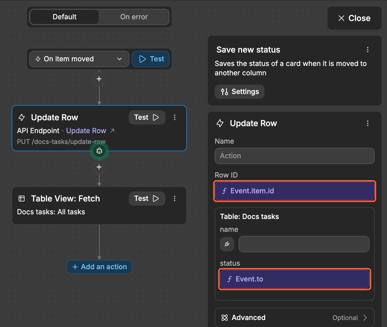
- Select the
Kanbanelement and add a workflow that triggersOn item moved - Add the
Update Rowaction of your table. You'll find it inFrom Data & API>API>Table: <your table> - Bind
Row IDtoEvent.item.id, and the column that holds the stack, herestatus, toEvent.to - Add a
Table View: Fetchaction on your table view, so the cards show the updated records
The On item moved event sends the card that moved and the columns it moved between:
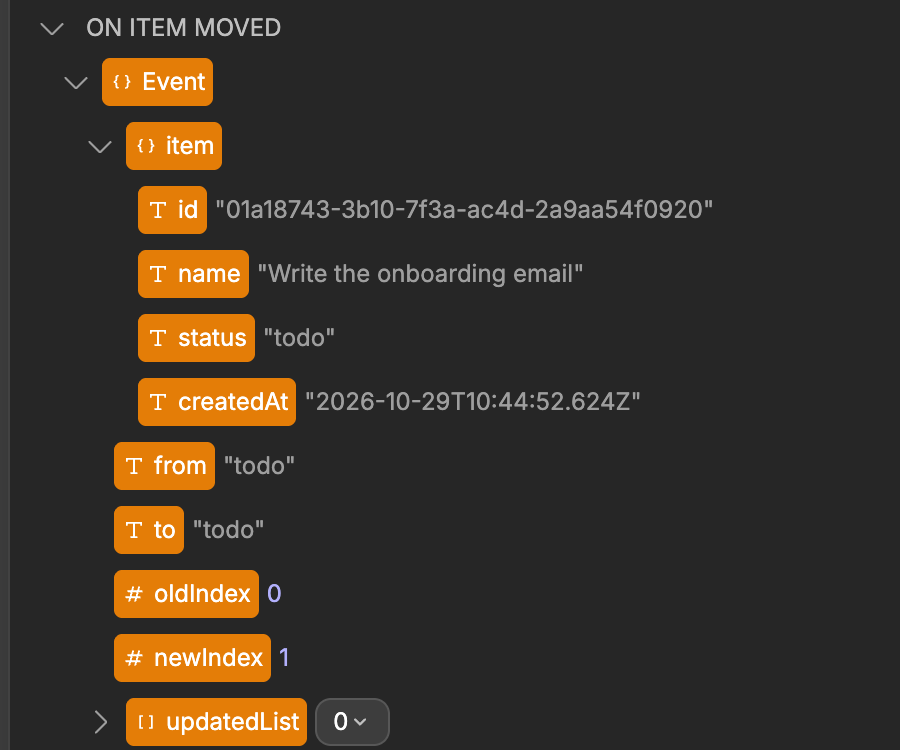
Event.to is the Value of the column the card was dropped in. See all the data sent by the event →
REORDERING A CARD IN THE SAME COLUMN
On item moved also triggers when a user moves a card inside its column. Event.from and Event.to are then the same, and the workflow saves the column the card was already in.
Learn more about calling API Endpoints from the interface →
Add a card to a column
Each column comes with an Add button in its Header. Its Add card workflow only adds the card to the Kanban - Data example variable. To save new cards in your table, change its actions:
- Select the
Addbutton in theHeaderofColumn, then open itsAdd cardworkflow - Delete its actions, then add the
Add Rowaction of your table. You'll find it inFrom Data & API>API>Table: <your table> - Bind the column that holds the stack, here
status, toItem.data.value: the value of the column the user clicked in. Fill in the other columns, for examplename - Add a
Table View: Fetchaction on your table view, so the new card shows in the column
The Add Row API Endpoint is created with your table, like Update Row.
Control how users drag cards
Sortable: lets users reorder cards inside a column. Turn it off to keep the order of the cards. Users can still move cards to another columnRead only: turns off drag and drop. Use it for a board that users can only look atDragging cursor: the cursor shown while a user drags a card.Grabbingby defaultCustom drag: by default, users can drag a card from anywhere on it. Turn onCustom dragto drag cards only from one element, such as a handle icon. Then add the class set inClass name(draggableby default) to that element, in itsSettings>HTML attributes>Class
While a user drags a card, the Kanban exposes isDragging as true. Use it to change the look of the page during the drag, for example to highlight the columns.
Example use cases
- Task board: move tasks from
To dotoIn progresstoDone - Sales pipeline: move deals through the stages of your sales process
- Hiring process: move candidates from application to interview to offer
- Support queue: show tickets by priority or by the person in charge
- Content calendar: follow articles from idea to draft to published
Best practices
Do:
- Use a field with a fixed list of values for
Stacked by, such as a status, so every record finds its column - Keep the
Valueof each stack identical to the values stored in your table - Refetch the table view after saving a move, so the cards show the latest data
- Turn on
Read onlywhen users shouldn't change the board
Don't:
- Use a field with free text for
Stacked by: records with a typo won't show in any column - Choose an
Item keythat two records can share - Forget the
On item movedworkflow: without it, a reload puts the cards back in their old columns
Forking
While the Kanban element offers the settings most boards need, there may be cases where you need functionality beyond what's natively available. In these situations, you can fork the element and modify it to meet your specific requirements.
If you are unsure how to fork an element, you can learn more in the dedicated documentation.
Forking example: limit the number of cards per column
One reason to fork the Kanban would be to stop users from dropping a card in a column that is already full. To do so, you could fork the Kanban, then edit it with AI and pass in the following prompt:
Add a setting to limit the number of cards per column, and prevent users from dropping a card in a column that has reached the limitProperties reference
Settings
| Property | Options/Type | Description |
|---|---|---|
| Items | array | The records to show as cards |
| Item key | field | A field that is unique to each record, such as id. Shown when Items is bound |
| Stacked by | field | The field that tells which column each record goes in. Shown when Items is bound |
| Sorted by | field | The field used to sort the cards inside each column. Shown when Items is bound |
| Sort order | Asc, Desc | The order of the cards when Sorted by is set. Asc by default |
| Read only | boolean | Turns off drag and drop |
| Dragging cursor | Auto, Default, Pointer, Move, Grab, Grabbing, and more | The cursor shown while a user drags a card. Grabbing by default |
| Custom drag | boolean | Lets users drag a card only from the elements that have the class set in Class name |
| Class name | text | The class of the elements users can drag cards from. draggable by default. Shown when Custom drag is on |
| Sortable | boolean | Lets users reorder cards inside a column. On by default. Shown when Items is bound |
| Uncategorized stack | boolean | Adds a column for the records whose value matches no stack |
| Stacks | array | The columns, each with a Label and a Value. Todo, In progress and Done by default |
| Label | field | When Stacks is bound, the field that holds the title of each column |
| Value | field | When Stacks is bound, the field that holds the value of each column |
Styling
| Property | Description |
|---|---|
| Wrap stacks | Moves the columns to a new row when there isn't enough room. On by default |
Style the cards and the columns with the elements inside Column, as explained in Design the cards and columns.
Event triggers
| Event | Description | Payload |
|---|---|---|
| On item moved | Triggered when a user drops a card, in another column or in the same one | item, from, to, oldIndex, newIndex, updatedList |
Example event payloads
On item moved
When a user drags the "Design the pricing page" task from To do to the top of In progress:
javascript
{
  "item": {
    "id": "01a18743-3b12-7f11-9bc4-f6a9902154e7",
    "name": "Design the pricing page",
    "status": "todo"
  },
  "from": "todo",
  "to": "in_progress",
  "oldIndex": null,
  "newIndex": 0,
  "updatedList": [
    { "id": "01a18743-3b12-7f11-9bc4-f6a9902154e7", "name": "Design the pricing page", "status": "todo" },
    { "id": "01a18743-3b12-7f83-8e62-97b7017a003b", "name": "Translate the FAQ", "status": "in_progress" }
  ]
}item: the record of the card that moved, as it was before the movefrom: the value of the column the card comes fromto: the value of the column the card was dropped inoldIndex: the position of the card in its column before the move, starting at 0. Empty when the card comes from another columnnewIndex: the position of the card in the column it was dropped in, starting at 0updatedList: the cards of the column the card was dropped in, in their new order
Exposed variables
| Variable | Type | Description |
|---|---|---|
| isDragging | boolean | true while a user drags a card |
Example variable values
isDragging
javascript
falseComponent actions
This element does not have any component actions.
Frequently asked questions
Why don't my records show in the columns?
Check that the Value of each stack matches the values of the Stacked by field exactly, including capital letters. To find the records that match no column, turn on Uncategorized stack.
Why do my cards go back to their old column when I reload the page?
The Kanban only moves the card on the screen. Add a workflow On item moved that saves the new column in your table. See how to save the moves →
Why can't I drag cards in the editor?
Drag and drop is turned off while you edit the page. Switch to Preview to try it.
Why does a card show its old data after I move it?
The card shows the record as your table view last retrieved it. Add a Table View: Fetch action after saving the move to retrieve the updated records.
CONTINUE LEARNING
The Kanban shows the records of a table view. Learn how to filter, sort and group the records your board displays.