Appearance
OTP Input New
The OTP input lets you collect one-time passcodes in a simple, user-friendly way.
Features
- Flexible format pattern: Define any layout using
xfor input slots and any other characters as separators (e.g.,xxxxxx,xxx-xxx,xx xx xx) - Numeric or alphanumeric: Restrict input to digits only or allow letters and numbers
- Smart paste support: Paste full codes into the first field; the element fills slots automatically
- Auto advance and backspace navigation: Moves forward on input and back on delete for a smooth UX
- Masking and placeholders: Hide values with a mask character and show subtle placeholders when empty
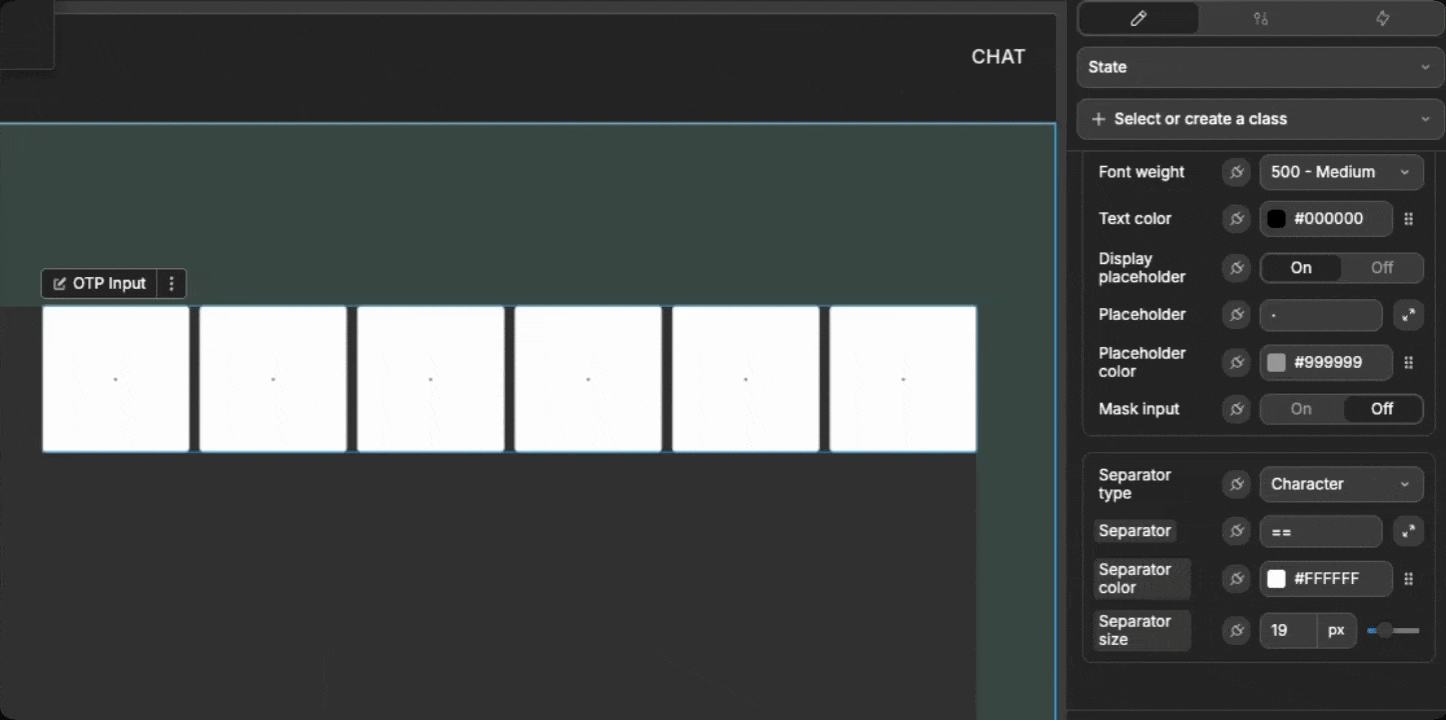
- Separator styling: Use characters or icons between groups with custom color and size
- Auto submit: When used inside a Form Container, you can enable the form to submit as soon as the code is complete
Getting started
Using AI
The quickest way to set up the OTP input is by using AI:
- Ask AI to add an
OTP Input. Include context such as:- Desired format (for example
xxx-xxx) - Whether values should be masked
- If it will be used in a form and should auto-submit on completion
- Desired format (for example
- The AI will add a configured OTP input to your page.
- Keep refining by asking for updates, for example:
- "Change the format to
xx xx xxand use a bullet as the mask character" - "Make the input numeric only and increase each field to 48px"
- "Change the format to
Manual setup
- Add the
OTP Inputelement to your page from theAdd Element - Set the
Formatto match the code pattern you expect (usexfor input slots; any other character becomes a separator) - Choose the
Input type(numericoralphanumeric) - (Optional) If using a form:
- Toggle
Requiredif all slots must be filled - Toggle
Auto submitto submit the form when the code is complete
- Toggle
- Adjust appearance in using the styling properties (field size, borders, text, mask, and separators)
Understanding the format pattern
The Format tells the element how many slots to render and where to place separators:
- Use
xfor each input slot - Any non-
xcharacter is treated as a separator
Examples:
xxxxxx→ 6 Slots, no separatorsxxx-xxx→ 6 Slots with your defined seperator in place of the '-'xx xx xx→ 6 Slots with your defined seperator in place of the spaces
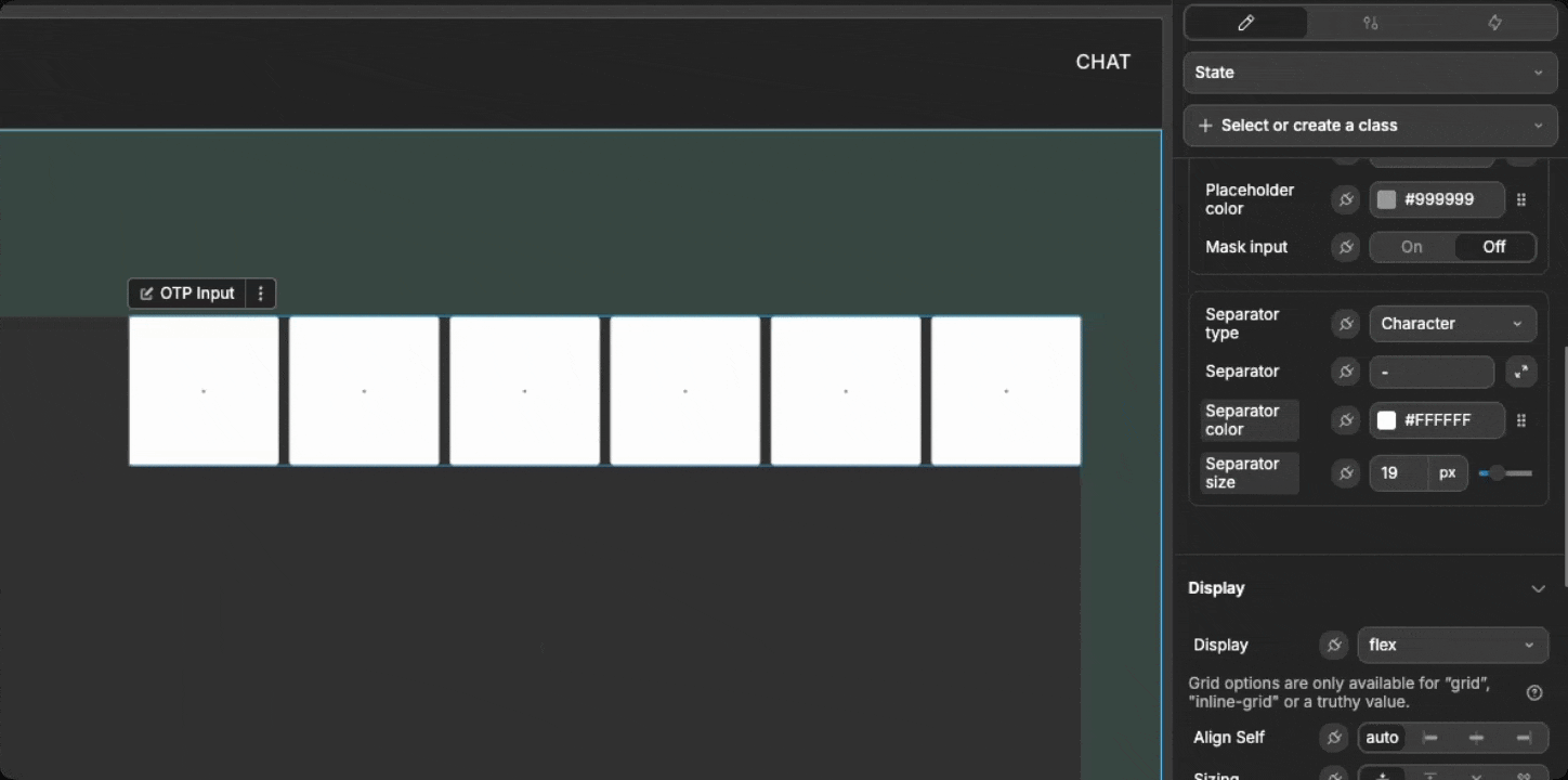
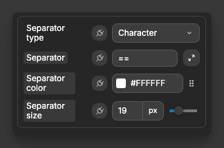
When Separator type is character, the element shows the Separator character. When it is icon, it shows the chosen Separator icon.
In this example, the seperator is set to '==', so when anything other than 'x' is input into the Format, it shows the '==' seperator:
Separators
Separators appear wherever your Format contains a non-x character and Separator type is not none.
character: Displays theSeparatorcharactericon: Displays theSeparator icon- Control appearance with
Separator colorandSeparator size
Input behavior
Typing a valid character fills the current slot and moves focus to the next, and pressing Backspace returns to the previous slot:

Pasting a full code into the first slot fills all slots up to the format length:

Masking
Toggle Mask input to hide filled characters with the Mask character (for example, *)
TIP
The most common use case for using the Mask input setting is to mask entered characters with * so the code is not visible on shared or recorded screens.
Form integration
When you have the OTP input inside a Form Container, the following properties can be used:
Required: Marks the field as required for form submission (all slots must be filled)Auto submit: When on, the form submits automatically when the OTP becomes complete
TIP
New to forms? See the Form Container element for setup and behaviors.
Example use cases
Two-factor authentication (2FA)
Verify a 6-digit code after login:
- Set
FormattoxxxxxxandInput typetonumeric - Create a workflow on
On completeto call your verify-code API - If the code was correct, navigate the user, otherwise show an error message
Passwordless sign-in
Let users sign in with a one-time code sent by email:
- Set
Formattoxxx-xxxfor readability - Enable
Mask inputfor privacy - On
On complete, verify the code and sign the user in
Phone number verification
Confirm a code sent by SMS during onboarding:
- Set
Formattoxx xx xx - Increase
Field widthandField heightfor mobile UX - On
On complete, verify the code
Best practices
Do:
- Keep formats short (typically 4–8 characters)
- Use separators for readability on longer codes
- Provide clear feedback after verification succeeds or fails
Don't:
- Require letters if your codes are numeric-only
- Hide all feedback when masking is enabled. Make sure to use helper text or states
- Over stylize separators so they compete with the code itself
Forking
While the OTP Input element offers extensive built-in customization options, there may be cases where you need functionality beyond what's natively available. In these situations, you can fork the element and modify it to meet your specific requirements.
If you are unsure how to fork an element, you can learn more in the dedicated documentation.
Forking example: custom allowed characters
One reason to fork the OTP Input would be to allow a custom character whitelist (for example, uppercase only).
Please modify this forked OTP Input so it only accepts uppercase A–Z charactersThis adds a targeted UX for special code formats.
Properties reference
Settings
| Property | Type | Description |
|---|---|---|
| Format | Text | Pattern using x for slots and any other character as a separator (e.g., xxx-xxx) |
| Input type | Select | numeric alphanumeric |
| Init value | Text | Initial value for the slots (trimmed to the number of x in Format) |
| Auto focus | Toggle | Focuses the first empty slot on load |
| Auto submit | Toggle | Submits the form automatically when all slots are filled (if inside Form Container) |
| Required | Toggle | Requires all slots to be filled (if inside Form Container) |
| Read only | Toggle | Prevents editing the fields |
| Disabled | Toggle | Disables the fields |
Read only vs disabled
- Read only: focus/blur events can still fire.
- Disabled: no focus/blur events will fire.
Styling
| Property | Description |
|---|---|
| Gap | Space between fields and separators |
| Field width | Width of each field |
| Field height | Height of each field |
| Border radius | Corner roundness of fields |
| Border width | Border thickness of fields |
| Border color | Default border color |
| Border color (focus) | Border color when a field is focused |
| Background color | Background color of fields |
| Text align | Alignment of characters inside fields |
| Font family | Typeface for field text |
| Font size | Size of field text |
| Font weight | Weight of field text |
| Text color | Color of field text |
| Display placeholder | Shows placeholder characters in empty fields |
| Placeholder | Placeholder character shown in empty fields |
| Placeholder color | Color of placeholder characters |
| Mask input | Hides entered characters using a mask |
| Mask character | Character used for masking |
| Mask color | Color of masked characters |
| Separator type | Type of separator between groups: none character icon |
| Separator | Separator character used when type is character |
| Separator icon | Icon used when type is icon |
| Separator color | Color of separators |
| Separator size | Size of separators |
Event triggers
| Event | Description | Payload |
|---|---|---|
| On change | Fired whenever the OTP value changes | { value } |
| On complete | Fired when all slots are filled | { value } |
| On focus | Fired when any field gains focus | none |
| On blur | Fired when focus leaves all fields | none |
| On clear | Fired when the fields are cleared | { value } |
Example event payloads
On change
json
{ "value": "123456" }On complete
json
{ "value": "654321" }On clear
json
{ "value": "" }Exposed variables
| Variable | Type | Description |
|---|---|---|
| value | String | Current OTP value without separators (for example, "123456") |
| formattedValue | String | Current OTP value with separators applied (for example, "123-456") |
Example variable values
value
javascript
"123456"formattedValue
javascript
"123-456"Component actions
| Action | Description | Parameters |
|---|---|---|
| Focus first field | Focuses the first empty field (or the first field) | none |
| Clear all fields | Clears all slots | none |
| Set value | Sets the OTP value programmatically | value: string |
States
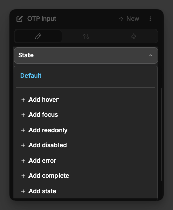
These native states are applied automatically and can be used for conditional styling:
| State | Description |
|---|---|
| Focus | Active when any OTP field is focused |
| Read only | Active when Read only is enabled |
| Disabled | Active when Disabled is enabled |
| Error | Active when Required is enabled and all fields are not filled |
| Complete | Active when all slots are filled |