Appearance
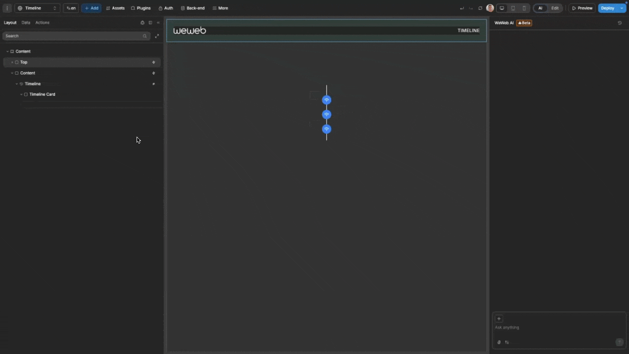
Timeline New
The Timeline element provides a flexible and customizable way to display chronological events, project milestones, or historical data. It supports both vertical and horizontal layouts with full control over markers, connectors, and event positioning.
Features
- Multiple Layout Options: Choose between vertical and horizontal timeline orientations
- Customizable Markers: Control shape, size, color, and add optional icons
- Flexible Alignment: Position events on left, right, or alternate sides in vertical layout, or top/bottom in horizontal layout
- Responsive Design: Automatically adapts to different screen sizes and container widths
- Interactive Elements: Click events for both markers and content
- Dynamic Data Binding: Easily connect to table views or variables
- Complete Styling Control: Customize colors, sizes, and connector appearance
Getting Started
Using AI
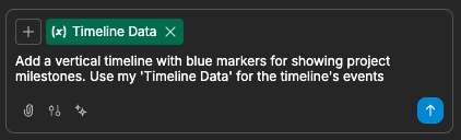
The quickest way to set up a timeline is by using AI:
Ask AI to add the timeline. Make sure to specify:
- Specific styling requirements
- Any contextual data you would like it to use
- Settings you would like applied
For example:
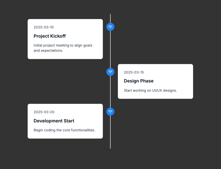
The AI will then create your styled timeline using any data you may have passed as context:
Continue refining your timeline by asking for specific adjustments:
- "Change the timeline to horizontal layout"
- "Make timeline markers square instead of round"
- "Add activity icons inside the markers"
- "Alternate events on both sides of the timeline"
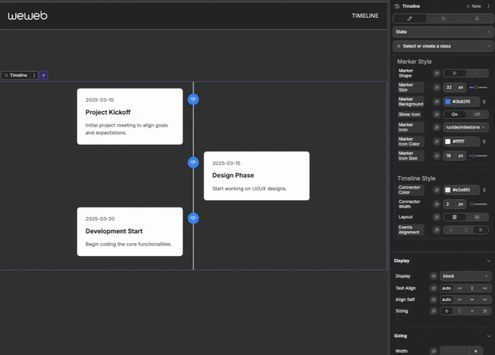
Manual Setup
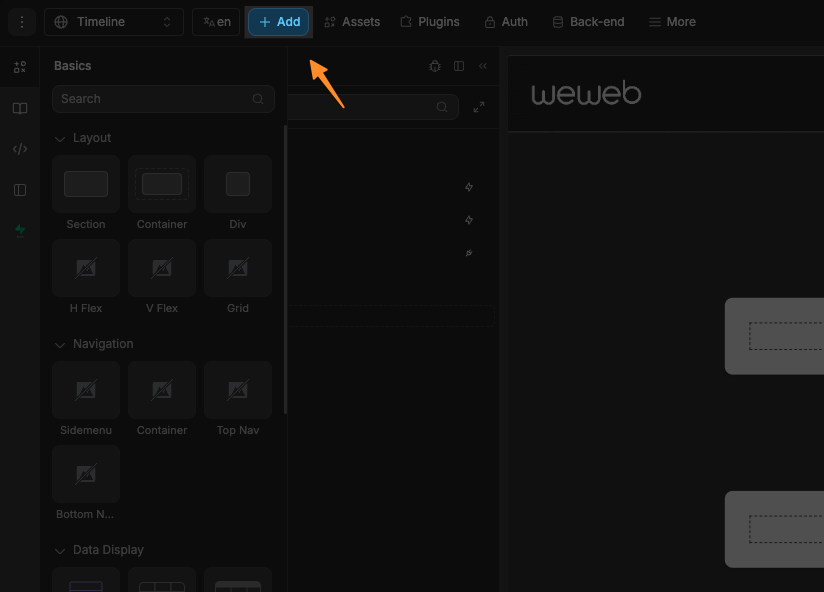
- Add a Timeline element to your page from the
Add Element - Configure the layout and alignment in the style
Styletab:- Choose vertical or horizontal layout
- Set the alignment of events
- Configure markers:
- Select marker shape (circle or square)
- Set size and background color
- Optionally add icons to markers
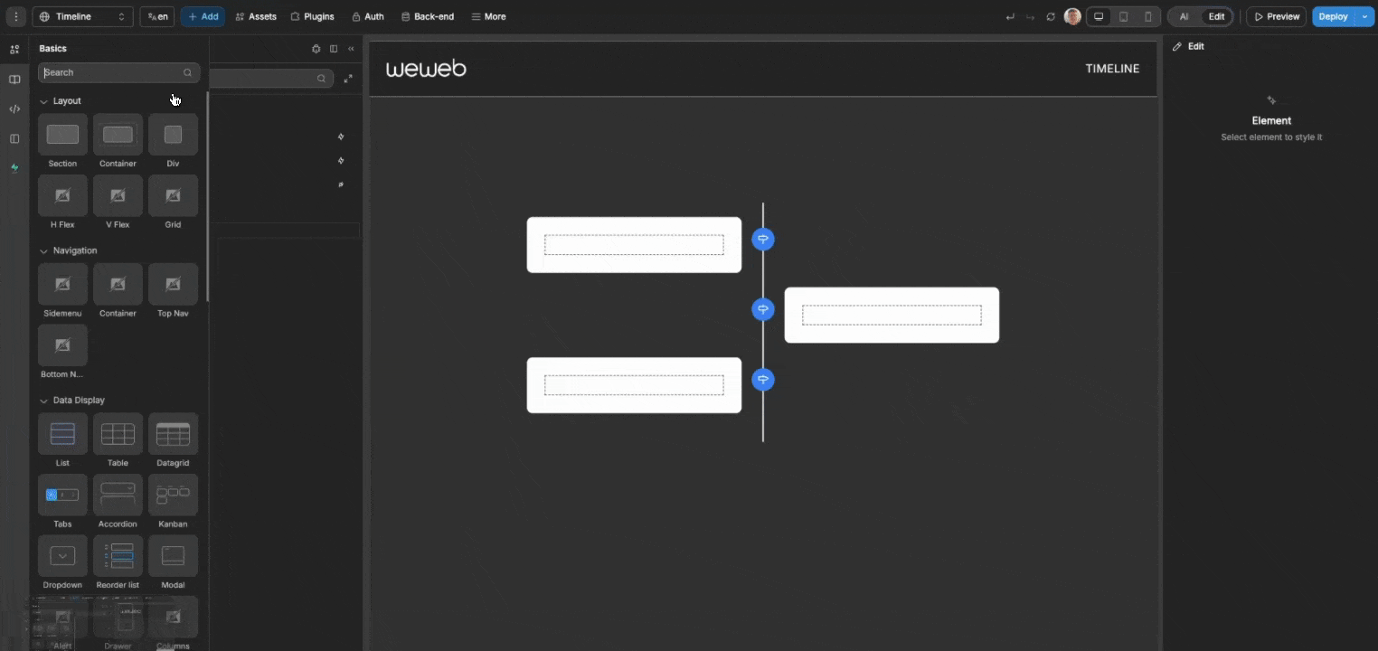
- Add timeline events:
- Create static events directly in the
Styletab, or - Bind to a table view or variable containing event data
- Create static events directly in the
Layout Options
The timeline offers two primary layout orientations:
| Layout | Best For | Description |
|---|---|---|
| Vertical | Traditional timelines, historical events | Events flow from top to bottom with markers aligned along a vertical connector |
| Horizontal | Project timelines, roadmaps | Events flow from left to right with markers aligned along a horizontal connector |
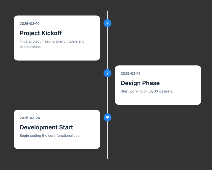
Vertical Layout
In vertical layout, you have three alignment options:
| Alignment | Description |
|---|---|
| Left | Markers and connector on the left, content on the right |
| Right | Markers and connector on the right, content on the left |
| Alternate | Markers and connector in the center, content alternates left and right |
Horizontal Layout
In horizontal layout, you have two alignment options:
| Alignment | Description |
|---|---|
| Top | Markers and connector on top, content below |
| Bottom | Markers and connector at bottom, content above |
In the horizontal layout, when the timeline has a width constraint and overflows as a result, it will create a scrollable container ensuring all events remain visible.
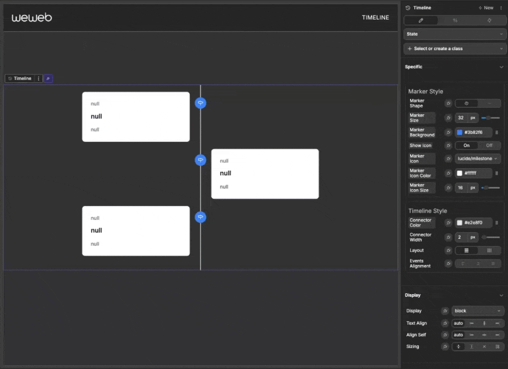
Markers
Markers are visual indicators that highlight each event point on the timeline.
Marker Style Options
| Property | Description | Options |
|---|---|---|
| Marker Shape | The shape of the timeline markers | Circle or Square |
| Marker Size | The size (width/height) of markers | Any valid length (e.g., "16px") |
| Marker Background | The background color of markers | Any color |
| Show Icon | Whether to display an icon inside markers | On/Off |
| Marker Icon | The icon to display in markers | Any icon from the library |
| Marker Icon Color | The color of the icon | Any color |
| Marker Icon Size | The size of the icon | Any valid length (e.g., "12px") |
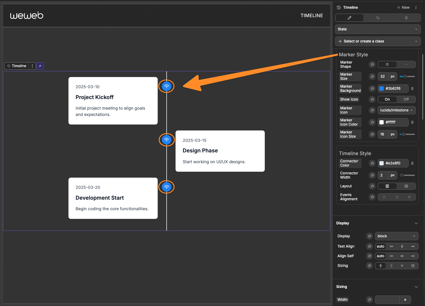
Timeline Style
Control the appearance of the timeline connector and layout:
| Property | Description | Options |
|---|---|---|
| Connector Color | The color of the timeline connector line | Any color |
| Connector Width | The thickness of the timeline connector line | Any valid length (e.g., "2px") |
| Layout | The orientation of the timeline | Vertical or Horizontal |
| Events Alignment | How events are positioned relative to the connector | For vertical: Left, Right, or Alternate. For horizontal: Top or Bottom |

Timeline Events
Events are the core data elements displayed on the timeline. Each event represents a point or period in time with associated information.
Adding Static Events
For simple timelines, you can add events directly in the timeline properties:
- Open the event schema creation panel
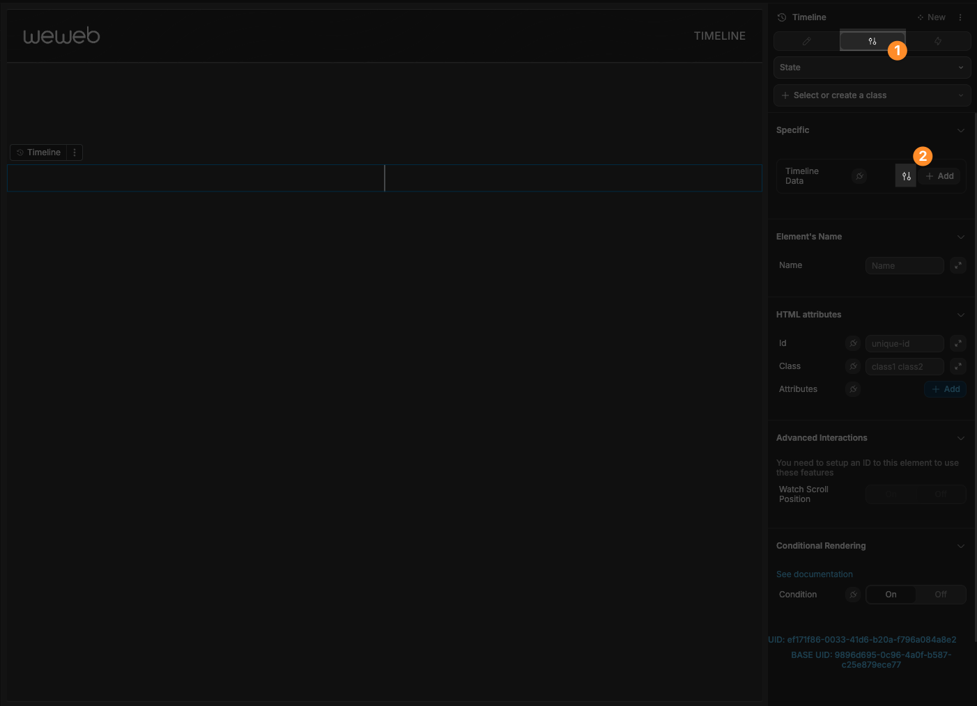
- Define the fields of your events
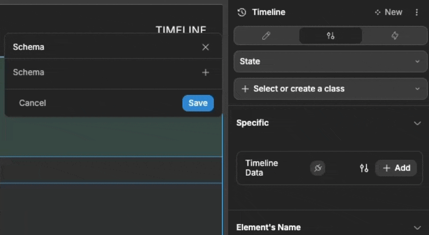
- Add as many events as needed. Each event will have the fields you defined in the event schema.
Binding Dynamic Events
For most applications, you'll want to bind events from a table view or variable:
- Create a table view or variable containing your event data
- In the timeline
Styletab, bind the "Timeline Data" property to your data source
Event Data Structure
A typical event object might include:
javascript
{
  "title": "Project Kickoff",
  "date": "January 15, 2025",
  "description": "Initial team meeting and project scope definition",
  "status": "completed",
  "metrics": {
    "team": 5,
    "tasks": 12
  }
}
The timeline does not expect any set fields in your data, so you can use any data structure that fits your needs. You can reference fields of your data within the timeline card using the context, like so:
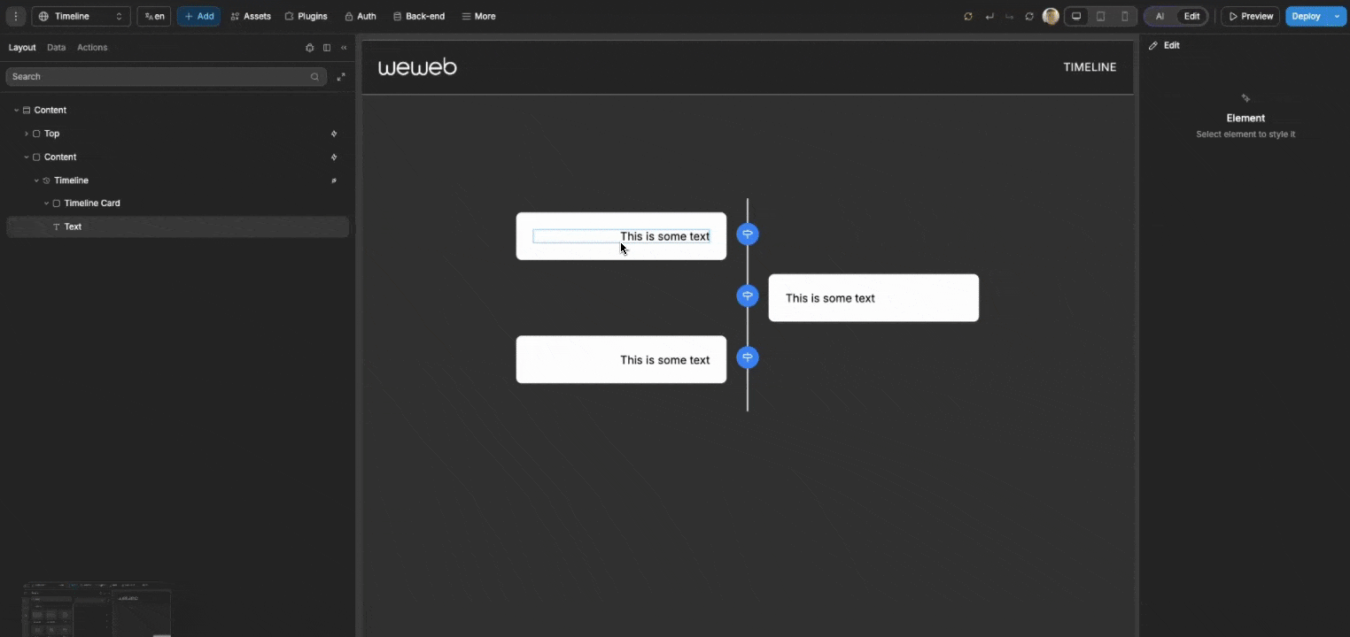
Customizing Event Content
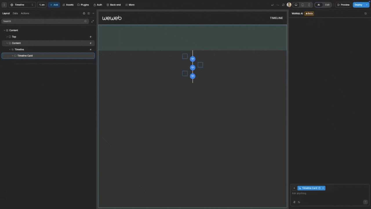
Each timeline event creates an empty Timeline Card container that you can fill with your own content. This allows for complete control over how each event is displayed. To populate your events with content:
- Open the
Add Element
- Drag whatever elements you like into your event container
- Utilise the context data of your events
OR
To quickly style the cards of your timeline, simply use AI:
- Pass in your
Timeline Cardas context by clicking on it
- Pass in any data you want to be used in the card, like the context data
- Prompt the AI with what you want your cards to look like. For example:
I want my timeline card to have a neat, modern design.- The AI will then adjust the design of your timeline cards and utilize any data passed:
Interacting With The Timeline
The timeline provides two primary events for user interaction:
Event Click
When a user clicks on an event's content (the timeline card), the On event click trigger fires with the complete event data. Use this to:
- Navigate to a detailed view of the event
- Open a modal with additional information
- Trigger other workflows based on the event data
Marker Click
When a user clicks specifically on an event's marker, the On marker click trigger fires with the event data. This allows for different behaviors when clicking markers versus content:
- Show a quick preview or tooltip
- Navigate to a different view
- Toggle expanded details
Both events provide the full event object from your timeline data.
Example Use Cases
Project Milestone Timeline
Create a timeline showing key project phases and deliverables:
- Use a vertical timeline with alternate alignment
- Add distinctive icons for different milestone types
- Color-code status using conditional styling
- Include progress metrics and team information
Historical Events Visualization
Display historical events with descriptive content:
- Use a horizontal timeline for chronological flow
- Include images for each historical period
- Provide detailed descriptions with expandable content
- Use custom styling to reflect historical periods
Product Roadmap
Showcase upcoming product features and releases:
- Use a horizontal timeline with top alignment
- Group features by release version
- Include status indicators and target dates
- Link to detailed feature specifications
Best Practices
Do:
- Use consistent spacing between timeline events
- Ensure adequate contrast between marker/connector colors and background
- Keep event content concise and visually balanced
- Use icons that clearly represent the event type or category
- Limit the number of events in horizontal timelines to prevent excessive scrolling
Don't:
- Overcrowd the timeline with too many closely-spaced events
- Use markers that are too small to be easily clickable
- Create text-heavy event cards that overwhelm the visual flow
- Use similar colors for different status indicators
- Forget to make the timeline accessible with clear navigation cues
Properties Reference
Marker Style Properties
| Property | Type | Description |
|---|---|---|
| Marker Shape | Select | Shape of timeline markers (circle or square) |
| Marker Size | Length | Size of timeline markers (width/height) |
| Marker Background | Color | Background color of markers |
| Show Icon | Toggle | Enable/disable icon display in markers |
| Marker Icon | Icon | Icon to display in markers |
| Marker Icon Color | Color | Color of the icon in markers |
| Marker Icon Size | Length | Size of the icon in markers |
Timeline Style Properties
| Property | Type | Description |
|---|---|---|
| Connector Color | Color | Color of the timeline connector line |
| Connector Width | Length | Width of the timeline connector line |
| Layout | Select | Orientation of the timeline (vertical or horizontal) |
| Events Alignment | Select | Alignment of timeline events relative to the connector |
Settings Properties
| Property | Type | Description |
|---|---|---|
| Timeline Data | Array | List of events to display on the timeline |
Event Triggers
| Event | Description | Payload |
|---|---|---|
| On event click | Triggered when clicking an event's content | Event object from timeline data |
| On marker click | Triggered when clicking an event's marker | Event object from timeline data |
Example Event Trigger Payloads
On event click / On marker click
javascript
{
  "title": "Project Kickoff",
  "date": "January 15, 2025",
  "description": "Initial team meeting and project scope definition",
  "status": "completed",
  "metrics": {
    "team": 5,
    "tasks": 12
  }
}