Appearance
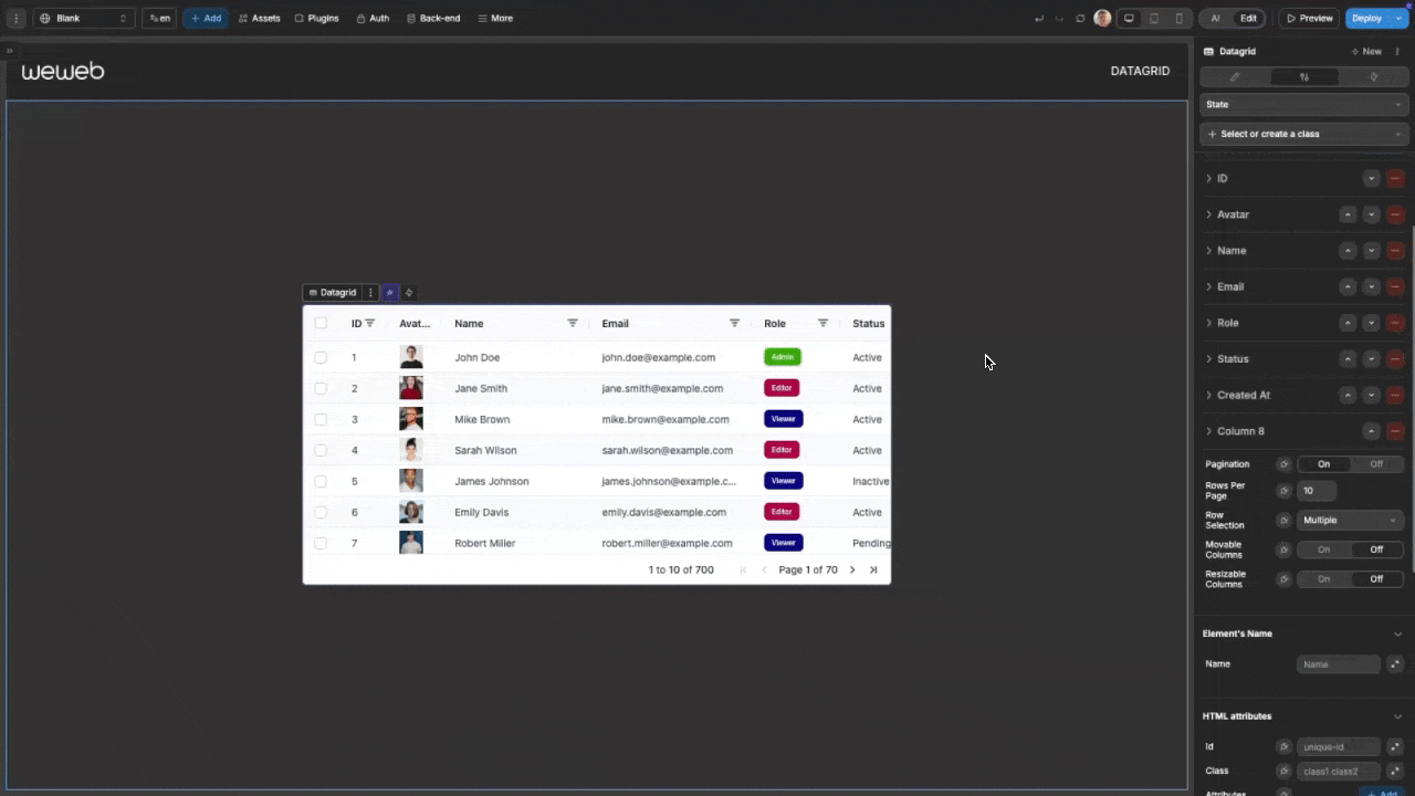
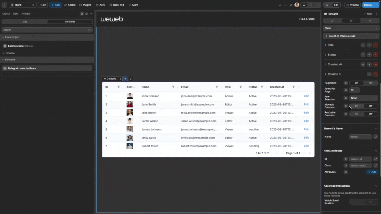
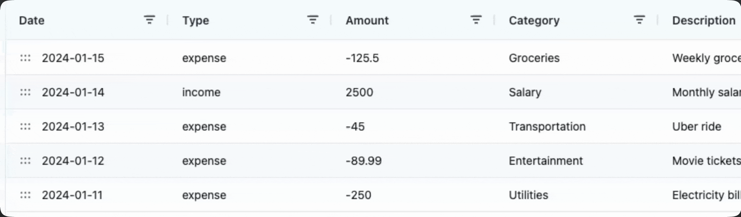
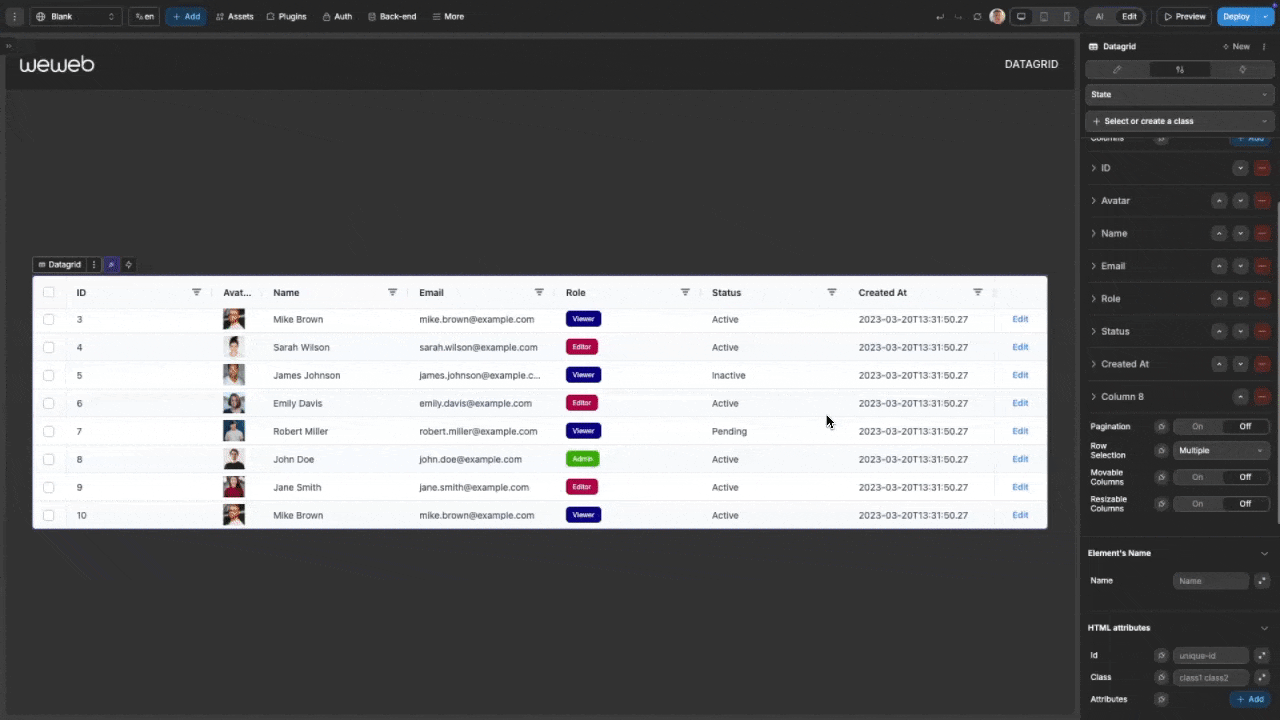
Data Grid New
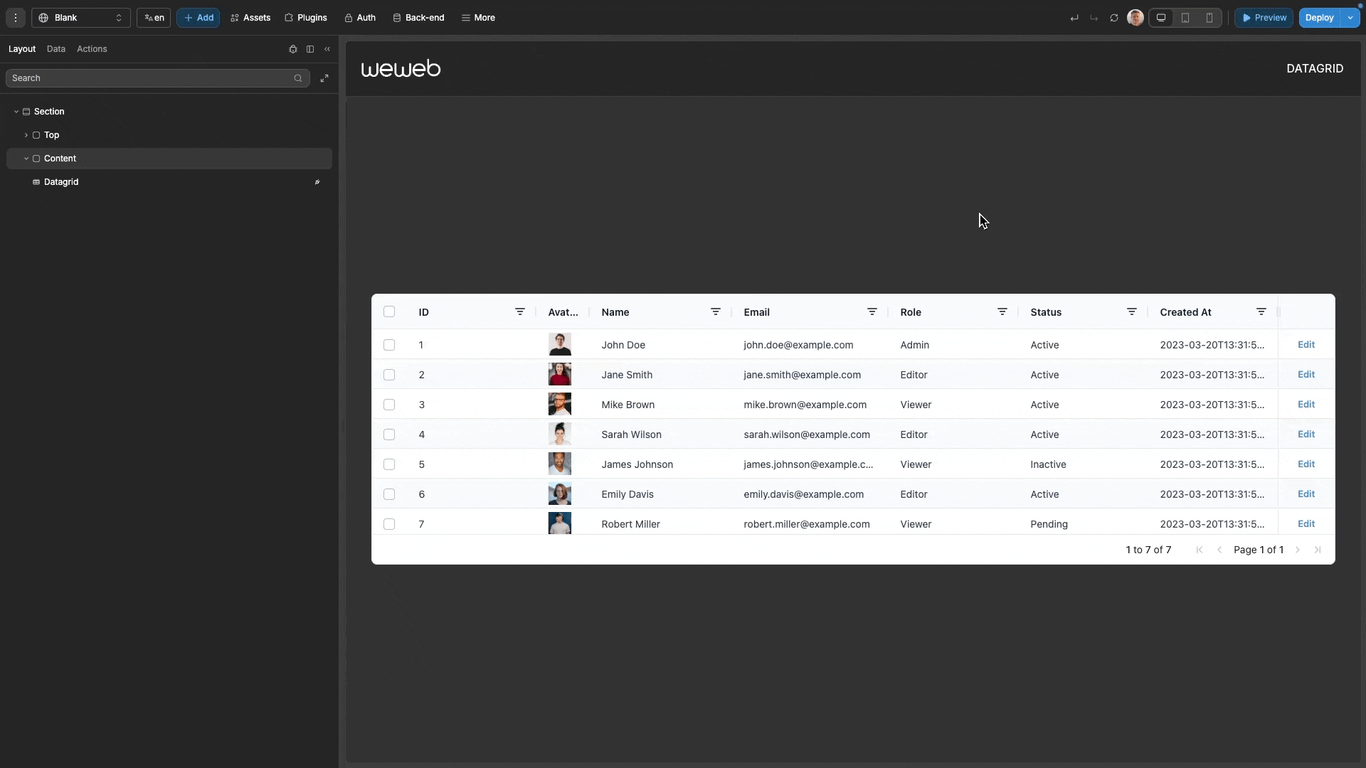
The advanced datagrid component allows you to display and interact with structured data in a tabular format. Built on the AG Grid framework, it offers high-performance rendering with advanced features like sorting, filtering, pagination, and cell editing. You can fully customize its appearance and behavior to meet your specific requirements.
Features
- High-Performance Rendering: Efficiently handles large datasets with virtual scrolling
- Advanced Sorting & Filtering: Helps users quickly find and organize data
- Row Selection: Single or multiple row selection with full event handling
- Interactive Cell Editing: Edit data directly within the grid with validation
- Custom Cells: Add your own UI components to grid cells
- Pagination: Traditional page-based navigation for structured data review
- Column Management: Resize, reorder, and pin columns as needed
- Comprehensive Styling: Extensive appearance customization for all grid elements
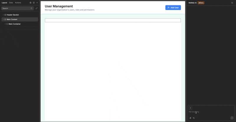
Getting started
Using AI
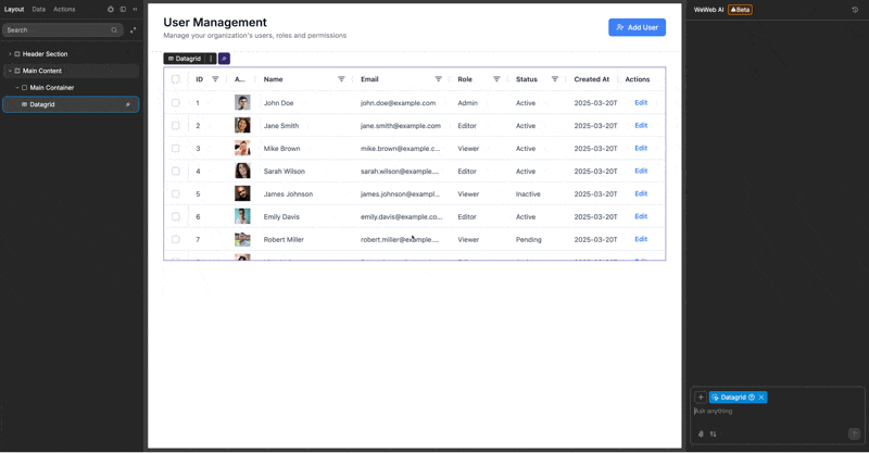
The quickest way to set up the datagrid is by using AI.
- First, ensure you have a variable or table view with your data ready.
- Ask AI: "Create a datagrid that uses
{{insert your data}}". Make sure you pass in your data as context in the chat.
- Continue refining and customizing your datagrid by asking AI for specific modifications:
- "Add an action column with an 'Edit' button"
- "Enable multiple row selection on the datagrid"
- "Make the email column wider and show the status column with color indicators"
- "Add pagination showing 5 rows per page"
Manual setup
- Add the datagrid to your page from the
Add Element - Configure the data source:
- Click the
Dataproperty and select a variable or table view - Set a unique row ID formula (typically using the primary key of your data)
- Click
Generate Columnsto create columns based on your data structure
- Click the
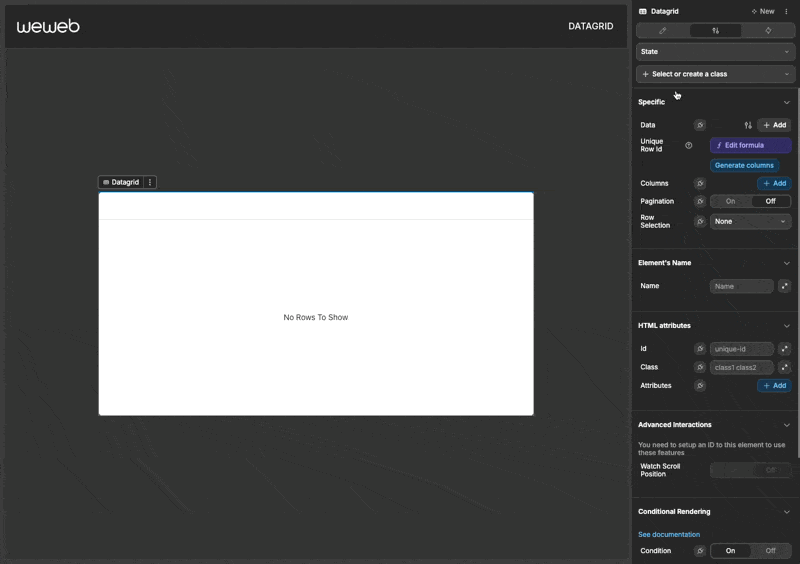
- Customize columns as needed through the
Styletab - Configure appearance settings in the Style panel
- Add workflows to handle interactions like row selection or action buttons
TIP
When binding data to the datagrid, it is optimal for your data to be an array of objects, as this will allow the automatic generation of columns.
If you are unsure what an 'array of objects' means, please refer to our guide on understanding variables: Variables Guide.
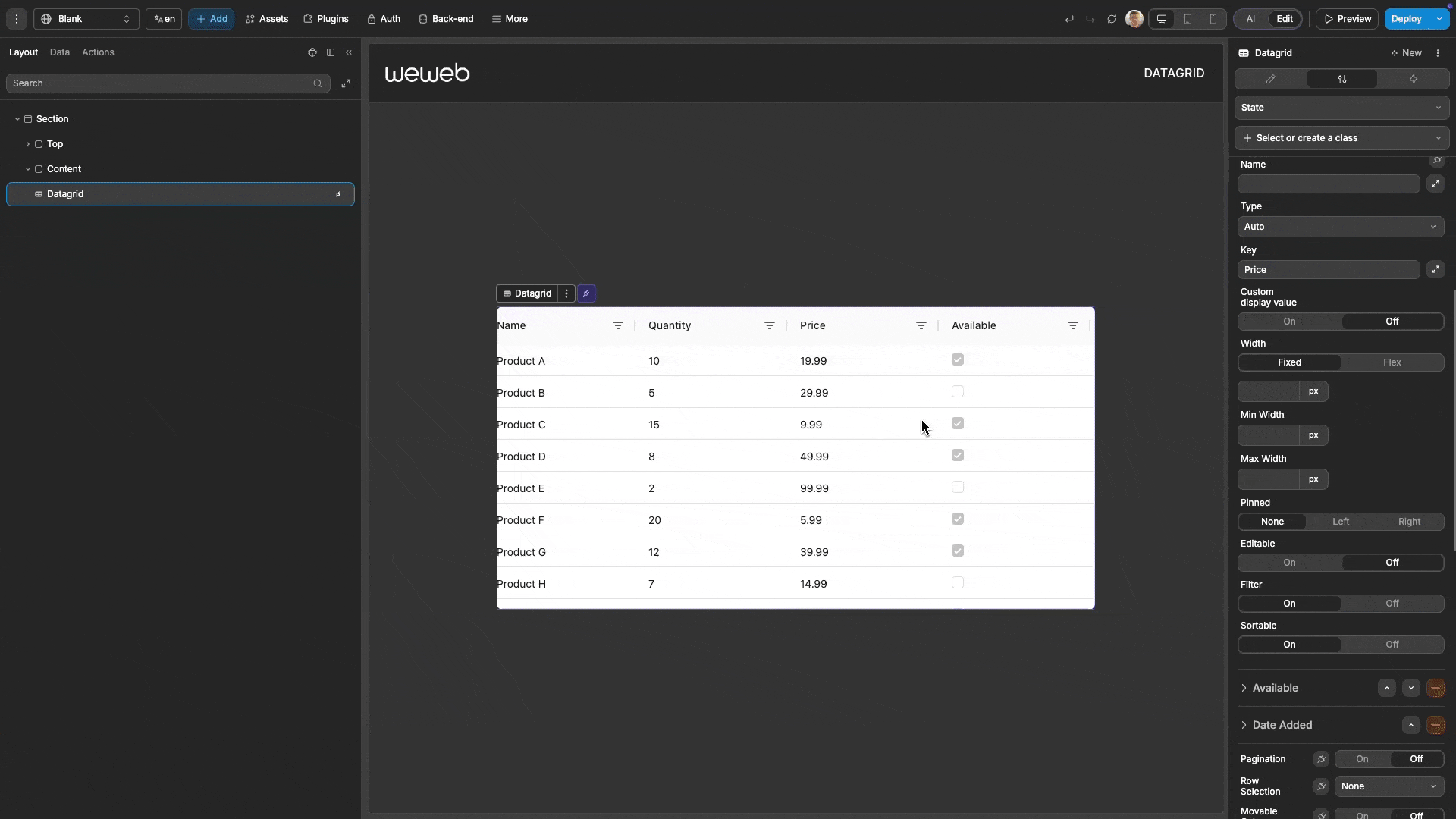
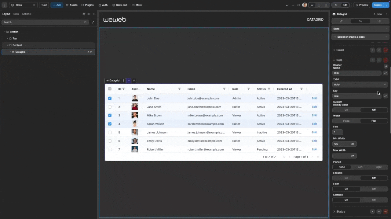
Column configuration
The datagrid organizes your data into columns that can be extensively customized.
Column types
| Type | Best For |
|---|---|
| Text | String data |
| Number | Numeric values |
| Boolean | True/false values |
| Date | Date strings |
| Image | Image URLs |
| Action | Interactive buttons |
| Custom | Complex elements |
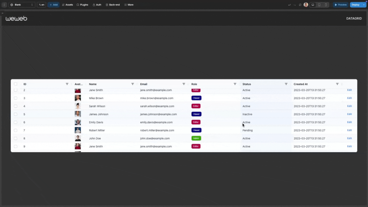
Custom display formatting
For Text, Number, Boolean, and Date columns, you can customize how values are displayed without changing the underlying data:
- Select a column in the
Styletab - Toggle on
Custom display value - Create a formula that transforms the raw value into your desired format
Dynamic column definition
For programmatically defining columns, bind the columns property to a variable with this structure:
javascript
[
    {
        "headerName": "Name",
        "cellDataType": "text",
        "field": "name",
        "width": "200px",
        "sortable": true
    },
    {
        "headerName": "Price",
        "cellDataType": "number",
        "field": "price",
        "width": "100px",
        "sortable": true
    },
    {
        "headerName": "In Stock",
        "cellDataType": "boolean",
        "field": "inStock",
        "width": "100px"
    },
    {
        "headerName": "Product Image",
        "cellDataType": "image",
        "field": "thumbnail",
        "imageWidth": "50px",
        "imageHeight": "50px"
    },
    {
        "headerName": "Actions",
        "cellDataType": "action",
        "field": "edit",
        "actionName": "editRow",
        "actionLabel": "Edit"
    }
]
WARNING
When using dynamic column definitions, you cannot define a column of type "custom". This is a technical limitation that we aim to address in a future update.
Column pinning
For tables with many columns, pin important columns to ensure they stay visible:
- Set the
Pinnedproperty to eitherLeftorRight - Pinned columns remain fixed while users scroll horizontally
- Useful for ID columns, status indicators, or action buttons
Column Width Strategies
The datagrid offers two approaches to handling column widths:
Fixed Width: Set a specific pixel width for the column
- Good for consistent layouts
- Best for columns with predictable content length
Flex Width: Distribute available space proportionally
- Adapts to different screen sizes
- Set flex values to control relative proportions
Dynamic column visibility
You can dynamically show or hide columns based on various conditions without removing them from the grid definition:
- For each column, find the
Hiddenproperty in the column settings - You can either:
- Set it to
Onto permanently hide the column - Bind it to a variable to dynamically control visibility
- Set it to
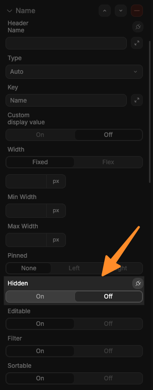
This allows for powerful use cases, such as:
- Creating responsive layouts that adapt to different screen sizes
- Allowing users to customize their view by toggling which columns they want to see
Building a column visibility controller
Here's a complete example of how to implement user-controlled column visibility:
Create a visibility state variable:
- Create a variable named
columnVisibilitywith the typeobject - Set its default value to be an object containing the columns in your datagrid with either a true or false value:javascript
{ "name": true, "email": true, "phone": true, "address": false, "joinDate": false } - (Optional) select
Yesfor theSave in local storageoption if you want to save the user's selected column visibility options between app sessions
- Create a variable named
Bind column visibility:
- For each column in your datagrid, bind its
Hiddenproperty to its respective field in thecolumnVisibilityvariable:- For the "name" column:
columnVisibility.name - For the "email" column:
columnVisibility.email - And so on for each column
- For the "name" column:
- For each column in your datagrid, bind its
Create toggle controls:
- Add a container above or beside your datagrid
- Add toggle switches (or checkboxes) for each column
- Bind each toggle's
Init Valueto the value to the corresponding property in yourcolumnVisibilityvariable - Example: For the "name" column toggle, bind to
columnVisibility.name - Add an
On changeworkflow to each toggle that updates the corresponding field incolumnVisibility
Filter configuration
The datagrid offers powerful filtering capabilities that can be further customized to support different languages and filtering conditions.
Initial filters
You can set up filters that will be applied when the datagrid first loads:
- In the datagrid settings properties, locate the
Initial Filterssetting
- Input an object that defines which columns to filter and how
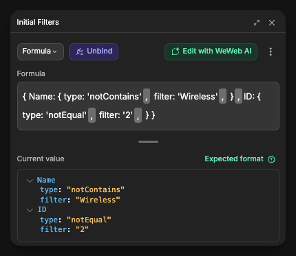
The filter object structure depends on the column type and whether you're using a single condition or multiple conditions:
Single condition filter
javascript
{
  "ColumnName": {
    "type": "contains",   // filter operation to apply
    "filter": "value"     // value to filter by
  }
}
Multiple conditions filter
For more complex filtering scenarios, you can combine multiple filter conditions on a single column using the operator and conditions structure:
javascript
{
  "ColumnName": {
    "operator": "AND",    // "AND" or "OR"
    "conditions": [
      {
        "filterType": "text",  // specify the filter type for each condition
        "type": "contains",
        "filter": "value1"
      },
      {
        "filterType": "text",
        "type": "notEqual",
        "filter": "value2"
      }
    ]
  }
}
Important notes for multiple conditions:
- The
operatorfield determines how conditions are combined:"AND": All conditions must be true"OR": At least one condition must be true
- You can combine any number of conditions for the same column
Available filter types by column type
Text Columns
| Type | Description |
|---|---|
| contains | Matches cells containing the text |
| notContains | Matches cells not containing the text |
| equals | Matches cells exactly matching the text |
| notEqual | Matches cells not matching the text |
| startsWith | Matches cells starting with the text |
| endsWith | Matches cells ending with the text |
| blank | Matches empty cells |
| notBlank | Matches non-empty cells |
Number Columns
| Type | Description |
|---|---|
| equals | Matches cells equal to the number |
| notEqual | Matches cells not equal to the number |
| greaterThan | Matches cells greater than the number |
| greaterThanOrEqual | Matches cells greater than or equal to the number |
| lessThan | Matches cells less than the number |
| lessThanOrEqual | Matches cells less than or equal to the number |
| inRange | Matches cells in a range (requires filter and filterTo) |
| blank | Matches empty cells |
| notBlank | Matches non-empty cells |
Date Columns
| Type | Description |
|---|---|
| equals | Matches cells with date equal to given date |
| notEqual | Matches cells with date not equal to given date |
| greaterThan | Matches cells with date after given date |
| lessThan | Matches cells with date before given date |
| inRange | Matches cells with date in a range (requires filter and filterTo) |
| blank | Matches empty cells |
| notBlank | Matches non-empty cells |
On or after a specific date (e.g., on or after 2024-01-01):
javascript
{
  "CreatedAt": {
    "operator": "OR",
    "conditions": [
      {
        "filterType": "date",
        "type": "greaterThan",
        "dateFrom": "2024-01-01"
      },
      {
        "filterType": "date",
        "type": "equals",
        "dateFrom": "2024-01-01"
      }
    ]
  }
}
Text filter:
javascript
{
  "Name": {
    "filterType": "text",
    "type": "notContains",
    "filter": "Wireless"
  }
}
Number filter:
javascript
{
  "Price": {
    "filterType": "number",
      "type": "greaterThan",
      "filter": 50
    }
}
Date filter:
javascript
{
  "CreatedAt": {
    "filterType": "date",
    "type": "inRange",
    "dateFrom": "2023-01-01",
    "dateTo": "2023-12-31"
  }
}
Filtering multiple columns:
javascript
{
  "Category": {
    "filterType": "text",
    "type": "equals",
    "filter": "Electronics"
  },
  "Price": {
    "filterType": "number",
    "type": "greaterThan",
    "filter": 50
    },
  "Name": {
    "filterType": "text",
    "type": "contains",
    "filter": "Wireless"
  }
}
Multiple conditions examples
Number range filter (e.g., price between 50 and 70):
javascript
{
  "Price": {
    "operator": "AND",
    "conditions": [
      {
        "filterType": "number",
        "type": "greaterThan",
        "filter": 50
      },
      {
        "filterType": "number",
        "type": "lessThan",
        "filter": 70
      }
    ]
  }
}
Text multiple conditions (e.g., contains "Wireless" OR contains "Bluetooth"):
javascript
{
  "Name": {
    "operator": "OR",
    "conditions": [
      {
        "filterType": "text",
        "type": "contains",
        "filter": "Wireless"
      },
      {
        "filterType": "text",
        "type": "contains",
        "filter": "Bluetooth"
      }
    ]
  }
}
Date multiple conditions (e.g., before 2024-01-01 OR after 2024-12-31):
javascript
{
  "CreatedAt": {
    "operator": "OR",
    "conditions": [
      {
        "filterType": "date",
        "type": "lessThan",
        "dateFrom": "2024-01-01"
      },
      {
        "filterType": "date",
        "type": "greaterThan",
        "dateFrom": "2024-12-31"
      }
    ]
  }
}
Complex example combining single and multiple condition filters:
javascript
{
  "Category": {
    "filterType": "text",
    "type": "equals",
    "filter": "Electronics"
  },
  "Price": {
    "operator": "AND",
    "conditions": [
      {
        "filterType": "number",
        "type": "greaterThan",
        "filter": 50
      },
      {
        "filterType": "number",
        "type": "lessThan",
        "filter": 200
      }
    ]
  },
  "Name": {
    "operator": "OR",
    "conditions": [
      {
        "filterType": "text",
        "type": "contains",
        "filter": "Pro"
      },
      {
        "filterType": "text",
        "type": "contains",
        "filter": "Premium"
      }
    ]
  }
}
Language selection
You can configure the language used in filter dropdown menus and filter option text:
- In the datagrid settings properties, locate the "Language" setting
- Select your preferred language from the dropdown options
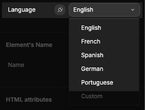
- The language used in the filters will then reflect to be that of your chosen language
LANGUAGE NOT UPDATING
If you experience an issue where the language in the filter does not correctly update to your chosen language, you may need to refresh the page or re-render the datagrid by turning its conditional rendering property off then on. This is due to a technical limitation that we aim to address in a future update.
Defining custom language
For complete control over the language used throughout the datagrid:
- Select
Customfrom the Language dropdown
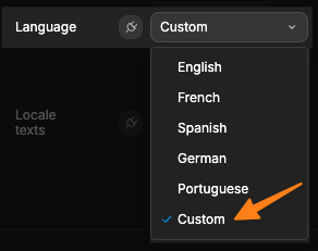
- When
Customis selected, you'll see aLocale textsinput field where you can provide a JSON object with all text strings
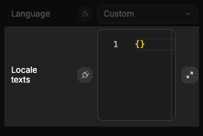
- In the
Locale textsinput, pass in your object with your custom language deifined. Below is the full object you need to pass in:
Click to view the entire custom language object
javascript
{
    // Set Filter
    selectAll: '(Select All)',
    selectAllSearchResults: '(Select All Search Results)',
    addCurrentSelectionToFilter: 'Add current selection to filter',
    searchOoo: 'Search...',
    blanks: '(Blanks)',
    noMatches: 'No matches',

    // Number Filter & Text Filter
    filterOoo: 'Filter...',
    equals: 'Equals',
    notEqual: 'Does not equal',
    blank: 'Blank',
    notBlank: 'Not blank',
    empty: 'Choose one',

    // Number Filter
    lessThan: 'Less than',
    greaterThan: 'Greater than',
    lessThanOrEqual: 'Less than or equal to',
    greaterThanOrEqual: 'Greater than or equal to',
    inRange: 'Between',
    inRangeStart: 'From',
    inRangeEnd: 'To',

    // Text Filter
    contains: 'Contains',
    notContains: 'Does not contain',
    startsWith: 'Begins with',
    endsWith: 'Ends with',

    // Date Filter
    dateFormatOoo: 'yyyy-mm-dd',
    before: 'Before',
    after: 'After',

    // Filter Conditions
    andCondition: 'AND',
    orCondition: 'OR',

    // Filter Buttons
    applyFilter: 'Apply',
    resetFilter: 'Reset',
    clearFilter: 'Clear',
    cancelFilter: 'Cancel',

    // Filter Titles
    textFilter: 'Text Filter',
    numberFilter: 'Number Filter',
    dateFilter: 'Date Filter',
    setFilter: 'Set Filter',

    // Group Column Filter
    groupFilterSelect: 'Select field:',

    // Advanced Filter
    advancedFilterContains: 'contains',
    advancedFilterNotContains: 'does not contain',
    advancedFilterTextEquals: 'equals',
    advancedFilterTextNotEqual: 'does not equal',
    advancedFilterStartsWith: 'begins with',
    advancedFilterEndsWith: 'ends with',
    advancedFilterBlank: 'is blank',
    advancedFilterNotBlank: 'is not blank',
    advancedFilterEquals: '=',
    advancedFilterNotEqual: '!=',
    advancedFilterGreaterThan: '>',
    advancedFilterGreaterThanOrEqual: '>=',
    advancedFilterLessThan: '<',
    advancedFilterLessThanOrEqual: '<=',
    advancedFilterTrue: 'is true',
    advancedFilterFalse: 'is false',
    advancedFilterAnd: 'AND',
    advancedFilterOr: 'OR',
    advancedFilterApply: 'Apply',
    advancedFilterBuilder: 'Builder',
    advancedFilterValidationMissingColumn: 'Column is missing',
    advancedFilterValidationMissingOption: 'Option is missing',
    advancedFilterValidationMissingValue: 'Value is missing',
    advancedFilterValidationInvalidColumn: 'Column not found',
    advancedFilterValidationInvalidOption: 'Option not found',
    advancedFilterValidationMissingQuote: 'Value is missing an end quote',
    advancedFilterValidationNotANumber: 'Value is not a number',
    advancedFilterValidationInvalidDate: 'Value is not a valid date',
    advancedFilterValidationMissingCondition: 'Condition is missing',
    advancedFilterValidationJoinOperatorMismatch: 'Join operators within a condition must be the same',
    advancedFilterValidationInvalidJoinOperator: 'Join operator not found',
    advancedFilterValidationMissingEndBracket: 'Missing end bracket',
    advancedFilterValidationExtraEndBracket: 'Too many end brackets',
    advancedFilterValidationMessage: 'Expression has an error. ${variable} - ${variable}.',
    advancedFilterValidationMessageAtEnd: 'Expression has an error. ${variable} at end of expression.',
    advancedFilterBuilderTitle: 'Advanced Filter',
    advancedFilterBuilderApply: 'Apply',
    advancedFilterBuilderCancel: 'Cancel',
    advancedFilterBuilderAddButtonTooltip: 'Add Filter or Group',
    advancedFilterBuilderRemoveButtonTooltip: 'Remove',
    advancedFilterBuilderMoveUpButtonTooltip: 'Move Up',
    advancedFilterBuilderMoveDownButtonTooltip: 'Move Down',
    advancedFilterBuilderAddJoin: 'Add Group',
    advancedFilterBuilderAddCondition: 'Add Filter',
    advancedFilterBuilderSelectColumn: 'Select a column',
    advancedFilterBuilderSelectOption: 'Select an option',
    advancedFilterBuilderEnterValue: 'Enter a value...',
    advancedFilterBuilderValidationAlreadyApplied: 'Current filter already applied.',
    advancedFilterBuilderValidationIncomplete: 'Not all conditions are complete.',
    advancedFilterBuilderValidationSelectColumn: 'Must select a column.',
    advancedFilterBuilderValidationSelectOption: 'Must select an option.',
    advancedFilterBuilderValidationEnterValue: 'Must enter a value.',

    // Side Bar
    columns: 'Columns',
    filters: 'Filters',

    // columns tool panel
    pivotMode: 'Pivot Mode',
    groups: 'Row Groups',
    rowGroupColumnsEmptyMessage: 'Drag here to set row groups',
    values: 'Values',
    valueColumnsEmptyMessage: 'Drag here to aggregate',
    pivots: 'Column Labels',
    pivotColumnsEmptyMessage: 'Drag here to set column labels',

    // Header of the Default Group Column
    group: 'Group',

    // Row Drag
    rowDragRow: 'row',
    rowDragRows: 'rows',

    // Other
    loadingOoo: 'Loading...',
    loadingError: 'ERR',
    noRowsToShow: 'No Rows To Show',
    enabled: 'Enabled',

    // Menu
    pinColumn: 'Pin Column',
    pinLeft: 'Pin Left',
    pinRight: 'Pin Right',
    noPin: 'No Pin',
    valueAggregation: 'Value Aggregation',
    noAggregation: 'None',
    autosizeThisColumn: 'Autosize This Column',
    autosizeAllColumns: 'Autosize All Columns',
    groupBy: 'Group by',
    ungroupBy: 'Un-Group by',
    ungroupAll: 'Un-Group All',
    addToValues: 'Add ${variable} to values',
    removeFromValues: 'Remove ${variable} from values',
    addToLabels: 'Add ${variable} to labels',
    removeFromLabels: 'Remove ${variable} from labels',
    resetColumns: 'Reset Columns',
    expandAll: 'Expand All Row Groups',
    collapseAll: 'Close All Row Groups',
    copy: 'Copy',
    ctrlC: 'Ctrl+C',
    ctrlX: 'Ctrl+X',
    copyWithHeaders: 'Copy With Headers',
    copyWithGroupHeaders: 'Copy with Group Headers',
    cut: 'Cut',
    paste: 'Paste',
    ctrlV: 'Ctrl+V',
    export: 'Export',
    csvExport: 'CSV Export',
    excelExport: 'Excel Export',
    columnFilter: 'Column Filter',
    columnChooser: 'Choose Columns',
    chooseColumns: 'Choose Columns',
    sortAscending: 'Sort Ascending',
    sortDescending: 'Sort Descending',
    sortUnSort: 'Clear Sort',

    // Enterprise Menu Aggregation and Status Bar
    sum: 'Sum',
    first: 'First',
    last: 'Last',
    min: 'Min',
    max: 'Max',
    none: 'None',
    count: 'Count',
    avg: 'Average',
    filteredRows: 'Filtered',
    selectedRows: 'Selected',
    totalRows: 'Total Rows',
    totalAndFilteredRows: 'Rows',
    more: 'More',
    to: 'to',
    of: 'of',
    page: 'Page',
    pageLastRowUnknown: '?',
    nextPage: 'Next Page',
    lastPage: 'Last Page',
    firstPage: 'First Page',
    previousPage: 'Previous Page',
    pageSizeSelectorLabel: 'Page Size:',
    footerTotal: 'Total',
    statusBarLastRowUnknown: '?',
    scrollColumnIntoView: 'Scroll ${variable} into view',

    // Pivoting
    pivotColumnGroupTotals: 'Total',

    // Enterprise Menu (Charts)
    pivotChartAndPivotMode: 'Pivot Chart & Pivot Mode',
    pivotChart: 'Pivot Chart',
    chartRange: 'Chart Range',

    columnChart: 'Column',
    groupedColumn: 'Grouped',
    stackedColumn: 'Stacked',
    normalizedColumn: '100% Stacked',

    barChart: 'Bar',
    groupedBar: 'Grouped',
    stackedBar: 'Stacked',
    normalizedBar: '100% Stacked',

    pieChart: 'Pie',
    pie: 'Pie',
    donut: 'Donut',

    lineChart: 'Line',
    stackedLine: 'Stacked',
    normalizedLine: '100% Stacked',

    xyChart: 'X Y (Scatter)',
    scatter: 'Scatter',
    bubble: 'Bubble',

    areaChart: 'Area',
    area: 'Area',
    stackedArea: 'Stacked',
    normalizedArea: '100% Stacked',

    histogramChart: 'Histogram',

    polarChart: 'Polar',
    radarLine: 'Radar Line',
    radarArea: 'Radar Area',
    nightingale: 'Nightingale',
    radialColumn: 'Radial Column',
    radialBar: 'Radial Bar',

    statisticalChart: 'Statistical',
    boxPlot: 'Box Plot',
    rangeBar: 'Range Bar',
    rangeArea: 'Range Area',

    hierarchicalChart: 'Hierarchical',
    treemap: 'Treemap',
    sunburst: 'Sunburst',

    specializedChart: 'Specialized',
    waterfall: 'Waterfall',
    heatmap: 'Heatmap',

    combinationChart: 'Combination',
    columnLineCombo: 'Column & Line',
    AreaColumnCombo: 'Area & Column',

    // Charts
    pivotChartTitle: 'Pivot Chart',
    rangeChartTitle: 'Range Chart',
    settings: 'Chart',
    data: 'Set Up',
    format: 'Customize',
    categories: 'Categories',
    defaultCategory: '(None)',
    series: 'Series',
    switchCategorySeries: 'Switch Category / Series',
    categoryValues: 'Category Values',
    seriesLabels: 'Series Labels',
    aggregate: 'Aggregate',
    xyValues: 'X Y Values',
    paired: 'Paired Mode',
    axis: 'Axis',
    xAxis: 'Horizontal Axis',
    yAxis: 'Vertical Axis',
    polarAxis: 'Polar Axis',
    radiusAxis: 'Radius Axis',
    navigator: 'Navigator',
    zoom: 'Zoom',
    animation: 'Animation',
    crosshair: 'Crosshair',
    color: 'Color',
    thickness: 'Thickness',
    preferredLength: 'Preferred Length',
    xType: 'X Type',
    axisType: 'Axis Type',
    automatic: 'Automatic',
    category: 'Category',
    number: 'Number',
    time: 'Time',
    timeFormat: 'Time Format',
    autoRotate: 'Auto Rotate',
    labelRotation: 'Rotation',
    circle: 'Circle',
    polygon: 'Polygon',
    square: 'Square',
    cross: 'Cross',
    diamond: 'Diamond',
    plus: 'Plus',
    triangle: 'Triangle',
    heart: 'Heart',
    orientation: 'Orientation',
    fixed: 'Fixed',
    parallel: 'Parallel',
    perpendicular: 'Perpendicular',
    radiusAxisPosition: 'Position',
    ticks: 'Ticks',
    gridLines: 'Grid Lines',
    width: 'Width',
    height: 'Height',
    length: 'Length',
    padding: 'Padding',
    spacing: 'Spacing',
    chartStyle: 'Chart Style',
    title: 'Title',
    chartTitles: 'Titles',
    chartTitle: 'Chart Title',
    chartSubtitle: 'Subtitle',
    horizontalAxisTitle: 'Horizontal Axis Title',
    verticalAxisTitle: 'Vertical Axis Title',
    polarAxisTitle: 'Polar Axis Title',
    titlePlaceholder: 'Chart Title',
    background: 'Background',
    font: 'Font',
    weight: 'Weight',
    top: 'Top',
    right: 'Right',
    bottom: 'Bottom',
    left: 'Left',
    labels: 'Labels',
    calloutLabels: 'Callout Labels',
    sectorLabels: 'Sector Labels',
    positionRatio: 'Position Ratio',
    size: 'Size',
    shape: 'Shape',
    minSize: 'Minimum Size',
    maxSize: 'Maximum Size',
    legend: 'Legend',
    position: 'Position',
    markerSize: 'Marker Size',
    markerStroke: 'Marker Stroke',
    markerPadding: 'Marker Padding',
    itemSpacing: 'Item Spacing',
    itemPaddingX: 'Item Padding X',
    itemPaddingY: 'Item Padding Y',
    layoutHorizontalSpacing: 'Horizontal Spacing',
    layoutVerticalSpacing: 'Vertical Spacing',
    strokeWidth: 'Stroke Width',
    offset: 'Offset',
    offsets: 'Offsets',
    tooltips: 'Tooltips',
    callout: 'Callout',
    markers: 'Markers',
    shadow: 'Shadow',
    blur: 'Blur',
    xOffset: 'X Offset',
    yOffset: 'Y Offset',
    lineWidth: 'Line Width',
    lineDash: 'Line Dash',
    lineDashOffset: 'Dash Offset',
    scrollingZoom: 'Scrolling',
    scrollingStep: 'Scrolling Step',
    selectingZoom: 'Selecting',
    durationMillis: 'Duration (ms)',
    crosshairLabel: 'Label',
    crosshairSnap: 'Snap to Node',
    normal: 'Normal',
    bold: 'Bold',
    italic: 'Italic',
    boldItalic: 'Bold Italic',
    predefined: 'Predefined',
    fillOpacity: 'Fill Opacity',
    strokeColor: 'Line Color',
    strokeOpacity: 'Line Opacity',
    miniChart: 'Mini-Chart',
    histogramBinCount: 'Bin count',
    connectorLine: 'Connector Line',
    seriesItems: 'Series Items',
    seriesItemType: 'Item Type',
    seriesItemPositive: 'Positive',
    seriesItemNegative: 'Negative',
    seriesItemLabels: 'Item Labels',
    columnGroup: 'Column',
    barGroup: 'Bar',
    pieGroup: 'Pie',
    lineGroup: 'Line',
    scatterGroup: 'X Y (Scatter)',
    areaGroup: 'Area',
    polarGroup: 'Polar',
    statisticalGroup: 'Statistical',
    hierarchicalGroup: 'Hierarchical',
    specializedGroup: 'Specialized',
    combinationGroup: 'Combination',
    groupedColumnTooltip: 'Grouped',
    stackedColumnTooltip: 'Stacked',
    normalizedColumnTooltip: '100% Stacked',
    groupedBarTooltip: 'Grouped',
    stackedBarTooltip: 'Stacked',
    normalizedBarTooltip: '100% Stacked',
    pieTooltip: 'Pie',
    donutTooltip: 'Donut',
    lineTooltip: 'Line',
    stackedLineTooltip: 'Stacked',
    normalizedLineTooltip: '100% Stacked',
    groupedAreaTooltip: 'Area',
    stackedAreaTooltip: 'Stacked',
    normalizedAreaTooltip: '100% Stacked',
    scatterTooltip: 'Scatter',
    bubbleTooltip: 'Bubble',
    histogramTooltip: 'Histogram',
    radialColumnTooltip: 'Radial Column',
    radialBarTooltip: 'Radial Bar',
    radarLineTooltip: 'Radar Line',
    radarAreaTooltip: 'Radar Area',
    nightingaleTooltip: 'Nightingale',
    rangeBarTooltip: 'Range Bar',
    rangeAreaTooltip: 'Range Area',
    boxPlotTooltip: 'Box Plot',
    treemapTooltip: 'Treemap',
    sunburstTooltip: 'Sunburst',
    waterfallTooltip: 'Waterfall',
    heatmapTooltip: 'Heatmap',
    columnLineComboTooltip: 'Column & Line',
    areaColumnComboTooltip: 'Area & Column',
    customComboTooltip: 'Custom Combination',
    innerRadius: 'Inner Radius',
    startAngle: 'Start Angle',
    endAngle: 'End Angle',
    reverseDirection: 'Reverse Direction',
    groupPadding: 'Group Padding',
    seriesPadding: 'Series Padding',
    tile: 'Tile',
    whisker: 'Whisker',
    cap: 'Cap',
    capLengthRatio: 'Length Ratio',
    labelPlacement: 'Placement',
    inside: 'Inside',
    outside: 'Outside',
    noDataToChart: 'No data available to be charted.',
    pivotChartRequiresPivotMode: 'Pivot Chart requires Pivot Mode enabled.',
    chartSettingsToolbarTooltip: 'Menu',
    chartLinkToolbarTooltip: 'Linked to Grid',
    chartUnlinkToolbarTooltip: 'Unlinked from Grid',
    chartDownloadToolbarTooltip: 'Download Chart',
    chartMenuToolbarTooltip: 'Menu',
    chartEdit: 'Edit Chart',
    chartAdvancedSettings: 'Advanced Settings',
    chartLink: 'Link to Grid',
    chartUnlink: 'Unlink from Grid',
    chartDownload: 'Download Chart',
    histogramFrequency: 'Frequency',
    seriesChartType: 'Series Chart Type',
    seriesType: 'Series Type',
    secondaryAxis: 'Secondary Axis',
    seriesAdd: 'Add a series',
    categoryAdd: 'Add a category',
    bar: 'Bar',
    column: 'Column',
    histogram: 'Histogram',
    advancedSettings: 'Advanced Settings',
    direction: 'Direction',
    horizontal: 'Horizontal',
    vertical: 'Vertical',
    seriesGroupType: 'Group Type',
    groupedSeriesGroupType: 'Grouped',
    stackedSeriesGroupType: 'Stacked',
    normalizedSeriesGroupType: '100% Stacked',
    legendEnabled: 'Enabled',
    invalidColor: 'Color value is invalid',
    groupedColumnFull: 'Grouped Column',
    stackedColumnFull: 'Stacked Column',
    normalizedColumnFull: '100% Stacked Column',
    groupedBarFull: 'Grouped Bar',
    stackedBarFull: 'Stacked Bar',
    normalizedBarFull: '100% Stacked Bar',
    stackedAreaFull: 'Stacked Area',
    normalizedAreaFull: '100% Stacked Area',
    customCombo: 'Custom Combination',
    funnel: 'Funnel',
    coneFunnel: 'Cone Funnel',
    pyramid: 'Pyramid',
    funnelGroup: 'Funnel',
    funnelTooltip: 'Funnel',
    coneFunnelTooltip: 'Cone Funnel',
    pyramidTooltip: 'Pyramid',
    dropOff: 'Drop-Off',
    stageLabels: 'Stage Labels',
    reverse: 'Reverse',

    // ARIA
    ariaAdvancedFilterBuilderItem: '${variable}. Level ${variable}. Press ENTER to edit',
    ariaAdvancedFilterBuilderItemValidation: '${variable}. Level ${variable}. ${variable} Press ENTER to edit',
    ariaAdvancedFilterBuilderList: 'Advanced Filter Builder List',
    ariaAdvancedFilterBuilderFilterItem: 'Filter Condition',
    ariaAdvancedFilterBuilderGroupItem: 'Filter Group',
    ariaAdvancedFilterBuilderColumn: 'Column',
    ariaAdvancedFilterBuilderOption: 'Option',
    ariaAdvancedFilterBuilderValueP: 'Value',
    ariaAdvancedFilterBuilderJoinOperator: 'Join Operator',
    ariaAdvancedFilterInput: 'Advanced Filter Input',
    ariaChecked: 'checked',
    ariaColumn: 'Column',
    ariaColumnGroup: 'Column Group',
    ariaColumnFiltered: 'Column Filtered',
    ariaColumnSelectAll: 'Toggle All Columns Visibility',
    ariaDateFilterInput: 'Date Filter Input',
    ariaDefaultListName: 'List',
    ariaFilterColumnsInput: 'Filter Columns Input',
    ariaFilterFromValue: 'Filter from value',
    ariaFilterInput: 'Filter Input',
    ariaFilterList: 'Filter List',
    ariaFilterToValue: 'Filter to value',
    ariaFilterValue: 'Filter Value',
    ariaFilterMenuOpen: 'Open Filter Menu',
    ariaFilteringOperator: 'Filtering Operator',
    ariaHidden: 'hidden',
    ariaIndeterminate: 'indeterminate',
    ariaInputEditor: 'Input Editor',
    ariaMenuColumn: 'Press ALT DOWN to open column menu',
    ariaFilterColumn: 'Press CTRL ENTER to open filter',
    ariaRowDeselect: 'Press SPACE to deselect this row',
    ariaHeaderSelection: 'Column with Header Selection',
    ariaSelectAllCells: 'Press Space to select all cells',
    ariaRowSelectAll: 'Press Space to toggle all rows selection',
    ariaRowToggleSelection: 'Press Space to toggle row selection',
    ariaRowSelect: 'Press SPACE to select this row',
    ariaRowSelectionDisabled: 'Row Selection is disabled for this row',
    ariaSearch: 'Search',
    ariaSortableColumn: 'Press ENTER to sort',
    ariaToggleVisibility: 'Press SPACE to toggle visibility',
    ariaToggleCellValue: 'Press SPACE to toggle cell value',
    ariaUnchecked: 'unchecked',
    ariaVisible: 'visible',
    ariaSearchFilterValues: 'Search filter values',
    ariaPageSizeSelectorLabel: 'Page Size',
    ariaChartMenuClose: 'Close Chart Edit Menu',
    ariaChartSelected: 'Selected',
    ariaSkeletonCellLoadingFailed: 'Row failed to load',
    ariaSkeletonCellLoading: 'Row data is loading',

    // ARIA Labels for Drop Zones
    ariaRowGroupDropZonePanelLabel: 'Row Groups',
    ariaValuesDropZonePanelLabel: 'Values',
    ariaPivotDropZonePanelLabel: 'Column Labels',
    ariaDropZoneColumnComponentDescription: 'Press DELETE to remove',
    ariaDropZoneColumnValueItemDescription: 'Press ENTER to change the aggregation type',
    ariaDropZoneColumnGroupItemDescription: 'Press ENTER to sort',
    // used for aggregate drop zone, format: {aggregation}{ariaDropZoneColumnComponentAggFuncSeparator}{column name}
    ariaDropZoneColumnComponentAggFuncSeparator: ' of ',
    ariaDropZoneColumnComponentSortAscending: 'ascending',
    ariaDropZoneColumnComponentSortDescending: 'descending',

    ariaLabelDialog: 'Dialog',

    ariaLabelColumnMenu: 'Column Menu',
    ariaLabelColumnFilter: 'Column Filter',

    ariaLabelCellEditor: 'Cell Editor',
    ariaLabelSelectField: 'Select Field',

    // aria labels for async context menus
    ariaLabelLoadingContextMenu: 'Loading Context Menu',

    // aria labels for rich select
    ariaLabelRichSelectField: 'Rich Select Field',
    ariaLabelRichSelectToggleSelection: 'Press SPACE to toggle selection',
    ariaLabelRichSelectDeselectAllItems: 'Press DELETE to deselect all items',
    ariaLabelRichSelectDeleteSelection: 'Press DELETE to deselect item',

    ariaLabelTooltip: 'Tooltip',
    ariaLabelContextMenu: 'Context Menu',
    ariaLabelSubMenu: 'SubMenu',
    ariaLabelAggregationFunction: 'Aggregation Function',
    ariaLabelAdvancedFilterAutocomplete: 'Advanced Filter Autocomplete',
    ariaLabelAdvancedFilterBuilderAddField: 'Advanced Filter Builder Add Field',
    ariaLabelAdvancedFilterBuilderColumnSelectField: 'Advanced Filter Builder Column Select Field',
    ariaLabelAdvancedFilterBuilderOptionSelectField: 'Advanced Filter Builder Option Select Field',
    ariaLabelAdvancedFilterBuilderJoinSelectField: 'Advanced Filter Builder Join Operator Select Field',

    // ARIA Labels for the Side Bar
    ariaColumnPanelList: 'Column List',
    ariaFilterPanelList: 'Filter List',

    // Number Format (Status Bar, Pagination Panel)
    thousandSeparator: ',',
    decimalSeparator: '.',

    // Data types
    true: 'True',
    false: 'False',
    invalidDate: 'Invalid Date',
    invalidNumber: 'Invalid Number',
    january: 'January',
    february: 'February',
    march: 'March',
    april: 'April',
    may: 'May',
    june: 'June',
    july: 'July',
    august: 'August',
    september: 'September',
    october: 'October',
    november: 'November',
    december: 'December',

    // Time formats
    timeFormatSlashesDDMMYYYY: 'DD/MM/YYYY',
    timeFormatSlashesMMDDYYYY: 'MM/DD/YYYY',
    timeFormatSlashesDDMMYY: 'DD/MM/YY',
    timeFormatSlashesMMDDYY: 'MM/DD/YY',
    timeFormatDotsDDMYY: 'DD.M.YY',
    timeFormatDotsMDDYY: 'M.DD.YY',
    timeFormatDashesYYYYMMDD: 'YYYY-MM-DD',
    timeFormatSpacesDDMMMMYYYY: 'DD MMMM YYYY',
    timeFormatHHMMSS: 'HH:MM:SS',
    timeFormatHHMMSSAmPm: 'HH:MM:SS AM/PM',
}
For the complete language object template, please check the AG Grid Localization documentation or contact support.
For a video walkthrough on how to utilize the custom language, see below:
TIP
You can customize as many or as few entries as needed. Any keys not specified in your custom language object will fall back to the default English text.
Sorting configuration
The datagrid allows you to define the initial sorting order of your data when the grid first loads.
Initial sorting
You can set up sorting rules that will be applied when the datagrid first loads:
- In the datagrid settings properties, locate the
Initial Sortsetting
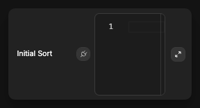
- Input an array that defines which columns to sort by and in what order
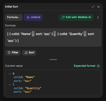
The sort configuration is an array of sort rules, with each rule specifying a column ID and sort direction:
javascript
[
  { colId: "ColumnName", sort: "asc" },  // First sort by this column ascending
  { colId: "AnotherColumn", sort: "desc" }  // Then sort by this column descending
]
Sort options
| Option | Description |
|---|---|
| colId | The ID of the column to sort (matches the key of the column) |
| sort | The sort direction: asc (ascending) or desc (descending) |
Example sorting configurations
Sort by a single column:
javascript
[
  { colId: "Price", sort: "desc" }  // Sort by Price high to low
]
Sort by multiple columns:
javascript
[
  { colId: "Category", sort: "asc" },  // First sort by Category alphabetically
  { colId: "Price", sort: "desc" }     // Then sort by Price high to low within each category
]
Multi-level sorting:
javascript
[
  { colId: "InStock", sort: "desc" },  // Show in-stock items first
  { colId: "Category", sort: "asc" },  // Then sort by Category alphabetically
  { colId: "Name", sort: "asc" }       // Then sort by Name alphabetically
]
Interactive features
Cell editing
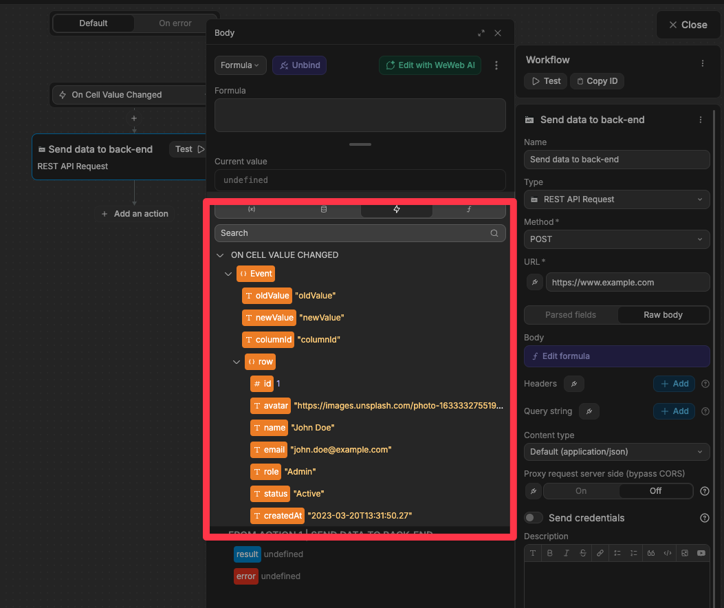
Enable users to edit data directly in the grid:
- Select a column in the
Styletab - Toggle on
Editable
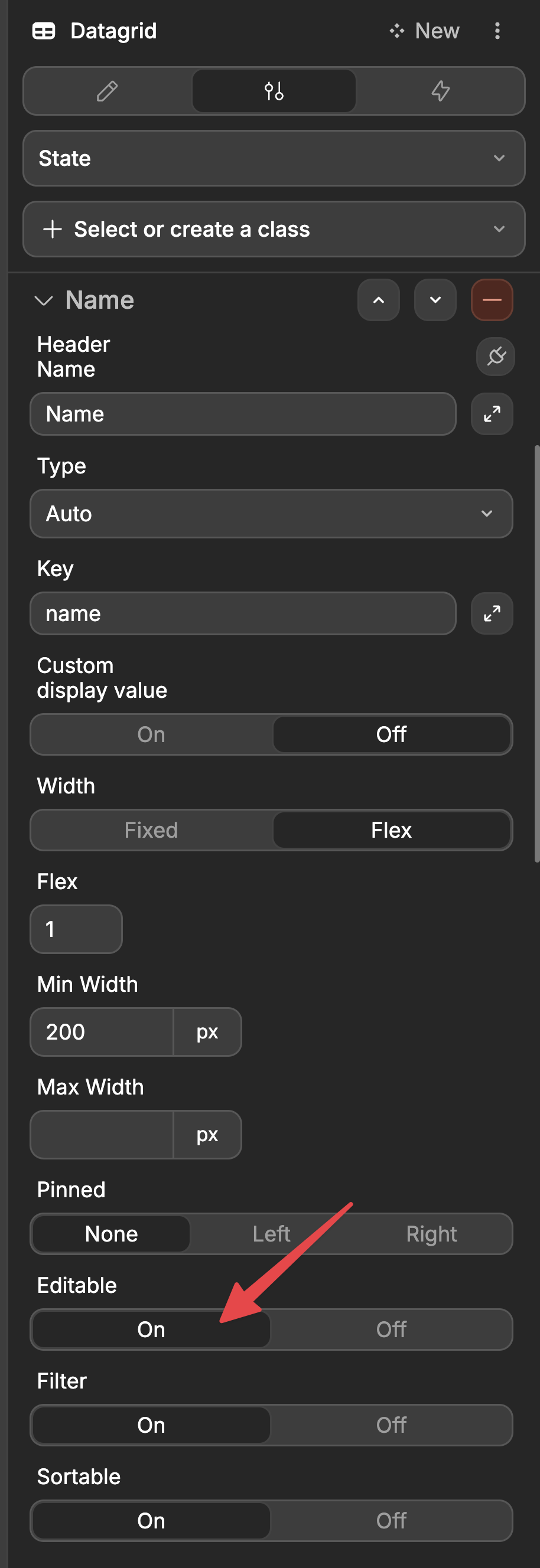
- Users can now double-click a cell to edit its content
- Create a workflow on the datagrid using the
On Cell Value Changedtrigger
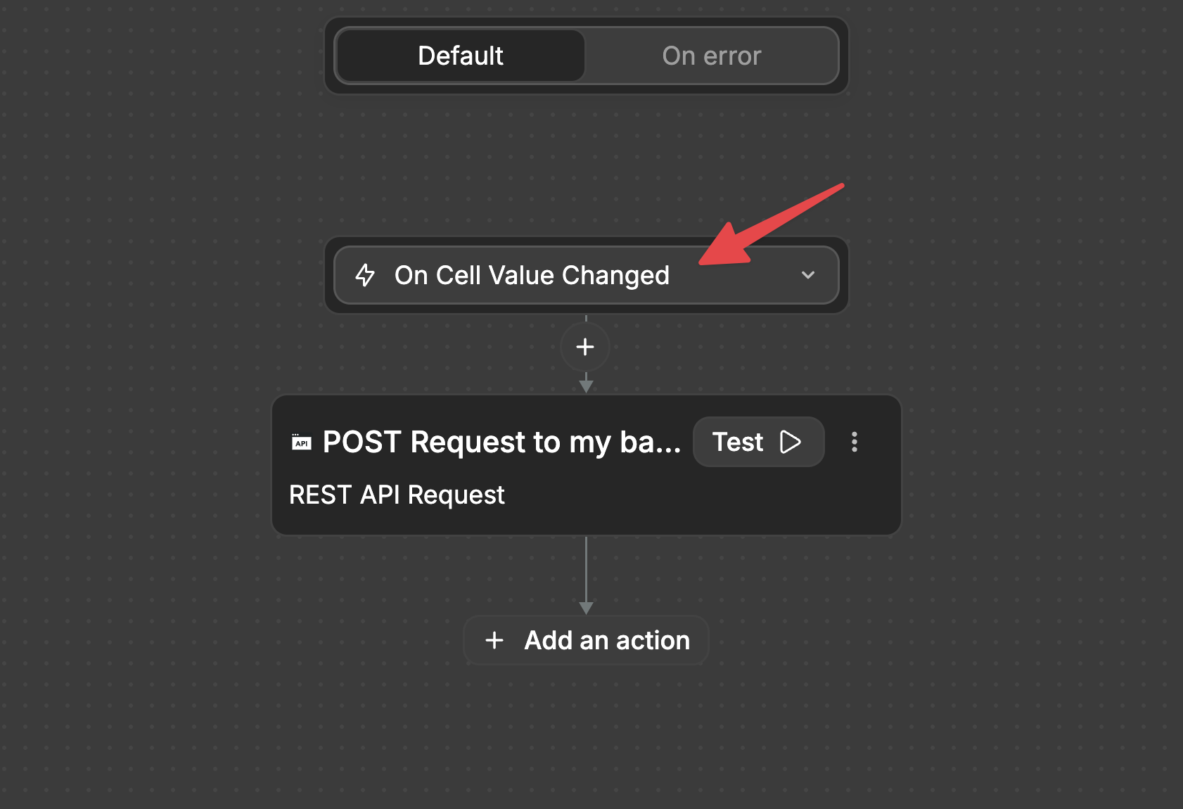
- In your workflow, you'll have access to:
- The old value
- The new value
- Which column was changed
- The complete row data
Row selection
Allow users to select one or multiple rows:
- In the datagrid properties, set
Row Selectionto eitherSingleorMultiple - Users can now select rows by clicking on them
- Create workflows for selection events:
On Row Selected: Triggered when a row is selectedOn Row Deselected: Triggered when a row is deselected
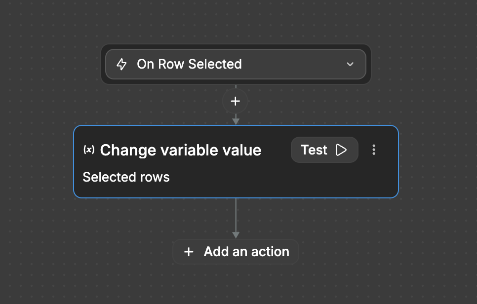
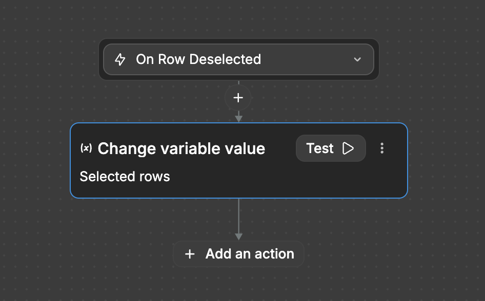
- Access all currently selected rows via the exposed
selectedRowsvariable OR access only the data of the row that triggered theOn Row SelectedorOn Row Deselectedevent
Advanced row selection options
For more control over row selection behavior, you can configure these additional options:
- Enable Click Selection: When enabled, users can select rows by clicking anywhere on the row.
- When enabled with multiple selection mode, users can:
- Shift+Click: Select a range of rows between the currently selected row and the clicked row
- Ctrl+Click (Windows/Linux) or Cmd+Click (Mac): Add or remove individual rows from the current selection
- When enabled with multiple selection mode, users can:
- Disable Checkboxes: Hides the selection checkboxes from the grid.
- Select All Behavior: Controls what happens when the "Select All" checkbox in the header is clicked:
All: Selects all rows in the grid, including those not currently visible due to filtering or paginationFiltered: Only selects rows that match the current filter criteriaCurrent Page: Only selects rows visible on the current page when pagination is enabled
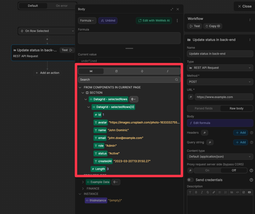
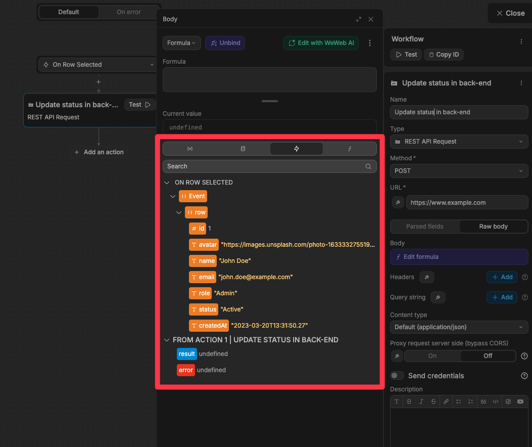
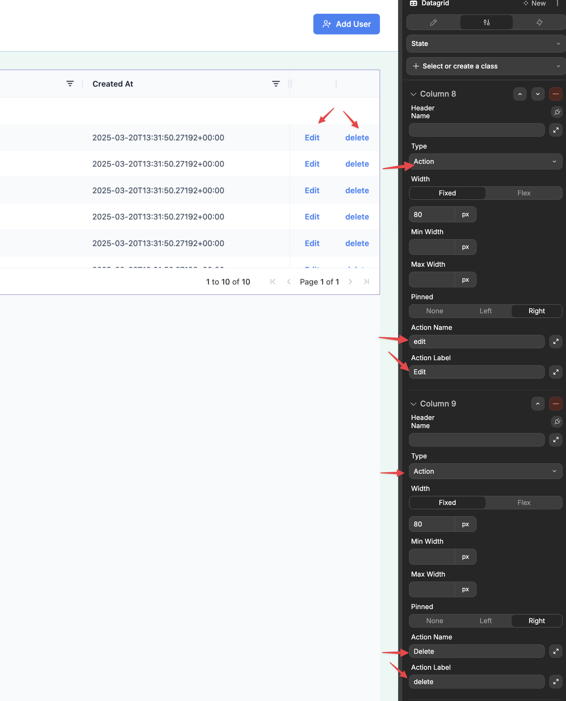
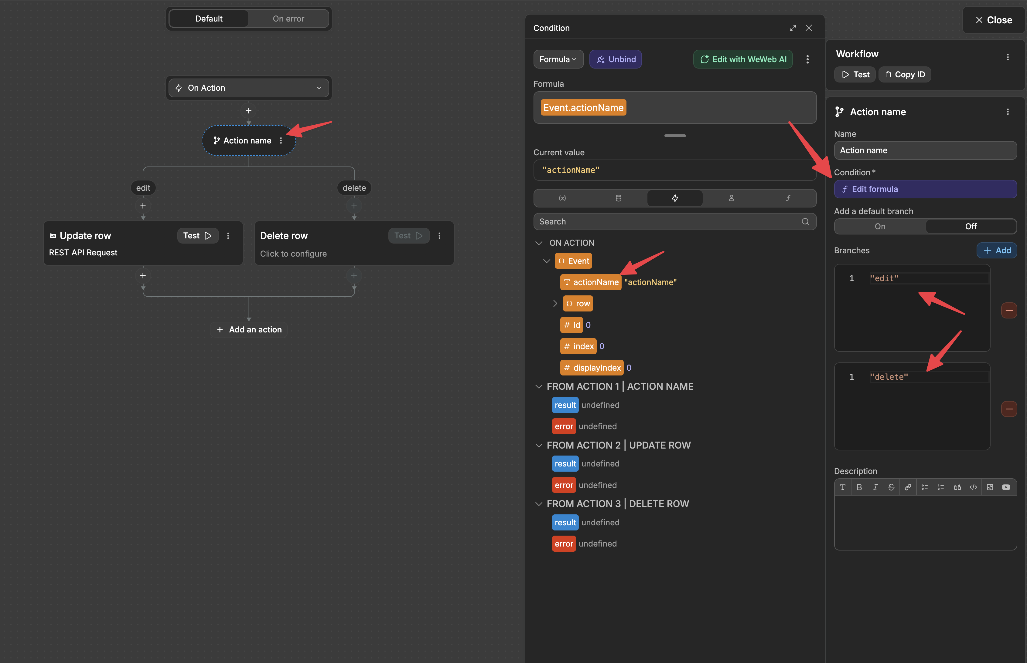
Action buttons
Add interactive buttons to each row of your datagrid:
- Add a new column with type set to
Action - Configure:
- Action Name: Identifier for the action (used in workflows)
- Action Label: Text displayed on the button
- Create a workflow on the datagrid using the
On Actiontrigger - In your workflow, you'll have access to:
- Which action was triggered
- The complete row data
Row reordering
Reorder rows by drag-and-drop:
- In the datagrid settings, toggle on
Row Reorder - A drag handle will be enabled on the first column to move rows
- Use events to react to reordering:
On Row Drag Start: Fires when a drag startsOn Row Dragged: Fires when a drag ends; includes the updatedrowsorder and thetargetIndex
WARNING
Row reordering is not compatible with pagination. Disable Pagination to reorder rows.
Column moving
Allow users to reorder columns:
- In the datagrid settings, toggle on
Movable Columns - Users can drag headers to change the column order
- The
On Column Movedevent is emitted when a move finishes, including the newcolumnsOrder
Custom cell content
Create completely custom cell rendering:
- Add a column with type set to
Custom - A Dropzone appears on the canvas where you can add any UI elements
- Drag and drop elements into this dropzone to create your custom cell appearance
- These elements will have access to the cell value and the entire row data
Managing large datasets
The datagrid provides two approaches to handling large amounts of data:
Virtual scrolling (default)
By default, the datagrid uses virtual scrolling to efficiently render large datasets:
- Only visible rows are rendered in the DOM
- Rows load dynamically as users scroll
- Provides smooth performance even with thousands of rows
Pagination
To enable pagination in the Datagrid, you can toggle on Pagination in the datagrid properties:
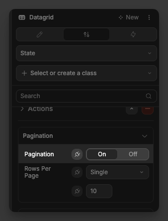
The datagrid will now display page navigation controls, and users can browse through pages of data.
Pagination Types
There are two pagination types:
- Single
Single: use a fixed Rows Per Page number
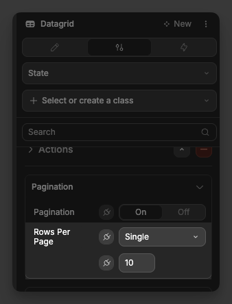
- Multiple
Multiple: provide a Rows Per Page Options array (e.g., [10, 20, 50, 100]) to show a selector in the grid 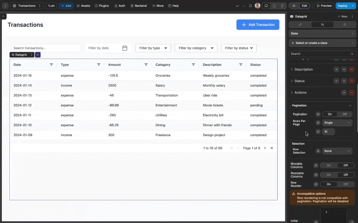
Example use cases
- Product Catalog: Display products with images, pricing, inventory status, and edit/view actions
- User Management: List users with filterable columns for roles, status, and registration dates
- Financial Dashboard: Present financial data with custom number formatting and row selection
- Task Tracker: Show tasks with status indicators, due dates, and action buttons
- Data Analysis: Enable sorting and filtering for data exploration with visual indicators
Forking
While the DataGrid component offers extensive built-in customization options, there may be cases where you need functionality beyond what's natively available. In these situations, you can fork the component and modify it to meet your specific requirements.
If you are unsure how to fork an element, you can learn more in the dedicated documentation.
Forking example: custom pagination styling
One reason to fork the DataGrid would be to create styling properties not available in the standard component. For example, you might want to be able to change the styling of the pagination.
To do so, you could fork the datagrid, then edit with AI and pass in the following prompt:
I want to edit this forked datagrid so that I can change the styling of the paginationThe AI will then add new styling properties to control the appearance of different aspects of the pagination: 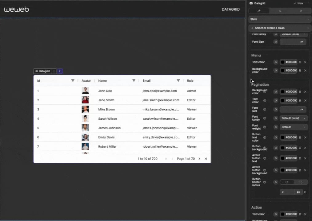
Properties reference
Settings properties
| Property | Options/Type | Description |
|---|---|---|
| Data | Table view/Array | The data to display in the grid |
| Unique Row ID | Formula | What to use for the Unique ID of each row |
| Columns | Array | Configuration for each column in the grid |
| Row Selection | None, Single, Multiple | Determines how users can select rows |
| Enable Click Selection | Boolean | When enabled, allows row selection by clicking anywhere on the row |
| Disable Checkboxes | Boolean | Hides selection checkboxes when using row selection |
| Select All Behavior | All, Filtered, Current Page | Controls what happens when the "Select All" checkbox is clicked |
| Pagination | Boolean | Enable/disable pagination for large datasets |
| Rows Per Page | Single/Multiple | Choose a fixed size (Single) or show a selector (Multiple) |
| Rows Per Page (Single) | Number | Number of rows per page when Rows Per Page is Single |
| Rows Per Page Options (Multiple) | Array | Page size options when Rows Per Page is Multiple (e.g., [10, 20, 50, 100]) |
| Movable Columns | Boolean | Allow users to reorder columns via drag and drop |
| Resizable Columns | Boolean | Allow users to adjust column widths |
| Initial Filters | Object | Define filters to be applied when the grid first loads |
| Initial Sort | Array | Define sorting to be applied when the grid first loads |
| Initial Columns Order | Array | Define initial column ordering by ID |
| Row Reorder | Boolean | Allow row reordering by drag and drop (incompatible with pagination) |
| Language | English, French, Spanish, German, Portuguese, Custom | Set the language for built-in grid text |
| Locale Texts | Object | Customize all text strings when using Custom language |
Column properties
Each column in the datagrid can be configured with these properties:
| Property | Options/Type | Description |
|---|---|---|
| Header Name | Text | The title displayed at the top of the column |
| Type | Text, Number, Boolean, Date, Image, Action, Custom | The type of data in this column |
| Key | Text | The field name from your data source |
| Width | Fixed/Flex | Column width approach (fixed pixel width or flexible) |
| Min Width | Pixels | Minimum column width |
| Max Width | Pixels | Maximum column width |
| Filter | Boolean | Enable/disable filtering for this column |
| Sortable | Boolean | Enable/disable sorting for this column |
| Pinned | None, Left, Right | Pin the column to the edge of the grid |
| Editable | Boolean | Allow users to edit cell values |
| Custom Display | Boolean | Use a formula to format how values are displayed |
| Hidden | Boolean | Hide the column from view while retaining it in the grid definition |
| Header Alignment | Left, Center, Right | Controls alignment of the column header label |
| Column Alignment | Left, Center, Right | Controls horizontal alignment for cell content in the whole column |
Image column properties
| Property | Description |
|---|---|
| Image Width | Width of the displayed image |
| Image Height | Height of the displayed image |
Action column properties
| Property | Description |
|---|---|
| Action Name | Identifier for the action (used in workflows) |
| Action Label | Text displayed on the button |
Styling properties
General
| Property | Description |
|---|---|
| Height Mode | Choose between Fixed height or Auto (based on content) |
| Grid Height | Set the height of the grid when using Fixed mode |
| Text Color | Global text color for the grid |
| Border Color | Color of grid borders |
Header
| Property | Description |
|---|---|
| Background Color | Set the background color of the header row |
| Text Color | Set the color of header text |
| Font Weight | Control the boldness of header text |
| Font Size | Adjust the size of header text |
| Font Family | Choose the font for header text |
| Header Height Mode | Choose between Fixed height or Auto (adapts to content) |
| Header Height | Set the header row height in pixels when using Fixed mode |
Row
| Property | Description |
|---|---|
| Background Color | Set the background color of rows |
| Alternate Color | Set the color for alternating rows |
| Hover Color | Set the background color when hovering over rows |
| Vertical Padding Scale | Adjust vertical spacing in rows (0-5) |
| Selected Background Color | Highlight color for selected rows |
Column
| Property | Description |
|---|---|
| Hover Highlight | Toggle column highlight effect on hover |
| Hover Color | Set the color for the column hover effect |
Cell
| Property | Description |
|---|---|
| Text Color | Set the color of cell text |
| Font Family | Choose the font for cell text |
| Font Size | Adjust the size of cell text |
| Cell Alignment Mode | Choose Same as column (default) or Custom to override alignment |
| Column Alignment (Custom) | When mode is Custom, set Left/Center/Right or bind a value |
Menu
| Property | Description |
|---|---|
| Text Color | Set the color of text in filter menus |
| Background Color | Set the background color of filter menus |
Selection
| Property | Description |
|---|---|
| Selected Background Color | Set the background color for selected rows |
| Selection Checkboxes Color | Set the color for selection checkboxes and radio toggles in the filter dropdown |
| Focus Shadow | Set the shadow effect for focused inputs (e.g. checkboxes, filter inputs etc) |
| Checkbox Unchecked Border Color | Set the border color for unchecked checkboxes |
Action
| Property | Description |
|---|---|
| Text Color | Set the color of action button text |
| Background Color | Set the background color of action buttons |
| Padding | Add space around action button text |
| Border | Set the border style for action buttons |
| Border Radius | Control the roundness of action button corners |
| Font Settings | Configure typography for action buttons |
Event triggers
The datagrid component provides events you can use to trigger workflows:
| Event | Description | Payload |
|---|---|---|
| On Action | Triggered when an action button is clicked | { actionName, row, id, index, displayIndex } |
| On Cell Value Changed | Triggered after a cell value is edited | { oldValue, newValue, columnId, row } |
| On Row Selected | Triggered when a row is selected | { row } |
| On Row Deselected | Triggered when a row is deselected | { row } |
| On Filter Changed | Triggered when filters are changed | Filter model object |
| On Sort Changed | Triggered when sort order is changed | Sort model array |
| On Row Clicked | Triggered when a row is clicked | { row, id, index, displayIndex } |
| On Row Drag Start | Triggered when a row drag begins | { row, id } |
| On Row Dragged | Triggered when a row is dropped | { row, id, targetIndex, rows } |
| On Column Moved | Triggered after a column is moved by the user | { columnId, toIndex, columnsOrder } |
Example event payloads
On Action
javascript
{
  actionName: "edit",
  row: {
    id: 42,
    name: "Product A",
    price: 29.99,
    inStock: true
  },
  id: 42,
  index: 5,
  displayIndex: 2
}
On Cell Value Changed
javascript
{
  oldValue: 29.99,
  newValue: 24.99,
  columnId: "price",
  row: {
    id: 42,
    name: "Product A",
    price: 24.99,
    inStock: true
  }
}
On Row Selected / On Row Deselected
javascript
{
  row: {
    id: 42,
    name: "Product A",
    price: 29.99,
    inStock: true
  }
}
On Filter Changed
javascript
{
  "Category": {
    "type": "equals",
    "filter": "Electronics"
  },
  "Price": {
    "type": "greaterThan",
    "filter": 100
  }
}
On Sort Changed
javascript
[
  { colId: "Category", sort: "asc" },
  { colId: "Price", sort: "desc" }
]
On Row Clicked
javascript
{
  row: {
    id: 42,
    name: "Product A",
    price: 29.99,
    inStock: true
  },
  id: 42,
  index: 5,
  displayIndex: 2
}
On Row Drag Start
javascript
{
  row: {
    id: 42,
    name: "Product A",
    price: 29.99,
    inStock: true
  },
  id: 42
}
On Row Dragged
javascript
{
  row: {
    id: 42,
    name: "Product A",
    price: 29.99,
    inStock: true
  },
  id: 42,
  targetIndex: 1,
  rows: [ /* full array of rows in new order */ ]
}
On Column Moved
javascript
{
  columnId: "price",
  toIndex: 1,
  columnsOrder: ["id", "name", "price", "inStock"]
}
Exposed variables
The datagrid component exposes the following variables for use in your application:
| Variable | Type | Description |
|---|---|---|
| selectedRows | Array | Array of currently selected rows |
| filters | Object | Current filter model applied to the grid |
| sort | Array | Current sort model applied to the grid |
| columnOrder | Array | Current ordered list of column IDs |
Example variable values
selectedRows
javascript
[
  {
    id: 42,
    name: "Product A",
    price: 29.99,
    inStock: true
  },
  {
    id: 43,
    name: "Product B",
    price: 49.99,
    inStock: false
  }
]
filters
javascript
{
  "Category": {
    "type": "equals",
    "filter": "Electronics"
  },
  "Price": {
    "type": "greaterThan",
    "filter": 100
  }
}
sort
javascript
[
  { colId: "Category", sort: "asc" },
  { colId: "Price", sort: "desc" }
]
columnOrder
javascript
["id", "name", "price", "inStock"]Component actions
| Action | Description | Parameters |
|---|---|---|
| Reset filters | Clears all active filters | – |
| Reset sort | Clears all active sort | – |
| Select all | Selects rows based on mode or grid behavior | mode (optional): all |
| Deselect all | Clears all row selections | – |
| Select row | Selects a specific row by ID | Row id (string) |
| Deselect row | Deselects a specific row by ID | Row id (string) |
| Force Datagrid refresh | Forces the datagrid to refresh after external data updates (use if you encounter any issues with datagrid not visually updating when bound data is updated) | – |
Frequently asked questions
How can I filter data in my datagrid?
There are two main approaches to filtering data in the datagrid:
Client-side filtering:
- Create input elements (like text fields or dropdowns) for your filter criteria
- Create a computed variable that filters your original data based on these inputs
- Bind this filtered data to your datagrid
URL-based filtering:
- Set up query parameters in your URL (e.g.,
?category=electronics&inStock=true) - Create a workflow that filters data based on these query parameters
- This approach allows users to bookmark or share filtered views
- Set up query parameters in your URL (e.g.,
For advanced filtering, you can also enable the built-in column filters:
- Select a column in the
Styletab - Toggle on the
Filterproperty for that column - Users will see filter icons in the column headers
How do I add a "Delete" button to each row?
To add a delete button for each row:
- Add a new column with type set to
Action - Configure:
- Action Name: "delete" (or any identifier you prefer)
- Action Label: "Delete" (or your preferred button text)
- Create a workflow on the datagrid using the
On Actiontrigger - In the workflow condition, check if
actionName === "delete" - Add actions to delete the row data (e.g., calling an API endpoint)
- Optionally refresh your table view after deletion
You can customize the button's appearance using the Action styling properties in the Style panel.
How can I create a "View More" modal for each row?
To implement a "View More" functionality that opens a modal with detailed information:
- Add a new column with type set to
Action - Configure:
- Action Name: "viewMore" (or any identifier you prefer)
- Action Label: "View" or "Details" (or your preferred button text)
- Create a modal that will be used for showing the detailed information
- Create a workflow on the datagrid using the
On Actiontrigger - In the workflow condition, check if
actionName === "viewMore" - In the workflow actions:
- Pass the selected row data to variables that will populate your modal
- Show the modal
- Design your modal to display the detailed information from the row
This approach allows users to see condensed information in the table and expanded details in a modal when needed, creating a cleaner user interface while still providing access to all data.
How can I make certain columns editable but others read-only?
You can control editability on a per-column basis:
- Select each column individually in the
Styletab - Toggle on
Editableonly for the columns you want users to edit - Leave the property off for read-only columns
When implementing cell editing, remember to:
- Create a workflow using the
On Cell Value Changedtrigger - Validate the edited data before saving changes
- Update your backend data store with the changes
This selective approach gives you fine-grained control over which data users can modify.
How do I implement pagination with a specific number of rows per page?
To implement pagination with custom row count:
- In the datagrid properties, toggle on
Pagination - Set the
Rows Per Pageto your desired number (e.g., 5, 10, 25) - The datagrid will automatically add pagination controls
For more advanced pagination:
- Create a dropdown to let users choose how many rows to display
- Bind the
Rows Per Pageproperty to a variable controlled by this dropdown - Add a workflow to update this variable when the user changes their preference
This gives users flexibility while maintaining organized data presentation.
Can I style alternate rows with different colors?
Yes, you can create a striped or alternating row effect:
- Go to the Style panel and find the Row section
- Set your primary
Background Colorfor standard rows - Set an
Alternate Colorfor every other row
This creates a visual distinction between adjacent rows, making your data easier to scan and read, especially for wide tables with many columns.
How can I hide columns dynamically?
You can conditionally hide columns while retaining their definition in the grid:
- Select a column in the
Styletab - Toggle on the
Hiddenproperty or bind it to a variable - When bound to a variable, you can dynamically show/hide columns based on user preferences, screen size, or other conditions
This is particularly useful for:
- Creating responsive layouts that show fewer columns on mobile devices
- Letting users customize which columns they want to see
- Building role-based views where certain columns are only visible to specific user roles
To implement user-controlled column visibility:
- Create toggle buttons for each column
- Bind each column's
Hiddenproperty to a variable controlled by these toggles - Save user preferences to localStorage or your backend for persistence
How can I change the language of the datagrid?
The datagrid supports multiple languages out of the box and allows custom translations:
- In the datagrid settings, locate the
Languageproperty - Select from predefined options: English, French, Spanish, German, or Portuguese
- All built-in text (filters, pagination controls, empty state messages, etc.) will update to the selected language
For custom language support:
- Select
Customfrom the Language dropdown - In the
Locale Textsproperty, provide a JSON object with your translations - You can customize as many or as few text strings as needed
- Any keys not specified will fall back to English
This is useful for:
- Supporting languages not included in the predefined list
- Customizing specific text to match your application's terminology
- Creating more user-friendly or domain-specific labels and messages
My datagrid doesn’t refresh after updating its bound data
If you update the data bound to the datagrid and the datagrid doesn’t visually update, use the datagrid action Force Datagrid refresh right after you update the bound variable.
Steps:
- Update the variable/table view bound to the datagrid.
- In the same workflow, use the
Execute component workflow, and run theForce Datagrid refreshaction of the datagrid.