Appearance
Breadcrumb New
The Breadcrumb element provides a navigation aid that helps users understand their current location within your WeWeb application's hierarchy. It displays the path from the homepage to the current page, allowing users to easily navigate back to previous levels.
Getting Started
Using AI
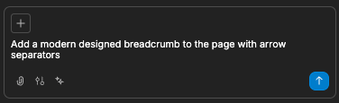
The quickest way to set up breadcrumbs is by using AI:
- Ask AI to add the breadcrumb. Make sure to specify:
- Specific styling requirements
- Settings you would like applied
- The AI will then create your styled breadcrumb:

- Continue refining your breadcrumbs by asking AI for specific modifications:
- "Make the breadcrumbs use the dot style"
- "Change the active item color to match my primary color"
- "Add home icon to the first breadcrumb item"
- "Make the breadcrumb collapses on mobile"
Manual Setup
- Add the Breadcrumb element to your page from the
Add Element - Choose between manual or automatic mode:
- Manual: Define each breadcrumb item yourself
- Auto: Generate breadcrumbs automatically based on the URL path
- Customize the appearance through the
Styletab - Configure navigation links for each item (in manual mode)
Modes
The Breadcrumb element offers two operating modes:
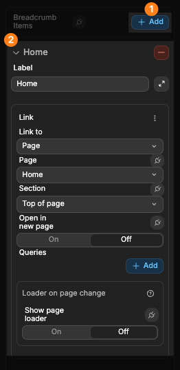
Manual Mode
In this mode, you define each breadcrumb item explicitly:
- Set the
Modeproperty toManual - Add breadcrumb items using the
Addbutton - For each item, specify:
- Label: The text to display
- Link: Where the item should navigate to when clicked
- Icon (optional): An icon to display before the item label
Auto Mode
WARNING
If you are unfamiliar with URL paths and/or have not worked with them in WeWeb before, it is highly recommended to read our dedicated documentation on URL paths to get familiar with them before experimenting with the breadcrumb element.
In this mode, breadcrumbs are automatically generated based on the URL path:
- Set the
Modeproperty toAuto - The breadcrumb will parse the current URL path and create breadcrumb items for each segment
- It will automatically try to match path segments to pages in your site
The auto mode is convenient for sites with a clear hierarchical structure reflected in the URL paths.
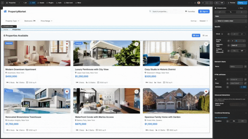
In the example below, the page is called 'Favorites', its URL path is favorites, and we have the Mode of the breadcrumb set to Auto:
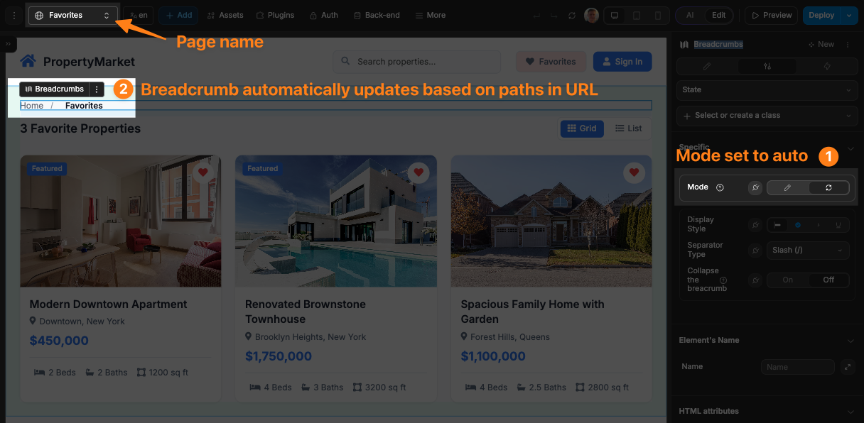
Then, when we navigate to this page from a different page, the breadcrumb auto-populates and includes Favorites due to its path being in the URL:
TIP
The Home link will always exist in the breadcrumb when using the Auto mode. If you do not wish to include this link, then you must use the Manual mode and configure the items in the breadcrumb.
Using Nested Paths
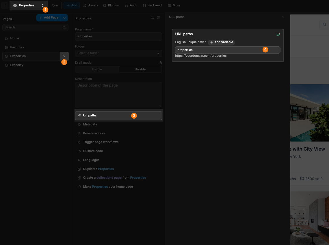
To create pages with nested paths, you can customise the URL path of your pages to have the needed paths. You can edit the URL of your page from the settings of the page:
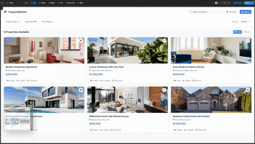
For example, if you had a page called Properties, and when clicking on a property, you wanted to direct the user to the respective Property page with the breadcrumb showing Home > Properties > {{Name Of Property}}, then you would do the following:
- Have a page with the path
properties
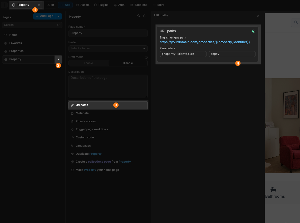
- Have a page with the base path
propertiesand a dynamic path added. This dynamic path would be populated with whatever is the identifier of the specific property we will show.
Because we have properties at the start of the path, the breadcrumb will automatically detect the distinct paths and show them accordingly
- Now, we can create a workflow on our property card to navigate to the
Propertiespage with the appropriate path of the property:
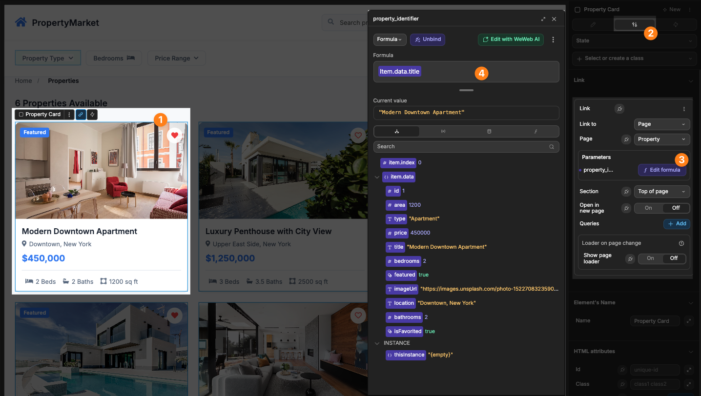
The breadcrumb on the page would then appear correctly and link to the appropriate pages:

DANGER
For the breadcrumb element to automatically create links to the correct page, the paths used when creating nested paths must be identical to that of the page you wish for it to link to.
In the example above, the URL set for the Property page was properties/{{property_identifier|}}. The breadcrumb is able to automatically link to the Properties page because the URL path of the Properties page is properties. In this example, if there was no page in our project with the path properties, the breadcrumb would have displayed Home > Properties > {{Name Of Property}}, but the Properties text would have had no link added.
WARNING
When working with pages that have dynamic paths, the paths may not always appear correctly in the editor, however, they will operate as expected in the published project. To learn more about working with dynamic paths, please refer to our dedicated documentation.:
Display Styles
The Breadcrumb element offers four distinct visual styles:
Standard
The default style with simple text links and separators:

Pills
Each breadcrumb item appears in a rounded pill shape:

Arrows
Items are connected with arrow shapes, creating a directional flow:
Underline
Text links with underlines for a classic navigation appearance:

Separator Options
When using styles other than Arrows, you can choose from various separator types:
- Slash (/): Traditional breadcrumb separator
- Arrow (›): Directional indicator
- Chevron (>): Alternative directional indicator
- Dot (•): Subtle divider between items
- Pipe (|): Vertical separator
- Dash (-): Simple horizontal divider
- Custom: Define your own custom separator text or HTML/SVG
Responsive Behavior
For improved display on smaller screens, you can enable breadcrumb collapsing:
- Toggle on the
Collapse the breadcrumbproperty - When enabled, only the first and last items will be shown, with an ellipsis (...) in between
- This maintains context while saving space on mobile devices

Binding to Dynamic Data
When working with dynamic data, you can bind the breadcrumb items to a table view:
- Set the
Modeproperty toManual - Bind the
Breadcrumb Itemsproperty to your table view or variable - Use the property path settings to map your data:
- Label Property: Specify which field contains the display text
- URL Property: Specify which field contains the link object
- Icon Property: Specify which field contains the icon name
If you wanted your breadcrumb to be Home > Properties > Property Detail, like so:

Then you would bind a list of data with the following structure:
javascript
[
    {
        "label": "Home",
        "link": {
                  type:'internal',
                  pageId:'5ae1841b-d6cd-48fc-9d2c-a98dca906f26', //Home page UID
                  sectionId: null,
                  targetBlank: false
                },
        "icon": "lucide/house"
    },
     {
        "label": "Properties",
        "link": {
                  type:'internal',
                  pageId:'03r0a4e7-9154-4cee-82b6-ffd512fccfbf', //Properties page UID
                  sectionId: null,
                  targetBlank: false
                },
        "icon": null
    },
    {
        "label": "Property Detail",
        "link": {
                  type:'internal',
                  pageId:'b9l6110b-d29a-423d-a179-ddaf2e0c5d7d', //Property Detail page UID
                  sectionId: null,
                  targetBlank: false
                },
        "icon": null
    }
]
BINDING LINKS
To learn more about how you can correctly create the needed link object when binding the breadcrumb's items, please refer to our dedicated documentation.
Best Practices
Do:
- Use breadcrumbs for sites with a clear hierarchical structure
- Keep breadcrumb labels concise (1-2 words is ideal)
- Place breadcrumbs near the top of the page below the main navigation
- Make sure the current page is visually distinct (but not clickable)
- Use icons sparingly to avoid cluttering the breadcrumb trail
Don't:
- Use breadcrumbs as the primary navigation method
- Include too many levels in a single breadcrumb trail
- Use inconsistent separators across your site
- Hide important navigation options in breadcrumbs
Example Use Cases
- E-commerce: Category > Subcategory > Product navigation
- Documentation: Section > Topic > Article hierarchy
- Portfolio: Work > Project > Case Study structure
- Content Management: Section > Category > Article organization
- User Accounts: Dashboard > Settings > Profile navigation
Forking
While the breadcrumb element offers extensive built-in customization options, there may be cases where you need functionality beyond what's natively available. In these situations, you can fork the element and modify it to meet your specific requirements.
If you are unsure how to fork an element, you can learn more in the dedicated documentation.
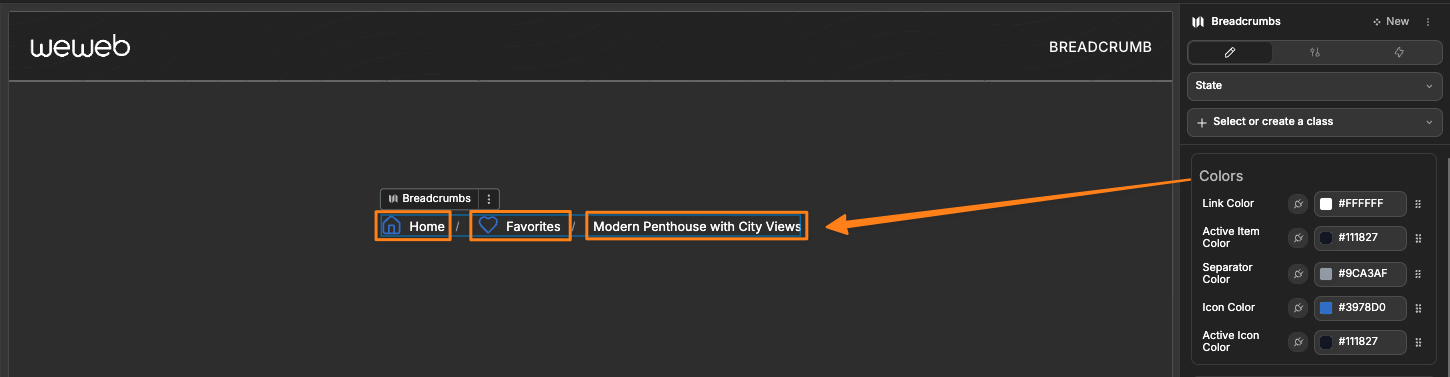
Forking Example: Custom Link Hovor Color
One reason to fork the breadcrumb would be to create styling properties not available in the standard element. For example, you might want to be able to change the styling of the pagination.
To do so, you could fork the breadcrumb, then edit with AI and pass in the following prompt:
I want to edit this forked breadcrumb so that I can change the color of the links on hovorThe AI will then add new styling properties to control the hovor color of the text links:
Properties Reference
Settings
General
| Property | Options | Description |
|---|---|---|
| Mode | Manual, Auto | Controls how breadcrumbs are generated |
| Separator Type | Slash, Arrow, Chevron, Dot, Pipe, Dash, Custom | Type of separator between items (not used with Arrows style) |
| Custom Separator | Text | Custom separator text or HTML when using the Custom separator type |
| Collapse the breadcrumb | Boolean | Whether to collapse the breadcrumbs on small screens |
| Breadcrumb Items | Array | Items to display when using Manual mode |
| ↳ Item Label | Text | Display text for each breadcrumb item |
| ↳ Item Link | Link | Navigation target when item is clicked |
| ↳ Item Icon | Icon | Optional icon to display before the item label |
Styling
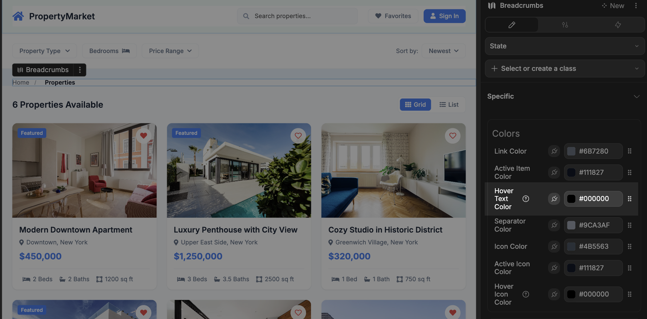
Colors
Customize the colors of all breadcrumb elements:
| Property | Description |
|---|---|
| Link Color | Color of regular breadcrumb links |
| Active Item Color | Color of the current/active breadcrumb item |
| Separator Color | Color of separators between items |
| Icon Color | Color of icons in regular breadcrumb items |
| Active Icon Color | Color of icons in the current/active item |
| Pill Background Color | Background of pill-style items (Pills style only) |
| Active Pill Background Color | Background of active pill-style item (Pills style only) |
| Arrow Color | Color of arrow shapes (Arrows style only) |
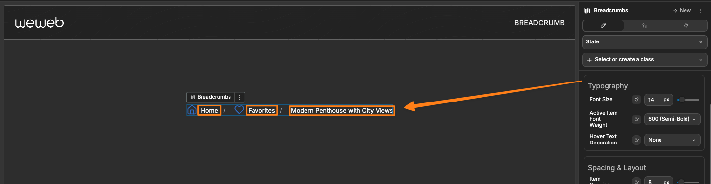
Typography
Control the text appearance:
| Property | Description |
|---|---|
| Font Size | Size of breadcrumb text |
| Active Item Font Weight | Font weight for the current/active item |
| Hover Text Decoration | Text decoration applied on hover |
Spacing & Layout
Fine-tune the spacing between each item:
| Property | Description |
|---|---|
| Item Spacing | Gap between breadcrumb items |
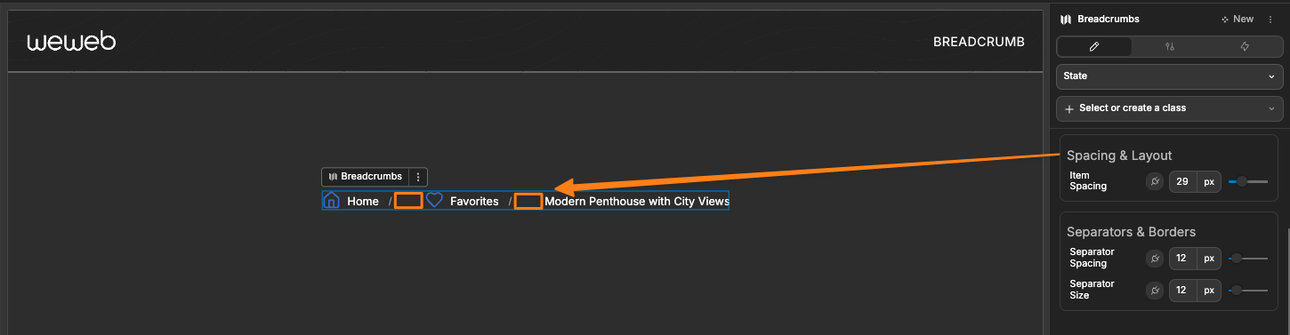
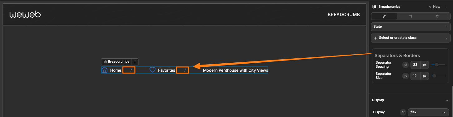
Separators & Borders
Adjust the spacing between the text and the separator, and the size of the separator:
| Property | Description |
|---|---|
| Separator Spacing | Margin around separators |
| Separator Size | Size of separator characters or icons |