Appearance
States
A state is a combination of CSS properties that you want to trigger at a specific moment on an element.
It can be classic CSS states like hover, or user-generated ones that you define while building your app.

How to create a State
To create a new CSS state, select the element, open the state selector at the top of the Style tab (it shows Default by default), and click Add state:

How to configure a state
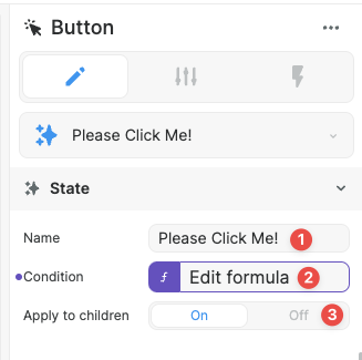
When the state is created, open its tab and set 3 options:
- The state's name
- The condition under which the state should trigger, which is bindable and should return
truewhen the state is to be active,falseotherwise - Whether to apply the state to the element's children or not
When the state is selected at the top of the style sidebar, any CSS changes that you'll do will be only applied for this state.
Example: here the color and display will only change when the state Please Click Me! is activated:

How to apply a State to an element's children
When Apply to children is set to On, you can use the state on any of the element's children by simply using it. It should be called {{Parent}}:{{State name}}.
For example, if a button has a state called Please Click Me!, an icon inside this button can use the same state which would be called Button:Please Click Me!:

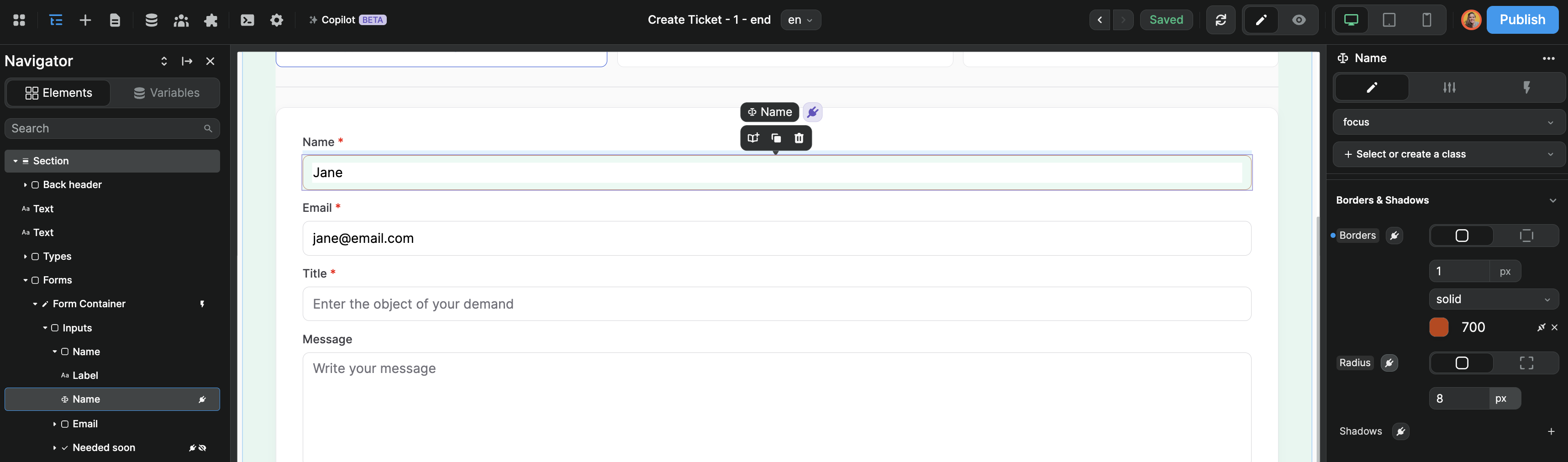
Focus state
The button and input elements recognize the focus state if you add it as a custom state on the element.
In the example below, we have a focus state on an input that changes the border color when a user navigates to the input: