Appearance
Component events
A component event is a message that tells other parts of your application when something specific happens within a component.
When building a component, you can trigger events that can then be used outside the component.
Let's say, for example, that we have a component called 'Login Form' that is displayed in 2 different parts of our application:
- On a dedicated login page
- In a login modal, accessed when the user clicks on a button in the navbar
In this example, the 'Login Form' is used to pass the user's input details to our back-end and log the user in.
When the user logs in, we will need someway of knowing from which part of the application they have used our 'Login Form' component, as:
- If they have come from the login page - we need to change the page and direct them to the appropriate screen.
- If they have come from the login modal - we need to close the modal.
We could approach this in 2 different ways:
- Include the logic inside the component with a property, or
- Handle the logic outside the component with an event.
Why trigger an event
With option 1, we would have a component property that says if the component is used on a dedicated page or in a modal.
Then, in our component's login workflow, we could add a branch that defines what to do depending on the property value.
Althought this works, it would introduce a large amount of manual work as we would need to add a branch to the workflow everytime we wanted to add new funtionality. As we introduce more and more functionality in the future, it could become impractial to manage all the branches.
We need more flexibility, so using option 2 makes more sense. To do so:
- First, in the component workflow, we trigger an event after the login action is successful
- Then, outside the component, we are able to react to this event.
Create a component event
In the example below, we created a component event called On login success in our login form component:
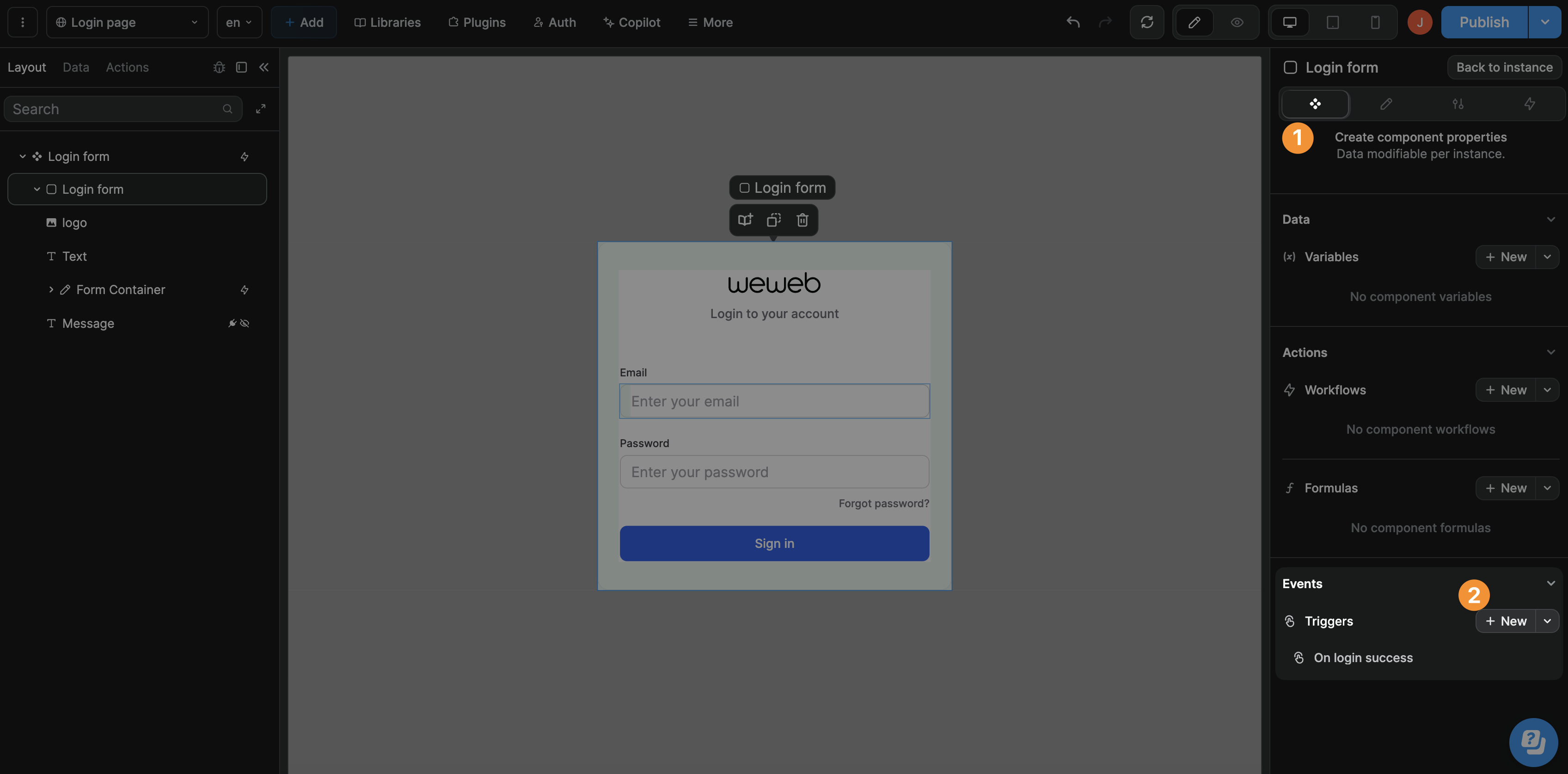
Emit a component event
We created a login workflow on submit of the form and triggered the On login success event after our login action:
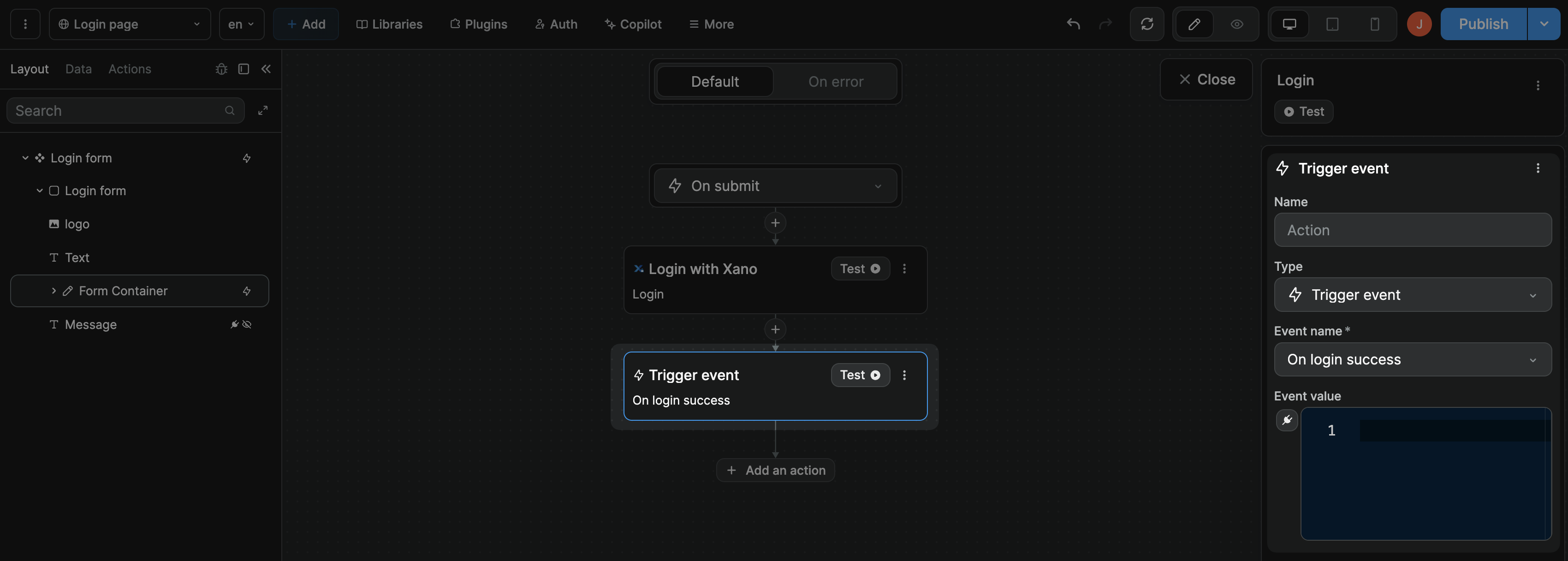
As a result, when an instance of the component emits that event, we can react to it with a workflow that is triggered by the On login success event.
TIP
You can type in or bind a specific event value if you want.
If you don't pass a value in the event, the event will fire but the event value will be null.
React to a component event
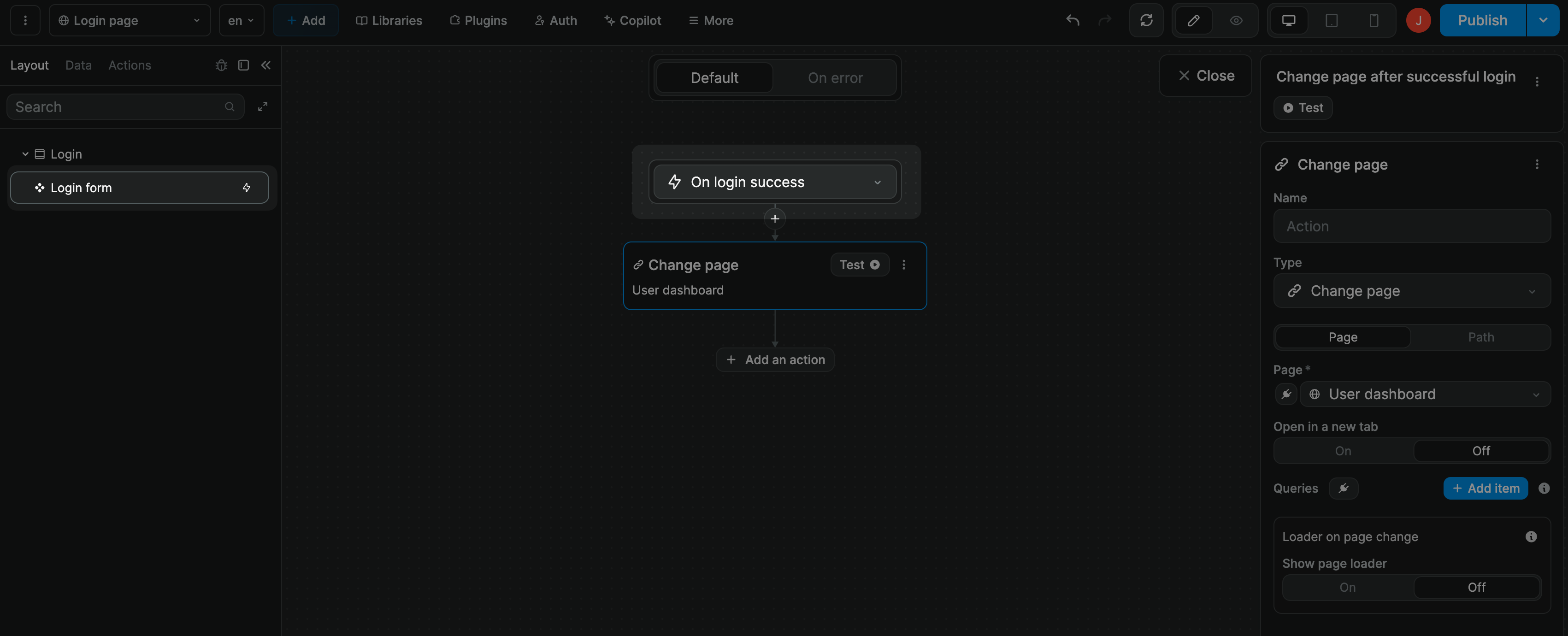
In the example below, on the instance of our component inside a modal, we choose to close the modal when the On login success event is emitted by the component:

We could follow the same logic to change page when the component is on a dedicated login page:
Event data and schema
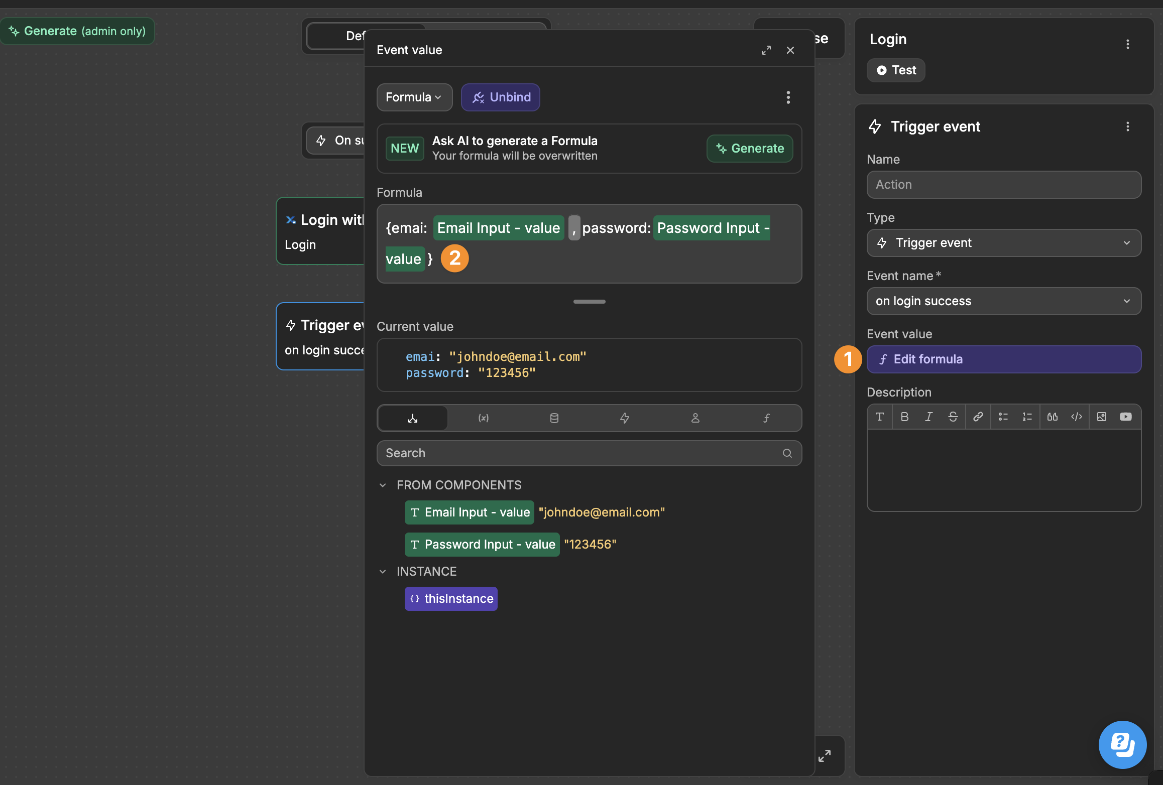
When your component triggers an event (like a successful login), you might want to pass along user information. This is done in the Event data section of your workflow.
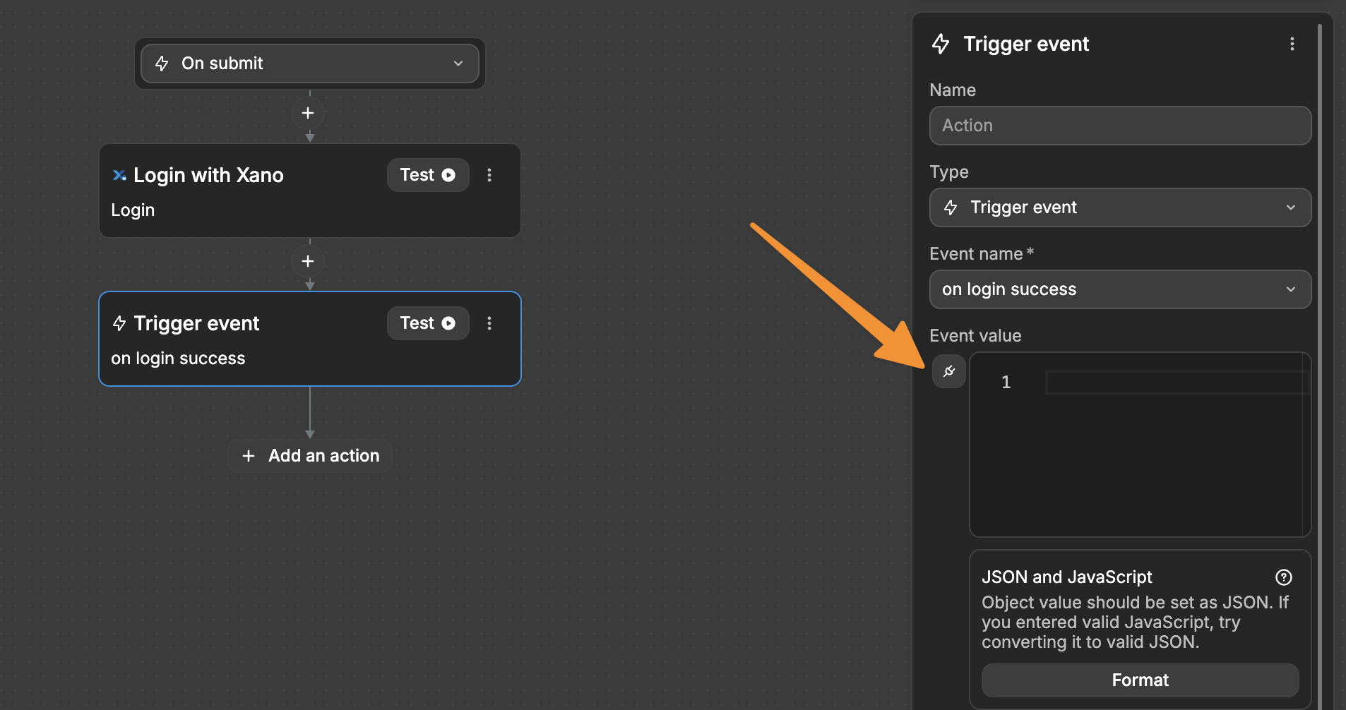
You can bind the data you want to pass with the event. For example, user information from your login form:
- Email address
- Username
- Any other relevant data
WARNING
We used a password field in this example for demonstration only. In real applications, never pass plain text passwords through events. Events might be logged and viewed, making them unsuitable for sensitive data. Instead, handle password submission through secure API calls and only pass non-sensitive information through events.
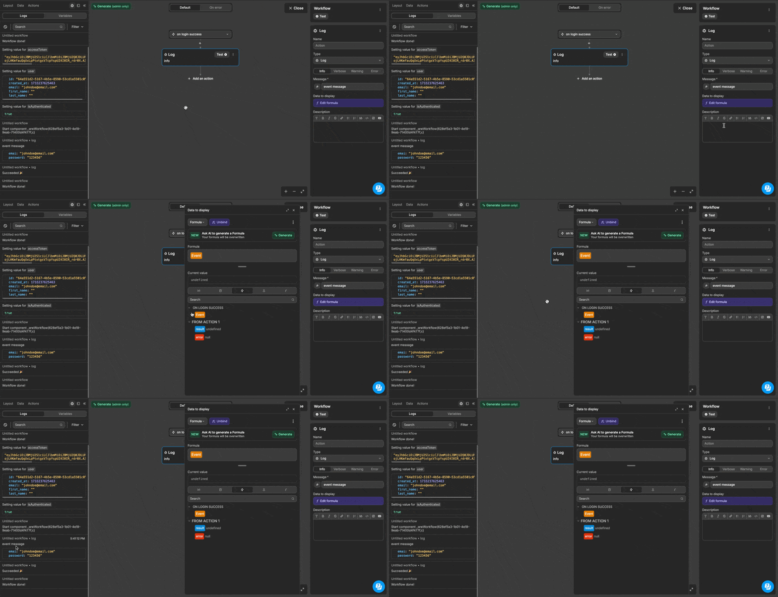
When you test your component:
- The binding UI for the
Eventobject appears empty at first - You won't see the actual data until the event triggers
- You can view the triggered event data in the Logs tab
Understanding Event schema
To help others understand what data your event will provide:
- Go to your component's event settings
- Add an Event schema with example data like:
json
{
  "email": "mockemail@email.com",
  "password": "mockpassword"
}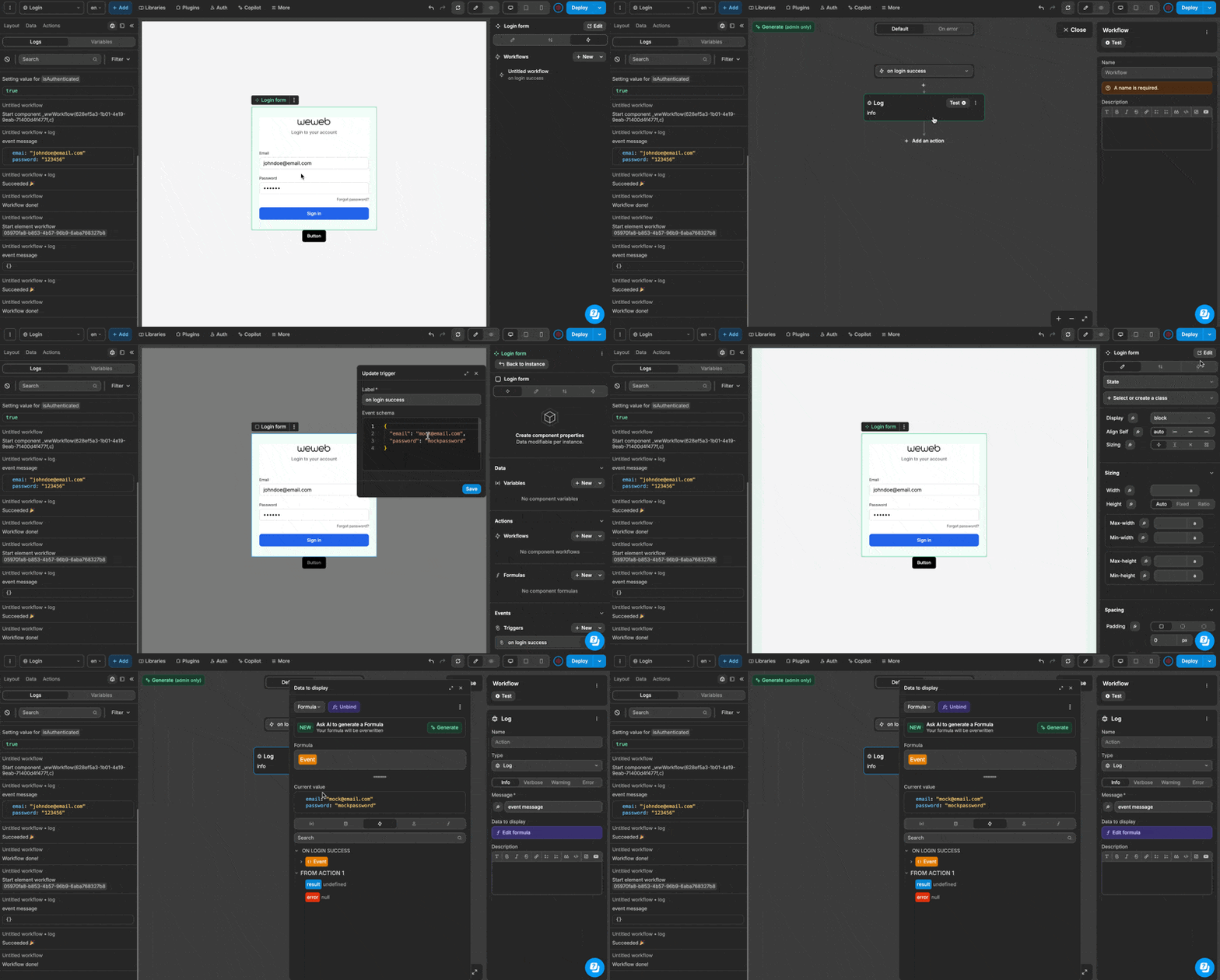
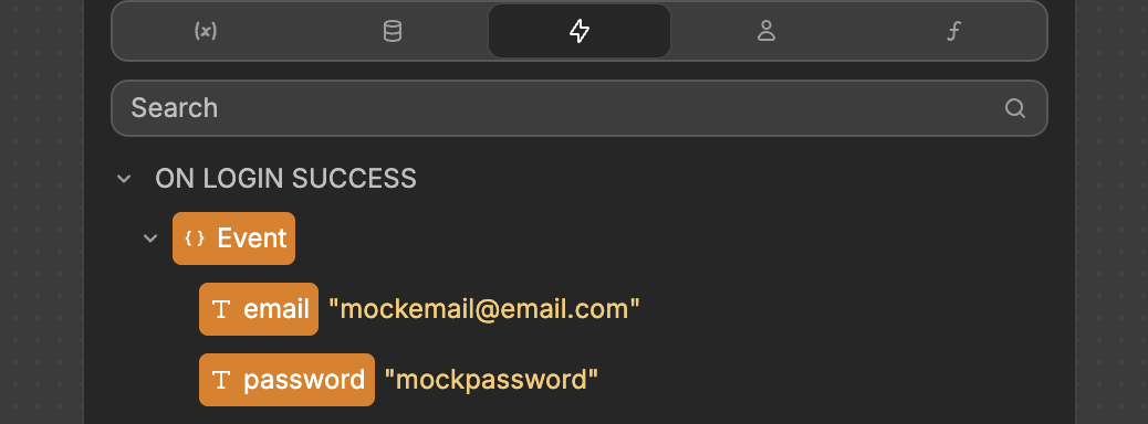
After adding the schema above, the binding UI now shows what data to expect, and others can see exactly what information will be available. This eliminates any guesswork about what event data will be accessible. The schema serves as clear documentation, making it easier for everyone to understand and work with your component's events.
TIP
Event schema is optional but recommended as it helps others understand how to use your component's events.

