Appearance
Donut Progress Bar
Incorporate a donut progress bar into your web application to visually represent the completion status of a task or process in a circular format.

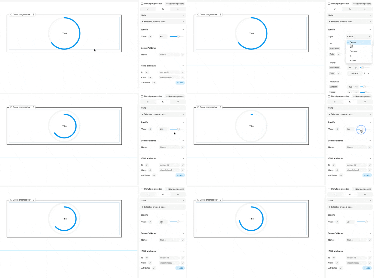
Customize the donut progress bar using the following properties:
Visual Settings:
- Style: Select from several display presets:
- Center: The progress is displayed in the center of the donut.
- Out: The progress is shown outside the donut's circumference.
- Out over: The progress extends over the outer edge of the donut.
- In: The progress is displayed inside the donut's circumference.
- In over: The progress extends over the inner edge of the donut.
- Fill:
- Thickness: Adjust the thickness of the filled portion.
- Color: Choose the color for the filled section.
- Empty:
- Thickness: Set the thickness of the empty portion.
- Color: Define the color for the empty section.
- Animation:
- Duration: Specify the animation duration in milliseconds.
- Delay: Set the delay before the animation starts, in milliseconds.
Within the settings tab, you can set the progress value, which is represented as a simple integer.
The donut progress bar is especially beneficial when linked to the progress of another process or task, providing users with a clear visual indicator of completion.

