Appearance
Library overview
A library is a table view of reusable design assets and UI elements that helps you build applications faster while maintaining consistency. It includes typographies, colors, spacings, components, templates, and classes that can be shared across your workspace and reused across different projects. It is essentially a way for you to build your design system.
Why use libraries
Colors, spacings, and typographies allow you to build user interfaces with a consistent look-and-feel, while templates and components help you build faster.
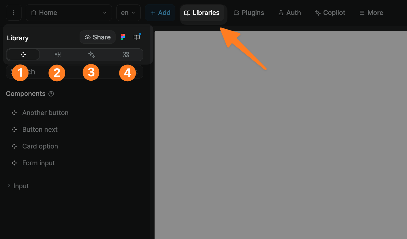
To access the library of your project:
- Click on the
Assetstab in theInterfacesection - Open the
Librarypanel
You will now see the library of your project:
If you start with a blank project, it will be empty but you can add:
- Components
- Templates
- Classes
- Spacings, colors, and typographies
TIP
Each WeWeb project has its own library, but you can:
- Share that library with the rest of your workspace, and
- Add other libraries from your workspace to a project
Learn more about sharing libraries in WeWeb.
Typographies
In the Library panel, inside the Typographies section, you can create and edit typographies so that all text elements bound to a typography are updated accordingly when a typography is updated:
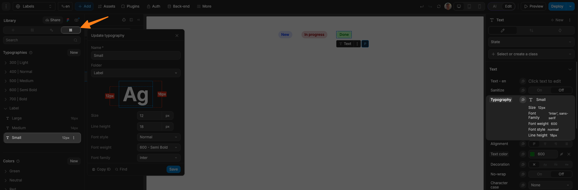
In the example below, you can see:
- In the
Typographiessection, we created theSmalltypography in theLabelfolder - We bound that typography in the
Styletab on the right side of the editor
TIP
When creating a typography, we recommend using a default font:
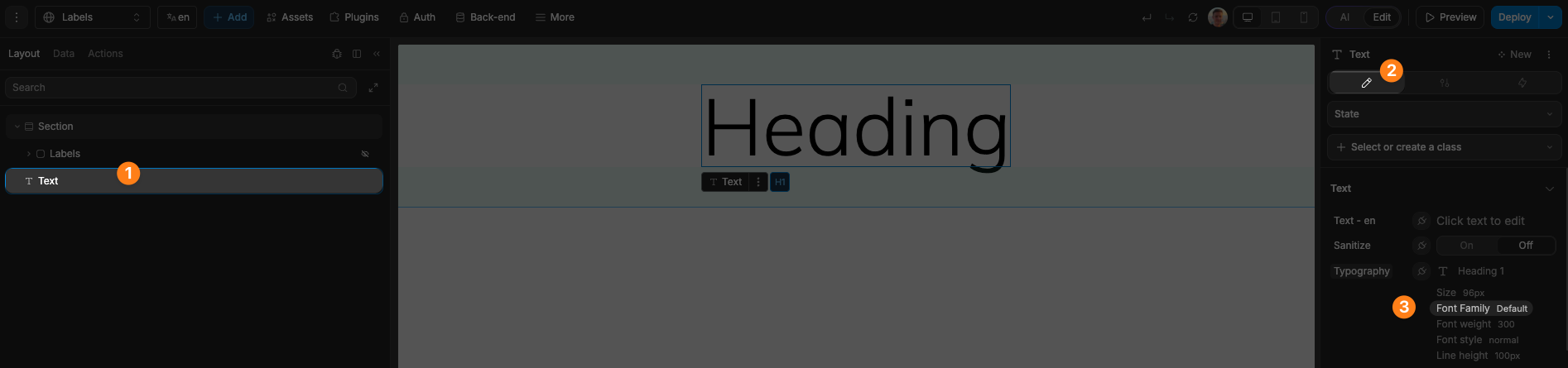
That way, users will be able to use the library without needing to add a specific font to their project.
If you associate a typography to a specific font, users will need to have that font installed in their project for the library to work as expected. Otherwise, when the project is published, the font displayed on the page will fall back to the browser's default font.
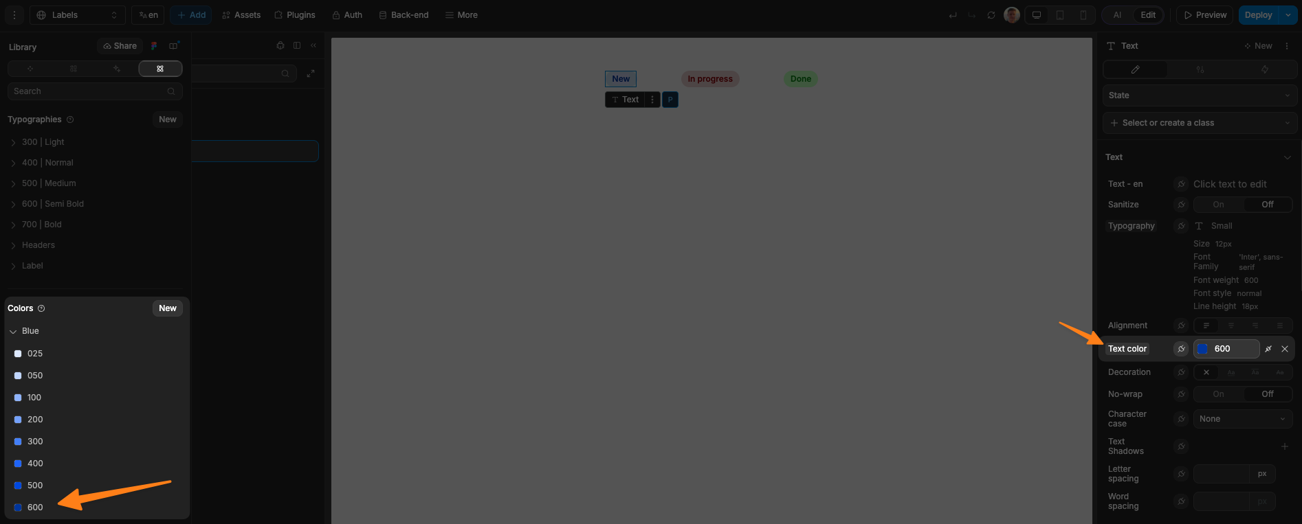
Colors
In the Library panel, inside the Colors section, you can add and organize colors that you can then bind to the CSS color property in the Style tab on the right side of the editor.
In the example below, we bound the text of one of our labels to the Blue 600 color in our project library:
You can also use library colors in formulas:
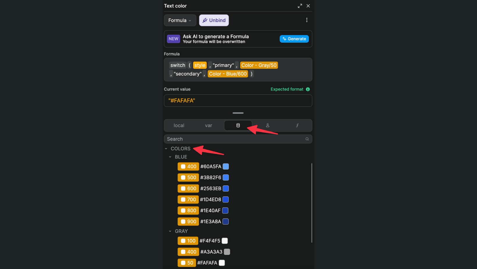
In the example above, the text color will be different if it's in a primary or secondary button.
Spacings
In the Library panel, inside the Spacings section, you can add and organize spacing styles that you can then bind to the CSS properties in the Style tab on the right side of the editor:
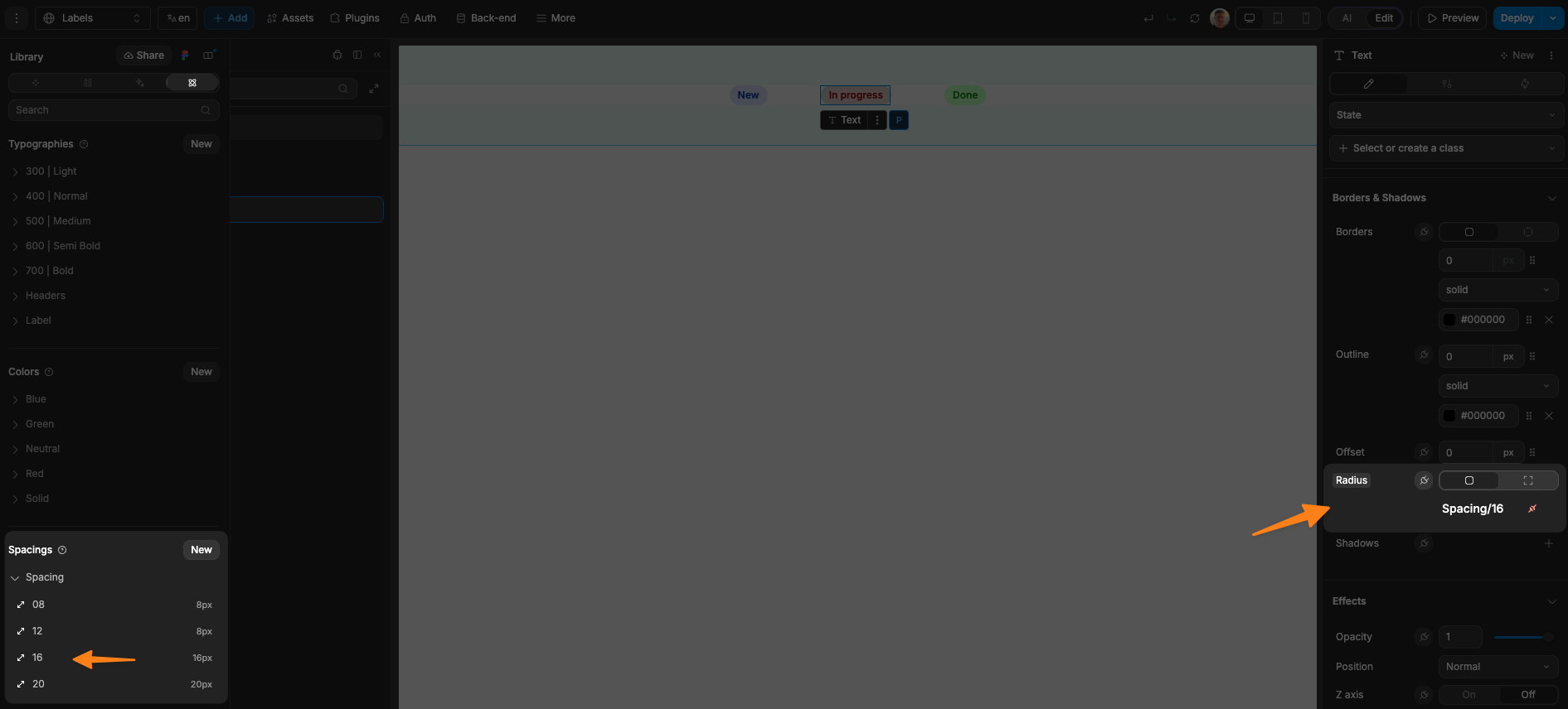
In the example above, we bound the corner radius of our label container to a 16px spacing.
Classes
In the Library panel, inside the Classes section, you will be able to see all the style classes in your library.
While you won't be able to rename or delete classes through this panel, it can be helpful to get an overview of what classes are used in an external library or to check if a class is attached to a specific library.
Learn more about working with CSS classes in WeWeb.
Components
In the Library panel, inside the Components section, you will find reusable components that you can use to build a UI that has a consistent look-and-feel, without having to build the same functionalities multiple times.
Learn more about WeWeb components.
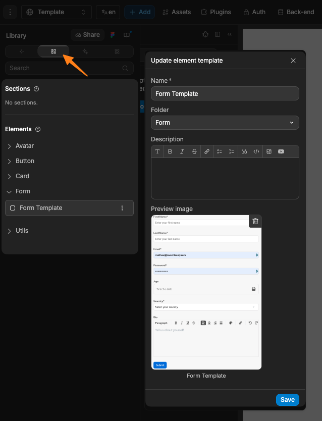
Templates
In the Library panel, inside the Templates section, you will find section and element templates that you can use as UI building blocks to design your apps faster:
How to add a template to a library
To save an element or section as a template:
- Select the element or section on the page
- Click on the three dots (•••) menu in the top right corner
- Click
Save to assets - Name your template and save
How to add a template to a page
Once you have saved templates to your project library, you will be able to drag-and-drop them onto the page.
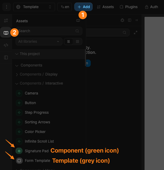
To view available templates and components:
- Click the
Add Elementicon in theInterfaceleft sidebar - Open
UI Kitsand select the library you want to use - Browse templates and components from that library
- Drag and drop the item onto your page
TIP
Elements with a green icon are components.
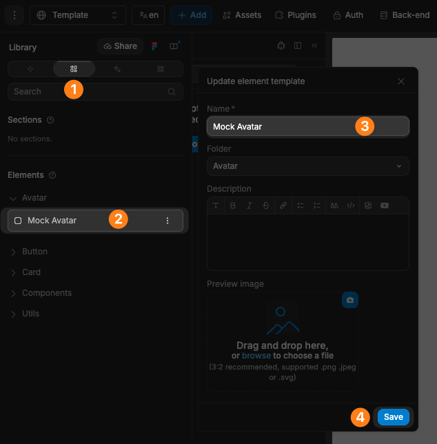
Rename library item
To rename a library item:
- Open the
Librarypanel in theAssetstab - Navigate to the section where the item is located
- Select the item you wish to rename
- Update the name and save
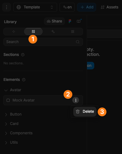
Delete library item
To delete a library item:
- Open the
Librarypanel in theAssetstab - Navigate to the section where the item is located
- Hover over the item you want to delete
- Click on the three dots (•••) next to it
- Click
Delete
Templates vs components
When you drag-and-drop a template on a page, it will create a copy of the template. If you later make a change to the template, those changes will not be reflected in the copies you created before.
When you drag-and-drop a component on a page, it will create a new instance of the component. If you make a change to the component, those changes will be reflected in all the instances of the component you created before.