Appearance
Charts
Add the plugin
To add charts to your WeWeb project, you'll need to add the Charts plugin in the Plugins > Extensions menu:
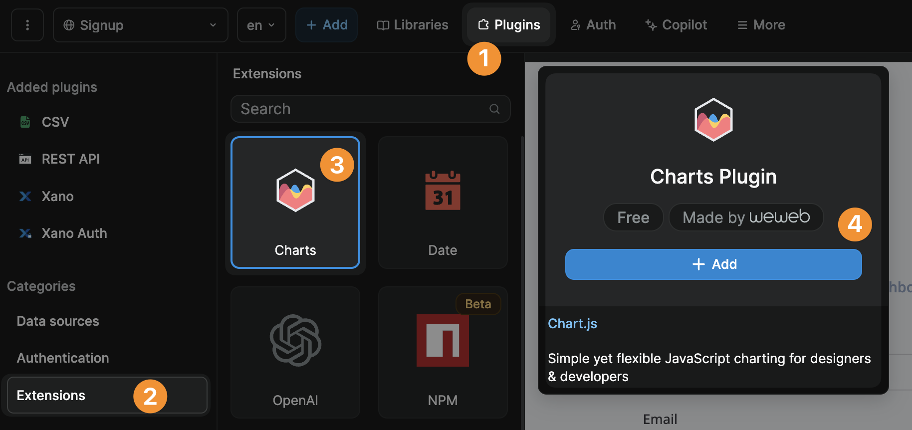
Once you have add the Charts extension to your project, you will have access to new charts elements in the Add menu:
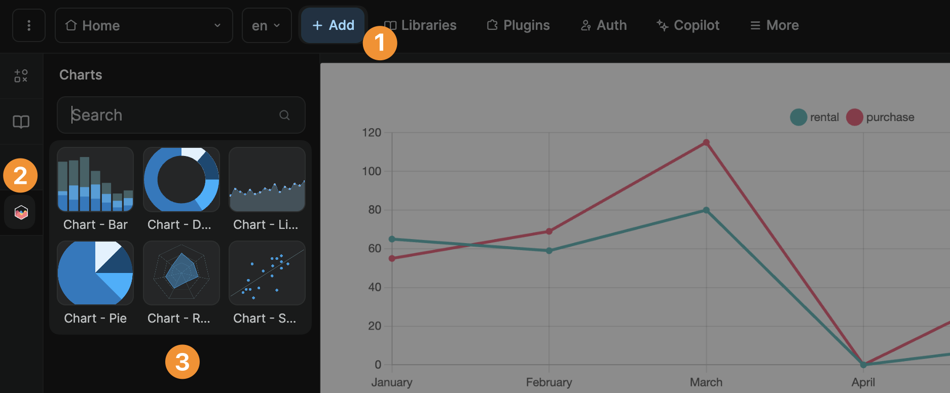
Like all WeWeb elements, you can simply drag-and-drop chart elements onto a page to start using them.
Guided vs Advanced modes
WARNING
Chart elements have two settings: Guided and Advanced.
The mode you choose will influence:
- How the data you bind needs to be structured, and
- How you customize the design of your chart.
Data structure
The Guided mode expects a single array of objects with all the data you need to display in each object.
The Advanced mode allows you to bind multiple data sets that relate to each other BUT the related items need to be in the exact same order in each data set for the data to be displayed in the same order.
Knowing this, it's important that you bind the data you want to display in the correct format. In order to do this, you can either:
- Ensure your backend returns in the information you want to display in a format the mode you chose will understand, or
- Use a workflow in WeWeb to transform the data returned by your backend so that it is structured in a way the mode you chose will understand.
Design
To customize the design of your chart in Guided mode, you can use the Style tab of WeWeb as you would for any other element.
To customize the design of your chart in Advanced mode, you will need to define the style of your chart in the Datasets array and Options object you bind in WeWeb.
TIP
To design a custom chart in Advanced mode, we recommend you test the labels, datasets, and options directly in the Chart.js documentation to ensure you are able to get the result you want from the library.
First, pick a chart type, for example a line chart as we did in the example below.
Then, play around with the Config and Setup in the dedicated article of the Chart.js documentation.
For more advanced configuration options, don't hesitate to explore the Charts.js documentation to learn all the ways you can label axes or style a legend for example.
Finally, once you are happy with how your chart looks in the Charts.js documentation, you can copy/paste the corresponding values in the Labels, Datasets, and Options fields in WeWeb and start building on top of data collections.
Pros & cons of each mode
The Guided mode allows you to build charts very fast, but you may run into customization limits.
The Advanced mode allows you to access all the customization options available in the Chart.js library. As a result, it can be more complex to build the chart you want, but you will never feel limited.
See the line chart and stacked bar chart examples below to get a better understanding of the differences between the Guided mode and Advanced mode of the Chart plugin.
Line chart
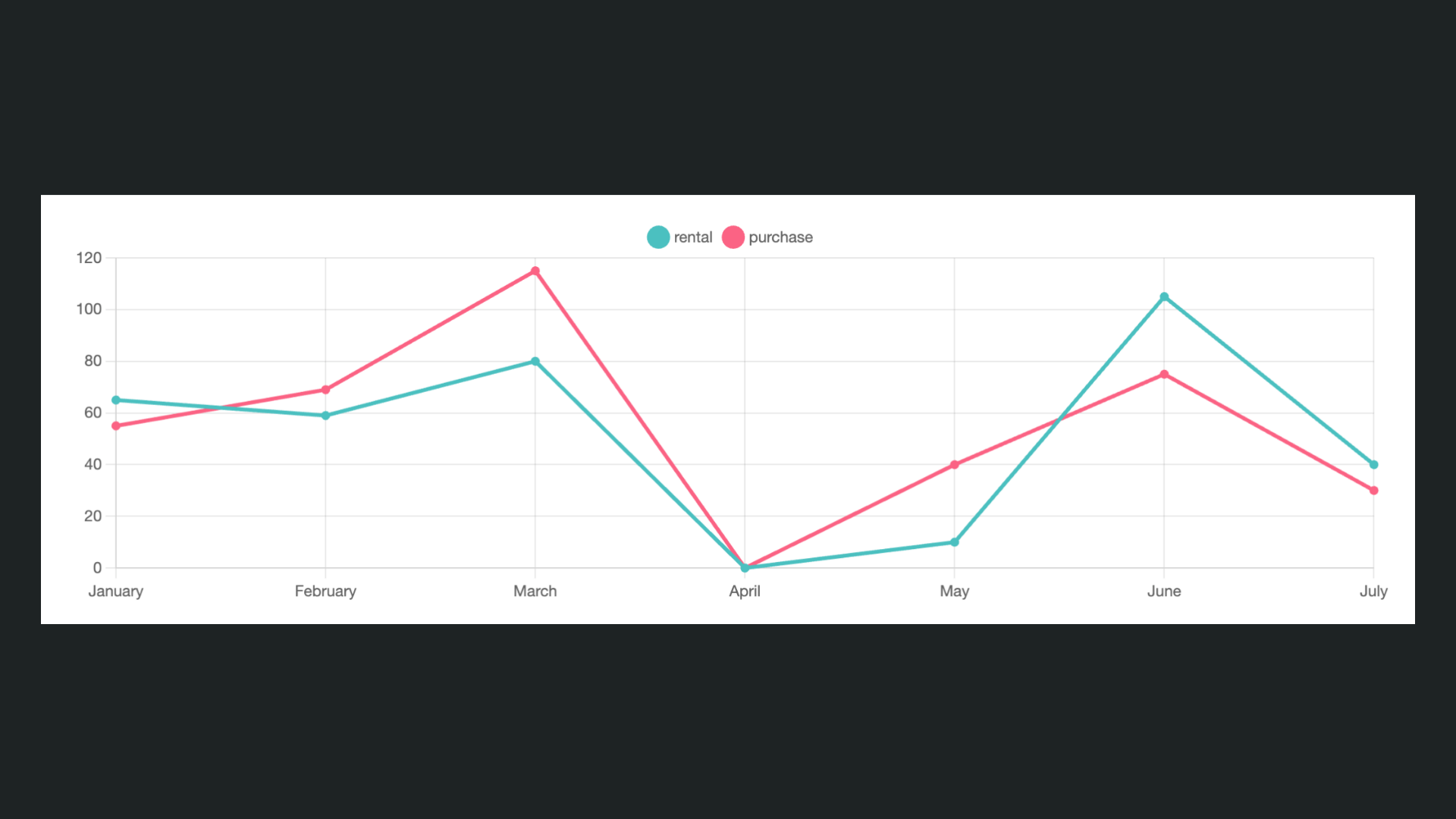
Let's look at a use case where we want to display the monthly values of 2 types of transactions (rentals and purchases):
Guided mode
In Guided mode, we would need to bind the chart to one array of objects.
Once we passed this list of items to the graph element, we could then decide what will be displayed on the Y-axis and X-axis of the graph:
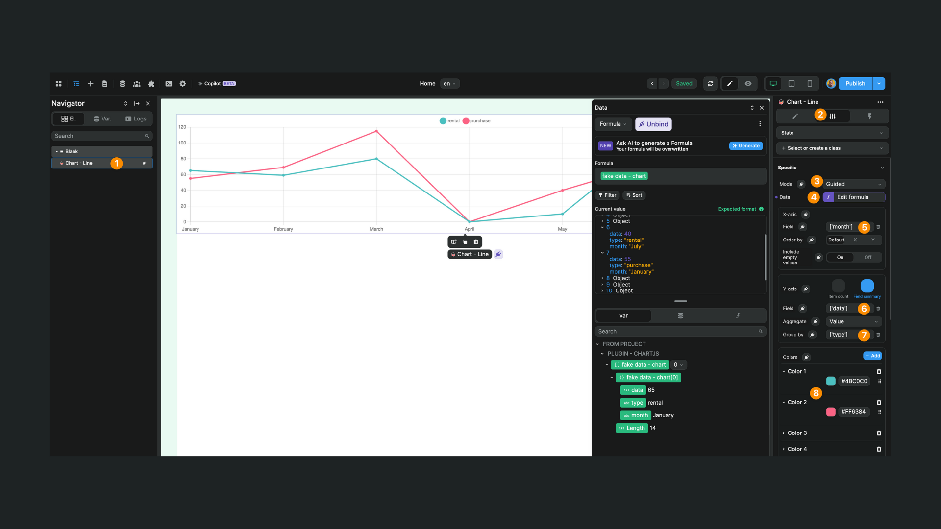
In the example above, you can see that:
- We selected a chart element
- Went to its settings
- Selected the
Guidedmode - Bound the data to an array of objects where each item contains values
- Decided to display the
monthvalues on the horizontal axis - Decided to display the
datavalues on the vertical axis - Grouped items by
typeso that the rental and purchase transactions would be displayed on two separate lines - Customized the color of each line
Advanced mode
To achieve the same result in Advanced mode, it would require more effort (the chart would be more customizable, but more on that later).
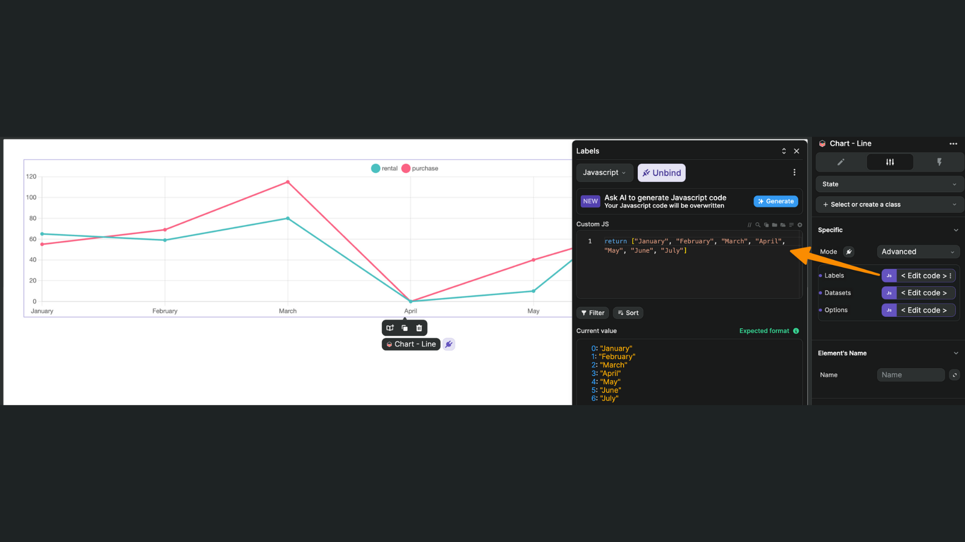
Indeed, instead of binding the chart element to a single array of objects, we would need to bind values to the three advanced settings: Labels, Datasets, and Options.
In Labels, we would pass the array of labels we want to display on our X-axis:
In Datasets, we would bind our data sets (in our example, one data set for rental transactions, and one data set for purchase transactions):
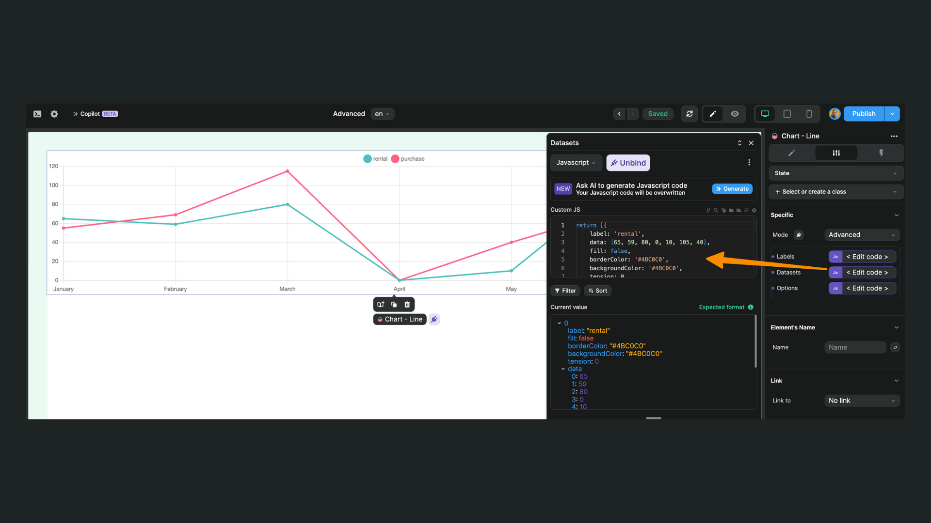
If you'd like to experiment on your side, here's the JavaScript array we are returning:
js
return [{
    label: 'rental', // name of the data set
    data: [65, 59, 80, 0, 10, 105, 40], // values of items in the rental data set
    fill: false, // if we add a color fill or not
    borderColor: '#4BC0C0', // color of the line and legend border
    backgroundColor: '#4BC0C0', // background color of the legend
    tension: 0 // how rounded the line is
  }, {
    label: 'purchase',
    data: [55, 69, 115, 0, 40, 75, 30],
    fill: false,
    borderColor: '#FF6384',
    backgroundColor: '#FF6384',
    tension: 0
  }]
TIP
Try playing around with these settings, for example changing the backgroundColor of one data set to "red" and the tension to 0.3.
Finally, in Options, we would style our graph, including the legend of the graph:
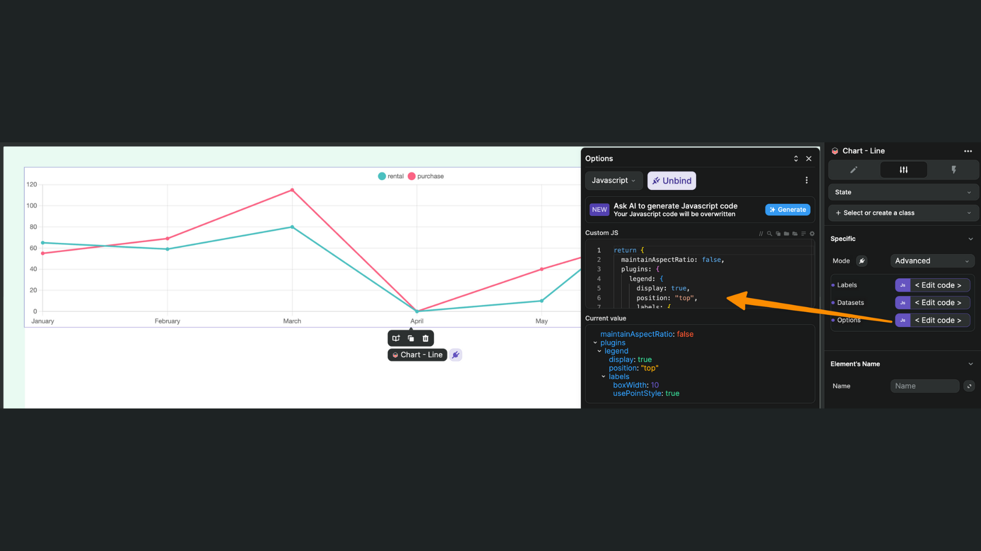
If you'd like to experiment on your side, here's the JavaScript array we are returning:
js
return {
  maintainAspectRatio: false, // to keep the height of the graph defined in the "Styles" tab
  plugins: {
    legend: {
      display: true, // change to false if you want to hide the legend
      position: "top", // choose where you want to display the legend
      maxHeight: 100%, // to set a maximum height on the chart
      labels: {
        boxWidth: 10, // change the width of the label
        usePointStyle: true // display a rounded label instead of rectangle
      },
    },
  }
}
TIP
To design a custom chart in Advanced mode, we recommend you test the labels, datasets, and options directly in the Chart.js documentation to ensure you are able to get the result you want from the library.
First, pick a chart type, for example a line chart as we did in the example above.
Then, play around with the Config and Setup in the dedicated article of the Chart.js documentation.
For more advanced configuration options, don't hesitate to explore the Charts.js documentation to learn all the ways you can label axes or style a legend for example.
Finally, once you are happy with how your chart looks in the Charts.js documentation, you can copy/paste the corresponding values in the Labels, Datasets, and Options fields in WeWeb and start building on top of data collections.
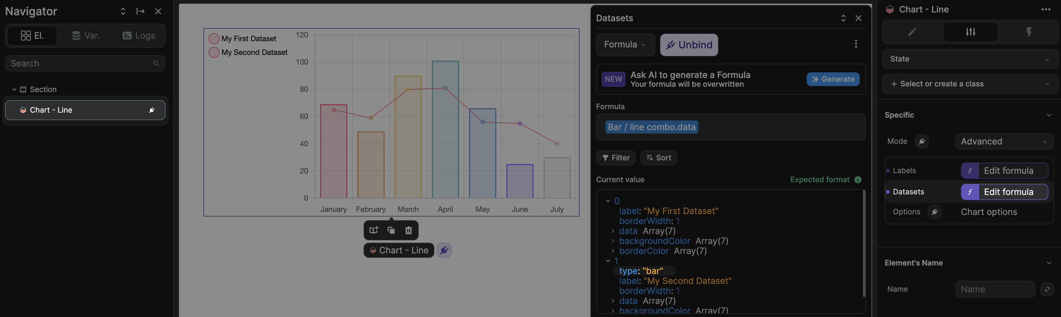
Bar / line chart combo
If you'd like to design a chart that displays bars for one dataset and a line for another, you'll need to:
- Use the
Chart - LineUI element inAdvancedmode, and - Add the
type: "bar"to the dataset you want to display as bars
Stacked bar chart
In the video below, we show you how to create the same stacked bar chart in Guided and Advanced mode:
You will learn how each mode you affects:
- How you need to structure your data,
- The time it takes to design a simple chart,
- The extent to which you can customize a design.