Appearance
Classes
When we talk about classes in the context of styling, we are specifically referring to CSS (cascading style sheets).
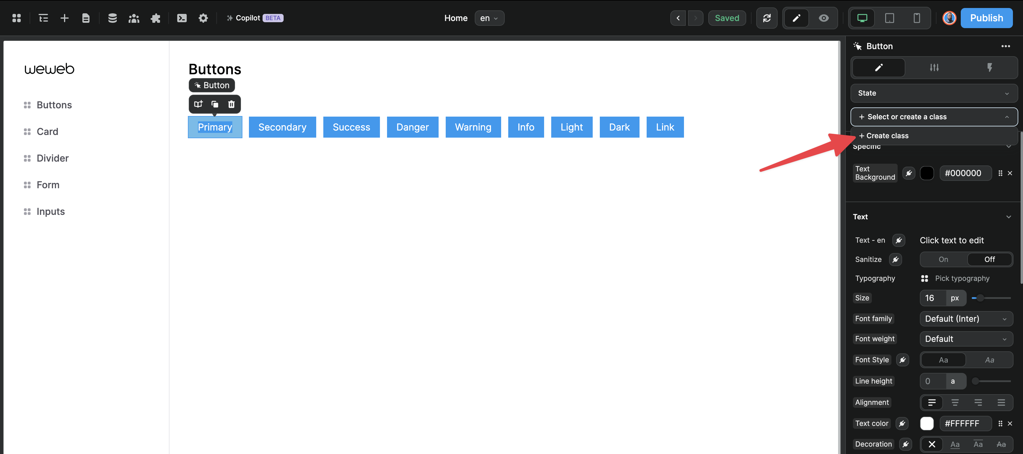
In WeWeb, if you wish to reuse a specific style, you can choose to create a class using the following option 👇
Classes & subclasses
Suppose you have a desire to integrate something like Bootstrap

A web developer would have to do something like this
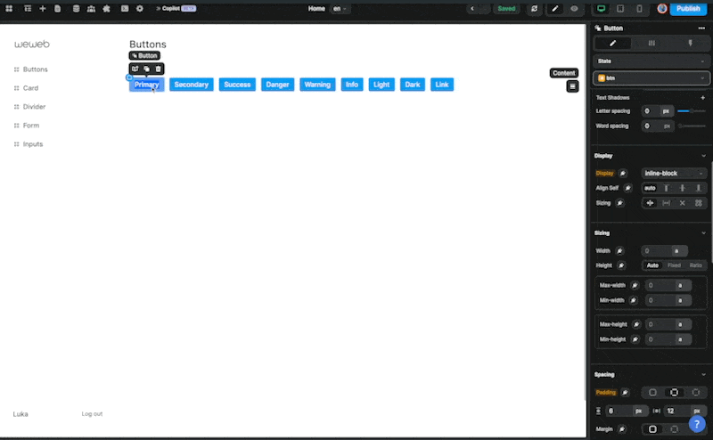
html
<button type="button" class="btn btn-primary">Primary</button>
<button type="button" class="btn btn-secondary">Secondary</button>
<button type="button" class="btn btn-success">Success</button>
<button type="button" class="btn btn-danger">Danger</button>
<button type="button" class="btn btn-warning">Warning</button>
<button type="button" class="btn btn-info">Info</button>
<button type="button" class="btn btn-light">Light</button>
<button type="button" class="btn btn-dark">Dark</button>
<button type="button" class="btn btn-link">Link</button> In this code, each button is assigned two CSS classes:
- The first class,
btn, is common to all buttons - The second class (or subclass) determines the specific style of each button (e.g. Primary, Danger, Warning)
In WeWeb, you could approach this in 2 different ways.
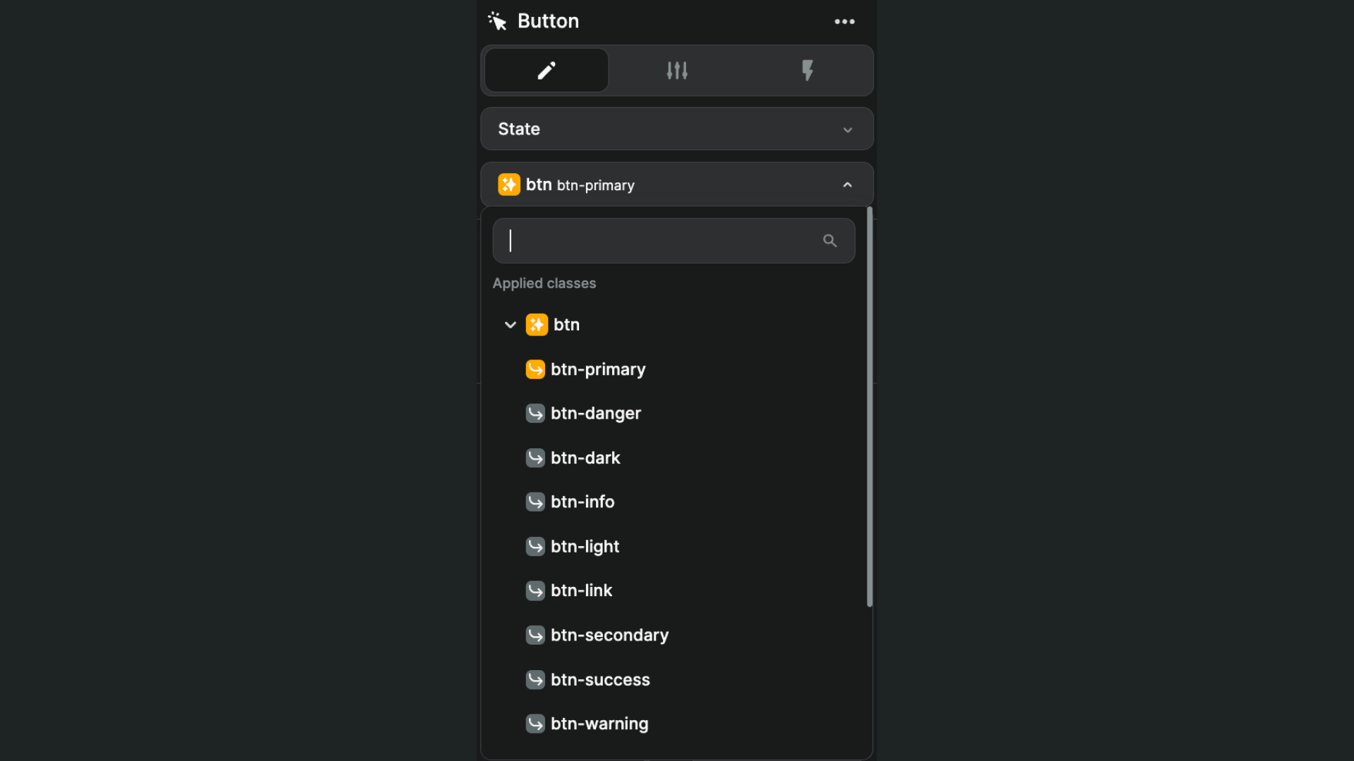
Option 1: create a default class & style subclasses
In this case, create a btn class and a btn-primary subclass attached to the btn class:
This approach has the benefit of being super simple to maintain. The downside of option 1 is that, in WeWeb, you can only have one sub-class per class.
We did this to help you build in a way that is efficient and maintainable while addressing 90% of use cases but if you find this too restrictive, please don't hesitate to reach out to us to share your specific use case.
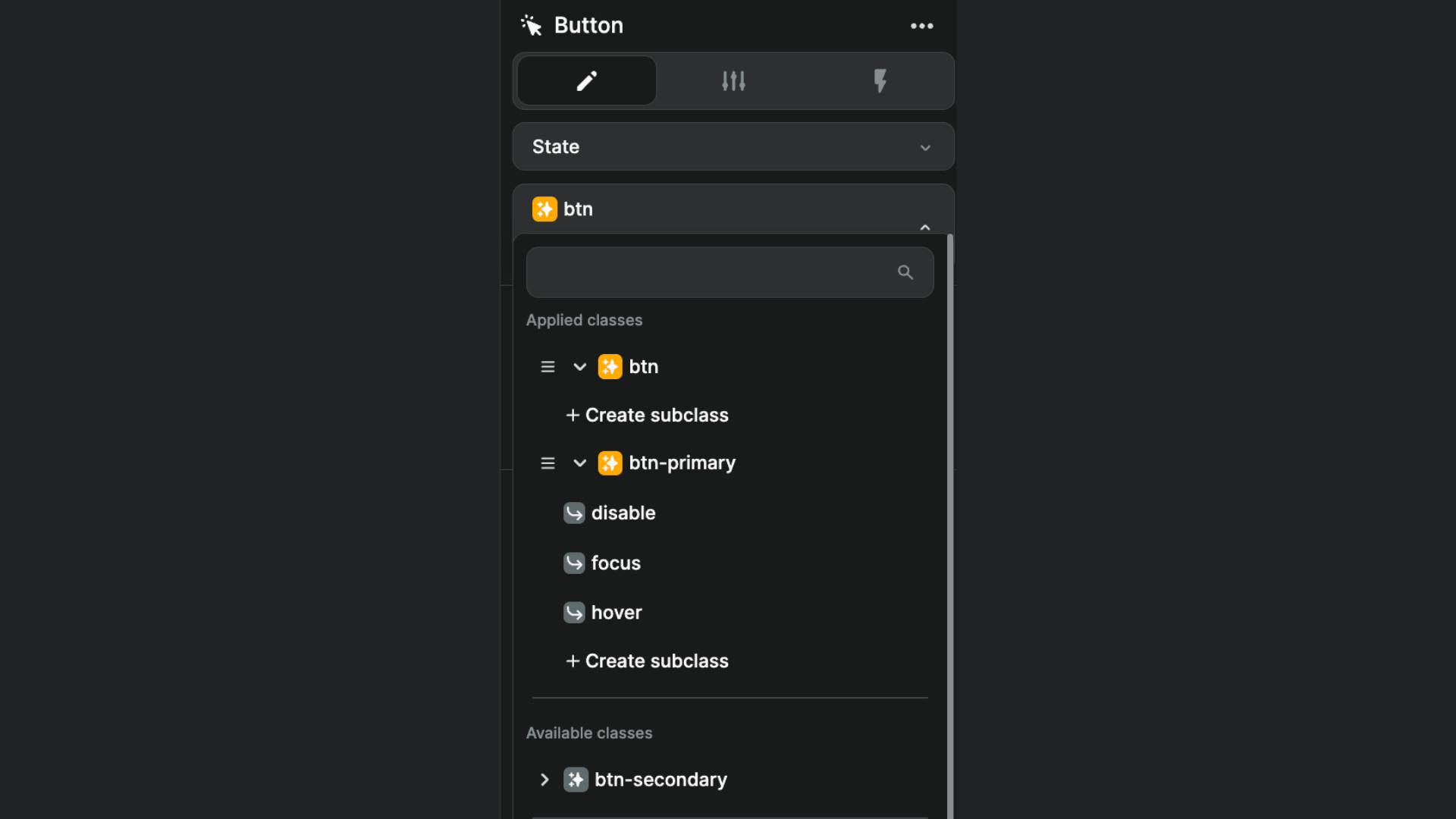
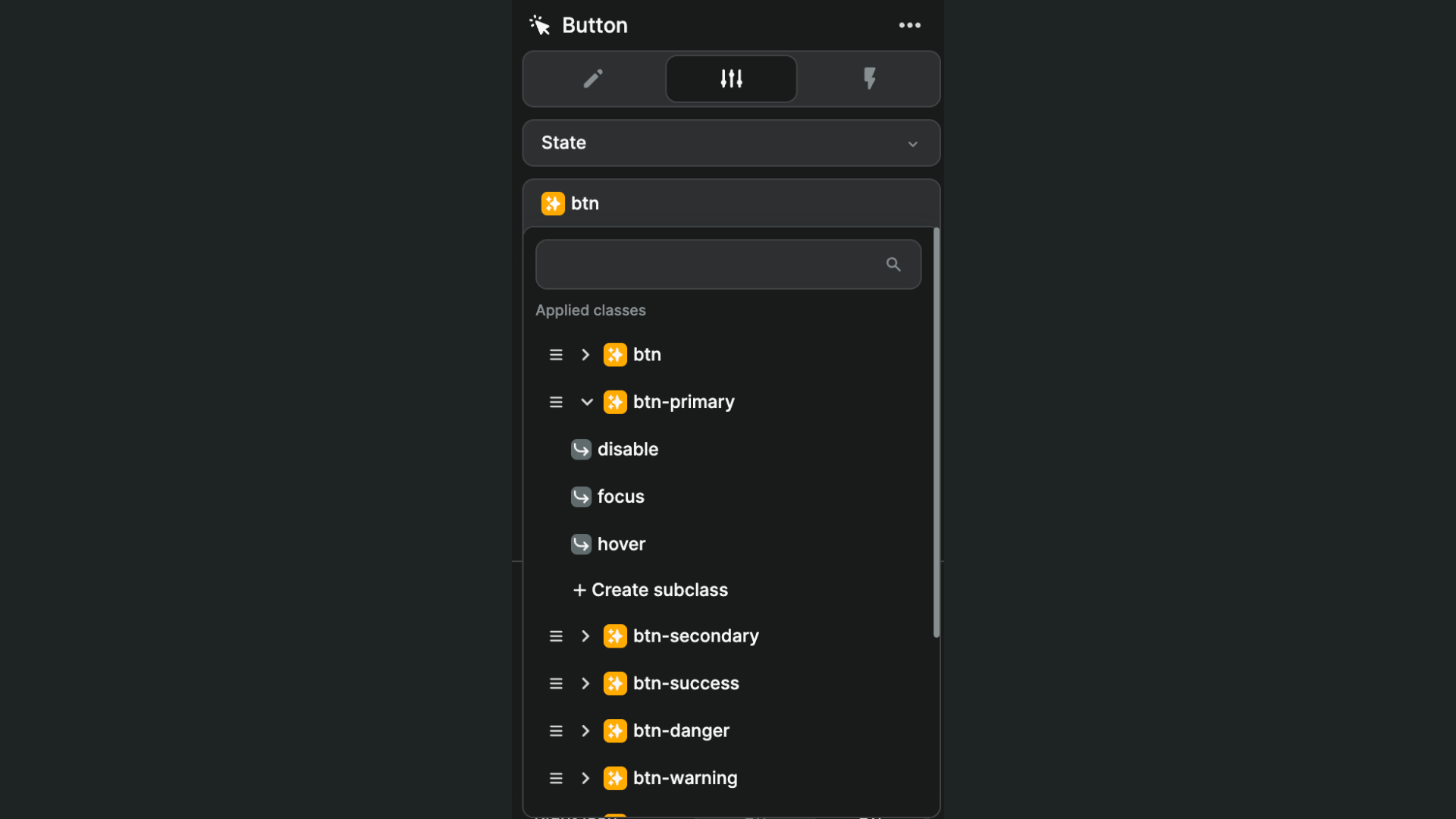
Option 2: create a default class & style classes with state subclasses
In this case, in addition to the btn class, you'd create:
- A class for each style (i.e.
btn-primary,btn-secondary, etc.) - With multiple subclasses for states on each class (e.g.
hover,focusanddisable)
This approach allows you to have as many classes as you want on an element (though we encourage you to stay lean for readibility and maintainability purposes).
It has the added benefit of enabling you to save and re-use states across elements in a subclass.
WARNING
The order of classes matters: the style of the bottom class will override the style of classes above.
If you want the btn-primary class to inherit styles from the btn class, it needs to be placed below its parent class.
Note that we made the decision to offer you the capability to reuse styles in a manner that closely aligns with how developers do it.
Our aim is to offer you the flexibility to manage your design systems according to your preferences. There is no single prescribed approach for doing so.
Instead, there are numerous best practices available. We encourage you to take the time to explore and identify the approach that suits you best, and then maintain consistency by adhering to it throughout your project.
We are constantly seeking to iterate and improve WeWeb. If you have any suggestions or request to improve this feature, please do not hesitate to share it with us.
Create a class
When creating a "parent" class for an element, ask yourself: what are the common style properties I want to feature on this element by default?
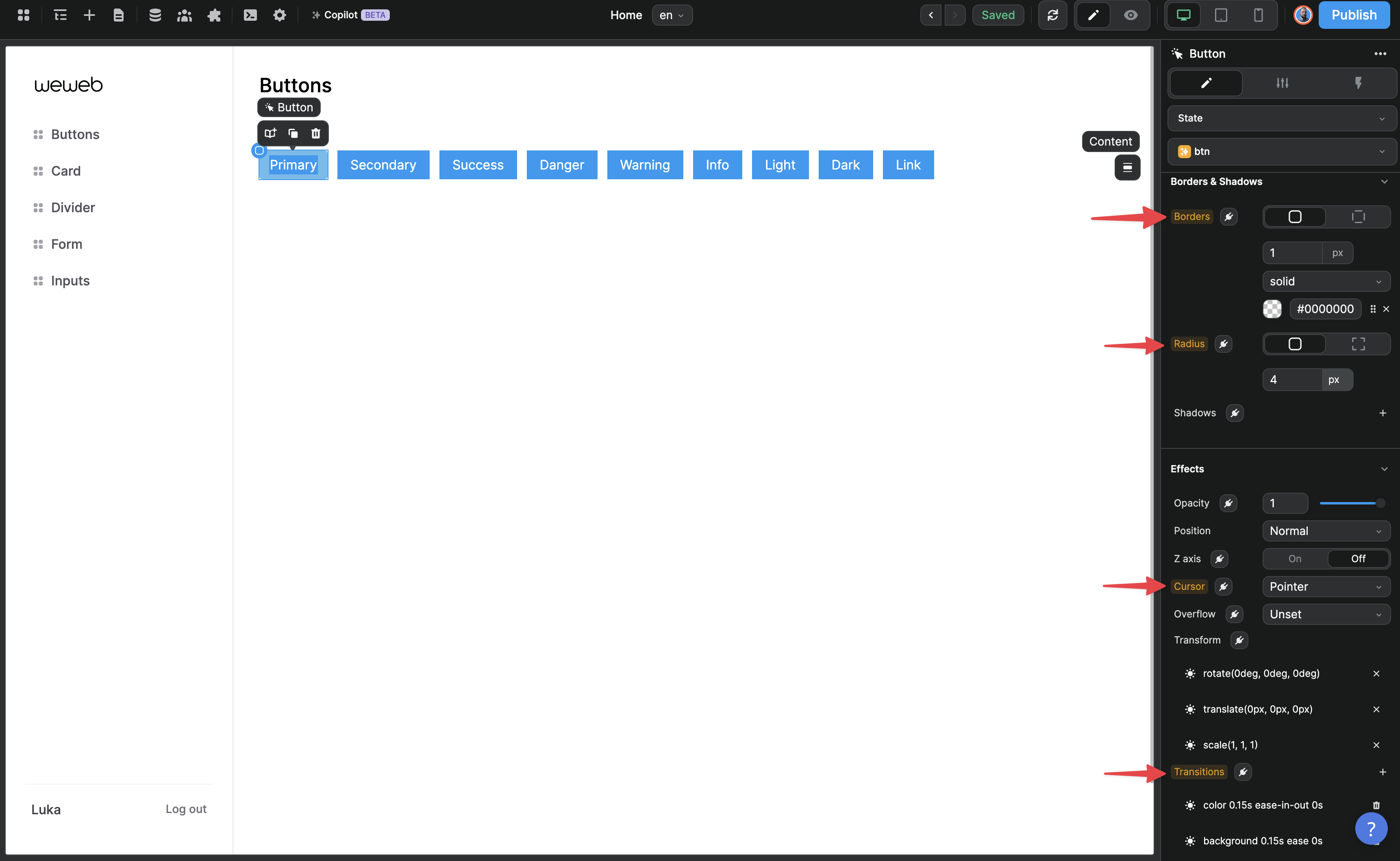
For example, the default style of a button could include:
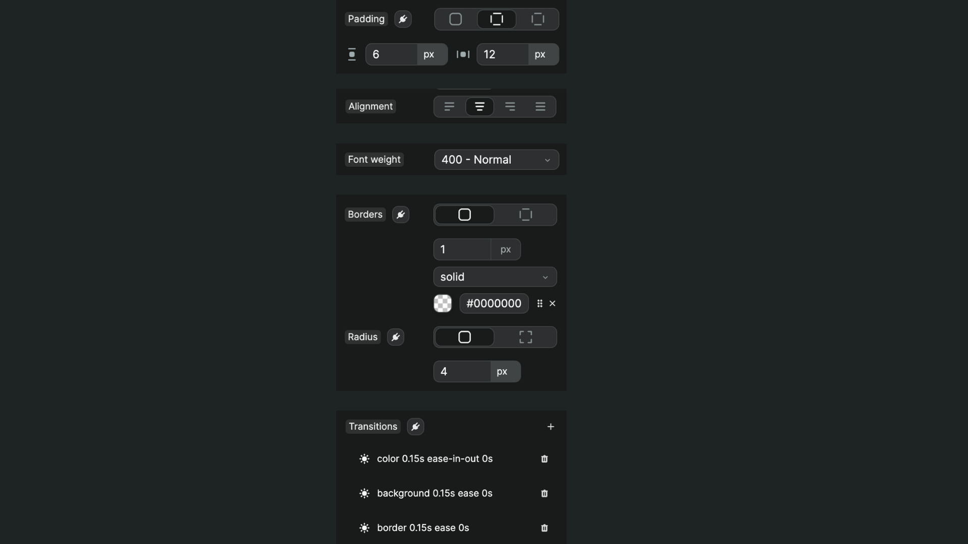
- Padding
- Text size
- Font weight
- Alignment
- Borders
- Transitions
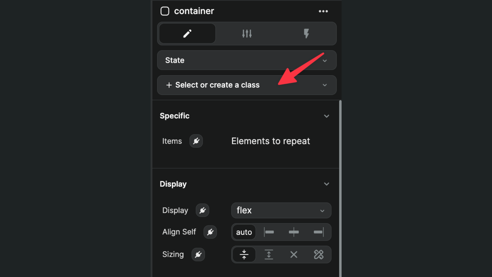
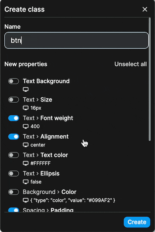
Once you're happy with the default style of your default element, go to Select or create a class to create your first class:
In the example below, we called it btn – stands for "button" – and selected the CSS properties we styled:
Save changes
We didn't want to enable autosave when styling a class because of the risk of updating something by mistake that impacts other elements in the project.
When editing the CSS property of a class, you will see a light gray background appear around the name of the property you just changed.
Once you save the change (by going to the pencil icon of the class and clicking on "Save"), you will see a yellow/orange background around the name of the properties you saved:
Re-use styles
Once you've created a class, you'll most likely want to apply it to other elements.
You can do this by simply selecting the class when you're on an element:

Class combos
In our Bootstrap example, we saw that each button had two classes.
As with code, we can have two classes on a single element in WeWeb.
If you don't want two classes to conflict with each other in an unexpected way, it's important that you select only the properties you want to update when styling a class.
In the example below, we added the btn-primary class and edited the style specific to that button, i.e.
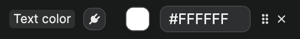
When saving our changes on the btn-primary class, we selected only those 3 properties to ensure it didn't potentially conflict with the style of our btn class:
TIP
Remember, the last class in the list will override the classes above so, if we saved font-size property with 14px on btn-primary and decided later to change the font-size to 12px on all buttons with the btn class, the change we inadvertently saved on btn-primary would mean our change on btn wouldn't be effective on elements with both classes.
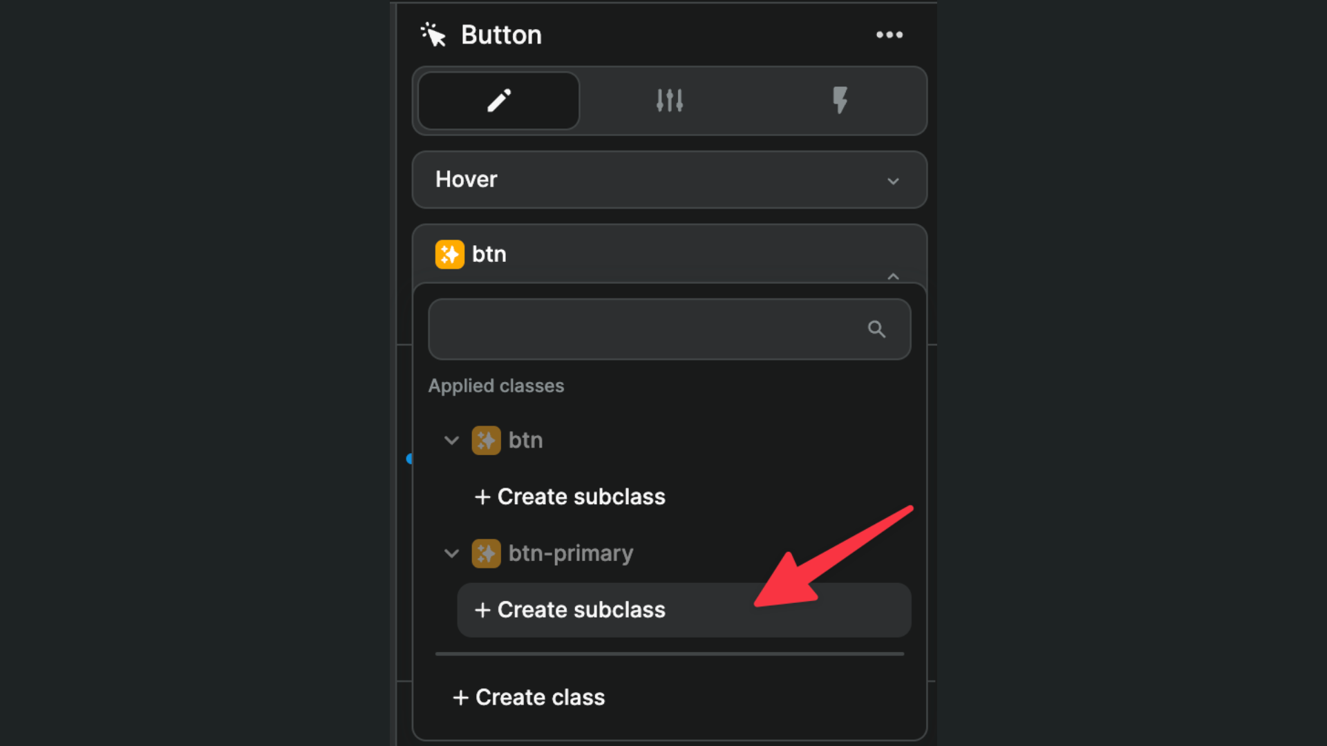
Subclasses
To add a subclass to a WeWeb class, simply click on Create subclass below the class you are working on.
A common use case involves adding a state as a subclass.
In order to do that, we can start by adding a state to our element (for example hover):
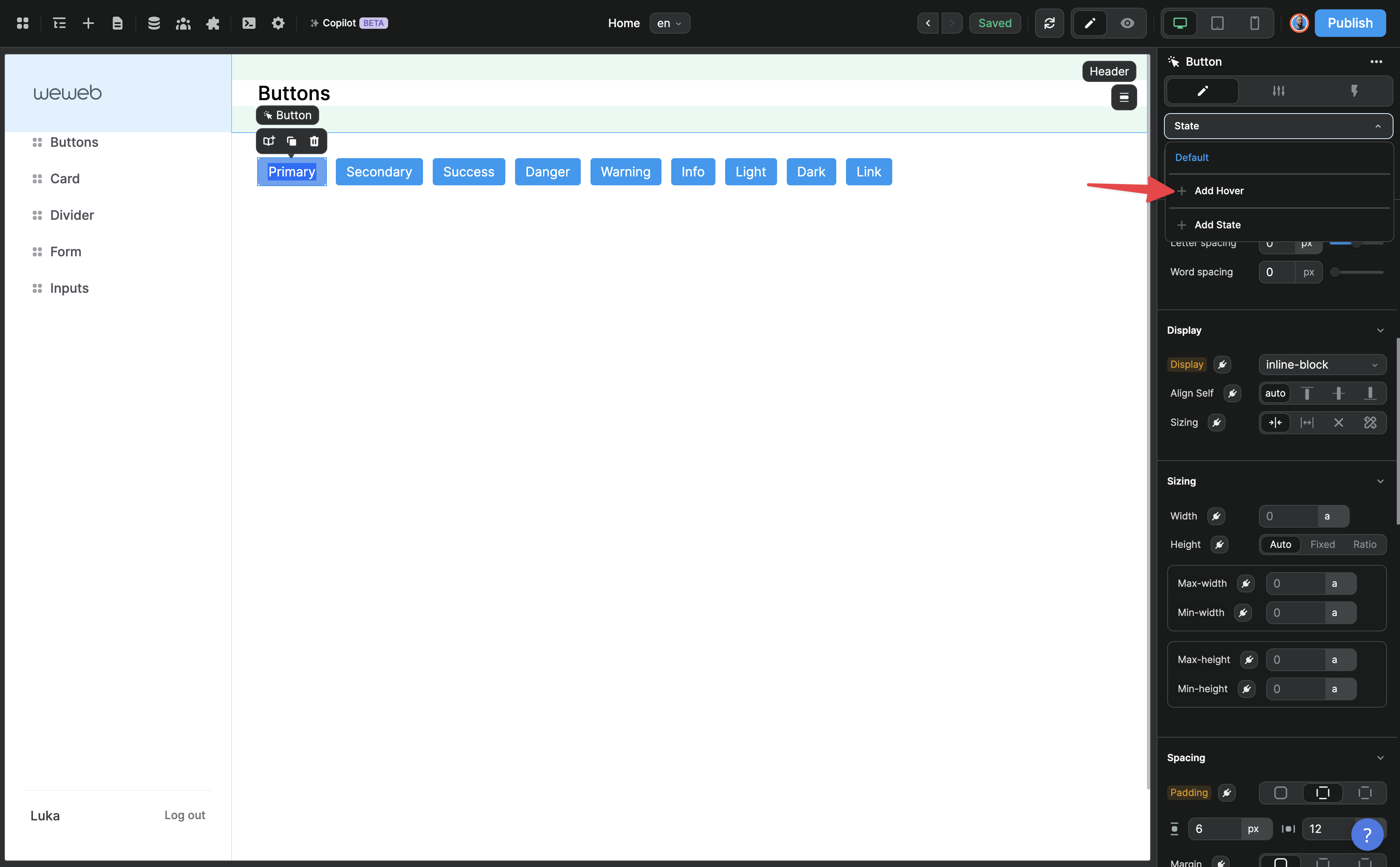
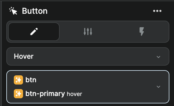
And make sure we are on that state when styling the element. In the example below, we are on an element with both the btn and btn-primary classes and we can see above the class names that the Hover state is selected:
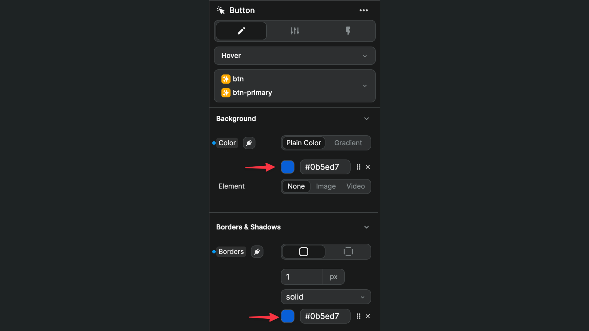
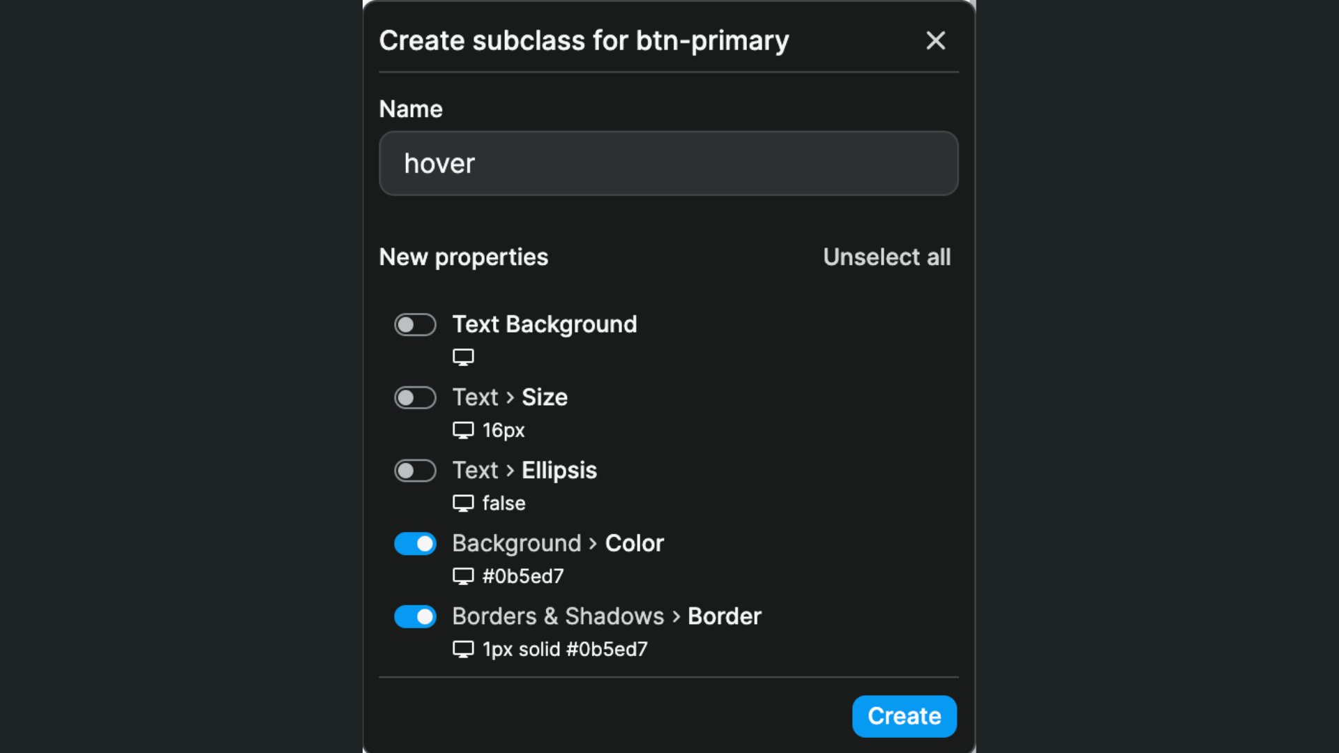
Since the background color of the button will change on hover depending on the type of button (not all buttons), we'll add a hover subclass to the btn-primary class (not btn):
And change only the background-color and border CSS properties:
We now have 2 classes and one subclass applied:
To accomplish the same result as our Bootstrap model, we'd need to repeat this process with all the button states we wanted (e.g. hover, focus, and disable), on each button type (i.e. Warning, Success, etc.) to obtain a list of classes that looks something like this:
TIP
You cannot have sub-subclasses. We chose this approach because we believe it is the most user-friendly to get started and most maintainable as your project grows in complexity.
After extensive user interviews in beta testing, we have yet to come across a use case where this is an issue.
If you feel stifled by this implementation, please reach out in the WeWeb community to let us know more about your use case.