Appearance
Working with popups
Popups are essential UI elements that appear above the main content of your application to display information, capture user input, or provide notifications. WeWeb's popup system allows you to create and manage various types of popups like modals, alerts, and toasts with a dedicated popup management system.
Understanding the popup system
In WeWeb, popups are treated as dedicated components with their own management system. This approach provides several advantages:
- Centralized management — All popups are managed in one dedicated location
- Instance-based control — Open multiple instances of the same popup type with different content
- Reusability — Create popup templates that can be reused throughout your application
- Customizability — Configure various settings like animation, position, and backdrop
Creating your first popup
To create a new popup in WeWeb:
- Open the
Add Elementfrom the+icon in the left sidebar - Under
Your project, clickManage Popups - Click the
Newbutton - Select a popup template (Modal, Alert, Toast, etc.)
- Customize the styling and content of your popup in the editor
Types of popups
WeWeb offers several built-in popup types to cover different use cases:
| Popup Type | Description | Best Used For |
|---|---|---|
| Modal | Centered dialog with overlay | Forms, confirmations, detailed information |
| Alert | Simple notification | Warnings, error messages, confirmations |
| Sheet | Slides in from edge of screen | Mobile-friendly interactions, settings panels |
| Toast | Small, temporary notification | Success messages, non-disruptive notifications |
Customizing popup appearance
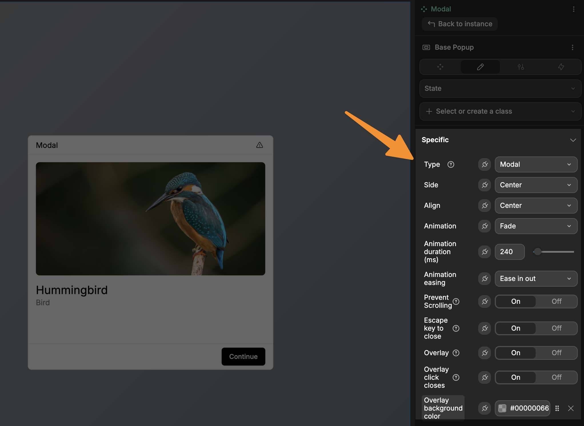
Each popup type has specific settings you can configure:
Common settings
STACKING AFFECTS AVAILABLE OPTIONS
When Allow stacking is enabled, the options listed below will not be available as they are replaced by stack-specific controls.
animation— Choose how the popup appears (Fade, Slide, Zoom, etc.)prevent scrolling— Toggle whether the background content can be scrolledescape key to close— Allow users to close the popup by pressing ESCoverlay— Toggle the background overlayoverlay click closes— Close the popup when clicking outside of itoverlay background color— Customize the overlay's appearance
Position settings (varies by popup type)
type— Select the popup variant (Modal, Sheet, etc.)side— Choose which side the popup appears from (Top, Bottom, Left, Right)align— Set the alignment (Center, Start, End)
MIGRATING FROM DIALOG ELEMENT
If you've previously used the Dialog element, these settings match the Dialog's properties, making it easy to recreate your existing popups.
Stacking popups
Enabling the Allow stacking property allows you to display multiple popup instances simultaneously, either stacked vertically or arranged horizontally.
By default, popups do not stack. If you open multiple instances of the same popup, they appear in the same position and only the most recent one is visible.
To enable and configure stacking:
- Open the popup model you want to stack and go to its settings
- Enable
Allow stacking - Configure how stacked instances are arranged — for example, set
directionto vertical and use the positioning controls (top,bottom,left,right) to place the stack where you want it on screen - Close any open instances of the popup from
Manage Popups - Switch to
Previewmode and trigger the popup multiple times to confirm instances stack as expected
STACKING USE CASES
Popup stacking is particularly useful for:
- Notification systems — Display multiple toast notifications that stack vertically
- Multi-step workflows — Show progress through a series of related popups
- Chat messages — Stack message popups to create a conversation flow
- Alert queues — Display multiple alerts without blocking each other
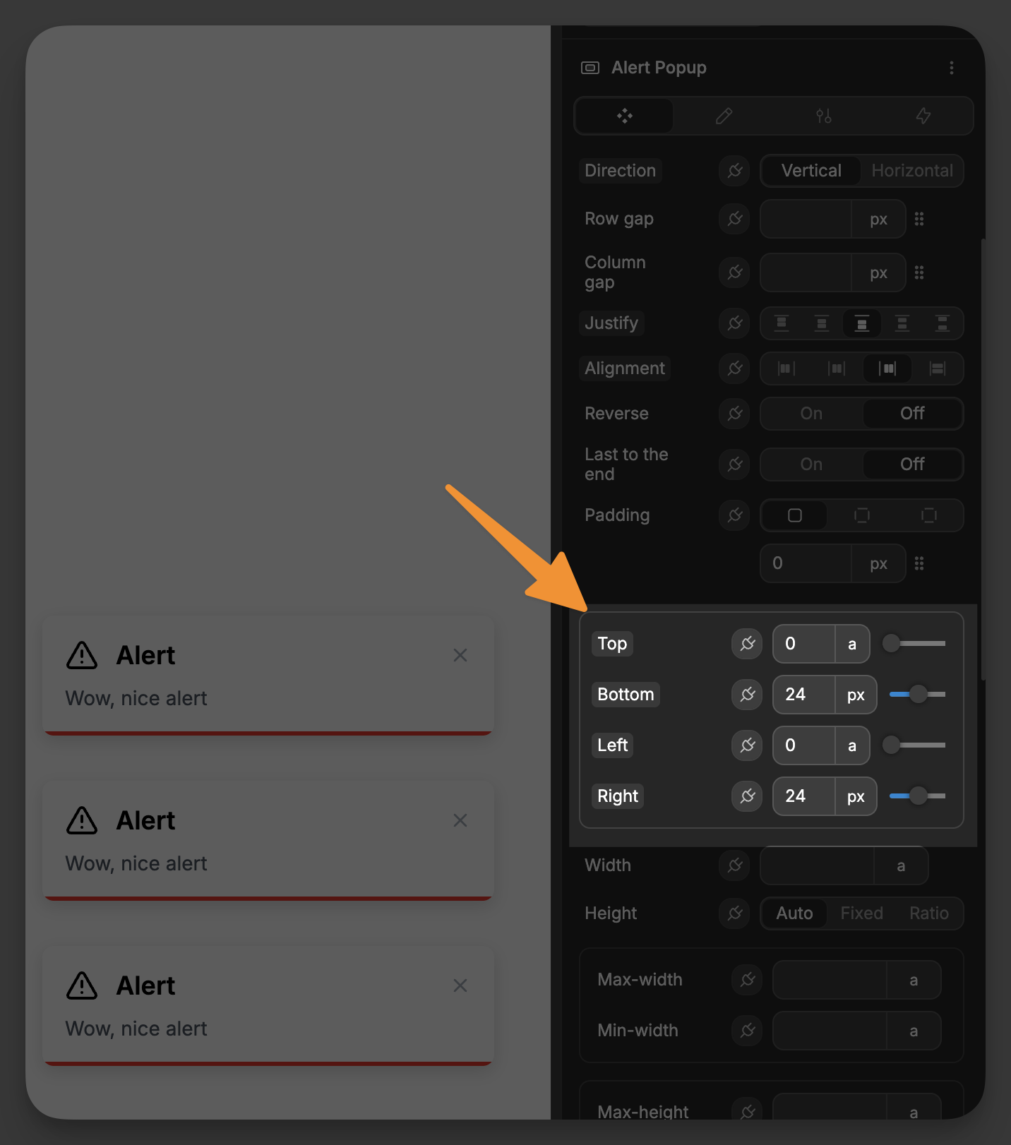
Stack properties
When you enable Allow Stacking, you have access to additional layout controls to manage how stacked popups are arranged:
direction— Choose the stacking direction (Vertical or Horizontal)row gap— Set the spacing between rows of stacked popupscolumn gap— Set the spacing between columns of stacked popupsjustify— Control the horizontal alignment of stacked popupsalignment— Control the vertical alignment of stacked popupswrap elements— Allow stacked popups to wrap to new lines when space is limitedreverse— Reverse the order of stacked popupslast to the end— Position the most recent popup at the end of the stackpadding— Set padding around the entire stack container
Stack positioning controls
When stacking is enabled, you also get precise positioning controls for where the entire stack appears on screen:
top— Set the distance from the top edge of the viewportbottom— Set the distance from the bottom edge of the viewportleft— Set the distance from the left edge of the viewportright— Set the distance from the right edge of the viewport
These controls allow you to position your stack of popups exactly where you want them, such as in the top-right corner for notifications or bottom-center for alerts.
Working with popup instances
A key concept in WeWeb's popup system is the notion of instances. An instance is a specific occurrence of a popup that is currently open in your application.
Managing instances
In simple terms, an "instance" is just a specific popup that's currently open on your screen. Think of it like this:
- A popup is like an email template (the design and structure you've created)
- An instance is like each individual email sent from that template (what appears for users)
For example, you might have an "Alert" popup with a title, message, and action button. Each instance of this alert could show different content:
- One instance might display "Payment successful" with account details
- Another instance might show "New message received" with a preview and reply button
- A third instance could present "Update available" with version info and download link
All these alerts use the same popup, but display as separate instances with their own content.
Open Manage Popups from the Add Element to see all currently open instances grouped by their popup model:
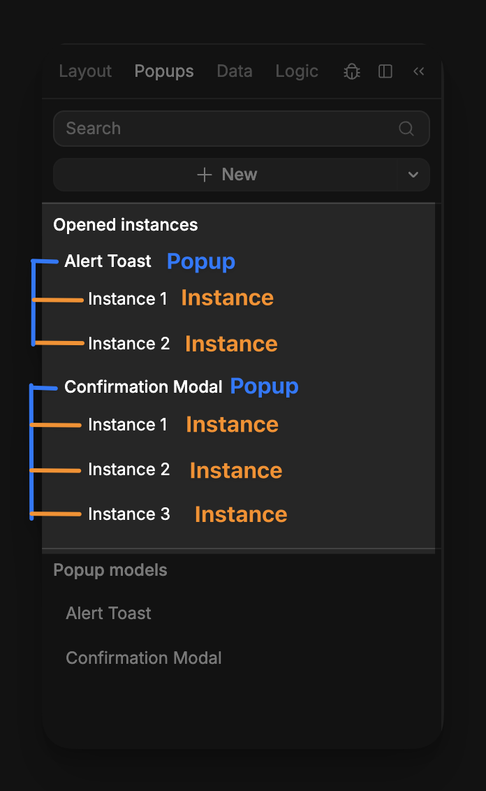
From Manage Popups, you can:
- See which popup instances are currently open
- Close specific instances directly from the panel
- Create, edit, open, rename, duplicate, or delete popup models in your project
DYNAMIC CONTENT IN INSTANCES
Popup instances are perfect for showing dynamic content based on user actions or data. You can create one popup design and use it in many different contexts by changing the content dynamically for each instance.
Opening and closing popups
Popups in the new system are controlled through workflows.
To control popups via workflow actions:
- Select the element you want to use as the trigger
- In the right panel, open the
Workflowstab and click+ New - Click
+ Add an actionand selectOpen popup - Open the
Popup modeldropdown and select the popup you want to open - Optionally, enable
Wait close eventif you want the workflow to pause until the popup is closed - Test in
Previewmode
WAIT CLOSE EVENT
The Wait close event property of the Open popup can be extremely powerful.
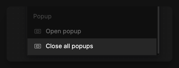
To close all open instances of a specific popup model, use the Close all popups workflow action and select that popup in the Popup model field:
Passing data to popups
To make your popups dynamic, you can pass data when opening them:
- In
Manage Popups, clickEditon the popup you want to make dynamic - In the right panel, open the
Componenttab and clickNewin thePropertiessection - Name your property, choose its type, and click
Create - Select an element inside the popup and bind the property to the field you want to make dynamic (for example, text content or an image source)
- Click
Return to instance, then close the popup - On the trigger element, open the
Open popupworkflow action and define the values to pass into the popup properties - Test in
Previewmode and confirm the popup shows the dynamic content
REUSING POPUPS
By using properties, you can reuse the same popup in multiple scenarios with different content:
- Display user profiles with different user data
- Show product details with varying product information
- Create confirmation dialogs with custom messages and actions
- Build error/success notifications with dynamic messages
Best practices for popups
- Use sparingly — Popups interrupt the user experience, so use them only when necessary
- Provide clear dismissal options — Always give users an obvious way to close popups
- Consider mobile users — Ensure popups work well on smaller screens
- Use appropriate types — Choose the right popup type for each use case (toast for non-critical notifications, modals for important interactions)
- Keep content focused — Popups should contain only the information or controls needed for the specific task
Common popup patterns
Here are some common ways to use popups in your WeWeb application:
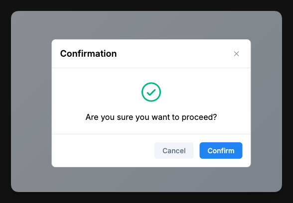
Confirmation dialogs
Use a modal popup to confirm user actions before proceeding with potentially destructive operations:
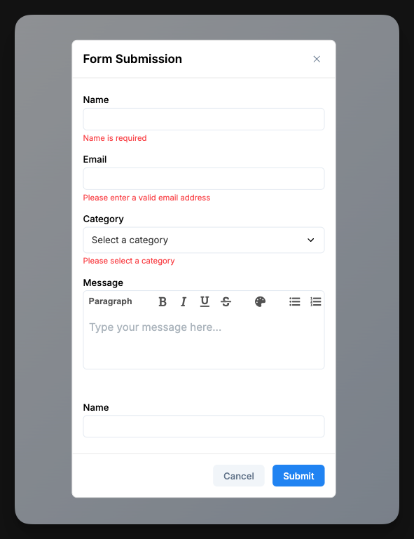
Form popups
Collect user input without navigating away from the current page:
Submitting forms with external action buttons
A common pattern in popup forms is to have the form content in the main popup area with action buttons (Submit, Cancel) positioned outside the form container, often in a dedicated footer area. This creates a clean separation between content and actions.
To submit a form using buttons outside the form container:
Step 1: Give your form an ID
- Select your Form Container element
- In the
Settingspanel, find theidfield - Enter a unique identifier for your form (e.g., "contact-form", "signup-form")
Step 2: Configure the external button
- Select the button that should submit the form
- In the
Settingspanel, make sure the button'sTypeisSubmit Button - Also in the
Settings panel, add an attribute - The name of the attribute should be
form, and the value should be the id you assigned to your form - Now, on click, the button will trigger the submission of your given form
This approach is particularly useful for:
- Multi-step forms in popups where you want consistent action button placement
- Complex popup layouts where form content and actions are visually separated
- Maintaining clean, professional popup designs with dedicated action areas
TIP
Learn more about external form submission in the Form container documentation.
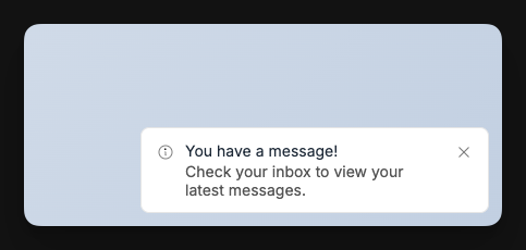
Notification toasts
Provide non-intrusive feedback about system events or action results:
CONTINUE LEARNING
Ready to dive deeper into creating interactive user experiences? Learn how to make your popups smarter with logic: