Appearance
Intro to components
Web components allow you to create reusable custom elements — with their functionality encapsulated away from the rest of your code — and utilize them in your web apps.
They are especially helpful to:
- Build faster
- Design an interface that has the same look-and-feel across pages
- Develop complex projects without repeating yourself
In summary:
The core idea of components is simple but powerful: create something once and reuse it in many different ways while keeping its functionality and data self-contained. This approach lets you build modular, maintainable applications without duplicating work or losing control of how your components behave and manage their own data.
Working with components
You can find components in the Library section of the Assets tab in the Interface section:
Templates vs components
When you drag-and-drop a template on a page, it will create a copy of the template. If you later make a change to the template, those changes will not be reflected in the copies you created before.
When you drag-and-drop a component on a page, it will create a new instance of the component. If you make a change to the component, those changes will be reflected in all the instances of the component you created before.
Create a new component
In WeWeb, there are two ways you can create a new component.
Option 1
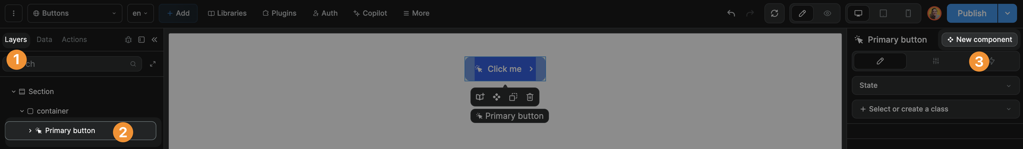
You can select an element in the layout tree and click Turn into component in the edition panel:
Option 2
You can select an element on the canvas and click on the component icon to transform it into a new component:

TIP
If you choose option 2, make sure the correct element is selected in the Layout Tree before you turn it into a component.
Rename or delete components
When you create a new component in a project, it will be added to that project's library.
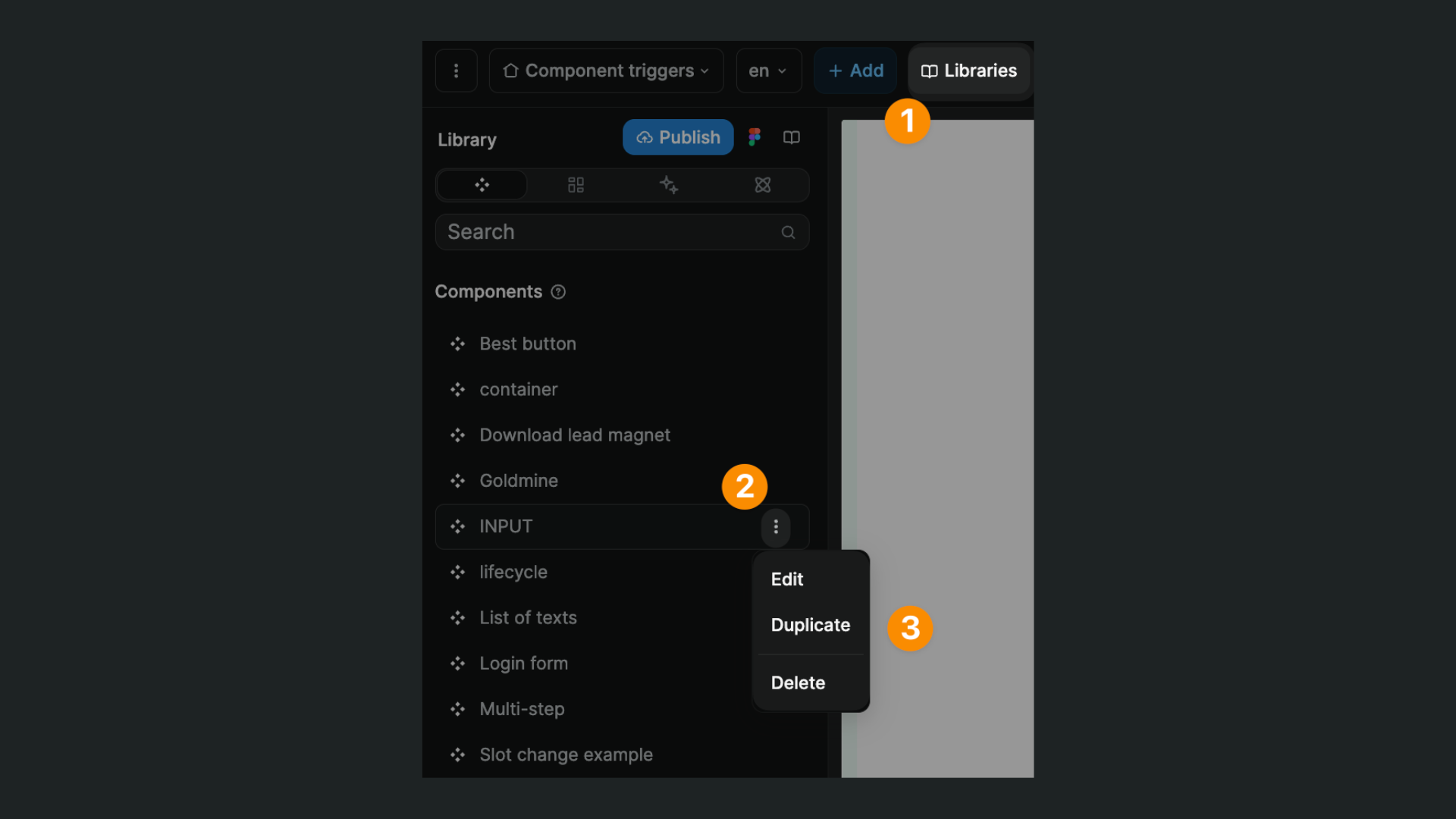
To view, rename, or delete a project component, you can navigate to the Library section in the Assets tab of the Interface section:
TIP
In the Library, you can view components from external libraries:

However, you won't be able to rename or delete them.
To rename or delete a component from an external library, you will need to open that project and update the component in that project's library.
Edit a component
Once you have created a component, you will be able to:
- Change the style of that instance of the component, or
- Edit the component itself so that changes are reflected on all the instances of that component
Updating an instance vs updating a component
To customize one instance of a component, simply make the changes you want in the right panel as you would with any other element.
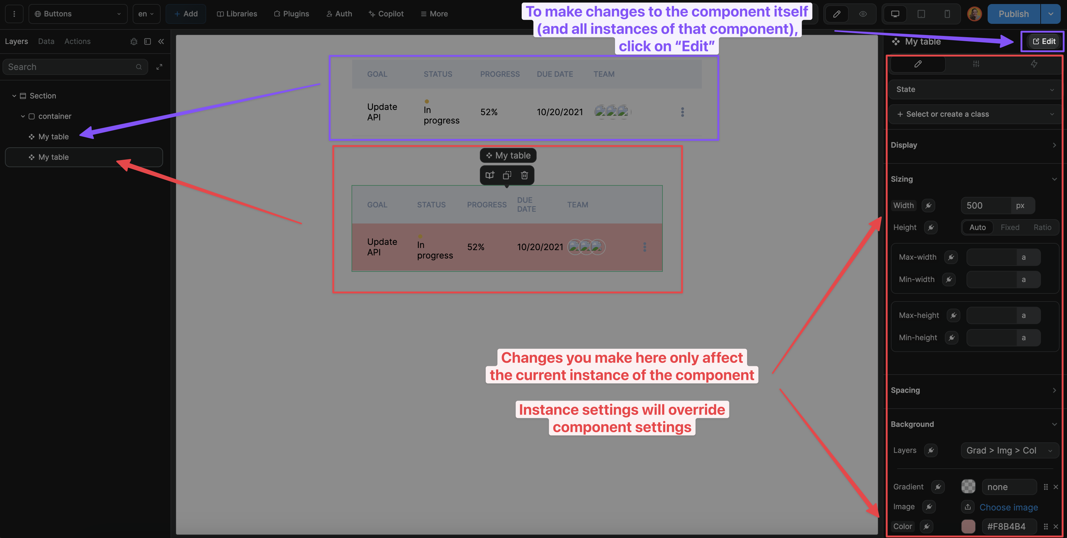
To edit a component (and have those changes reflected on all instances of that component), select the component and click on the Edit button at the top of the right panel:
WARNING
The changes you make on an instance of a component will override the component settings.
For example, let's say you are using one component three times in your project. If your component has a max-width of auto but change it to 100% on instance B of the component:
- Instance A will have a
max-widthofauto, - Instance B of the component will have a
max-widthof100% - Instance C of the component will have a
max-widthofauto
Updating a component
Once you have selected a component and clicked on Edit, you will be able to update the component itself:
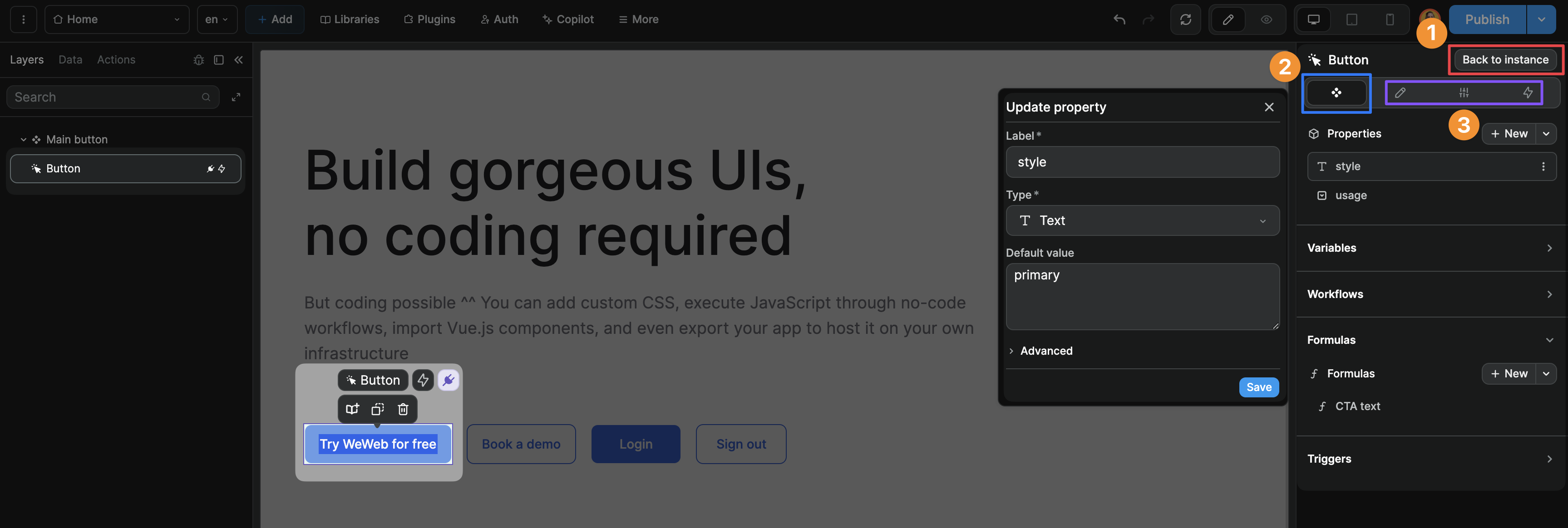
In the screenshot above, you can see a few things:
- The
Back to instancebutton in the top right confirms that you are currently editing the component itself, not an instance of the component - The
Componenttab allows you to create properties, variables, workflows, formulas, and triggers associated with the component - The
Styles,Settings, andWorkflowtabs allow you to customize the component as you would any other element. The changes you make here will be applied to all the instances of that component.
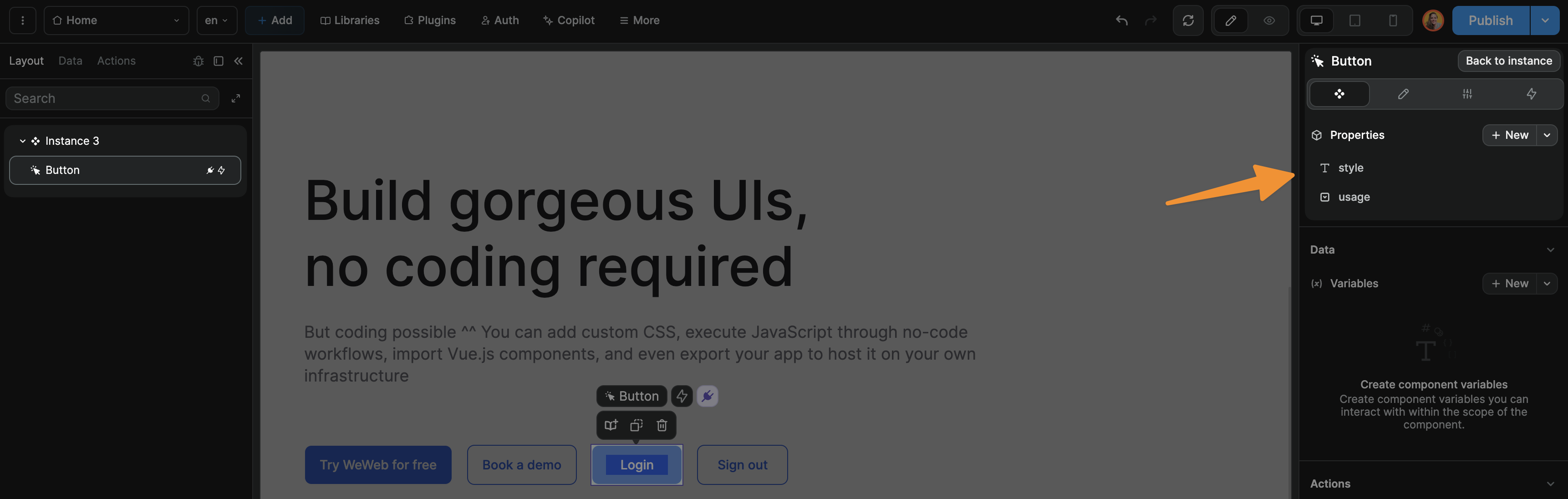
Component properties
When you create a component in WeWeb, you can also associate that component with properties (often referred to as "props").
These properties can be texts, numbers, booleans, selects, table views, and more:
Benefit of using props
When you use a component in multiple places, you can use its props to differentiate the behavior of one instance compared to another.
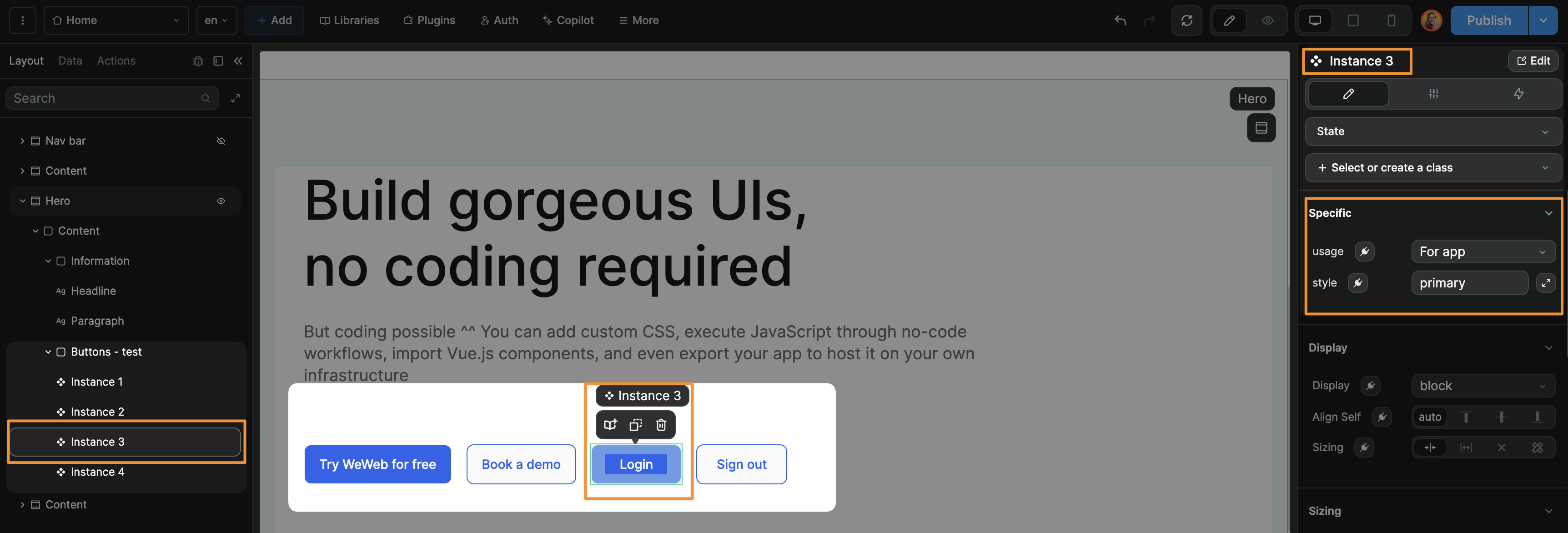
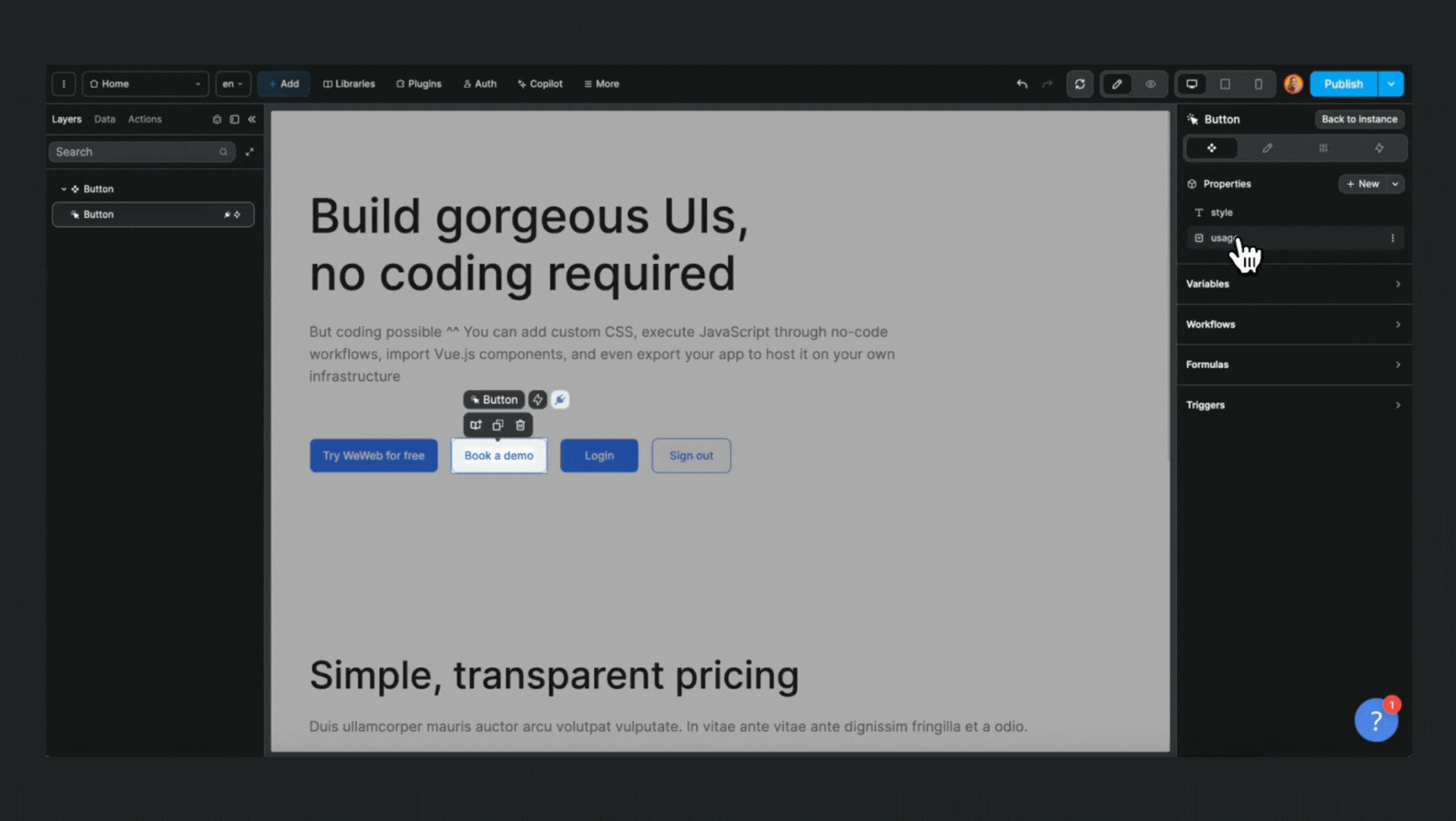
In the example below, we have a button component with 2 properties (style and usage):
One the page, we have 4 instances of the same component, but each instance is styled differently and display a different text.
This is because each instance of the component has different usage and style property values.
For example, the text of instance 3 is Login because its usage property value is For app:
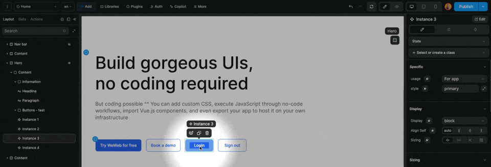
But we could change the text and colors of the button by changing the usage and style values of the instance.
In the example below, we change the property values of instance 3 to the same values as instance 2:
Create component property
In the Components tab, click on New to create a new component property:
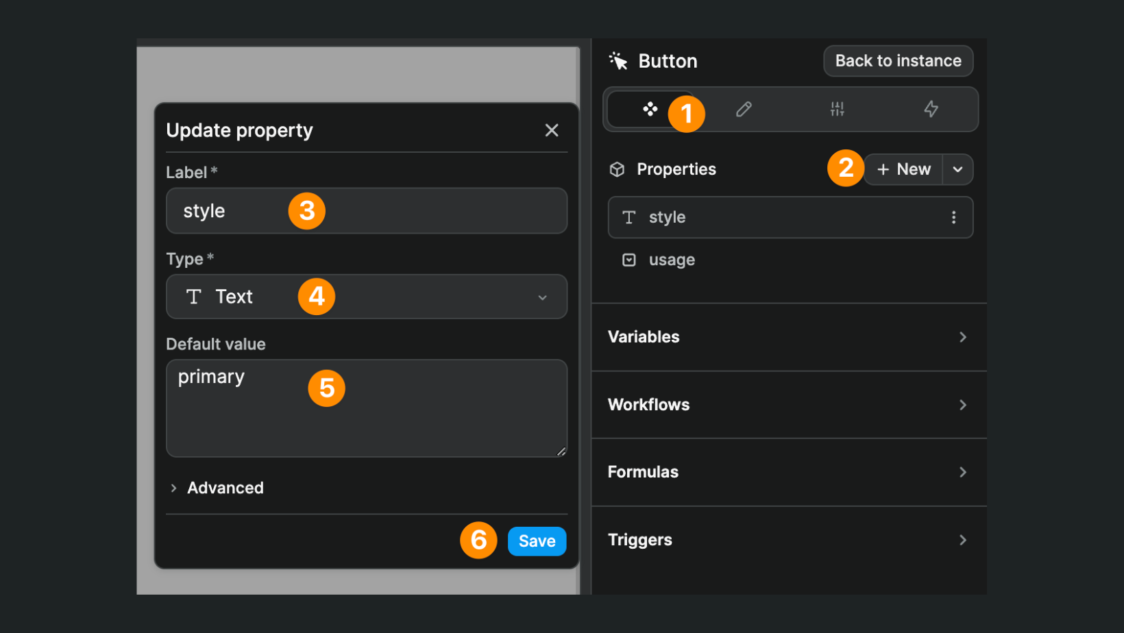
You will be invited to:
- Name it
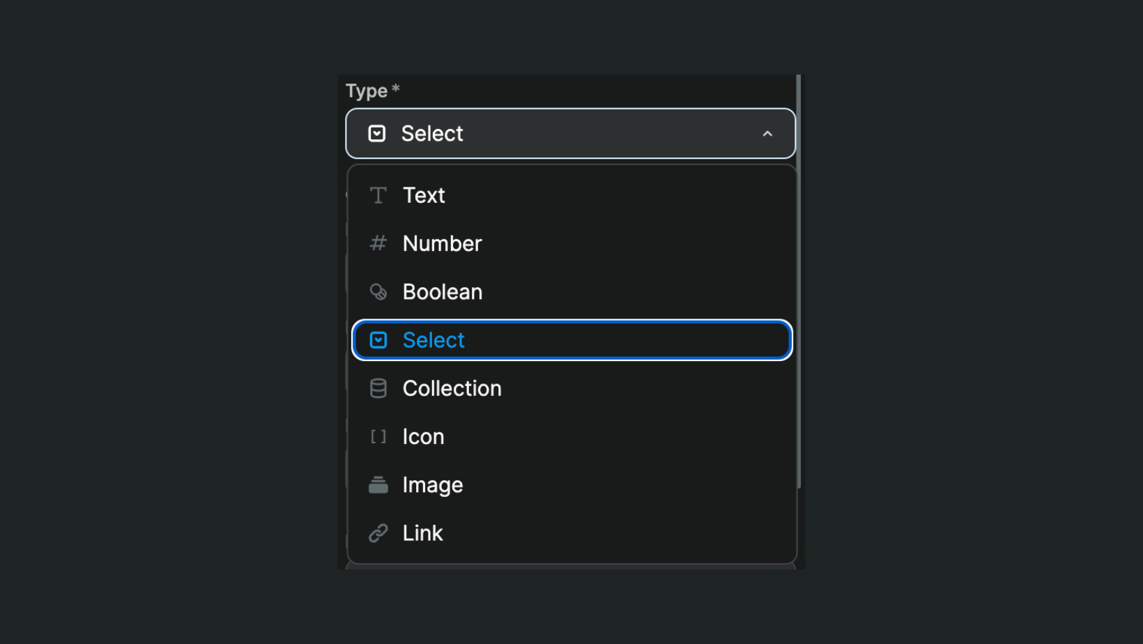
- Select a property type
- Provide a default value
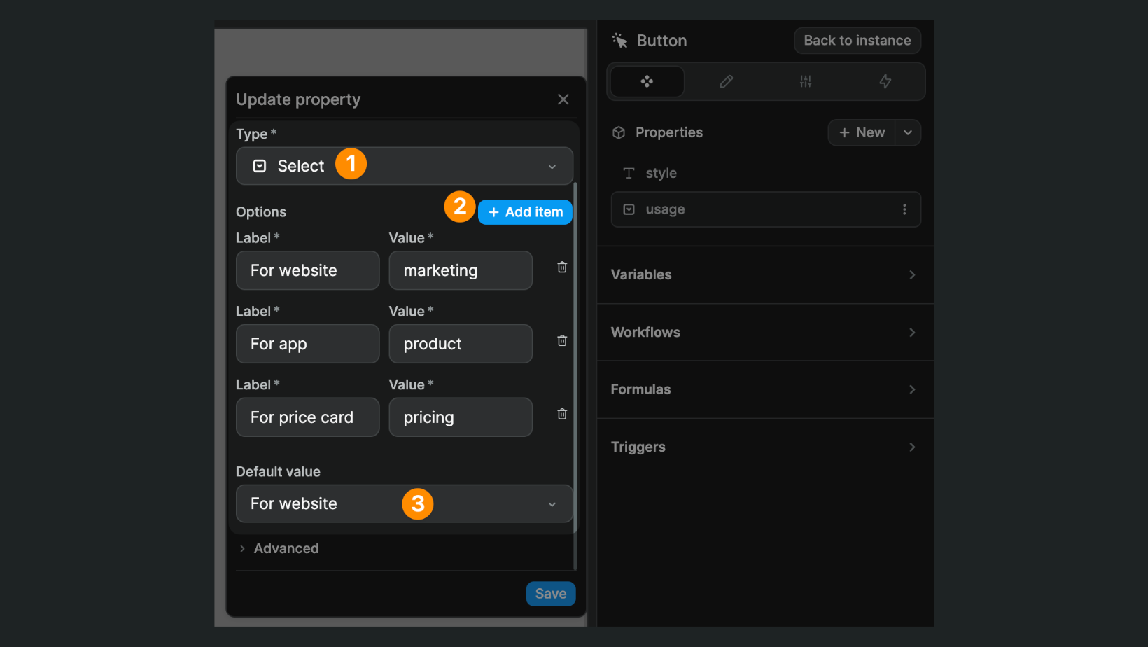
TIP
If you create a Select property, you will be invited to add options and select a default value:
Advanced options
In this section, you can decide if the component property:
- Should be displayed in the
StylesorSettingstab of the instance - Should be bindable
- Should include states
- Should include classes
Component variables
Component variables are variables that are scoped to the component, i.e. they can only be seen and referred to inside the component as opposed to global variables in the Variables tab of the Interface section, which can be seen and accessed throughout the project:
TIP
Component variables are especially helpful to keep your project clean and maintainable while it grows in complexity.
Component workflows
Component workflows are workflows that are scoped to the component, i.e. they can only be executed inside the component as opposed to Functions in the Workflows tab of the Interface section, which can be executed throughout the project:
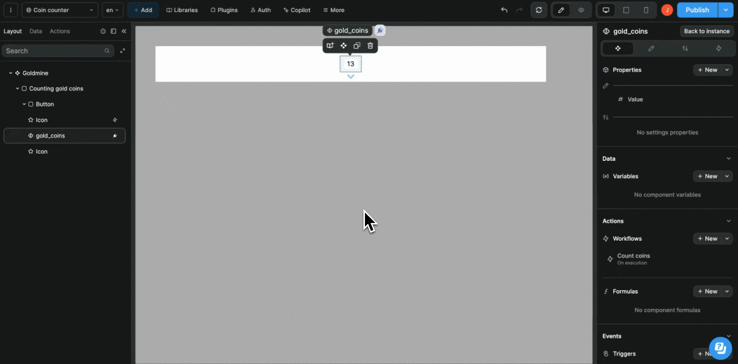
In the example below, you can see:
- Our component workflow expects a parameter
- We select the down arrow icon
- Execute the component workflow on click of that icon
- With the parameter
downto reflect the fact the user just clicked on the down arrow
TIP
Component workflows are especially helpful to keep your project clean and maintainable while it grows in complexity.
Component formulas
When building a component, you can create formulas that are local to that component. These formulas will not exist outside of the component:
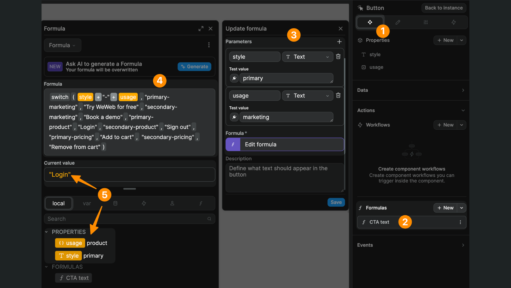
In the example above, you can see:
- Inside our component
- We created a
CTA textformula - With two parameters that refer to the two properties of the component:
styleandusage - The combination of these two parameters will decide what text is displayed in our component
- The
Current valueis"Login"because the property values of the current instance of the component areprimaryandproduct
TIP
Using component formulas is very helpful for scaling and debugging when you're building complex web applications because they don't crowd the project formulas in the Formulas tab of the Interface section:
Component events
When working with components, it can be helpful to emit a component event that you can then react to outside the component.
For example, you could have a login form component that authenticates the user and emits a login success event.
Then, depending on where you use the login form component, you could react to the login success event to decide if you need to close a modal or change page.
Learn how to emit and react to component events.