Appearance
Component dropzones
When you create multiple instances of a WeWeb component, they share identical content elements. While styling can be customized per instance, adding or removing elements affects all instances globally. Component dropzones solve this limitation by providing customizable areas within your component where you can add elements to individual instances without affecting others.
This feature:
- Makes components more versatile
- Enables instance-specific customization
- Reduces design repetition
Working with dropzones
A typical use case for dropzones would be an input form. Imagine you have a form component and use multiple instances of it in your application. This component has 3 input fields, and you want these 3 fields to be present in every instance of it.

But let's say there is one instance of this component where you need to include an additional rich text input field:
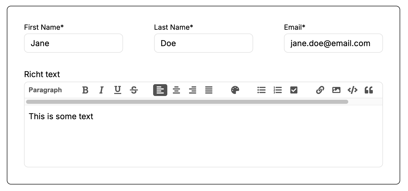
Create a component dropzone
While all other instances of this component remain the same, you can customize this specific instance. To create and customize a component dropzone:
- Create a form and convert it into a component following the steps described here: https://docs.weweb.io/components/intro-to-components.html
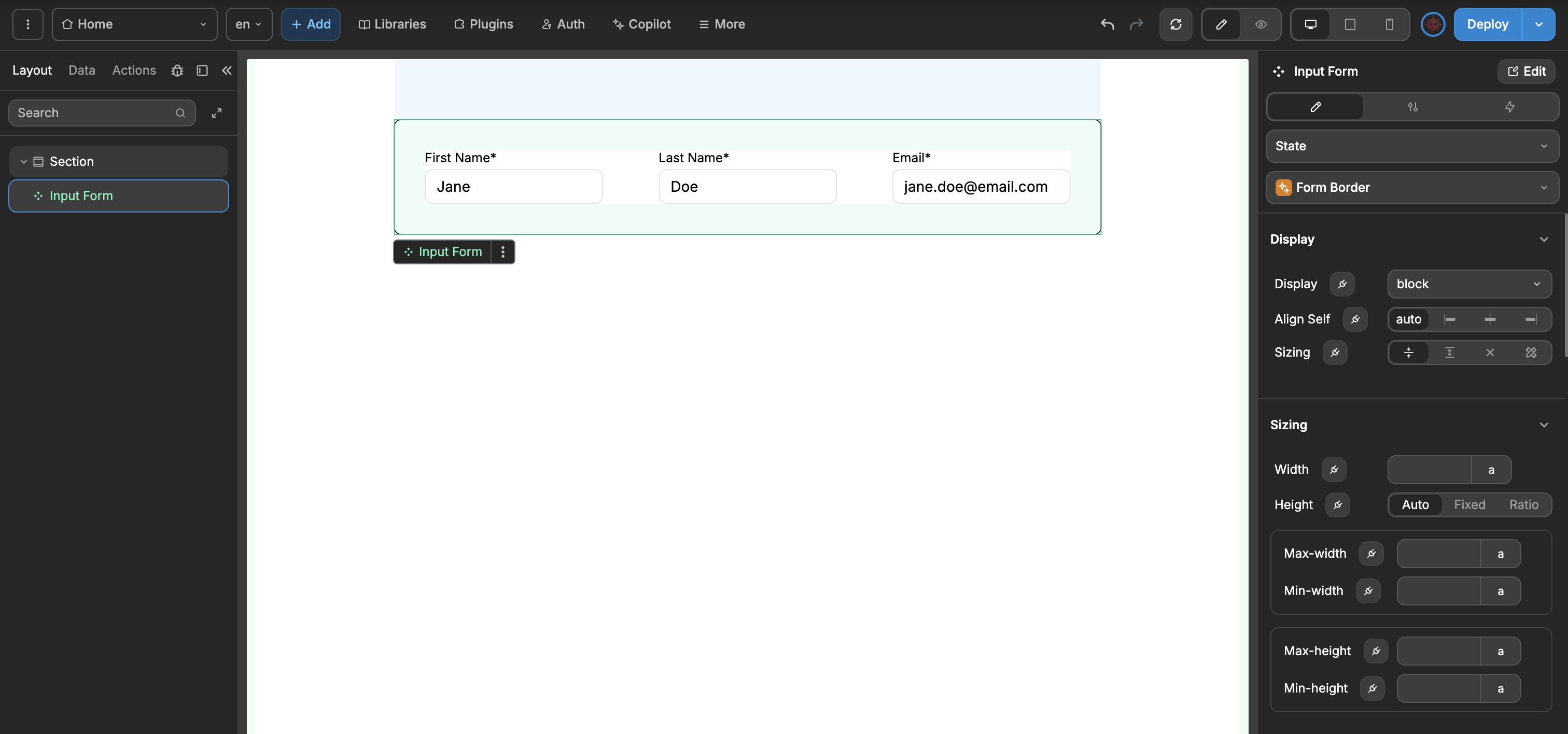
Open the component editor by double-clicking the component on your canvas or by clicking on the three dots in the component menu and selecting Edit
Once in the Edit mode, click on the Add button.
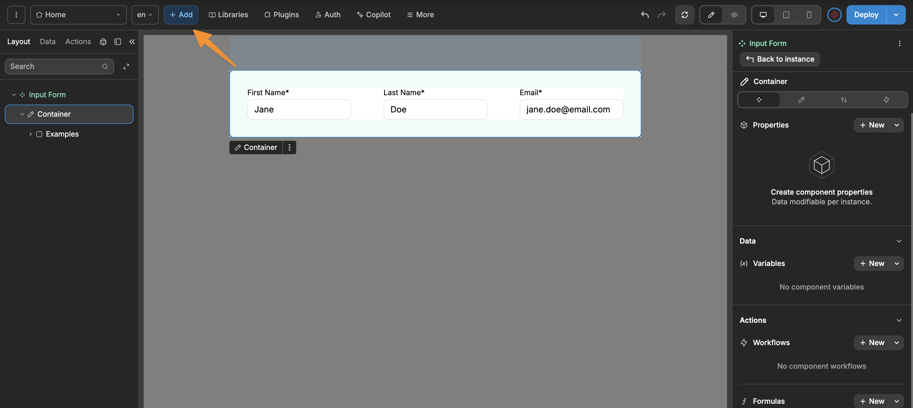
- Select the Dropzone element at the very top of the Elements list, drag and drop it to your component


That’s it! Your component dropzone is defined. All instances of this component will now include this dropzone.
Adding elements to dropzones
TIP
If you wish to add elements into a dropzone, make sure you are not in Edit mode for the component containing the dropzone. You are only able to add elements into dropzones if you are not editing the component.
To customize a specific instance with additional elements:
- Select the instance of the component you want to customize with the rich text element. Click on the arrow on the left side of the component in the elements tree to expand it

- Add the rich text element by clicking on the Add button and dragging and dropping it into the dropzone on your canvas or in the element tree

The customization is complete. Only this instance of the component will include the rich text input, all other instances will remain the same

Execute dropzone workflow
Component workflows help you organize and encapsulate functionality in one place. However, you might want to execute these workflows from outside the component or specifically from a dropzone.
- Suppose you have created a component workflow:
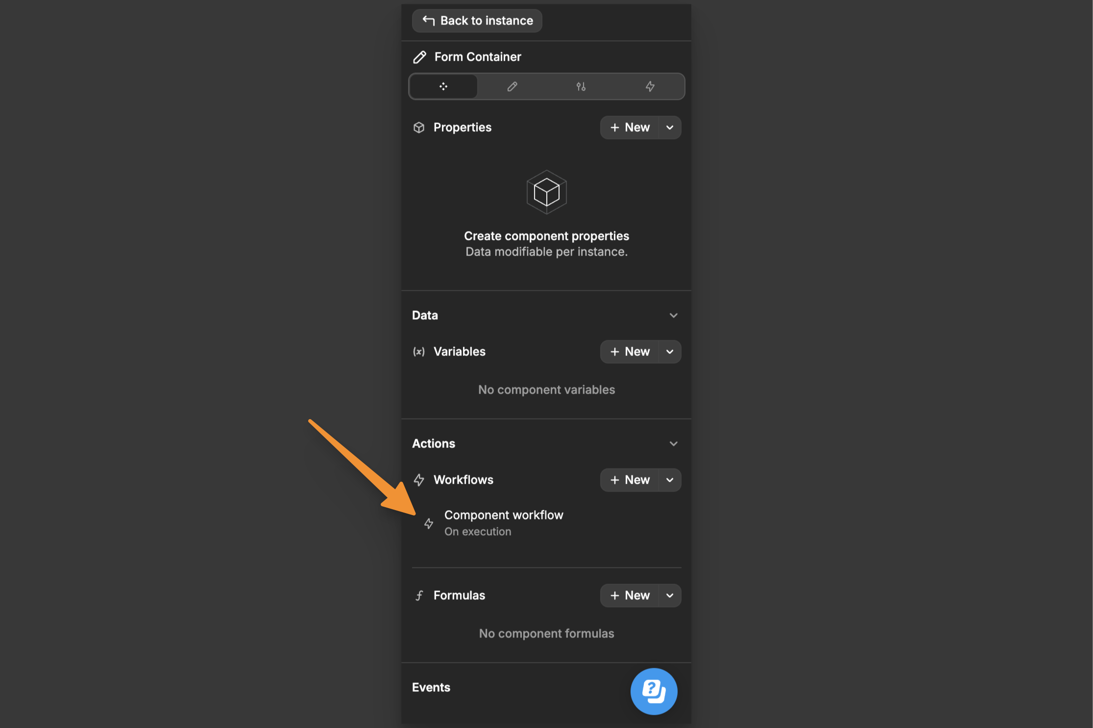
Configuring workflow execution
When creating a component workflow, you have two execution options:
Allow execution from outside- Enables the workflow to be triggered from anywhere using the Execute component action actionAllow execution from dropzone- Permits the workflow to be triggered specifically from elements within your dropzone

Using execute dropzone workflow
To trigger a component workflow from your dropzone:
- Select your dropzone element
- Add a new workflow (e.g., On Change)
- Add the
Execute dropzone workflowaction - Choose the component workflow you want to execute
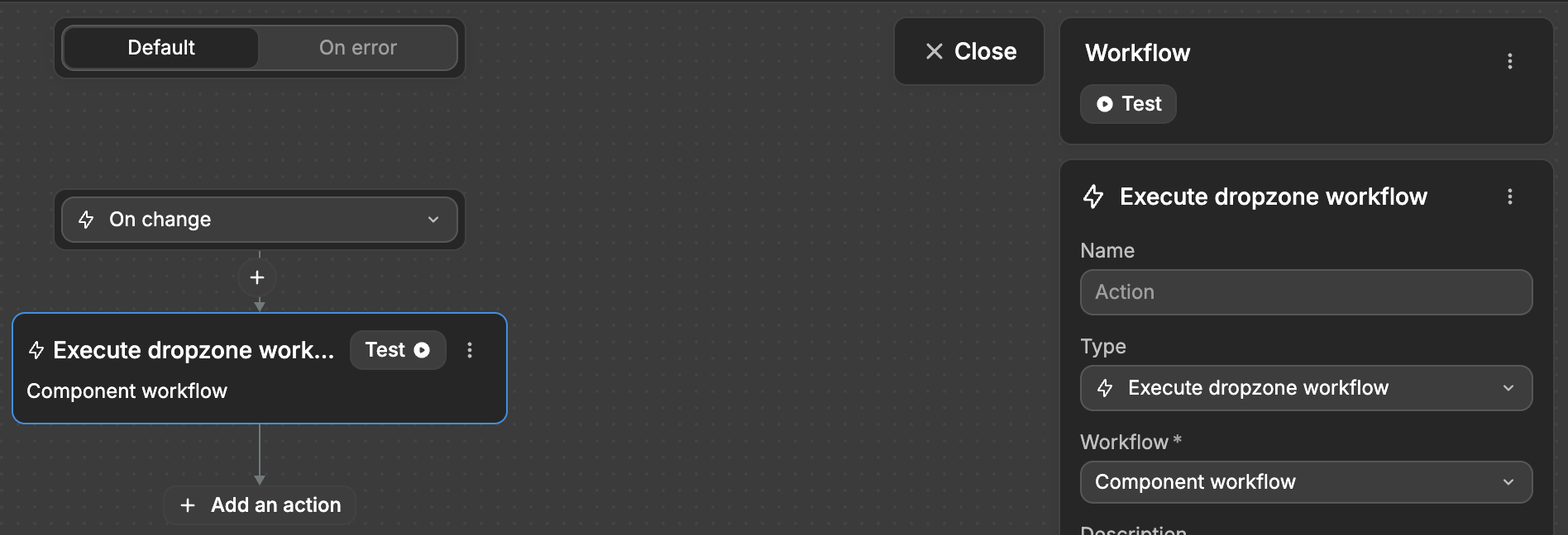
This approach lets you maintain organized component logic while still allowing flexible execution from dropzone elements when needed.
TIP
Remember to enable the appropriate execution permission (outside or dropzone) in your component workflow settings before attempting to trigger it.
Pass data to dropzones
To share component properties with your dropzone elements:
- Enter component Edit mode to select your dropzone
- Navigate to the
Dropzone datasection in the Settings tab - Locate the
Dataproperty:
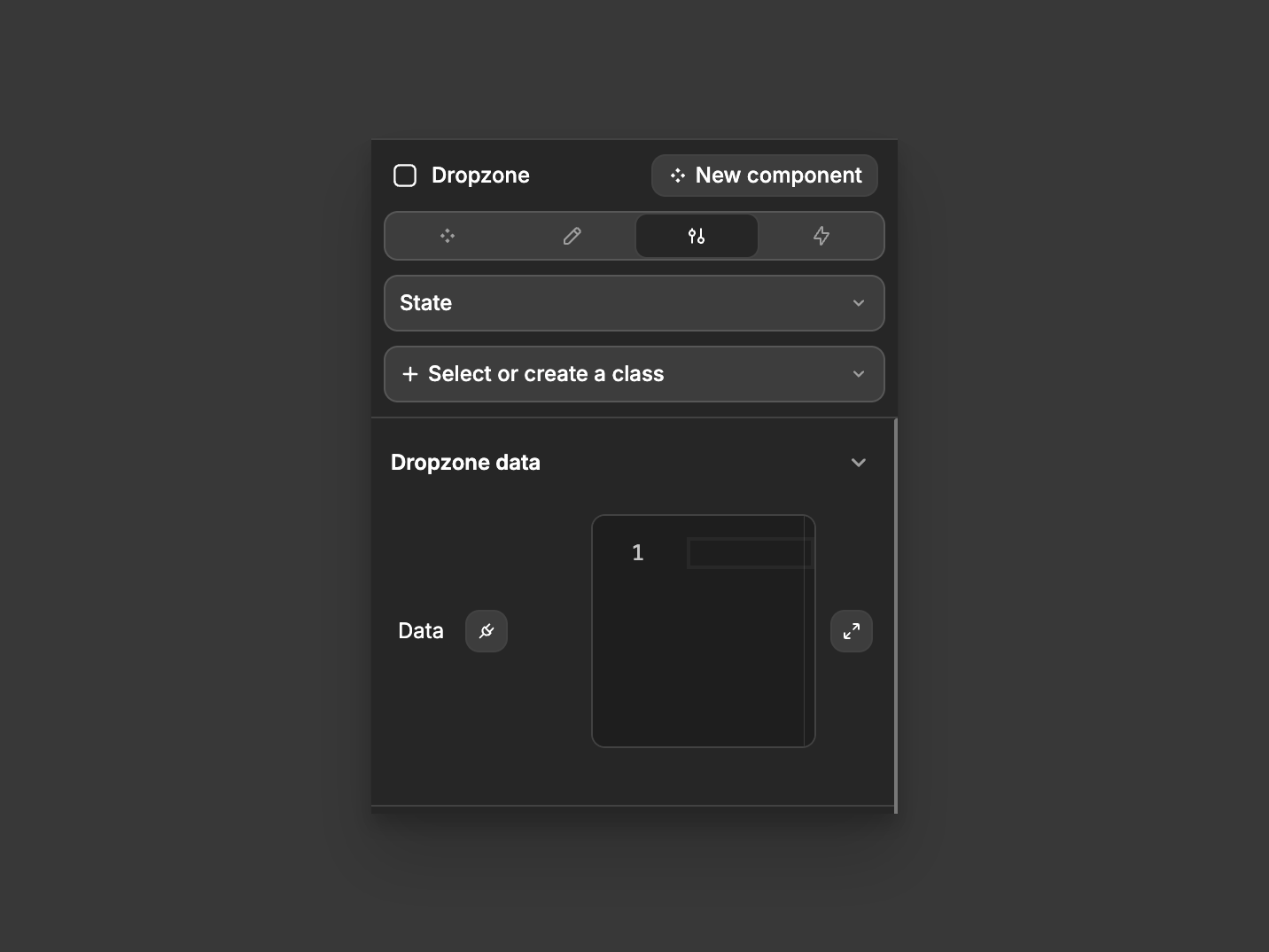
- Bind the component properties you want to make available in your dropzone
This allows elements within your dropzone to access and use the component's properties, enabling better integration between your component and its customizable areas.
TIP
You can pass multiple properties at once by binding them as an object.

