Appearance
Grid display
Why use CSS grids
CSS grids are a powerful tool to build complex, responsive layouts on the web.
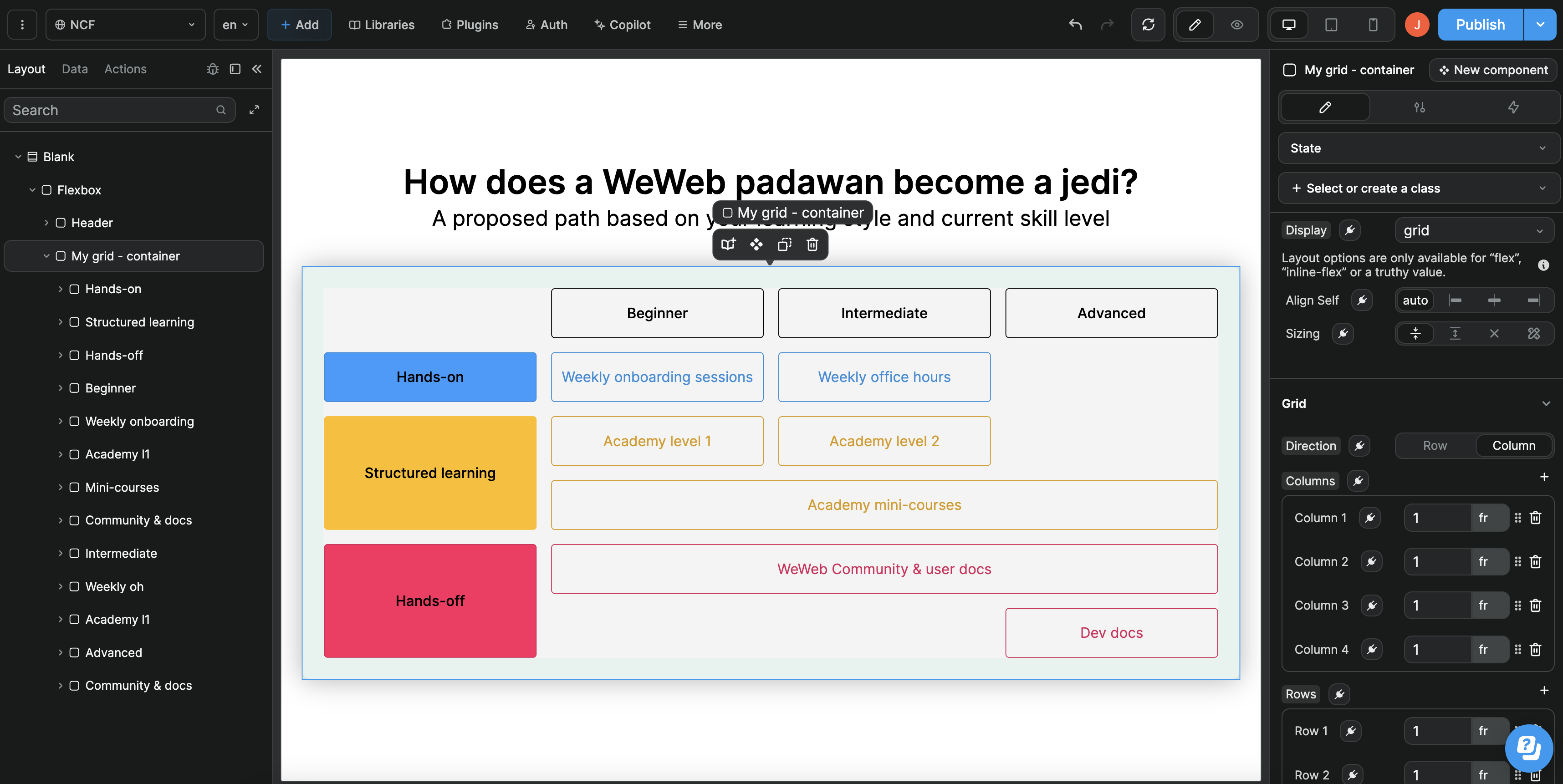
For example, designing a complex layout like this would be complex with a flex display but is fairly easy with a grid display:
CSS grid basics
UNDERSTANDING CSS GRID BASICS
The following article aims to explain how to use CSS grid properties in the WeWeb editor.
If you're new to CSS grids, we recommend you take the time to understand how CSS grids work in general.
We have selected 4 free resources that can help you with this:
- Learn CSS Grid helpfully lists and illustrates all available grid CSS properties
- CSS Grid Garden is an fun, interactive way to understand CSS grid properties
- MDN's docs explains the basic concepts of grid layouts
- Grid by Example includes numerous examples of grid layouts with the underlying HTML & CSS to reverse-engineer how each was built
Grid container
In the Style tab of WeWeb containers, you will find grid and inline-grid under the Display property options:
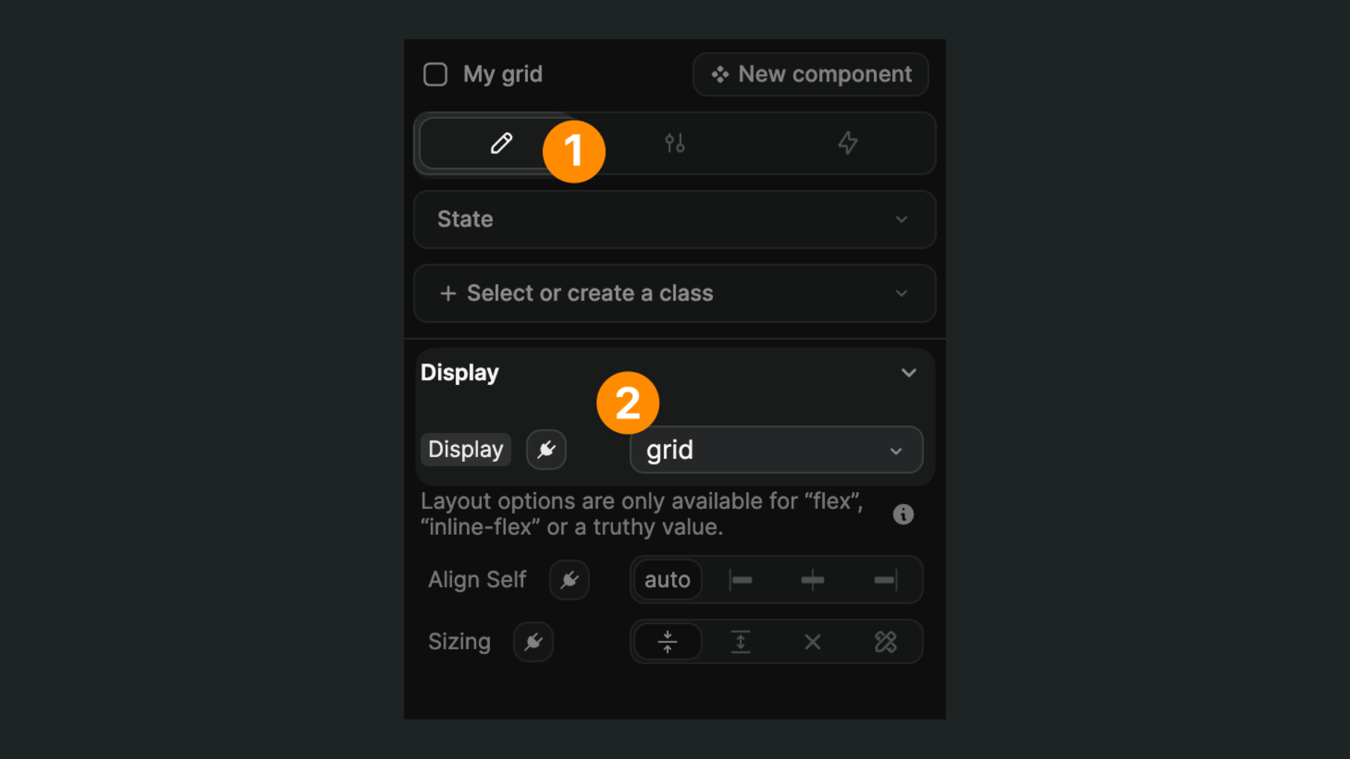
When a container has a grid or inline-grid display, all the children of that container become grid items.
Learn more about the grid container.
Grid direction
Grids can have a horizontal ("row") or vertical ("columns") direction:
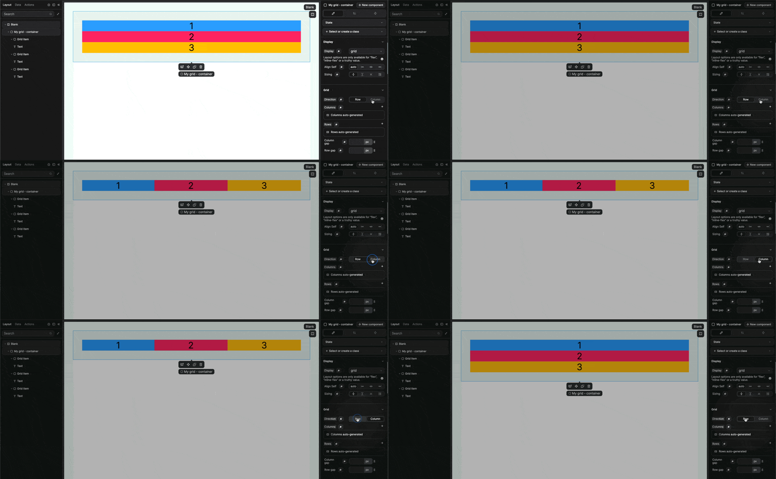
In the example above, we have 3 containers that can be displayed as rows or columns.
Grid column & row size
By default, each column or row will have the same width and height respectively.
You can, however, be explicit and set a fixed width or height to create more complex layouts:
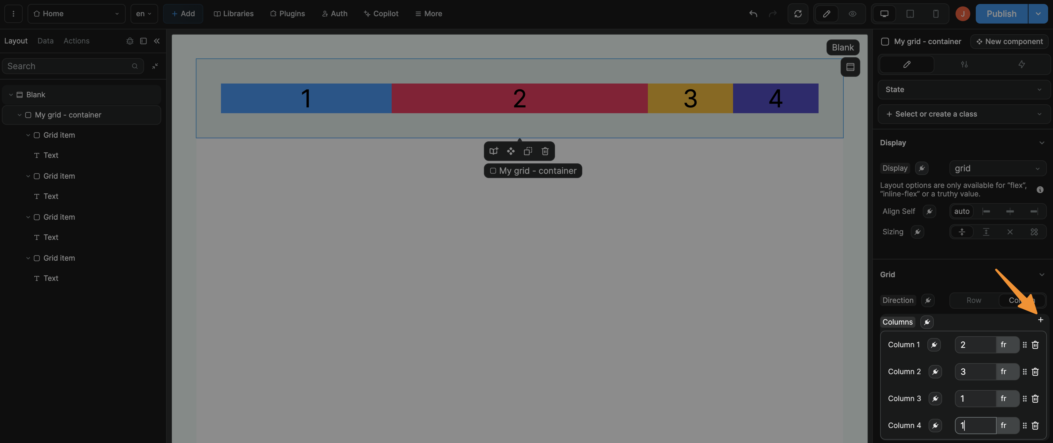
In CSS, this corresponds to the grid-template-rows and grid-template-columns properties.
In WeWeb, you have a couple of options to work with these properties:
- Use the no-code interface of WeWeb as shown in the columns example above, or
- Bind the
RowsorColumnssettings in WeWeb to CSS values as shown in the rows example below.
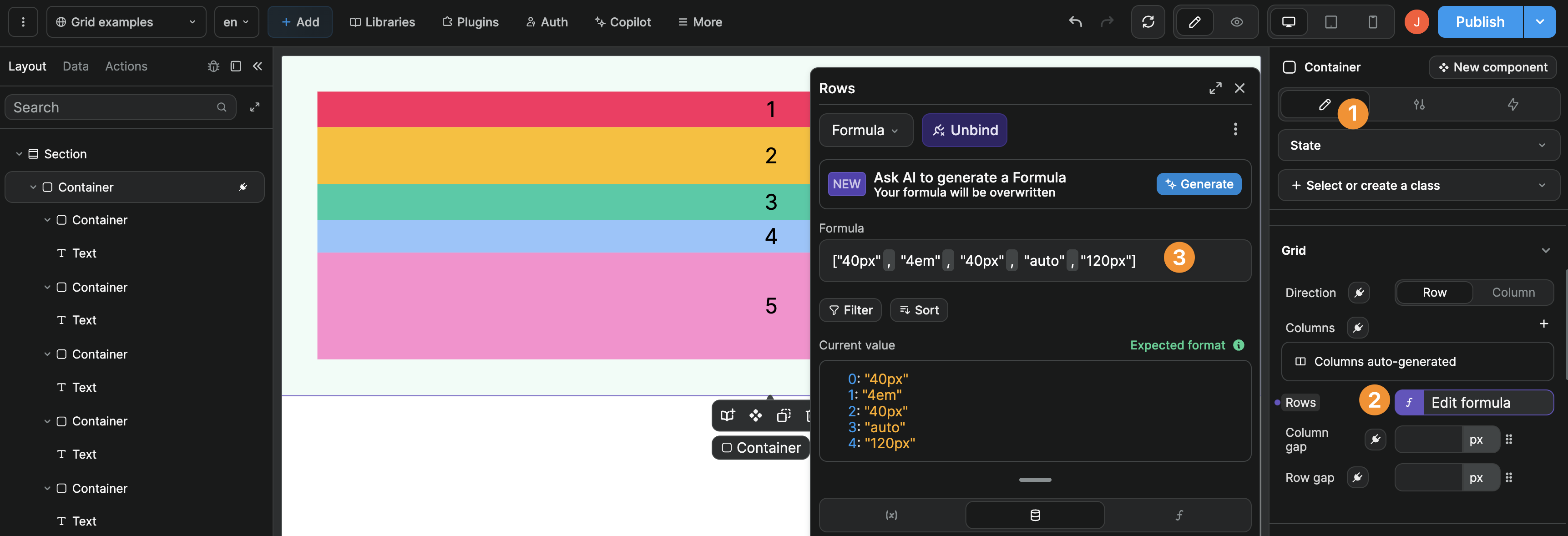
In the example above, you can see we have an array of 5 values that defines the height of the 5 rows in our grid.
Learn more about explicit grid templates
Grid gaps
Grid gaps (also called "gutters") are an elegant way of handling spacing:
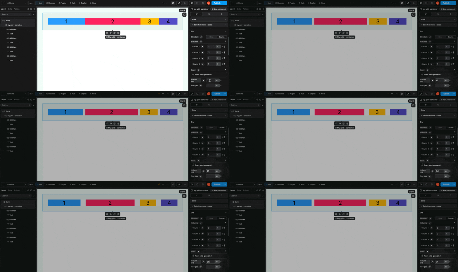
Learn more about grid gaps.
Grid items span & position
For each item in a grid, you can define its:
- Span — How many row or column units does it span
- Position — Where should it be placed in the row or column
Let's look at a few examples.
Example 1

In both cases, the grid container is configured as follows:
Direction: RowColumns: Auto-generatedRows: Auto-generatedWidth: 100%Height: 500Px
The grid on the left has no additional settings on the grid items. The grid on the right contains grid items where we specified the span or position.
Example 2
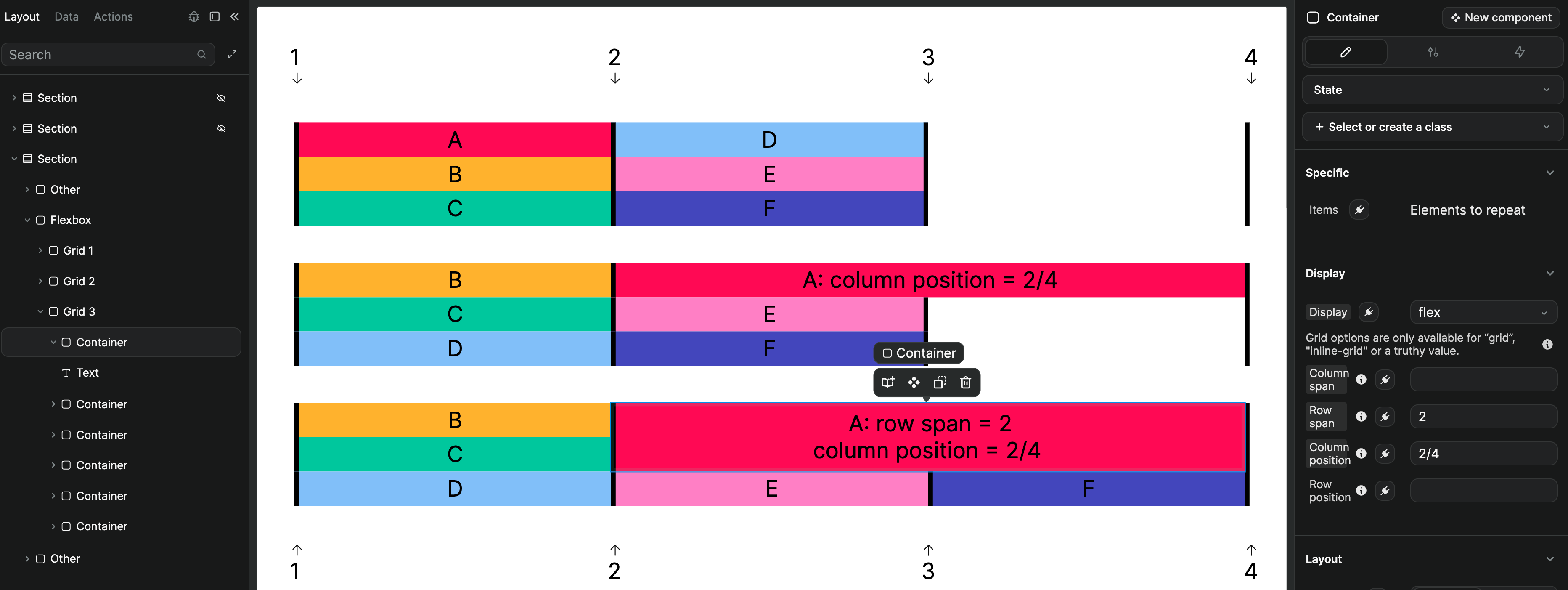
In all three cases, the grid container is configured as follows:
Direction: ColumnColumns: 3 Columns of1frRows: 3 Rows of1frWidth: 100%Height: Auto
The grid at the top has no additional settings on the grid items.
Grid item A of the middle grid has a Column position of 2/4.
Grid item A of the bottom grid has a Row span of 2 and a Column position of 2/4.
TIP
In the example above, notice that each grid has 4 vertical lines.
When we give the Column position property a 2/4 value, it means that the grid item should take up the space between vertical line 2 and vertical line 4 in the grid.
Learn more about positioning items by grid line number.
Troubleshooting
As mentioned above, this article aims to explain how to use CSS grid properties in the WeWeb editor.
If you're new to CSS grids, we recommend you take the time to understand how CSS grids work in general.
We have selected 4 free resources that can help you with this:
- Learn CSS Grid helpfully lists and illustrates all available grid CSS properties
- CSS Grid Garden is an fun, interactive way to understand CSS grid properties
- MDN's docs explains the basic concepts of grid layouts
- Grid by Example includes numerous examples of grid layouts with the underlying HTML & CSS to reverse-engineer how each was built
If you're still stuck after this, don't hesitate to reach out in the WeWeb Community! Make sure to include visuals that show:
- The end result you're trying to achieve, and
- The styles settings you have applied to your grid container and grid items.

