Appearance
The checkbox element is a popular element to allow users to:
- Select / unselect an option,
- Toggle an option on or off.
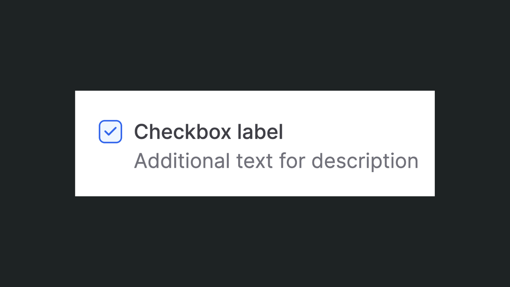
By default, it comes as a square checkbox with a light background color, a blue checkmark icon, and borders when the input is checked:
How it works
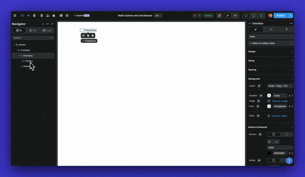
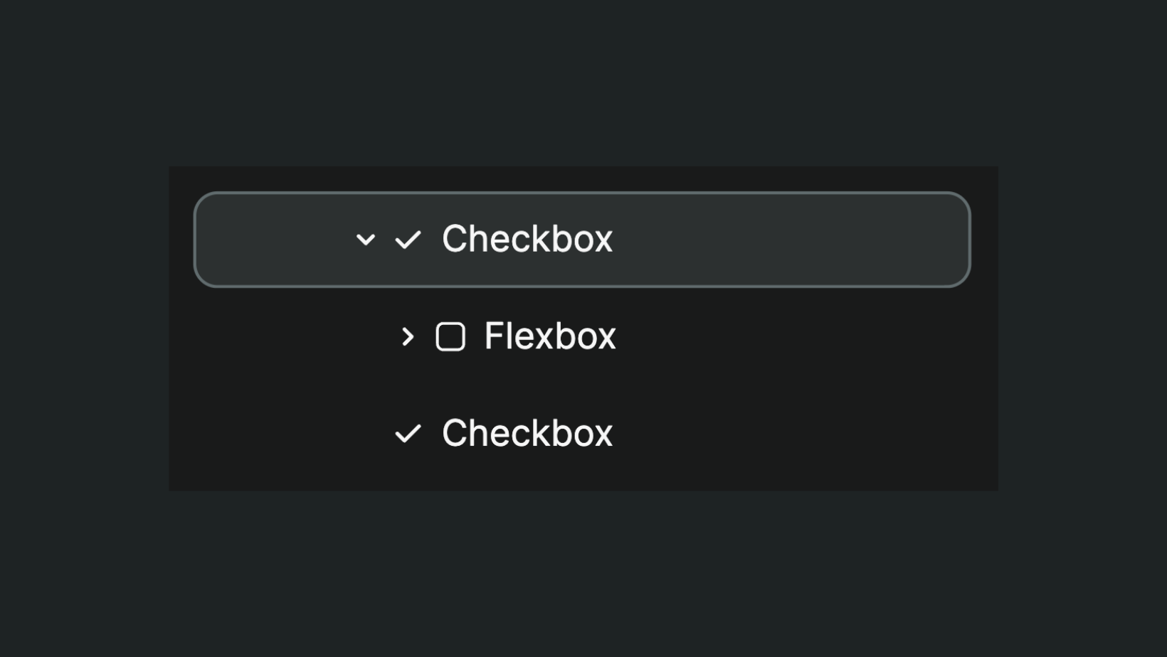
When you drag-and-drop a checkbox on a WeWeb page, you will notice that there is one Checkbox component that contains:
- A flexbox, and
- A checkbox input.
It's important to understand what these 3 items do and how they work together:
- The flexbox,
- The input, and
- The component as a whole.
Checkbox flexbox
The flexbox is helpful if you need to display a information next to the input for example.
In the Settings tab of the component, you can turn the Embedded container setting On or Off and decide where you want to display it:
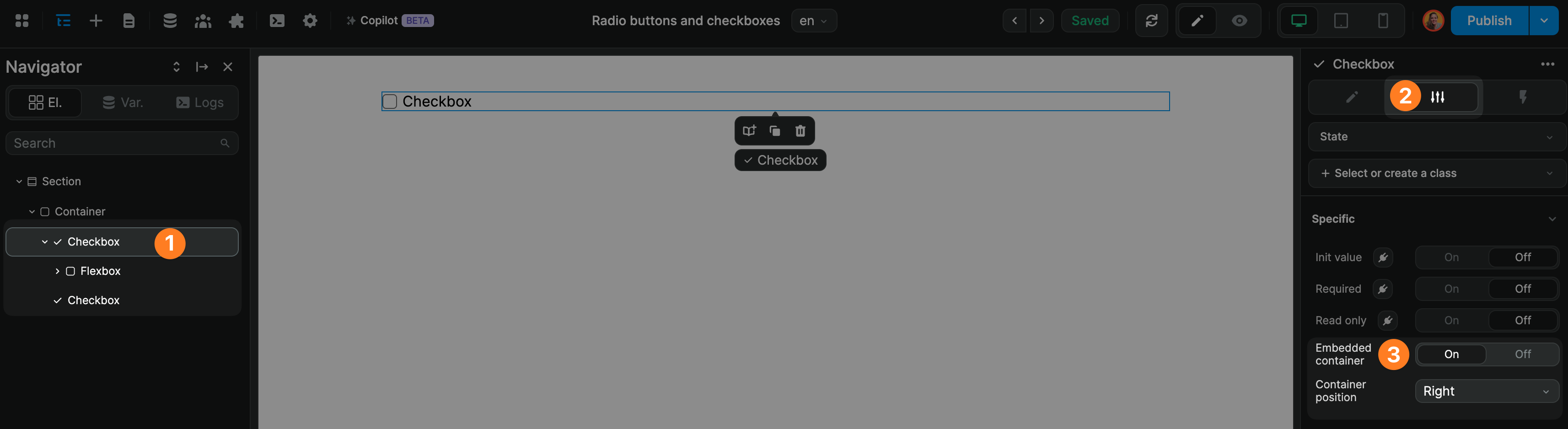
WARNING
Turning the Embedded container to Off deletes the container completely.
If you turn the Embedded container to Off and turn it back on to On, you will not be able to retrieve what you had in the container before changing the setting to Off.
You will need to start from scratch.
Checkbox input
The checkbox input is the element on which the user will click to toggle the option on or off.
By default, the checkbox input comes with two states (Default and checked):
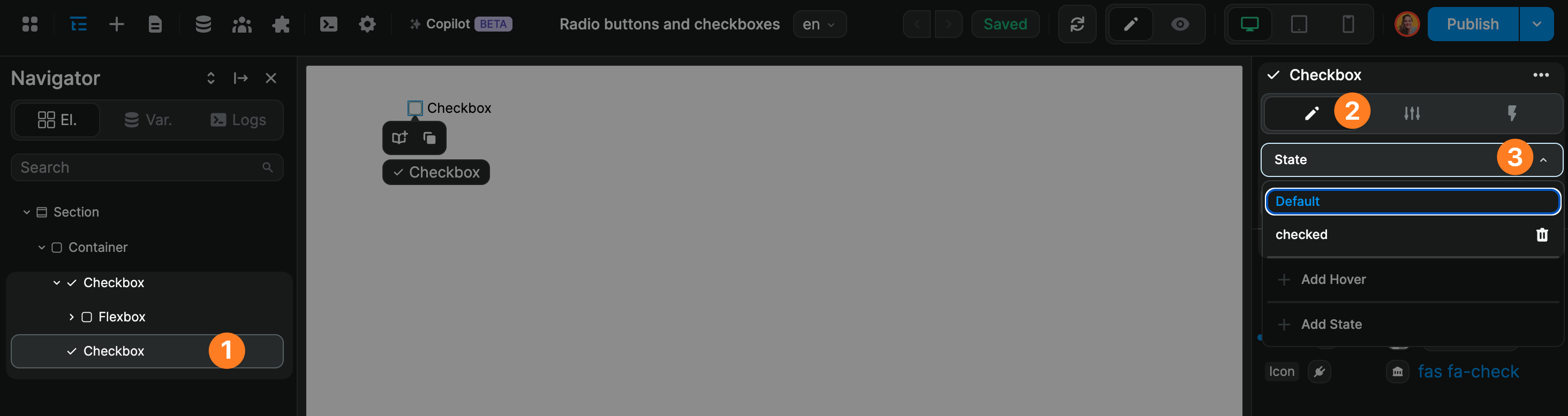
When the user clicks on the checkbox input, it will change the state of the input.
You can style the checkbox input in default or checked state (but more on that later).
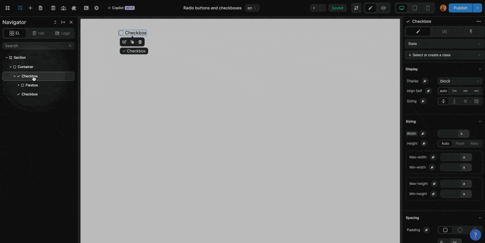
Checkbox component
The checkbox component contains both the checkbox input and the flexbox container if Embedded container is switched On.
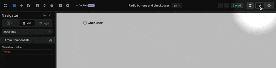
It comes with an internal variable:
- When the value is
false, the checkbox input will be displayed in itsDefaultstate - When the value is
true, the checkbox input will be displayed in itscheckedstate
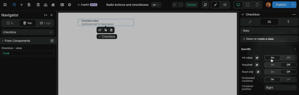
In Settings of the checkbox component, you can:
- Set or bind an initial value (which must be
trueorfalse), - Decide if the checkbox input is required,
- Decide if the checkbox input is read-only.
In the example below, you can see that we set the initial value to true by switching the Init value to On:

TIP
To test that your checkbox is behaving as expected, you will need to switch to Preview mode.
In the example below, the checkbox appears unchecked on the page despite:
- The
Init valuebeing set toOn, and - The component variable being
trueas a result
It's only when we move away from the Editing view that we can see the checkbox in action:
Style the checkbox
To style the checkbox itself, you will need to go on the checkbox element that's inside the checkbox component.
Once you've made sure you are on the checkbox input itself and not the parent element, you can style the checkbox as you would any other element:
Different state, different style
In the example above, you can see us styling the checkbox when in its Default state.
You can have a different style when the checkbox is in the checked state: