Appearance
Container
A Container is a versatile element used to group and organize other elements within a layout.
Adding a container to a page
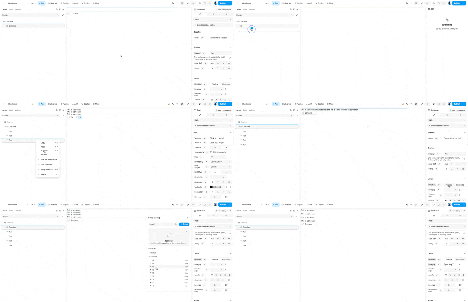
To add a Container, drag and drop it onto the editor. In WeWeb, a container defaults to a flexbox layout but can be configured as a grid too.
Adding elements to a container
Drag and drop elements inside Container to add them.

Sizing a container
Like other elements in WeWeb, the sizing of a Container can be adjusted from the sizing panel.
By default, a Container's width is set to 100%, its height is set to auto, and its max-width is set to 940px. This means it will take the full width available up to 940px, and the height will adjust to fit its child content.
Container sizing is managed through the sizing panel. You can adjust the sizing using the following properties:
- width: Sets the width of the Container. By default, it takes the full width available.
- height: Sets the height of the Container. By default, it adjusts to the height of its child content.
- max-width: Defines the maximum width the Container can expand to, preventing it from growing beyond this value.
- min-width: Defines the minimum width the Container must maintain, ensuring it doesn't shrink below this value.
- max-height: Sets the maximum height the Container can reach, limiting its expansion vertically.
- min-height: Sets the minimum height the Container must maintain, ensuring it doesn't shrink below this value.
Spacing in a conatiner
Padding and margin are CSS properties that can be applied to a div to control spacing.
- Padding: This property adds space inside the div, between the content and the border. It can be set for all sides or individually for top, right, bottom, and left.
- Margin: This property adds space outside the div, between the border and surrounding elements. Like padding, it can be set for all sides or individually for top, right, bottom, and left.
Styling a container
The following properties can be used to enhance the visual appearance of a container:
- Borders: This property allows you to define the thickness, style, and color of the border surrounding the container. It can be applied to all sides or individually to the top, right, bottom, and left.
- Outline: Similar to borders, outlines are drawn outside the border edge of the container. They do not take up space or affect the layout, and can be used to highlight or emphasize the container.
- Radius: This property is used to round the corners of the container. You can specify a uniform radius for all corners or set different values for each corner to achieve various shapes.
- Shadows: This property adds a shadow effect to the container, creating a sense of depth. You can customize the shadow's color, size, blur, and position to achieve the desired effect.
You can set a background color to a container, add an image or video

