Appearance
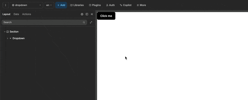
Dropdown
A dropdown allows you to select an option from a list, making it ideal for conserving space and presenting multiple choices in a compact form.
Components of the Dropdown
A dropdown consists of two main parts:
- Trigger: This is the interactive part that, when clicked, toggles the visibility of the dropdown's contents. By default, it includes a button, but feel free to add multiple elements to customize your dropdown trigger.
- Dropdown Content: This is where the dropdown's content resides. By default, it starts with a list, but you can add various elements to suit your needs.
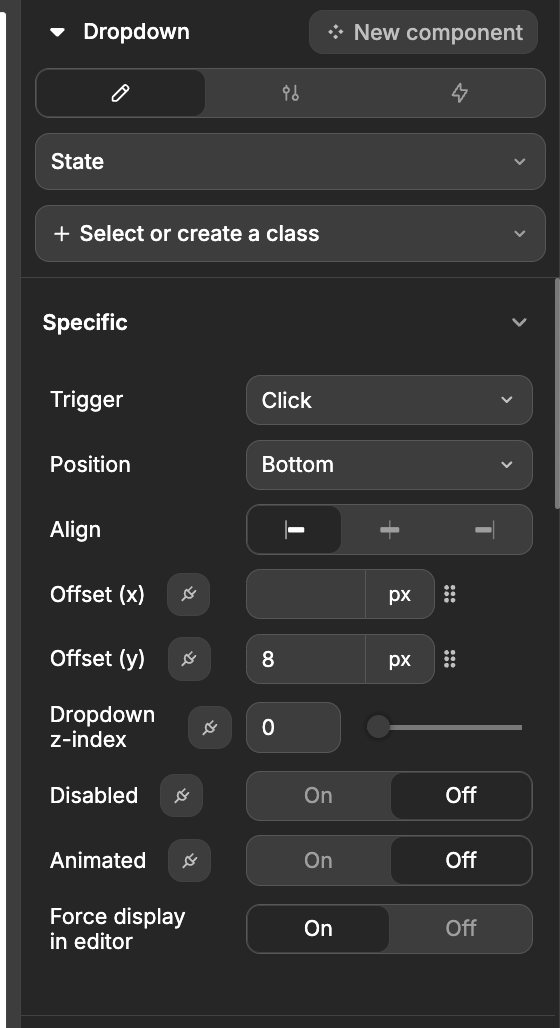
Configuring the Dropdown
The Dropdown comes with several handy properties to tailor it to your needs:
| Property Name | Description |
|---|---|
| Trigger | This is what activates the dropdown. By default, it's set to click, but you can switch it up to hover or right click if you prefer. |
| Position | This determines where the dropdown content appears in relation to the trigger. You can choose from Top, Right, Bottom, or Left, with Bottom being the default. |
| Align | This controls how the content aligns itself—vertically if it's on the right or left, or horizontally if it's on the top or bottom. |
| Offset (x) | Adjusts the horizontal spacing from the trigger element. You can use both positive and negative values here. |
| Offset (y) | Adjusts the vertical spacing from the trigger element. Again, both positive and negative values are welcome. |
| Dropdown z-index | This property allows you to set the z-index for the dropdown, which determines its stacking order relative to other elements. A higher z-index value places the dropdown above elements with lower z-index values, making it useful for managing overlapping content. |
| Disabled | A simple toggle to enable or disable the dropdown. |
| Animated | Another toggle to turn on or off the animation when the dropdown opens. |