Appearance
Data pickers
In WeWeb, you can access 3 date picker elements in the Add Element:
- The date and time picker,
- The date range picker, and
- The time picker.
Under the hood, these are in fact the same element with different Selection Mode and Time Mode presets but more on that later...
For now, let's focus on how it works out of the box.
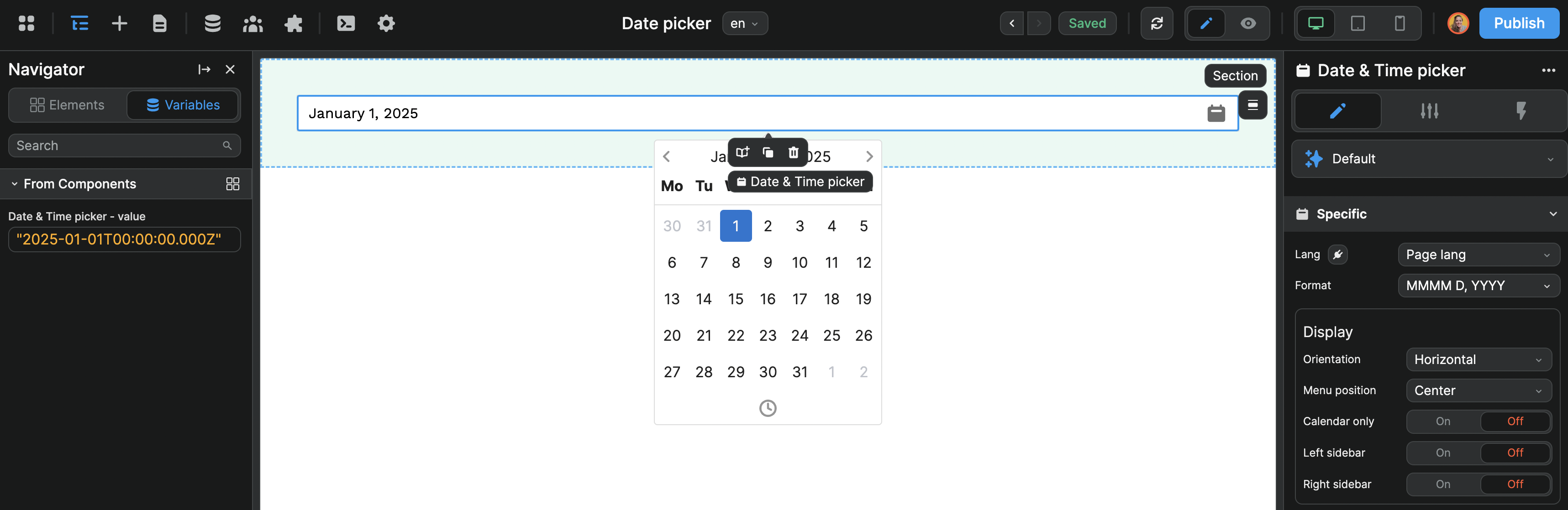
Component variable
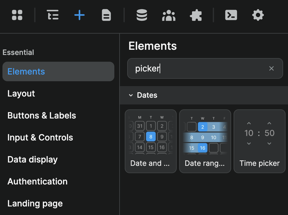
The first thing to understand is that, when you drag-and-drop a date or time picker element on the page, a new component variable will be created in the Variables panel:
If you change the Time > Mode to Date instead of the default Datetime, the variable will only include the date with no time information:

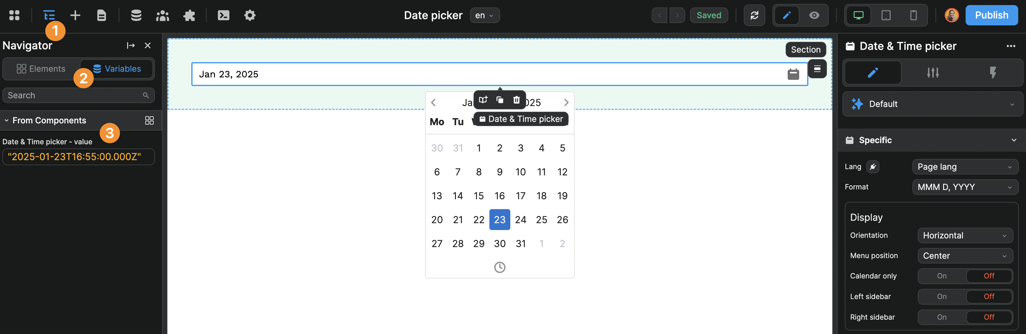
If you change the Selection > Mode to Range, the component variable will include a start and end date:
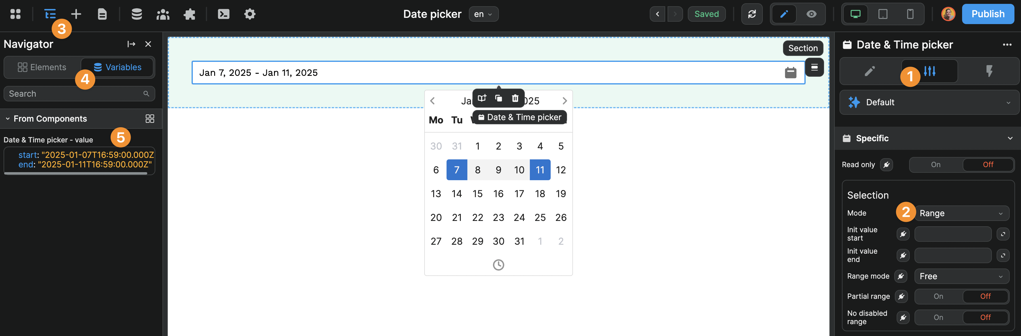
If you change the Selection Mode to Multi dates, the component variable will include
WARNING
Make sure to send the date in a format your backend understands. For example, if your backend expects a list of dates, send the selected date(s) in an array, even if the user only selected one date.
Styling the date picker
Let's have a look at the different no-code styling options that come with the date picker elements.
Lang
This setting will change the default language of the calendar.
If you select Page lang, the language of the calendar will take the current language of the page.
In the example below, we are working with three languages and we can see the language of the calendar changes based on the page language:

Format
The Format setting allows you to change how the date is displayed on the page.
The value of the component variable will remain unchanged but the date will be displayed to the user as you choose.
In the example below, we chose a format to display the full month name in letters. Instead of displaying Jan 5,2025, we display January 5, 2025:
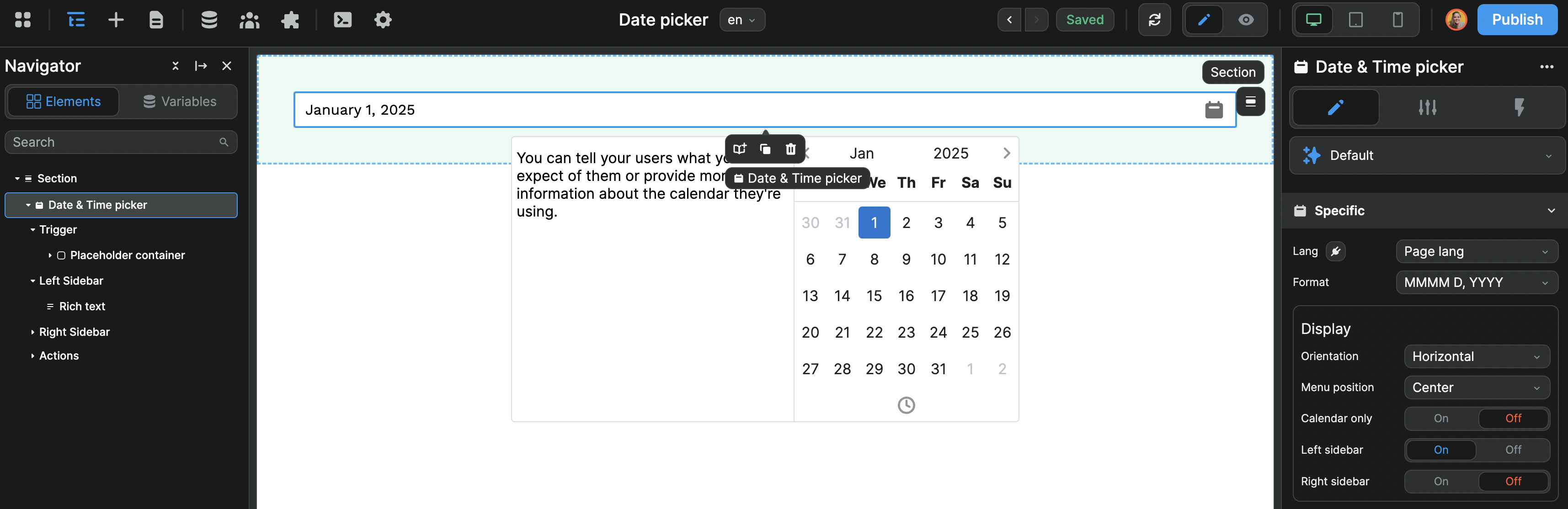
Display
The Display options allow to change a little bit how the date picker is displayed.
In the example below, we decided to keep the Menu position centered and display a Left sidebar in which we added a Rich text element to display a text:
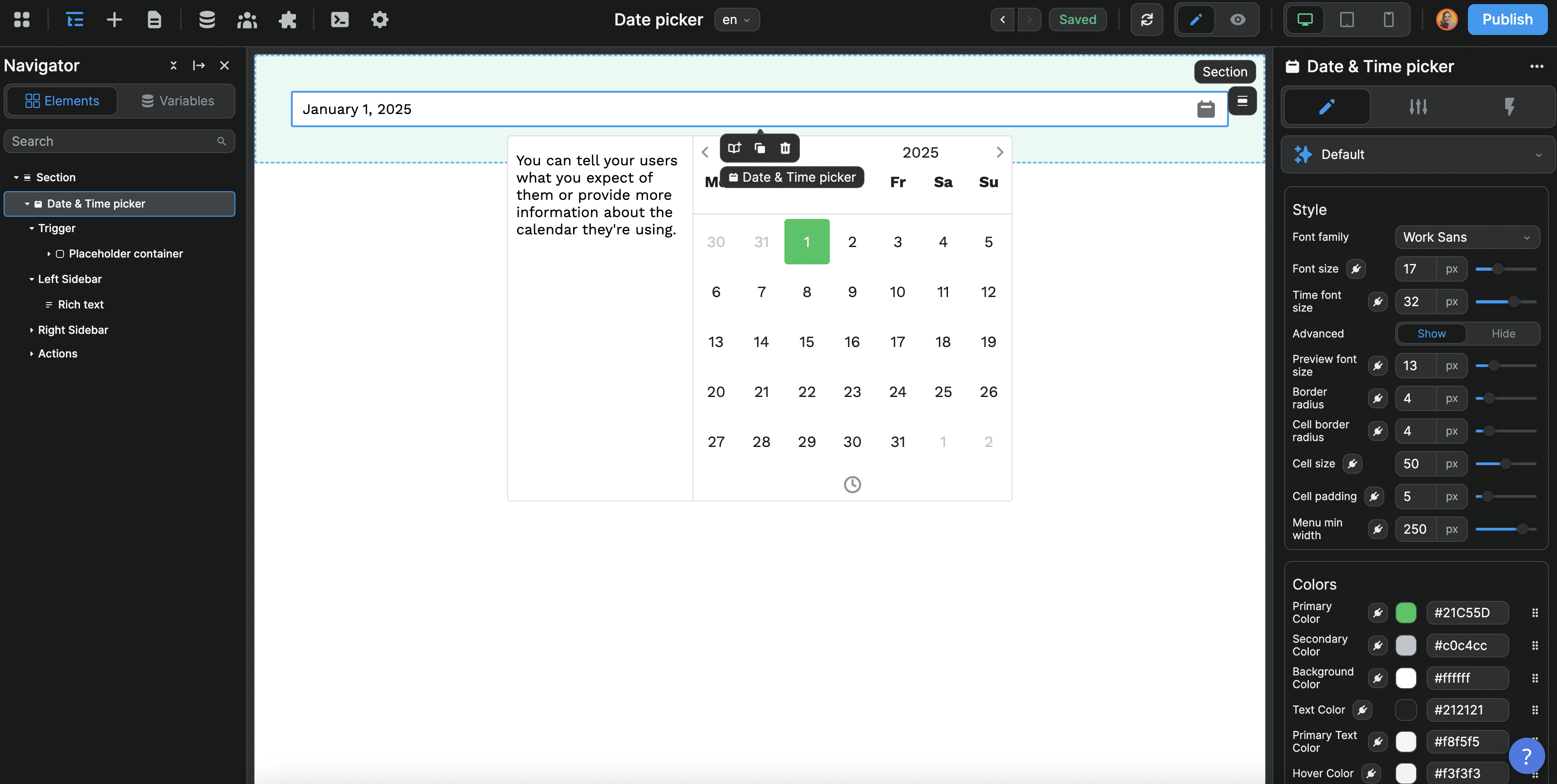
Style and Colors
The Style and Color properties are fairly intuitive.
Here, we made the cells of the calendar bigger by changing the Cell size from the default 35px to 50px and changed the background color from the standard blue to a nice green:
Other CSS properties
The other CSS properties available in no-code for the date pickers are standard (e.g. Sizing, Spacing, Display, etc.)
You can find more about each property in the article dedicated to standard CSS properties.
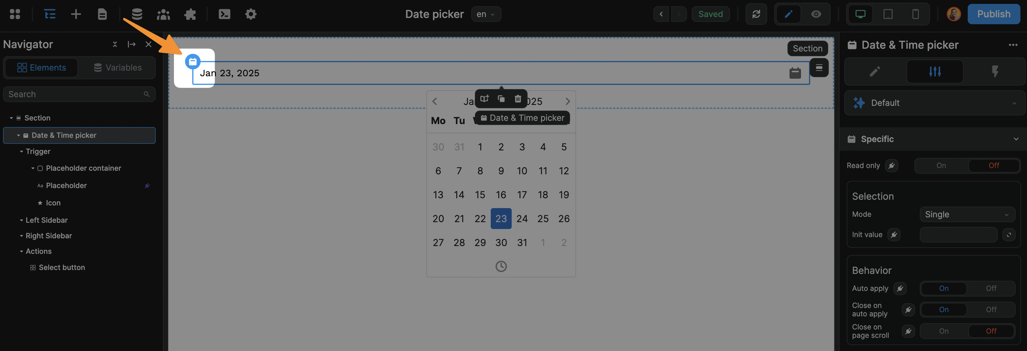
TIP
If you're noticing you're having trouble selecting the date picker element, consider selecting it from the Layout Tree or on the page by selecting the date picker icon in the top left of the element:
Let's now dig into the customization options available with the date picker elements.
Single, multiple, or range date picker
As mentioned above, the date and time picker elements in WeWeb are all the same under the hood with different default settings. The first setting that changes from one type of picker to the other is its Mode.
In the specific settings of the date pickers, you can switch between one of three modes:
- Single: users will be able to select a single date. The variable value will be a date string.
- Range: users will be able to select a range of dates. The variable value will be an object with a
startandenddate - Multi dates: users will be able to select multiple dates. The variable value will be an array with a list of date strings.
Single mode
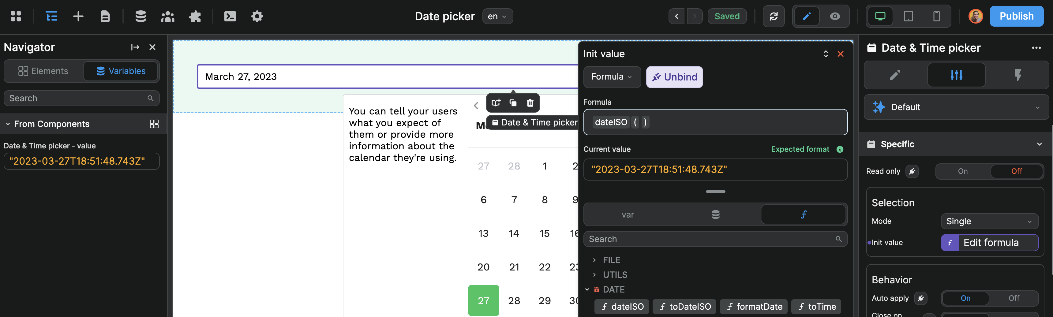
The one thing you might want to set in Single mode is the initial value (Init value) of the date picker. In the example below, we used a no-code formula to select the current date by default:
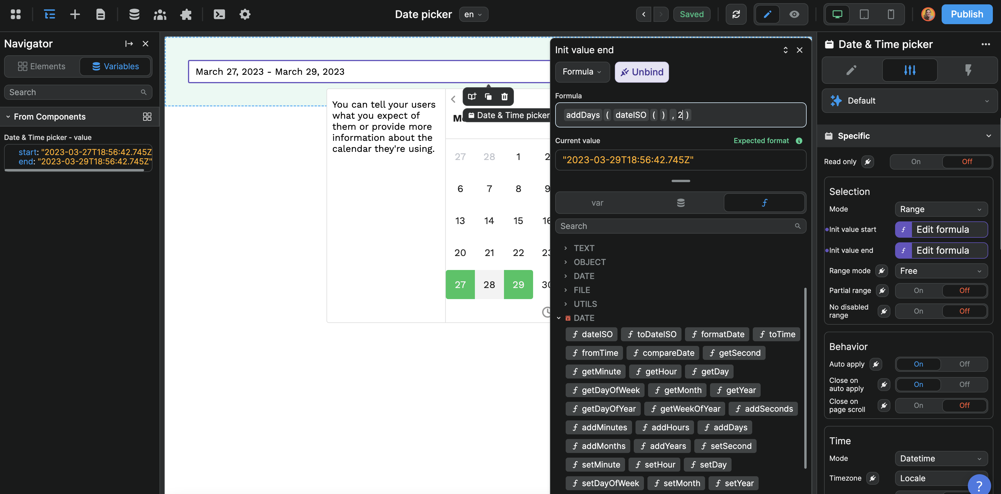
Range mode
The range mode works similarly except it expects a start and end date:
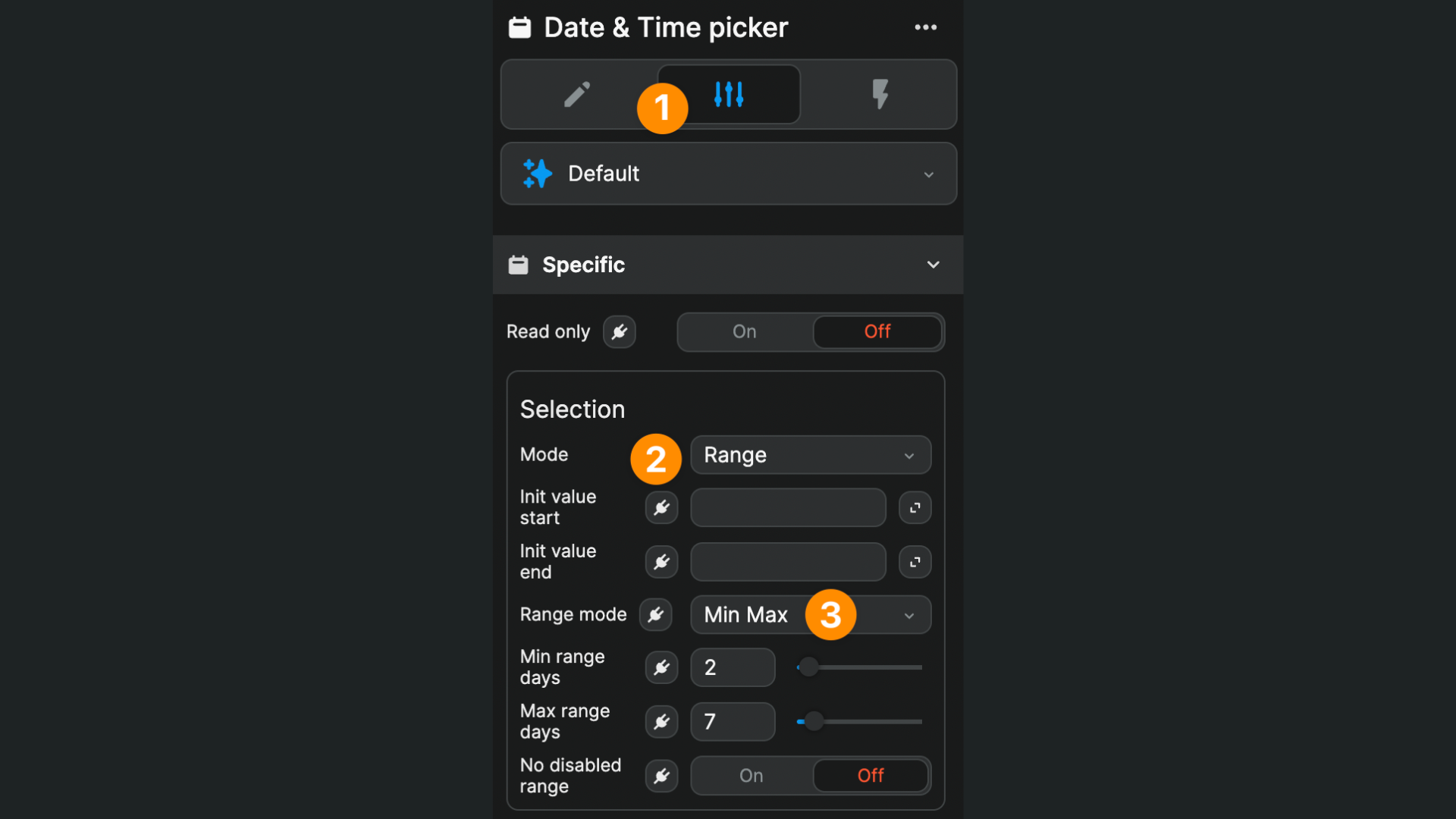
There are three Range mode options:
- Free: the user can select whatever date ranges they want
- Auto: the user selects the start date and you define how many days after the range ends with the
Auto range dayinput - Min Max: the user can select the range they like provided its above and below the numbers you define
In the example below, we want users to book more than 2 but no more than 7 nights:
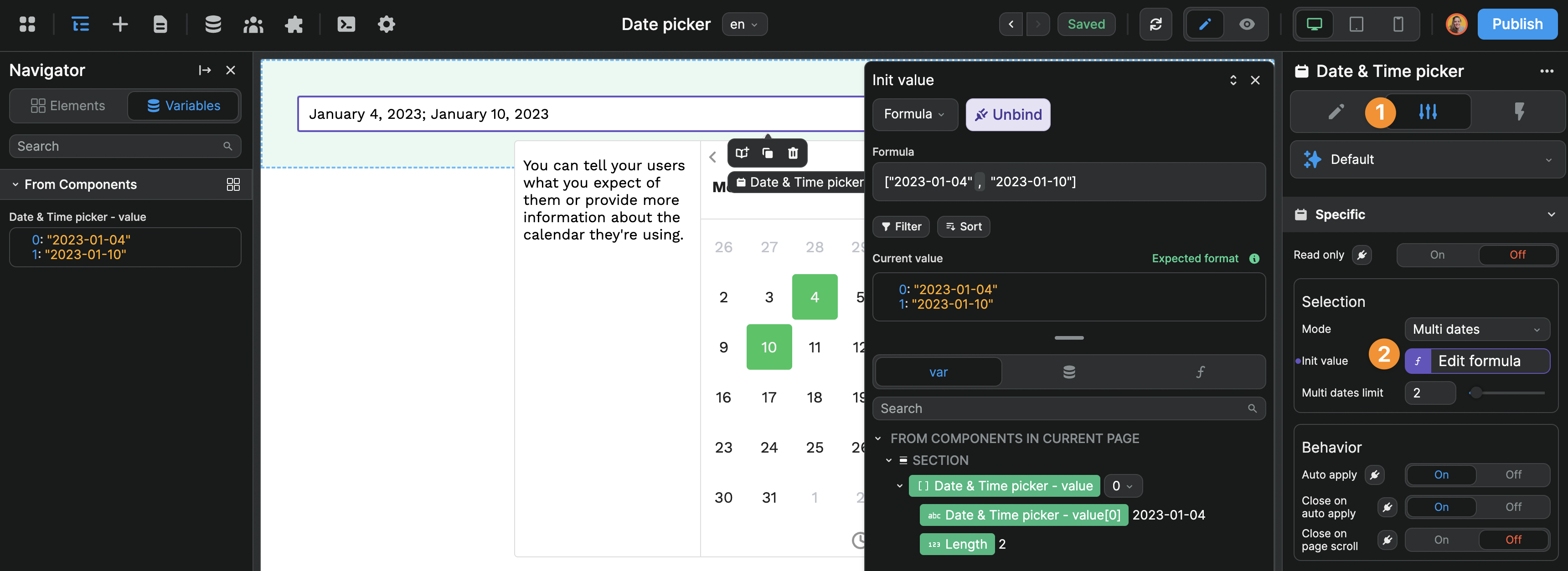
Multi dates mode
The Multi dates selection mode expects an array of dates as an initial value.
In the example below, we enabled the option to select multiple dates (Multi dates), selected 2 dates by default (Init value), and limited the number of dates a user can select at one time (Multi date limits). As a result, we can see two dates are highlighted by default and the component variable is an array of strings:
Behavior settings
Auto apply: disable if you want the user to confirm the selection before closing the calendar
Close on auto apply: disable if you want the calendar to stay open even after user has selected the date
Close on page scroll: enable if you want the calendar to close automatically when the user scrolls out of view
Time settings
The Time settings define the type of range will be able to select. One way to look at it is through the value that is updated in the component variable of the date picker element:
- In
Datetimemode, the variable returns a date with year, month, date, and time. For example,"2025-01-06T23:00:00.000Z" - In
Datemode, the variable returns a date without the time. For example,"2025-01-10" - In
Timemode, the variable returns an hour, minute, and seconds. For example,"19:28:00" - In
Monthmode, the variable returns a year and month. For example,"2025-01" - In
Yearmode, the variable returns a year. For example,"2025"
TIP
In code, dates are strings. That's why the date values are displayed in between quotation marks.
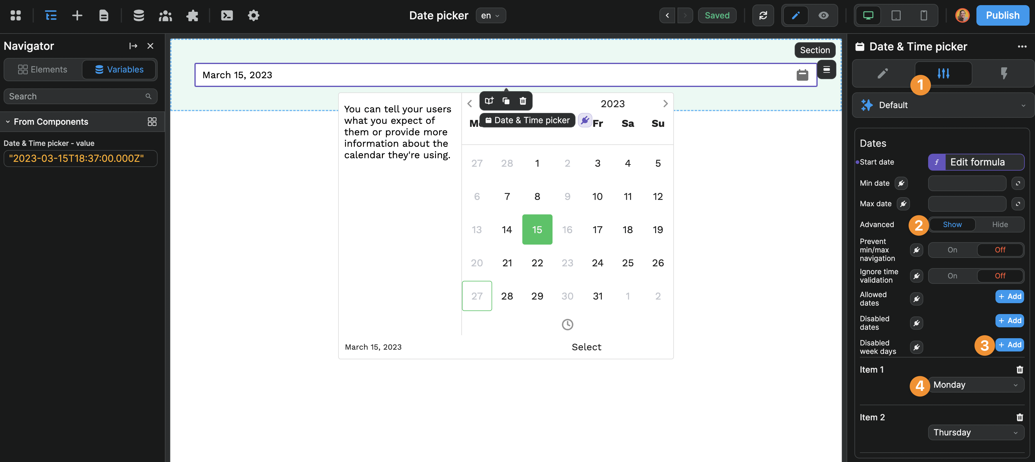
Dates settings
Start date: the date on which the date picker will open
Min date: users can't select a date before that
Max date: users can't select a date after that
Advanced date navigation settings
Prevent min/max navigation: users can't navigate before the Min date and after the Max date
Allowed dates: users will only be able to select among these dates. Expects a list of dates. For example, ["2023-03-25","2023-04-01","2023-04-12"]
Disabled dates: users will not be able to select these dates. Expects a list of dates. For example, ["2023-03-25","2023-04-01","2023-04-12"]
Disabled week days: users will not be able to select dates that fall on specific week days. Expects an array of numbers where 0 stands for Sunday, 1 for Monday, etc. For example, [1, 4] to disable Mondays and Thursdays.
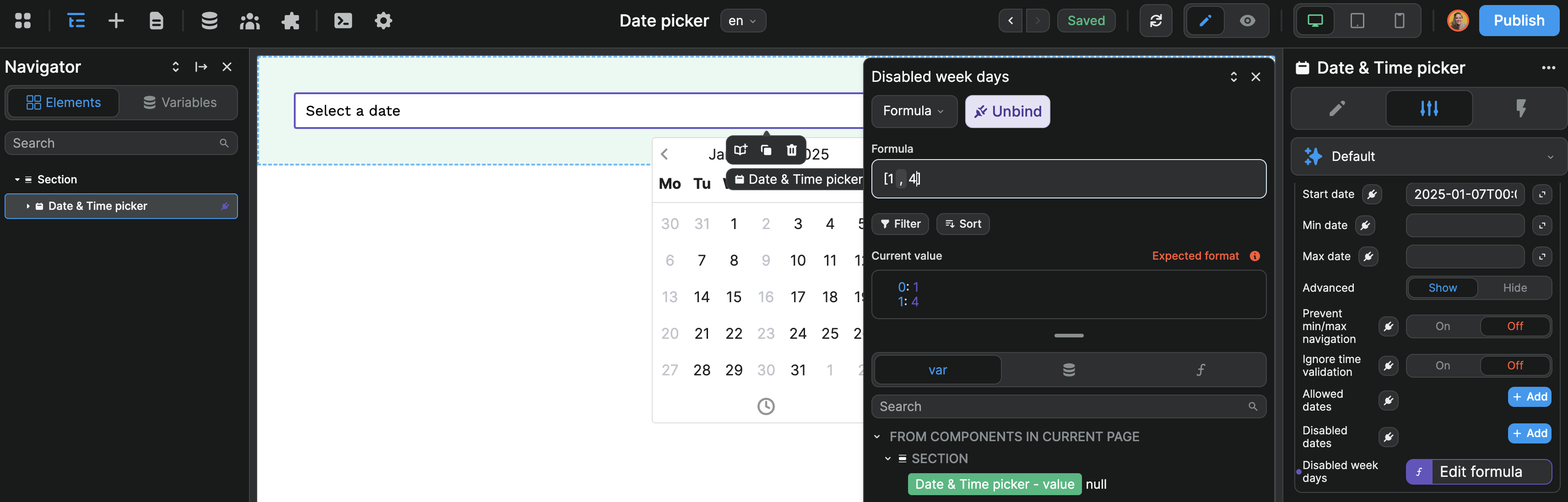
If you don't need to decide which days to disable dynamically, you could use the Add button instead of binding to hard-code the disabled week days:
WARNING
The Allowed dates, Disabled dates, and Disabled week days settings expect a list of dates. For example: ["2024-06-04", "2024-06-20"]

If your intention is for only one date to be available, you will still need to “wrap it” inside an array. For example: ["2024-06-04"]
Weeks / Months settings
Week start: define which day the weeks start on
Week numbers: choose if you want to display week numbers
Hide offset dates: hide the last days from the previous and first days from the next month
Disable month/year select: hide the calendar navigation
Flow
The Flow is the order in which users will be invited to pick a date and/or time.
By default, when the user clicks on a date picker element, they see a monthly calendar which they can navigate in. Depending on your use case, this can be a bit cumbersome.
To change this UX, you can enable the Flow setting and fully control how the user will interact with the date picker.
In the example below, we configured the date picker flow so the user would be invited to choose a year and month before selecting the correct day in the calendar:
- Remove the steps you don't need
- Re-order the steps as you see fit
- Go to preview mode
- Click on the date picker
- Select a year
- A month
- And day
TIP
This type of UX can be helpful when there's a good chance the date that is picked is a few years back. When you ask for someone's birthday for example, asking them to navigate year after year after year can be cumbersome.
PS: This tip is not at all influenced by the age of the person typing this ^^