Form container
Form containers are the primary method for creating forms in WeWeb, allowing users of your web-app to send you information via the user interface. They are essential for tasks such as:
- subscribing to a newsletter,
- updating profile information, or
- creating a new entry in your database.
Add a form container
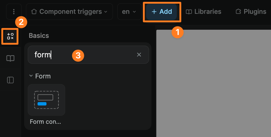
To add a form container in WeWeb, go to Add > Basics and search for "form":

Customize a form
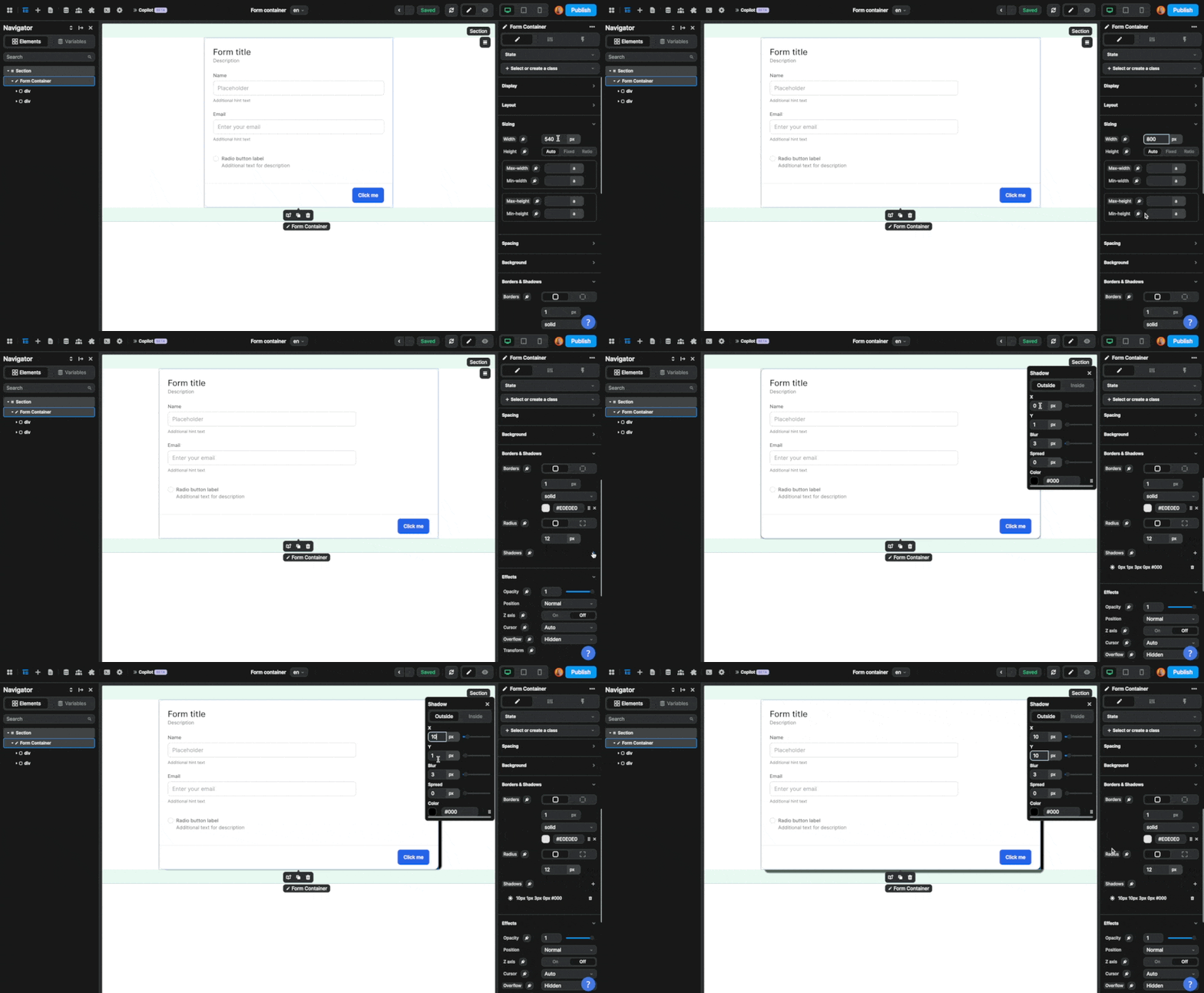
You can customize the style of a form like you would any other element:

In the example above, we changed the width of the form and added shadows.
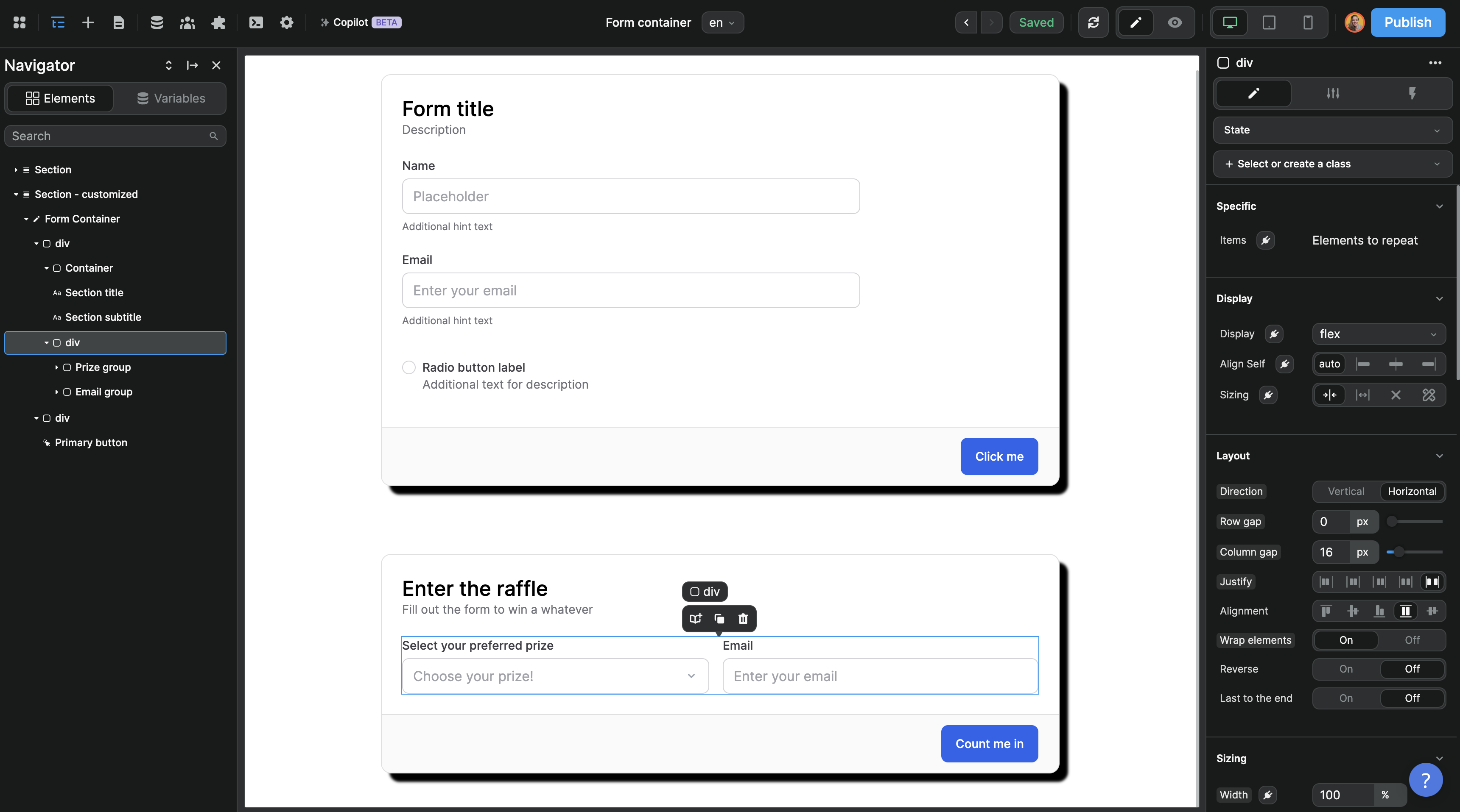
You can also add, remove, and customize elements inside the form container:

In the example above, we deleted a few elements, added a select input, and changed the direction of the div that contains the user inputs to display them horizontally.
Submit a form
To allow users to submit the form, you'll need to add a workflow.
WARNING
For the form to be validated properly when the user submits it, the workflow should be on the Form container element itself, not on the button

TIP
Looking at the Navigator on the left in the example above, notice the lightning icon next to the Form container element. There's no such icon next to the Submit button element. This shows us we added the workflow on the correct element.
The form submission workflow should be triggered On submit. The actions that come after that will depend on your use case:

In the example above, when a user submits a signup form, we create their profile in the WeWeb auth plugin (action 1) before redirecting them to a login page (action 2).
UX best practices
There are a number of best practices related to forms that will greatly improve your web-apps accessibility and user experience, including but not limited to:
- labels,
- input states, and
- what happens after a user submits a form (whether it's successful or not).
Labels on text inputs
In order to improve user experience, it's best practice to display a label above text inputs so that, when a user starts typing in the field, they have a reminder of what input they're on.
You have a couple of options to do that in WeWeb:
- you can add a static label above every input like we have in the form containers provided in the
Addpanel, or - you can use enable the
Advanced placeholderoption in theStyletab of the input

States on inputs
In order to improve your web-app's accessibility and user experience it's best practice to add states to form inputs.
Learn more about adding states in WeWeb.
After form submission
When a user submits a form, it is best practice to let them know if their form submission went well or not.
In terms of UX, you could do this in different ways. Most times, you'll choose one of 2 options:
- redirect the user to a success or error page, or
- display a success or error message on the current page.
To display a success or error message, you could use WeWeb's Alerts element or simply add and display a text element below the form to inform the user of the submission status.
Debugging a form
Features with user interactions like form submissions can be tricky to develop.
Here are a few things to look out for if your form is not working as expected.
The workflow is not working when you test it in the debugger
We recommend that you:
- test each action of the workflow from top to bottom
- when you see an error, try to understand what it means
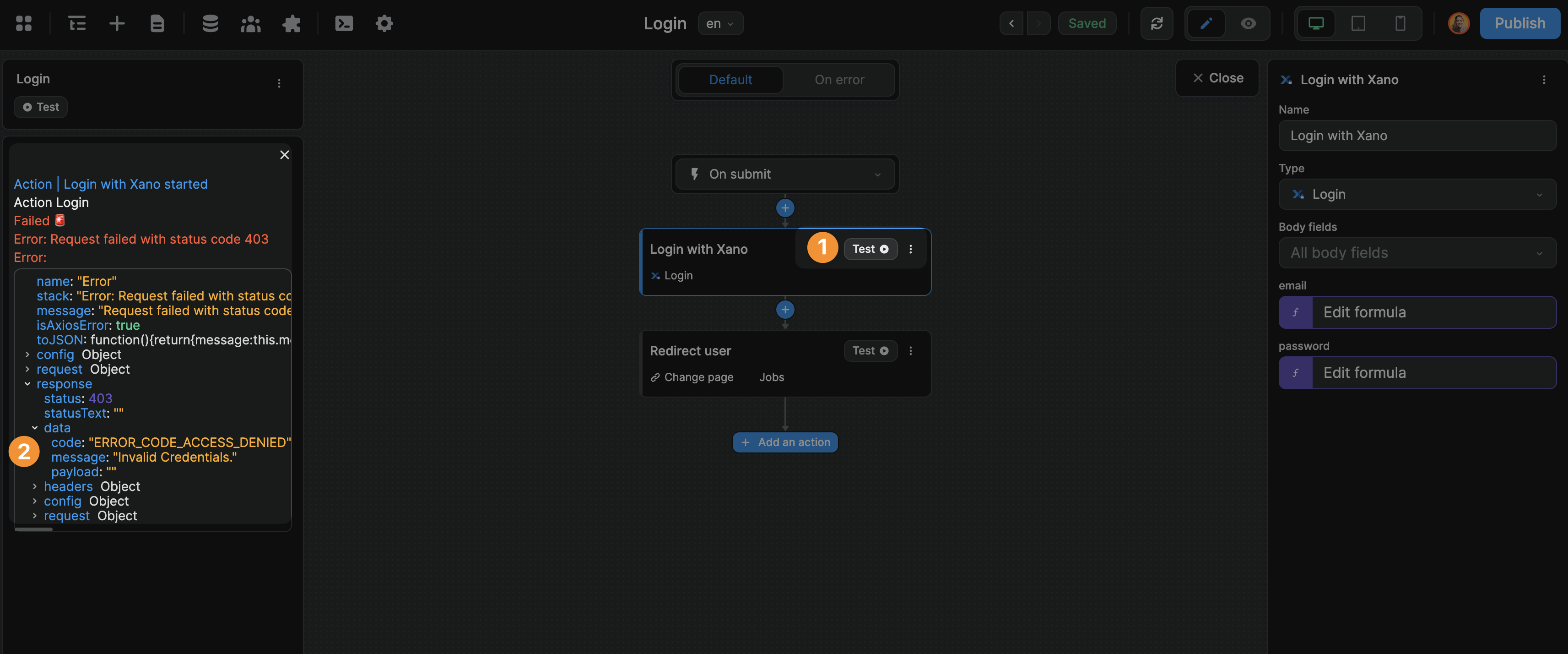
Don't hesitate to open and search through the API response. Very often, APIs you're working with will send back a complex object with more information about the error inside:

The workflow is working in the debugger but not in preview mode
Check the following:
- is the workflow on the
Form container? - is it triggered
On submit? - is the form button a
Submit button? (check theSettingstab of the button) - is the form button enabled? (check it's not disabled in the
Settingstab of the button) - is the submit button inside the form container?