Appearance
Select
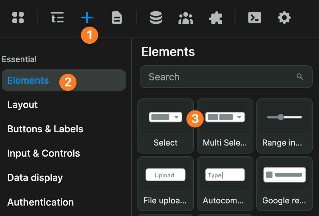
You'll find the select and multi-select elements in the Add Element:
Select filters 101
In the video below, we explain how to use the select element to filter a list of phone calls based on how long they lasted:
00:00 - Understanding component variables
01:10 - Configuring selectable options (label != value)
02:29 - Filtering the list based on the option selected by the user
04:15 - Outro
Dynamic options
In the example above, we "hard-coded" the options displayed in the select element.
This is a great approach if you know your options will rarely change. However, depending on your use case, you might want to display dynamic options.
For example, if you're a car rental company with new locations opening or closing regularly, you might want to bind the select element to data in a table view:
Better UX & performances
WeWeb's select element comes with advanced options which can boost the UX and performances of your web app, including but not limited to:
- Allow users to search through items (not just scroll)
- Limit number of options displayed and enable infinite scrolling to boost performances
- Decide to close or leave the select options open after selection
Multi-select
In the video below, we explain how you can filter a table view based on values selected by the user in a multi-select dropdown: