Appearance
Button
Add a button to your web app—it's perfect for kicking off actions or submitting forms!

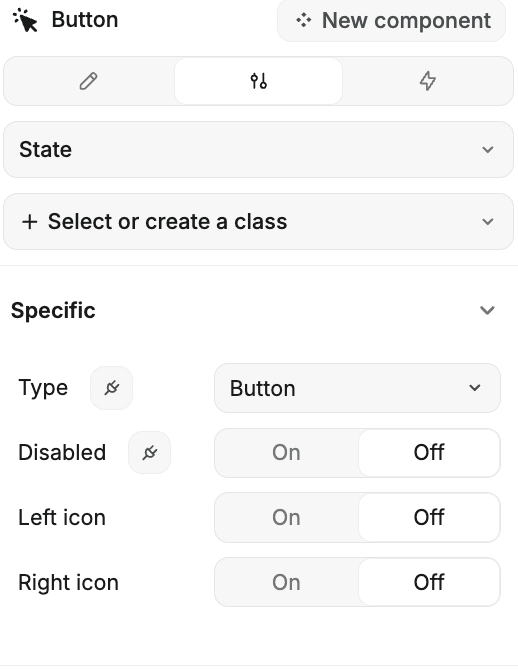
Configuring the Button
- Type: Choose what kind of button you want:
- None: No specific action assigned.
- Button: Standard button for general actions.
- Submit Button: Used for submitting forms.
- Disabled: Toggle this to disable the button if needed. When disabled,
onClickis no longer triggered. Therefore all workflows relying ononClickwill not be triggered. Also, form submissions will not be triggered. - Left Icon: Want an icon on the left? Toggle this on and pick your favorite icon.
- Right Icon: Prefer an icon on the right? Toggle this on and select the icon you like.
For triggering actions, the best approach is to use workflows with the on click trigger.
If you're looking to save or update forms, it's smarter to trigger workflows on the form container. By using a Submit Button, the form container will automatically recognize it as a submit action. This way, you'll have access to all the form's properties, and your logic will be neatly organized.


