Appearance
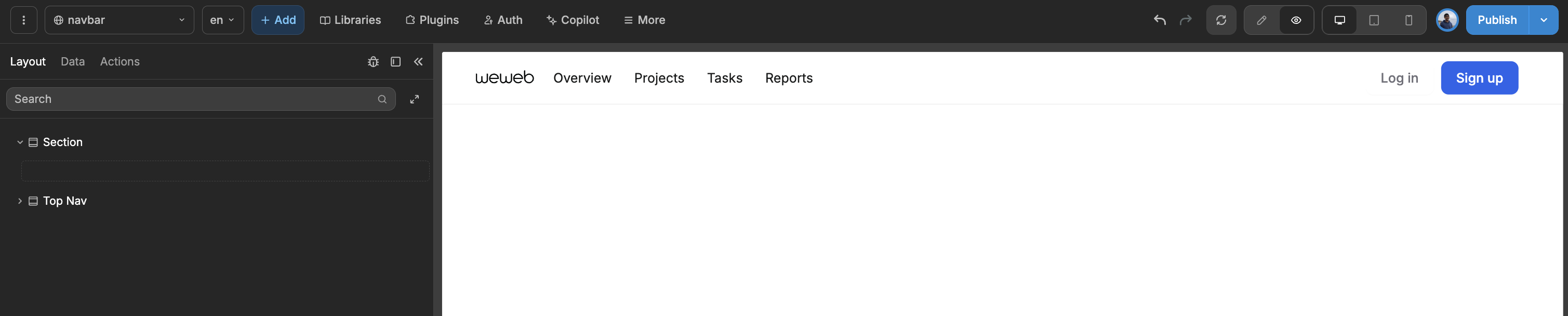
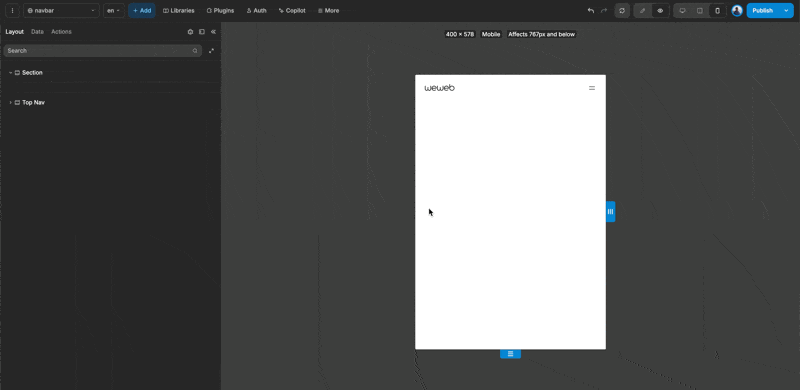
Top Navigation Bar
The top navigation bar is positioned at the top of the page and is designed to showcase essential links and actions for easy access.
Components of the Top Nav bar
The Top Nav Bar consists of two containers: one for Web View and another for Mobile View. It is responsive and automatically displays the appropriate container based on the screen size. You can modify these settings by adjusting the display property in the style panel. Be sure to review this property across different screen sizes to ensure optimal configuration.
Web View
The Web View consists of three main containers:
- Menu: This container holds the list of links available in the navigation bar.
- Actions: This section includes two buttons designed for call-to-action purposes.
- Mobile Icon: This icon is used to open the menu when viewed on mobile devices.
Mobile Menu
The Mobile Menu is composed of two primary containers:
- Menu: This container displays the list of links available in the navigation bar.
- Actions: This section contains two buttons for call-to-action purposes.