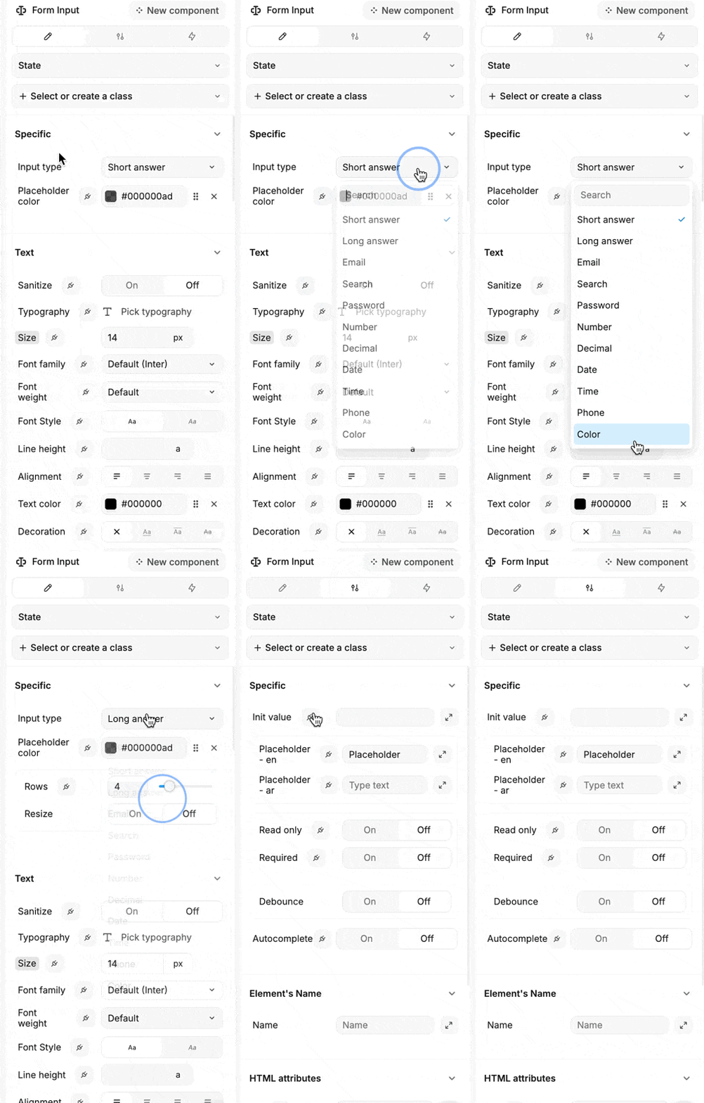
Appearance
Input
Add an input element to your web app to easily gather various types of user input.
Configuring the Input
When setting up an input element, you've got a bunch of options to play with:
Input Type: Choose the kind of input you need:
- Short Answer: Perfect for brief text entries.
- Long Answer: Ideal for more detailed responses.
- Email: Specifically for email addresses.
- Search: A handy search bar.
- Password: For secure password entries.
- Number: For whole numbers. Options include:
- Minimum number: Set the lowest value allowed.
- Maximum number: Define the highest value permitted.
- Step value: Specify the increment between numbers.
- Option to hide arrows: Choose whether to display the increment/decrement arrows.
- Decimal: When you need decimal numbers.
- Date: For date entries.
- Time: For time inputs.
- Phone: For phone numbers.
- Color: A color picker for selecting colors.
Initial Value: Set a default value that appears when the page loads.
Placeholder: Add a hint to guide users on what to enter.
Read Only: Toggle this if you want the input to be non-editable.
Required: Make the input mandatory by toggling this on.
Debounce: Want to make your app feel smoother? Use debounce to pause input processing a bit. It's super handy when you've got workflows or collections that react to input changes. With debounce, you can decide how fast those changes should kick in.
Autocomplete: Enable this to suggest possible completions as users type.


