Calendar
The Calendar element provides a feature-rich interface for displaying and managing events in various time-based views. It offers multiple view options, event management capabilities, and extensive customization to fit your specific requirements.
Features
- Multiple View Types: Year, month, week, day, and list views
- Event Management: Display, create, update, and delete events
- Drag & Drop Support: Easily reschedule events by dragging
- Event Resizing: Adjust event duration by stretching
- Responsive Design: Adapts to container size
- Full Styling Control: Customize colors, fonts, and dimensions
- Internationalization: Support for multiple languages
- Time Grid: Configurable time slots for week and day views
- Interactive Features: Event selection, view switching, date navigation
Getting Started
Using AI
The quickest way to set up a calendar is by using AI:
- Ask AI to add the calendar. Make sure to specify:
- Specific styling requirements
- Any contextual data you would like it to use
- Settings you would like applied
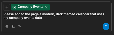
- The AI will then create your styled calendar:
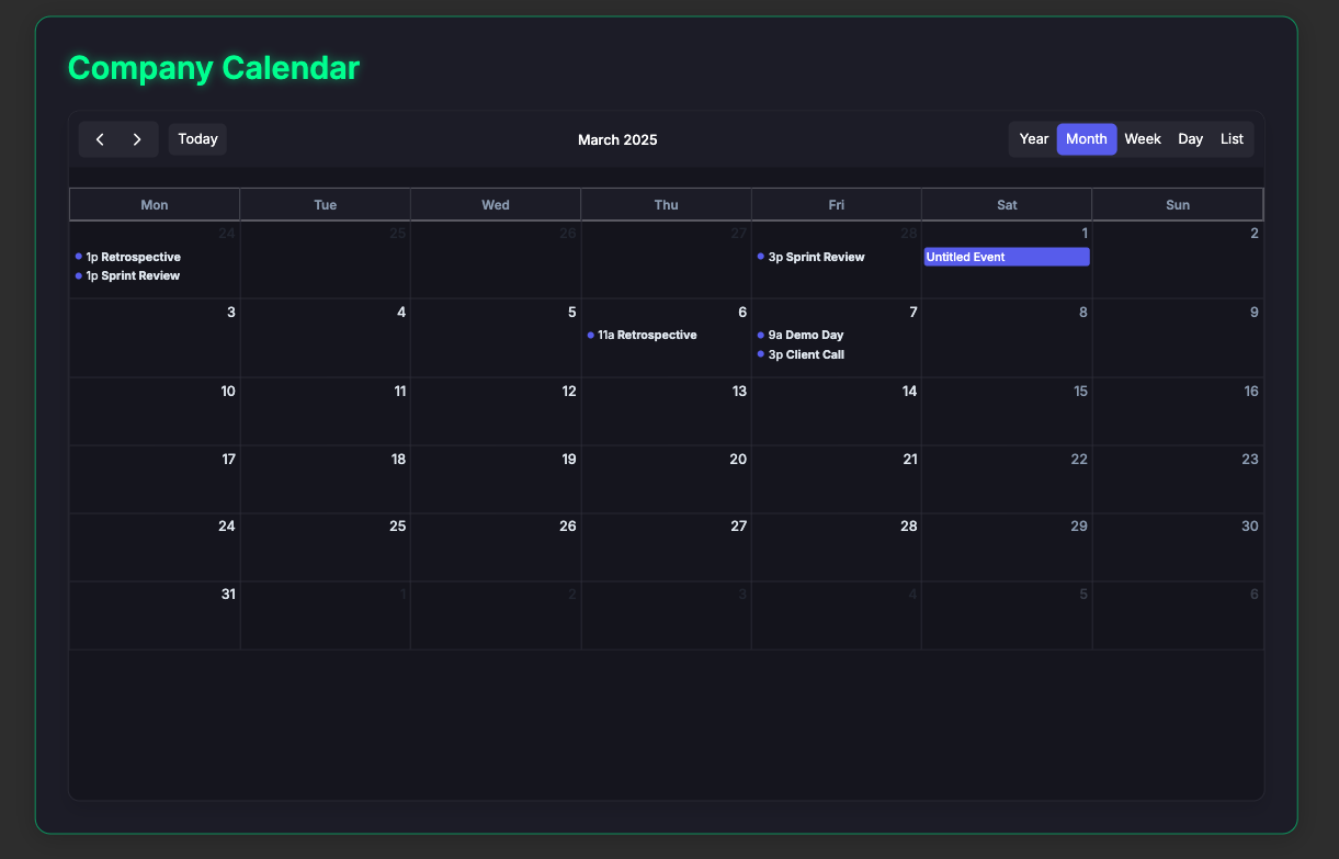
- Continue refining your calendar by asking for specific adjustments:
- "Change the calendar to start weeks on Sunday"
- "Add a red indicator line for the current time"
- "Hide weekends on the calendar"
- "Make today's date background yellow"
Manual Setup
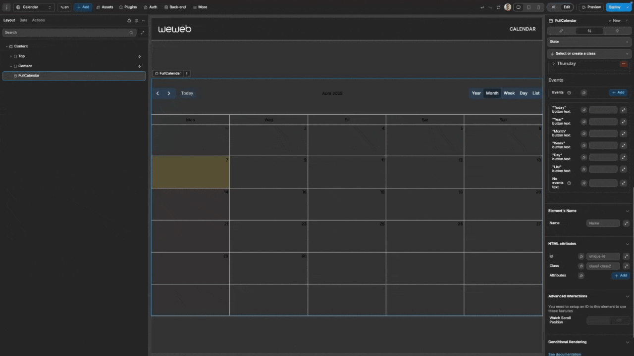
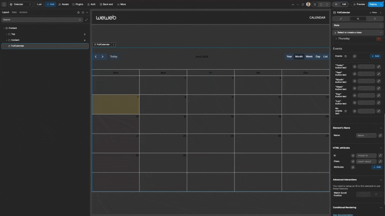
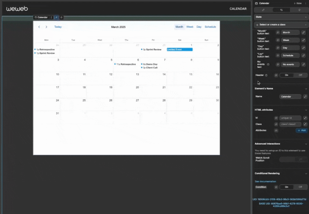
- Add a Calendar element to your page from the
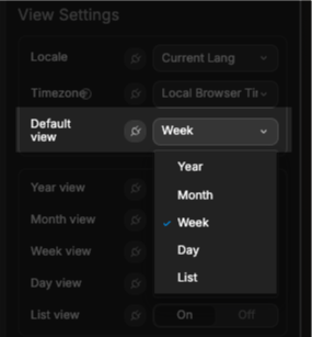
Addpanel - Configure the view settings in the properties panel:
- Select which views to enable (year, month, week, day, list)
- Choose a default view
- Set the locale
- Configure events:
- Add static events directly in the properties panel, or
- Bind to a collection or variable containing event data
- Customize the appearance through style properties:
- Colors for header, cells, buttons, and events
- Font settings
- Dimensions and spacing
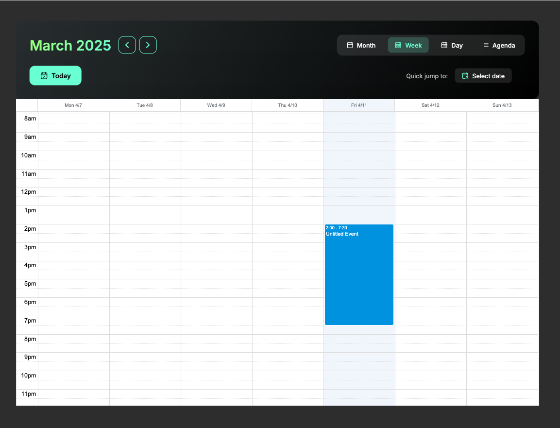
Views
The calendar offers five different views to display your event data:
| View | Best For | Image |
|---|---|---|
| Year | Annual planning, long-term overview | 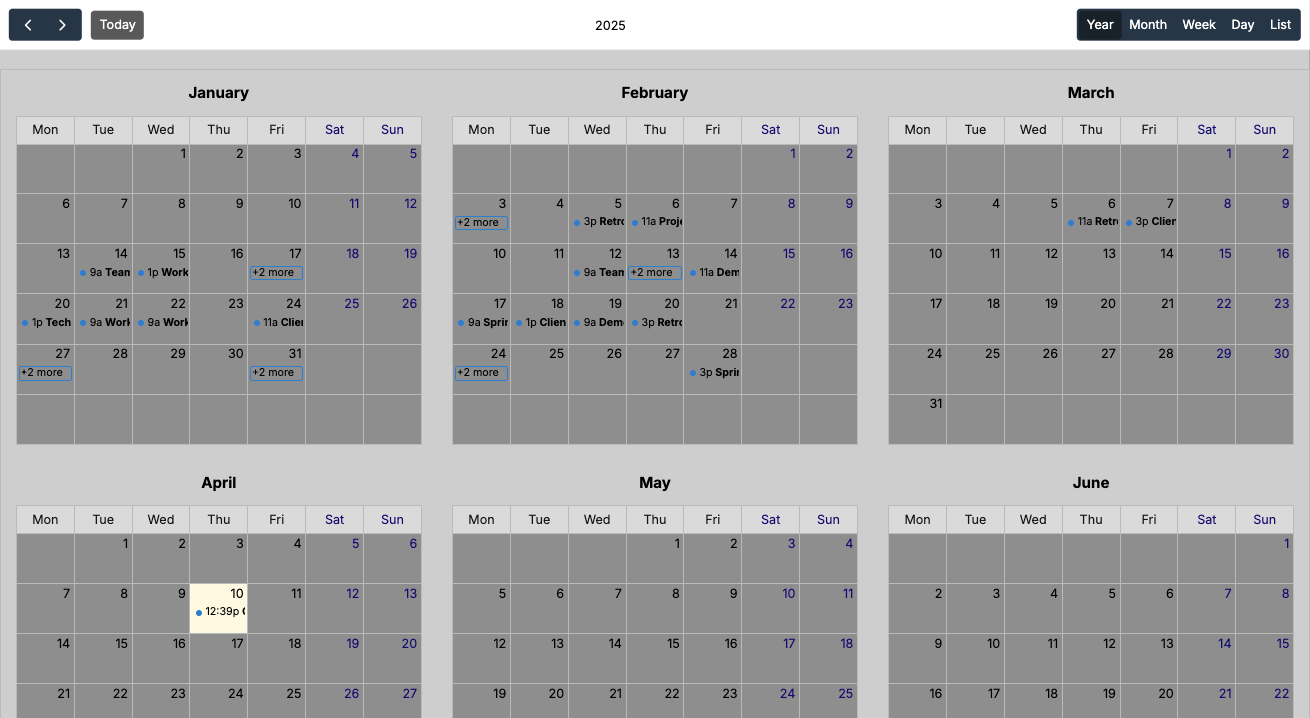 |
| Month | Traditional calendar view with all days in month | 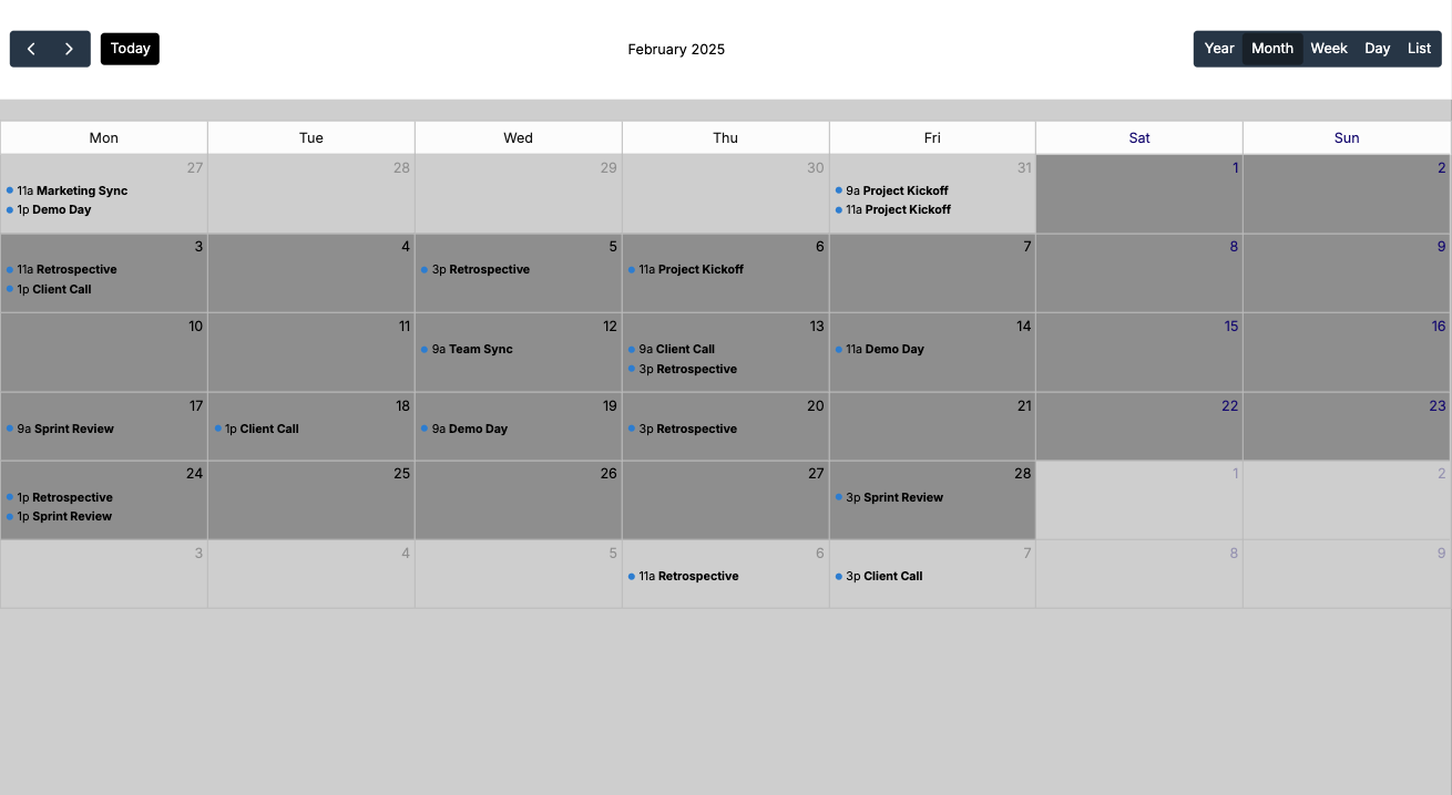 |
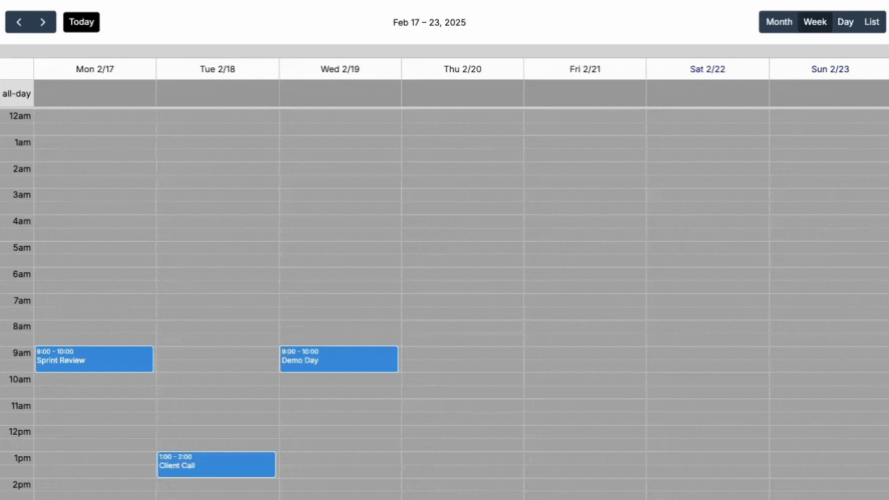
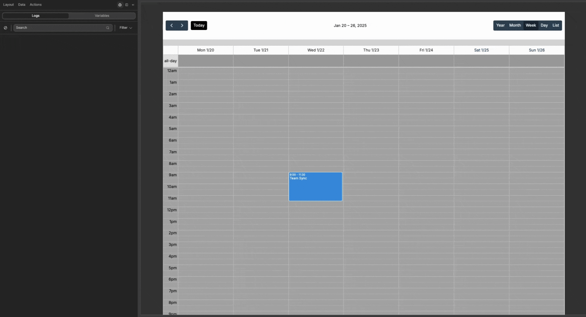
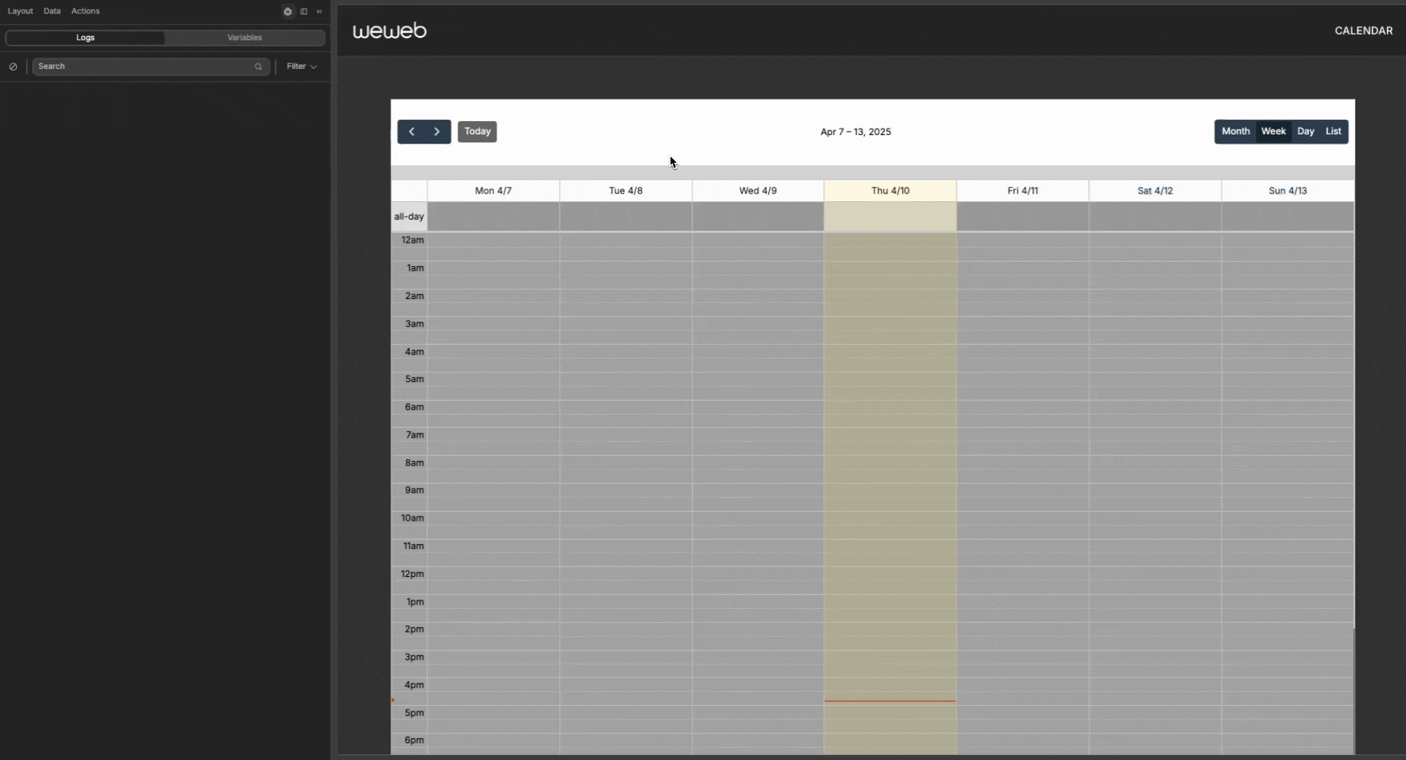
| Week | Detailed weekly schedule with time slots | 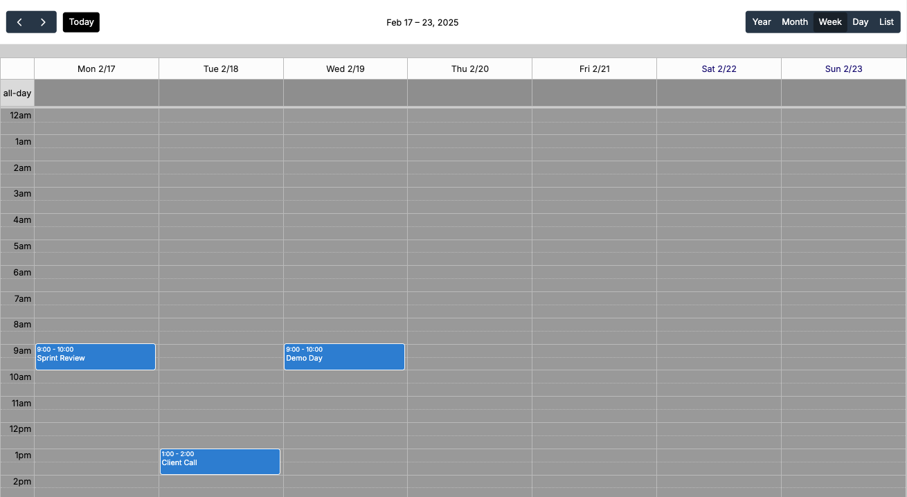 |
| Day | Focused view of a single day's schedule | 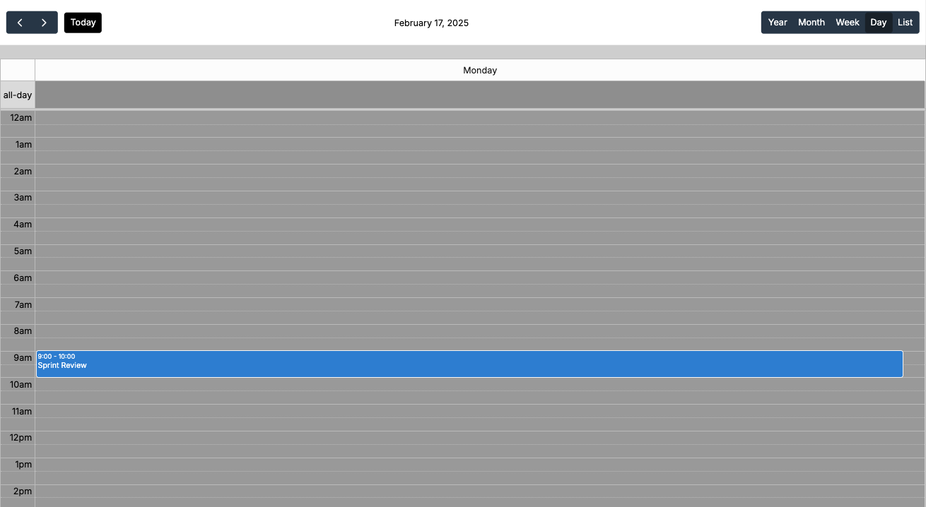 |
| List | Compact, text-based event listing | 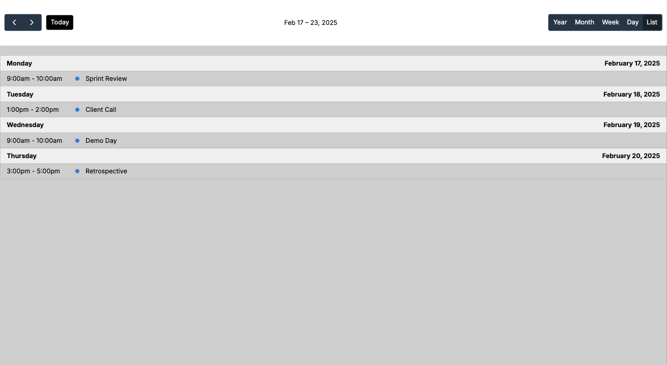 |
Configuring Views
- In the calendar properties, you can enable/disable available views:
- Set a default view that will be shown when the calendar first loads
- Users can switch between enabled views using the buttons in the calendar header:
View-Specific Settings
Time Grid (Week & Day Views)
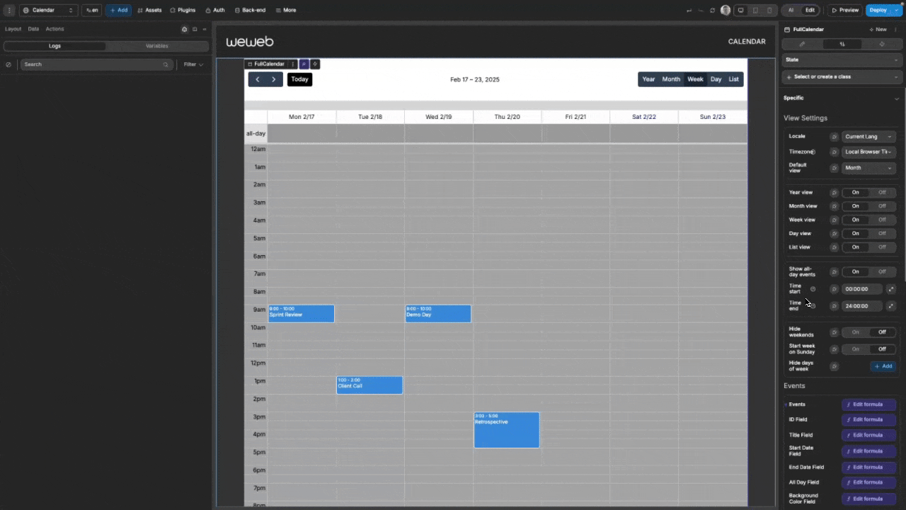
For week and day views, you can customize the time range displayed:
- Time Start: Set the starting time for the time grid (format: "HH:MM:SS")
- Time End: Set the ending time for the time grid (format: "HH:MM:SS")
For example, setting the Time Start to 12:00:00 and the Time End to 18:00:00 would retrict the times like so:
Day Display Options
Control which days are shown in the calendar:
- Hide Weekends: Hide Saturday and Sunday
- Start Week on Sunday: Change the first day of the week to Sunday
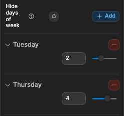
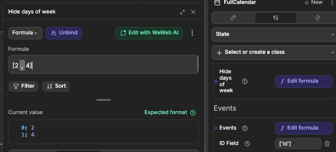
- Hide Days of Week: Hide specific days by entering their numeric values (0=Sunday, 1=Monday, 2=Tuesday, etc.). In the example below, Tuesday and Thursday is being hidden:
| Manual | Dynamic Binding |
|---|---|
 |  |
Events In The Calendar
Events are the core data elements displayed on the calendar. Each event represents a scheduled activity with a start and end time.
Understanding Event Fields
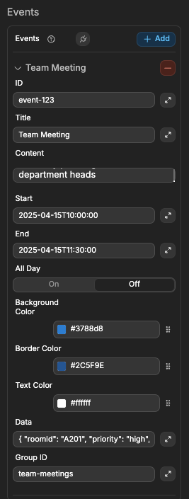
Each event can contain the following fields:
| Field | Purpose | Example Value |
|---|---|---|
| ID | Unique identifier used by the calendar to track events | "event-123" |
| Title | Main text displayed on the event | "Team Meeting" |
| Start | When the event begins (ISO format) | "2025-04-15T10:00:00" |
| End | When the event ends (ISO format) | "2025-04-15T11:30:00" |
| All Day | Whether the event is shown in the all-day section | true or false |
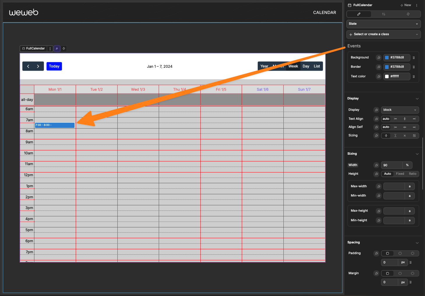
| Background Color | Background color of the event block | "#3788d8" |
| Border Color | Color of the event's border | "#2C5F9E" |
| Text Color | Color of the event's text | "#FFFFFF" |
| Content | Extended description or notes about the event | "Quarterly planning session with all department heads" |
| Group ID | Links related events that should move together | "team-meetings" |
| Data | Custom data object for storing any additional information | { "roomId": "A201", "priority": "high", "requiredAttendees": ["alice", "bob"] } |
The Content Field is useful for storing longer descriptions, details, or instructions related to an event. This content isn't displayed directly on the calendar but can be accessed when handling event clicks to show in tooltips, modals, or detail panels.
The Data Field is a flexible container for any additional information about the event that doesn't fit into the standard properties. You can store complex objects with custom properties that your application needs, such as:
- Associated users or resources
- Metadata like creation time or last modification
- Status information
- Custom flags or settings
- Related record IDs from your database
When using the field mapping feature, you can specify which properties from your data source correspond to each of these event fields.
Event Properties
Each event requires the following properties:
| Property | Description |
|---|---|
| ID | Unique identifier for the event |
| Title | Event title displayed on the calendar |
| Start | Start date/time (ISO format: YYYY-MM-DDTHH:MM:SS) |
| End | End date/time (ISO format: YYYY-MM-DDTHH:MM:SS) |
| All Day | Boolean indicating if the event spans the whole day |
Additional optional properties:
| Property | Description |
|---|---|
| Background Color | Background color for the event |
| Border Color | Border color for the event |
| Text Color | Text color for the event |
| Content | Extended description or details for the event, often used for displaying additional information in tooltips or popups |
| Group ID | Identifier for related events that should move together when dragged |
| Data | Additional custom data for the event (can store any JSON object with custom properties) |
WARNING
If you do not want items to move together when dragged, ensure the Group ID you use is unique to each item.
Adding Static Events
For simple use cases, you can add events directly in the calendar properties:
- In the calendar properties panel, find the "Events" section
- Click the "+" button to add a new event
- Fill in the required properties
- Add as many events as needed
Binding Dynamic Events
For most applications, you'll want to bind events from a collection or variable:
- Create a collection or variable containing your event data
- In the calendar properties panel, bind the "Events" property to your data source
- If your data structure doesn't match the expected format, use the field mapping options to specify which fields correspond to event properties
Interacting With The Calendar
Event Interaction
The calendar provides several ways for users to interact with events:
Clicking Events
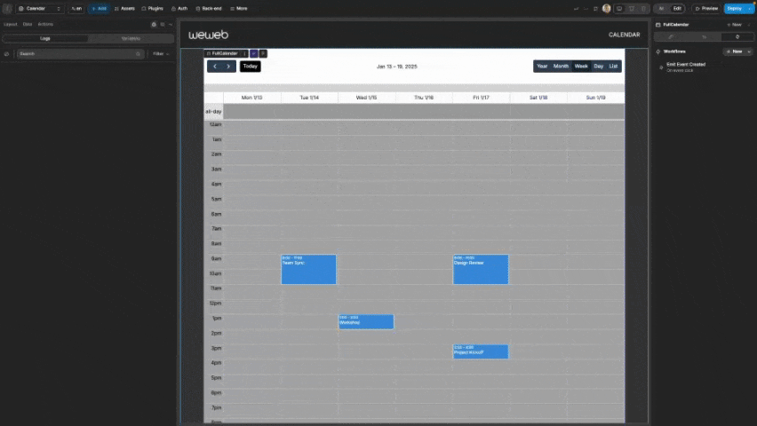
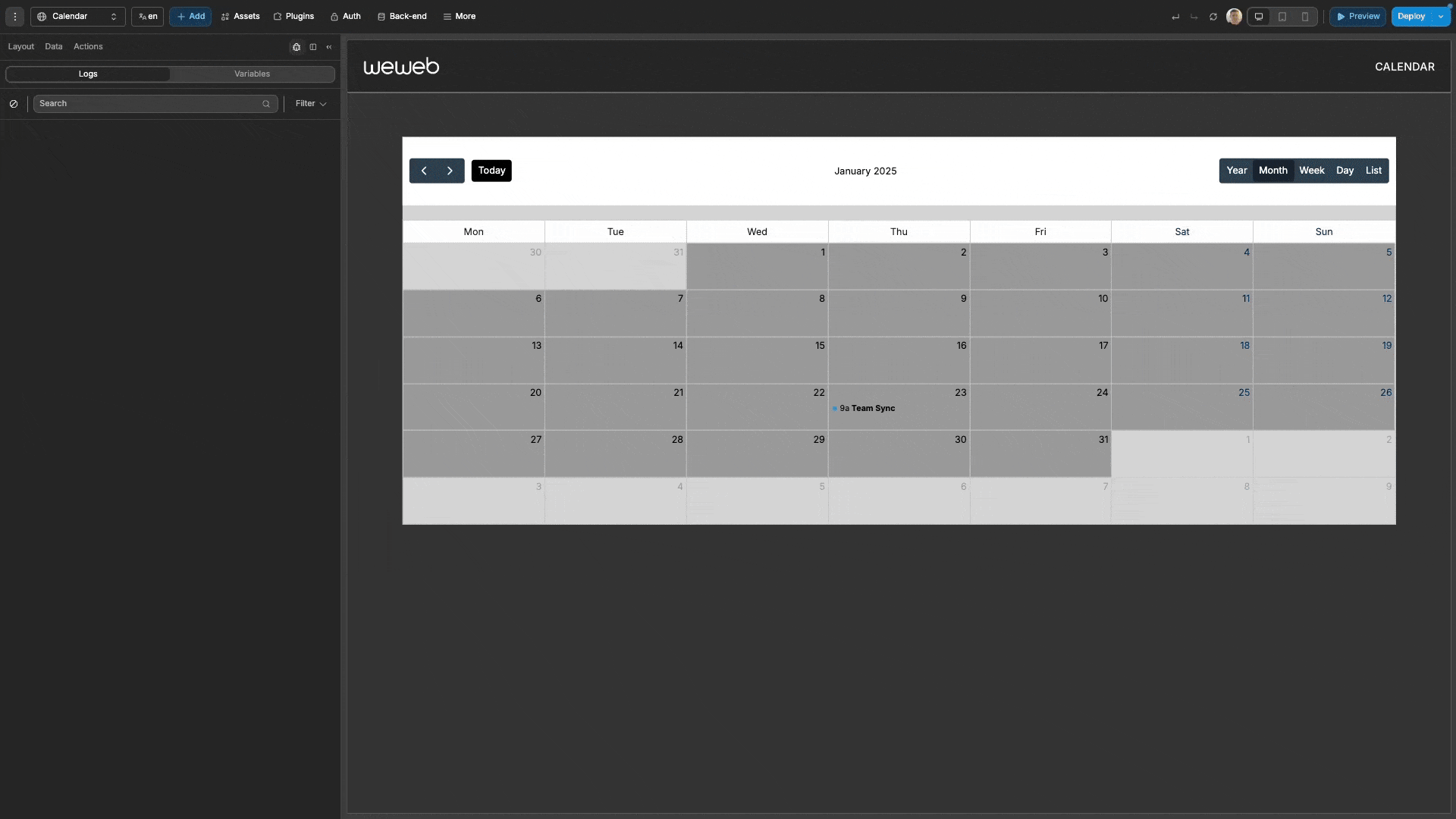
When a user clicks on an event, the On event click trigger fires with the complete event data. Use this to:
- Show event details in a popup
- Navigate to an event details page
- Allow editing of the event
javascript
// This event data is available from the `On event click` trigger
{
  "id": "event1",
  "title": "Meeting with Team",
  "start": "2025-04-06T10:00:00",
  "end": "2025-04-06T11:00:00",
  "allDay": false,
  "backgroundColor": "#3788d8",
  "borderColor": "#3788d8",
  "textColor": "#ffffff",
  "content": "Weekly team sync meeting"
}
In the example below, a workflow has been created with the On event click, and in the workflow the data available from the On event click is being logged:
Dragging Events
Users can reschedule events by dragging them to a new date/time:
- The
On event drag starttrigger fires when dragging begins - The
On event drag endtrigger fires when the drag gesture ends - The
On event droptrigger fires when the event is dropped at a new position
The On event drop trigger provides the updated event data along with a delta object showing the change:
javascript
{
  "id": "event1",
  "title": "Meeting with Team",
  "start": "2025-04-07T10:00:00", // Updated date
  "end": "2025-04-07T11:00:00",   // Updated date
  "allDay": false,
  "delta": { "days": 1, "milliseconds": 0 } // Moved by 1 day
}
In the example below, there are workflows created on all three drag events (On event drag start, On event drag end, and On event drop) to log the event data.
On the first drag, the event is not moved to a different time, and thus the On event drop trigger does not fire. However, on the second drag, the event is moved to a different time, and thus the On event drop trigger does fire:
Resizing Events
When in the Week, Day, or Month view, users can adjust event duration by dragging the bottom edge of events:
- The
On event resize starttrigger fires when resizing begins - The
On event resizetrigger fires when resizing is complete
The On event resize trigger provides delta information showing how the event was changed:
javascript
{
  "id": "event1",
  "title": "Meeting with Team",
  "start": "2025-04-06T10:00:00",
  "end": "2025-04-06T12:00:00",   // Updated end time
  "allDay": false,
  "startDelta": { "days": 0, "milliseconds": 0 },
  "endDelta": { "days": 0, "milliseconds": 3600000 } // Extended by 1 hour
}
In the example below, workflows are created for both resize events (On event resize start and On event resize) to log the event data:
Creating New Events
Users can create new events by selecting a time slot:
- Click and drag over the desired time period on the calendar
- The
On event createdtrigger fires with the selected date and time range
javascript
{
  "start": "2025-04-06T14:00:00",
  "end": "2025-04-06T15:00:00",
  "allDay": false
}
Use this data to:
- Populate a form for creating a new event
- Directly add an event to your data source
- Show a confirmation dialog
Handling Event Creation/Modification
To pragmatically handle the creation and modification of events, there are three core workflows you need to create on the calendar:
Using the
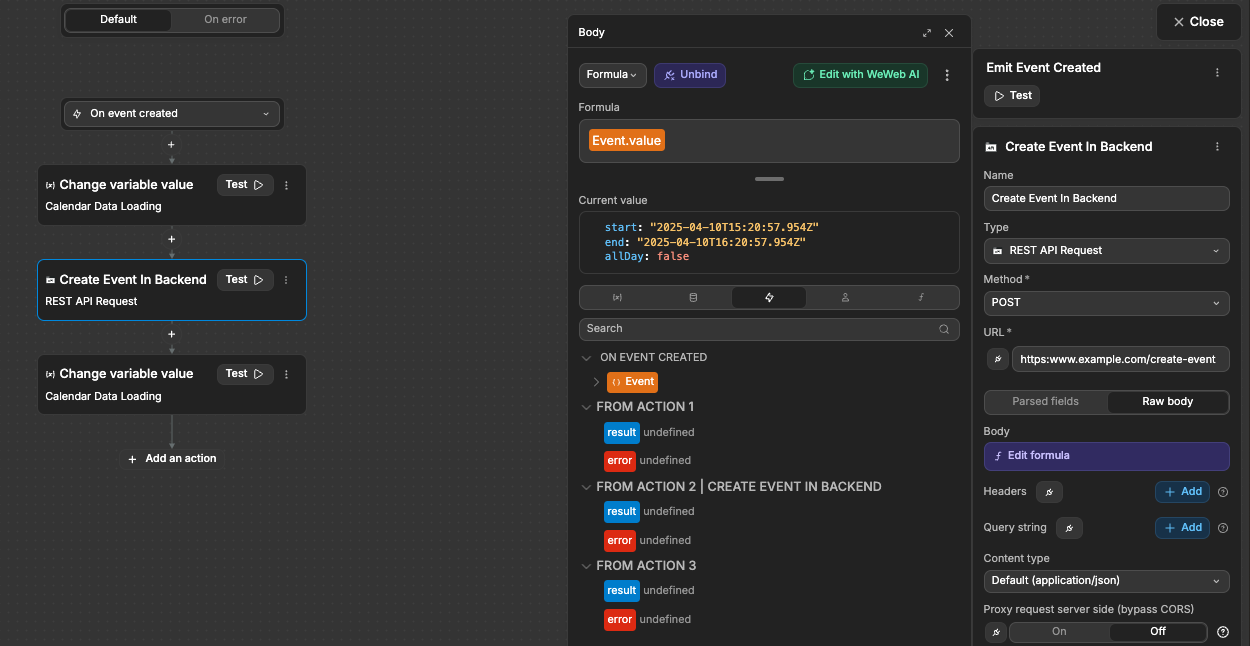
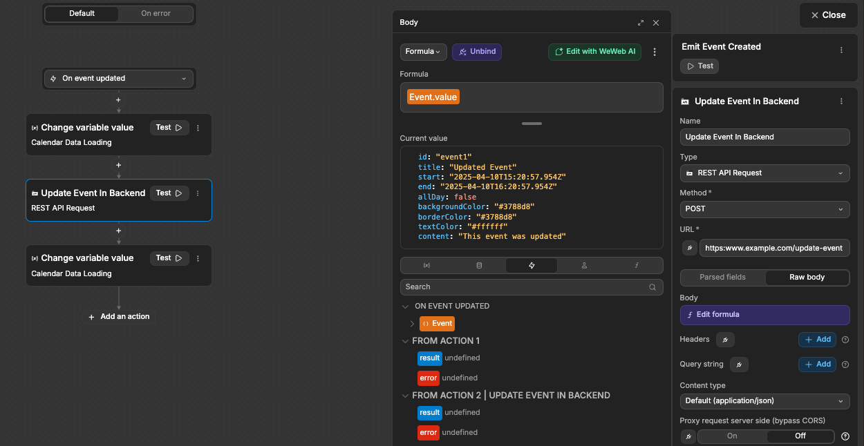
On event createdtrigger, a workflow to add to your existing events dataIn practice, your workflow would be something like this:
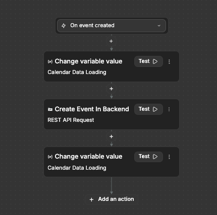
Ensuring to send the new event data to your backend for creation in your database, like so:
Using the
On event updatedtrigger, a workflow to update your existing events dataIn practice, your workflow would be almost identical to the event creation workflow:
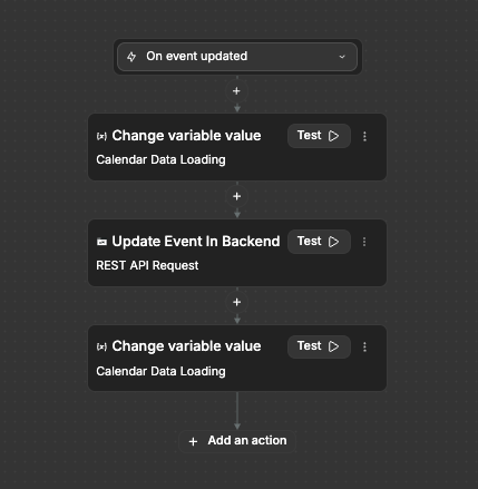
The key difference being the event data you send to your backend is used for updating and not creation:
Using the
On event clickedtrigger, a workflow to show a modal/popup that allows the user to make specific edits to the event meta information, like the title.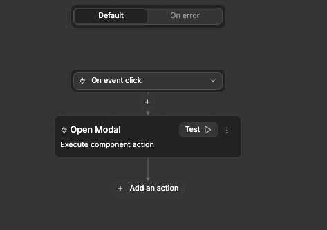
The calendar automatically exposes which event was most recently clicked via the
selectedEventvariable, so we can use this information in our modal/popup and allow editing: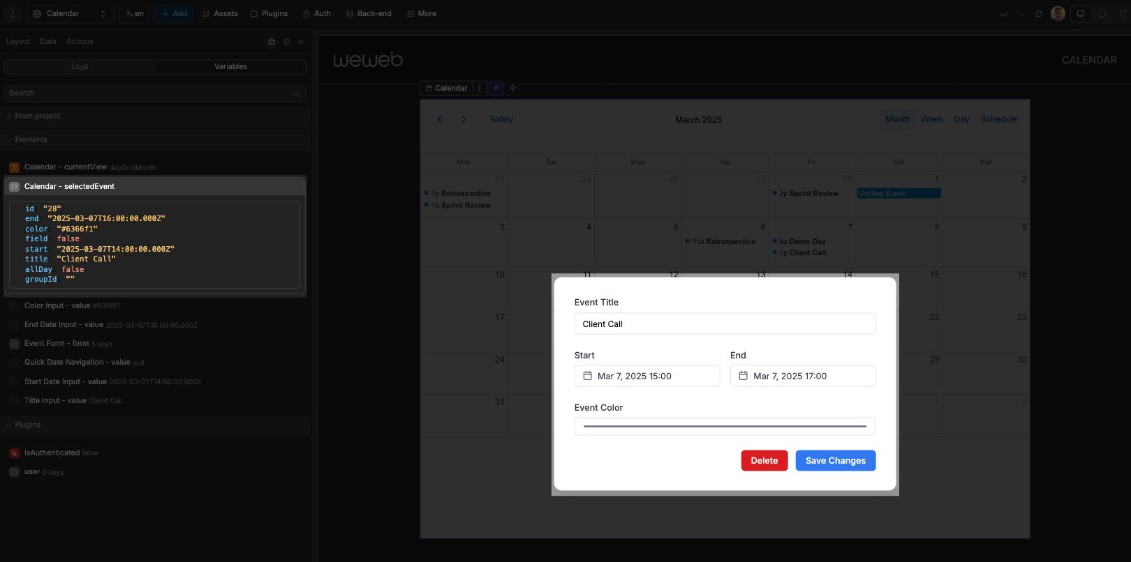
Then, on our delete and submit buttons, we would have workflows set up to appropriately communicate the needed changes to our backend (e.g. delete the record or update it), and then close the modal/popup
REFETCH DATA
After creating an event, changing an event, or deleting an event in your backend, always ensure you refetch the data so the calendar has the latest, correct data.
Custom Calendar Header
The calendar element provides the option to hide the default header and create your own custom header design.
Hiding the Default Header
- In the calendar properties, set the
Headertoggle to "Off" - The default navigation buttons, title, and view selectors will be hidden
Creating a Custom Header
With the default header hidden, you can build your own header with full control over its appearance and functionality:
- Create a container above the calendar element
- Add your own buttons, text elements, dropdowns, and other UI elements
- Use element actions to connect your custom UI to the calendar functionality
TIP
If you are unsure how to style your custom header, get AI to do it for you! Here is an example prompt:
Please create a custom header for my calendar. I want a sleek, modern design.Connecting Custom UI to Calendar Actions
Use these component actions of the calendar to make your custom header elements work with the calendar:
| UI Element | Action to Use | Purpose |
|---|---|---|
| Previous button | Previous period | Move backward in time |
| Next button | Next period | Move forward in time |
| Today button | Go to today | Jump to current date |
| View selector | Change view | Switch between view types |
| Date picker | Go to date | Navigate to a specific date |
Properties Reference
Settings
| Property | Type | Description |
|---|---|---|
| Readonly | Toggle | Controls whether users can interact with the calendar to create or modify events |
View Settings
| Property | Type | Description |
|---|---|---|
| Locale | Select | Sets the language (auto uses current site language) |
| Default View | Select | Initial view when calendar loads |
| Year View | Toggle | Enable/disable year view |
| Month View | Toggle | Enable/disable month view |
| Week View | Toggle | Enable/disable week view |
| Day View | Toggle | Enable/disable day view |
| List View | Toggle | Enable/disable list view |
| Show All-Day Events | Toggle | Show or hide the all-day slot |
| Time Start | Text | Start time for day/week views (HH:MM:SS) |
| Time End | Text | End time for day/week views (HH:MM:SS) |
| Hide Weekends | Toggle | Hide Saturday and Sunday |
| Start Week on Sunday | Toggle | Start weeks on Sunday instead of Monday |
| Hide Days of Week | List | Specific days to hide (0=Sunday, 1=Monday, etc.) |
Event Properties
| Property | Type | Description |
|---|---|---|
| Events | Array | Collection of events to display |
| ↳ Event ID Field | Path | Field to use as event ID |
| ↳ Event Title Field | Path | Field to use as event title |
| ↳ Event Start Date Field | Path | Field to use as event start date |
| ↳ Event End Date Field | Path | Field to use as event end date |
| ↳ Event All Day Field | Path | Field to use as event all-day flag |
| ↳ Event Background Color Field | Path | Field to use as event background color |
| ↳ Event Border Color Field | Path | Field to use as event border color |
| ↳ Event Text Color Field | Path | Field to use as event text color |
| ↳ Event Content Field | Path | Field to use as event content/description (can contain HTML or plain text) |
| ↳ Event Data Field | Path | Field to use for storing additional custom data (any JSON object with custom properties) |
| ↳ Event Group ID Field | Path | Field to use as event group ID (for events that should move together) |
Button Text Properties
| Property | Type | Description |
|---|---|---|
| "Today" Button Text | Text | Custom text for the Today button |
| "Year" Button Text | Text | Custom text for the Year view button |
| "Month" Button Text | Text | Custom text for the Month view button |
| "Week" Button Text | Text | Custom text for the Week view button |
| "Day" Button Text | Text | Custom text for the Day view button |
| "List" Button Text | Text | Custom text for the List view button |
| No Events Text | Text | Text to display when no events are available |
| Property | Type | Description |
|---|---|---|
| Header | Toggle | Controls whether the default header is displayed |
Styling
General
Control the overall appearance of the calendar:
| Property | Description |
|---|---|
| Font Family | Sets the typeface for all calendar text |
| Font Size | Controls the size of text elements |
| Font Weight | Sets the boldness of text |
| Now Indicator Color | Color for the line showing current time |
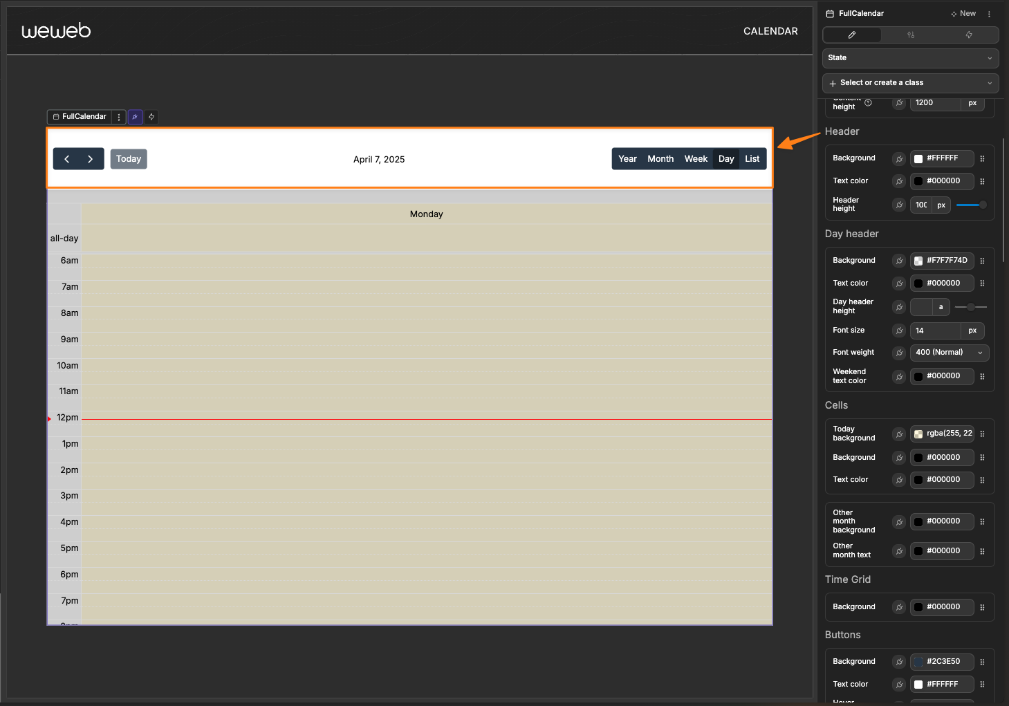
Header
Customize the appearance of the calendar's header:
| Property | Description |
|---|---|
| Background | Background color for the header area |
| Text Color | Color for text in the header |
| Header Height | Sets the height of the header area |
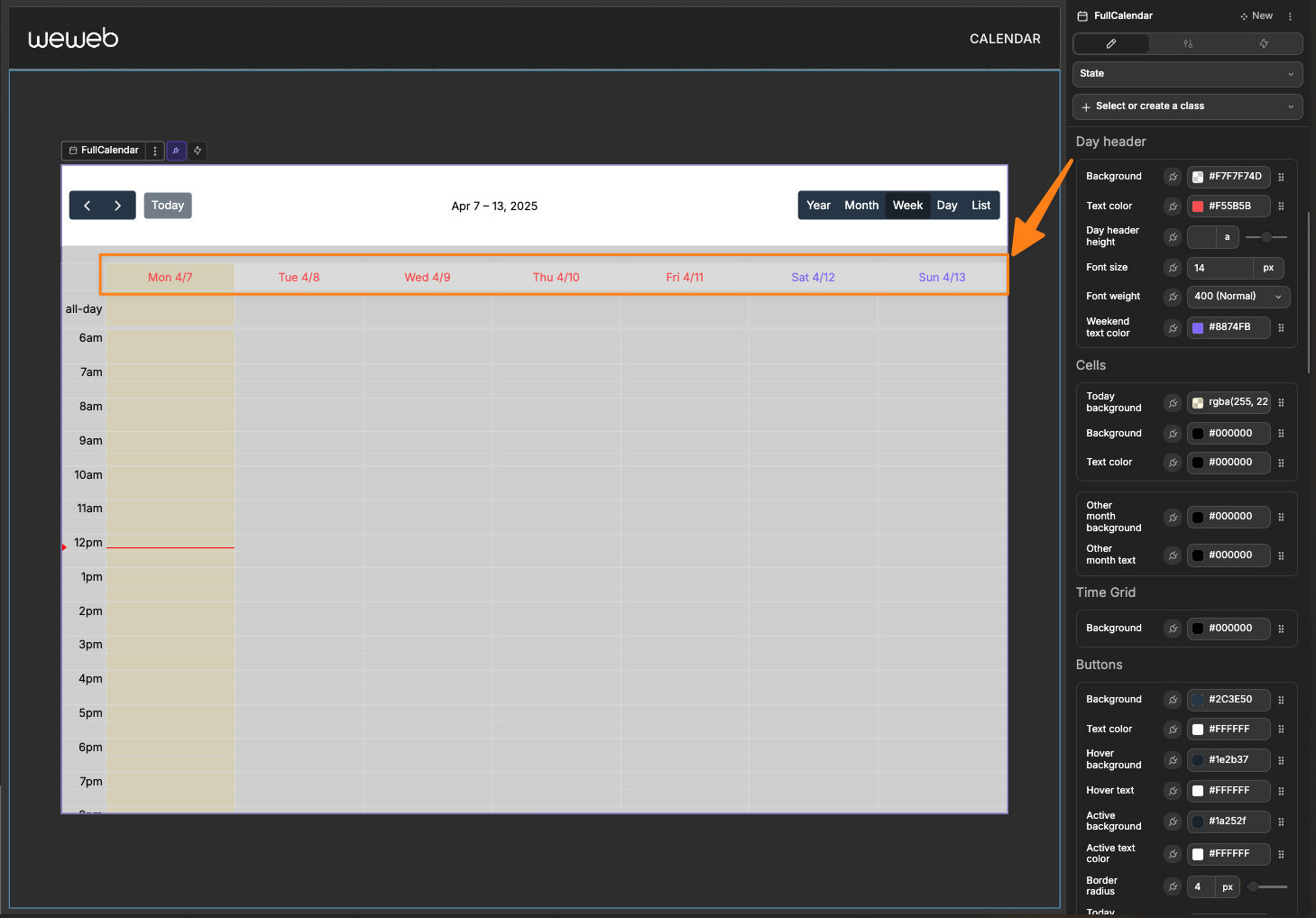
Day Header
Customize the appearance of the calendar's day header:
| Property | Description |
|---|---|
| Background | Background color for the day header area |
| Text Color | Color for text in the day header |
| Day Header Height | Sets the height of the day header area |
| Font Size | Size of text in the day header |
| Font Weight | Weight of text in the day header |
| Weekend Text Color | Color of text in the day header |
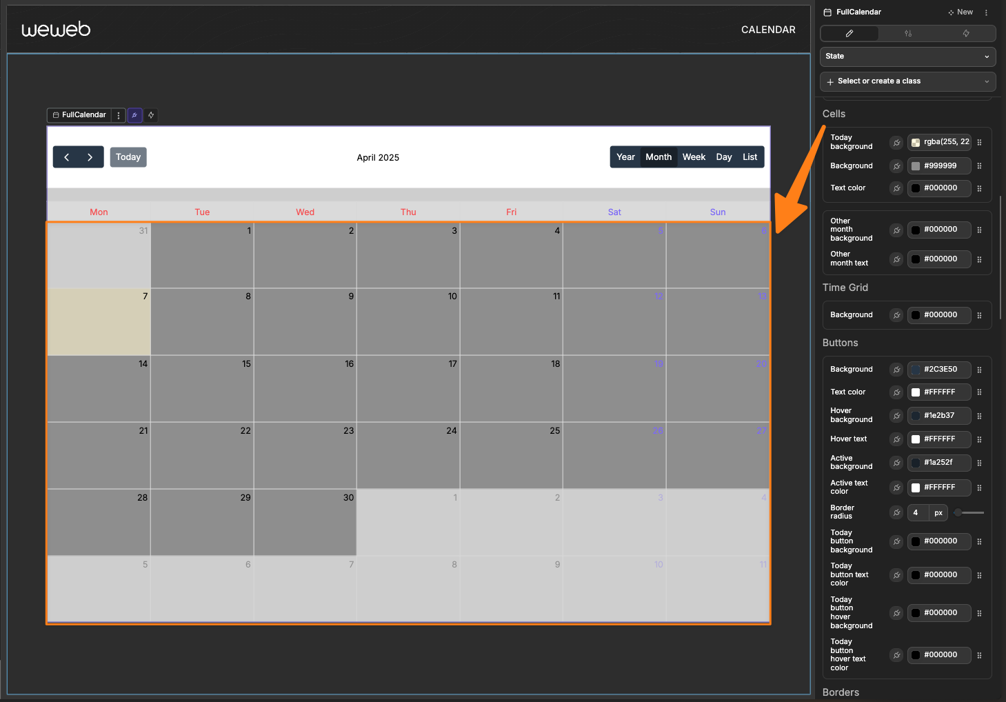
Cells
Style the calendar's date cells and today's highlight:
| Property | Description |
|---|---|
| Today Background | Highlight color for the current day |
| Background | Default background color for day cells |
| Text Color | Default text color for day cells |
| Other Month Background | Background for days from adjacent months |
| Other Month Text | Text color for days from adjacent months |
Time Grid
Style the time-based views (week and day views):
| Property | Description |
|---|---|
| Background | Default background color of time grid |
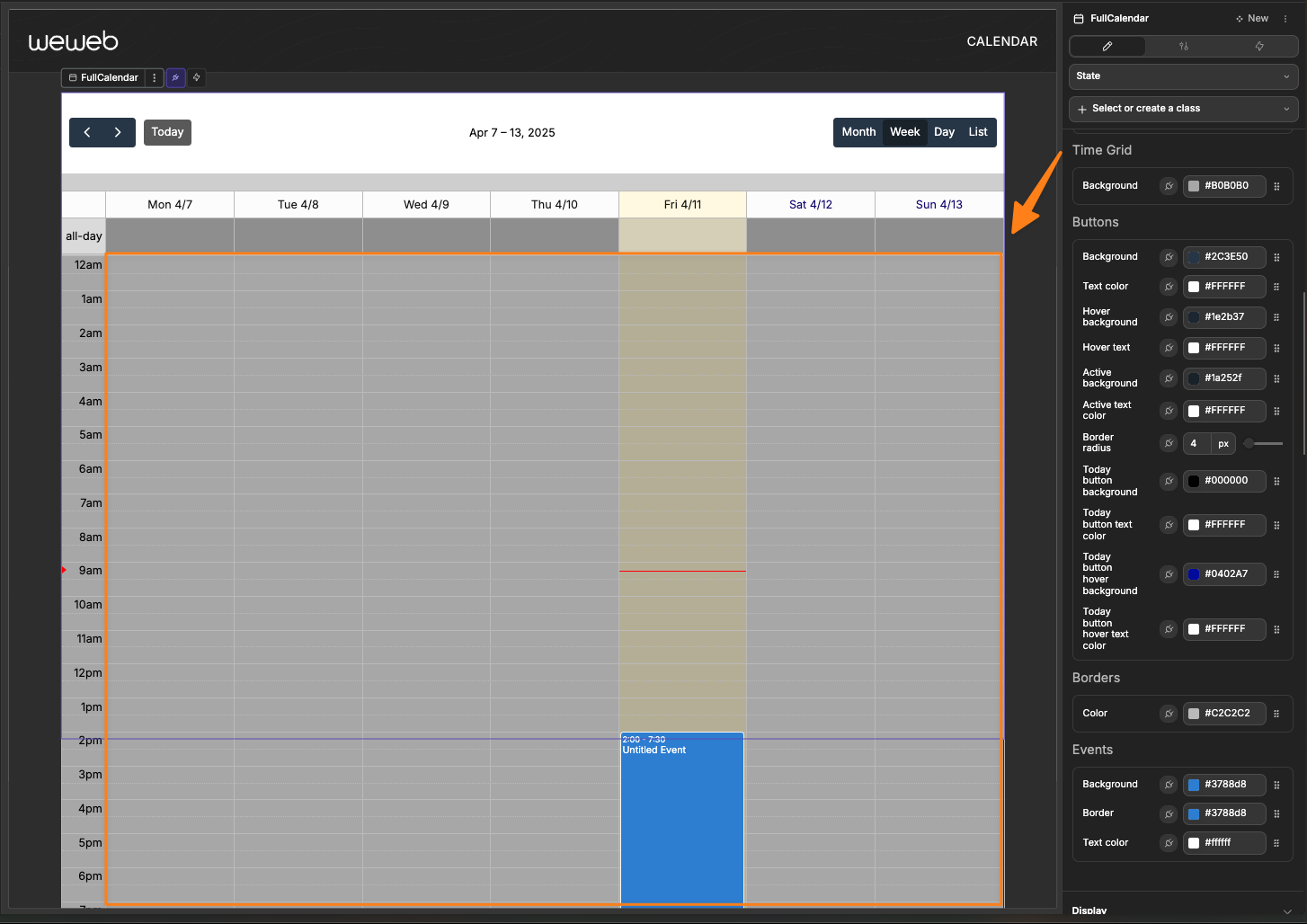
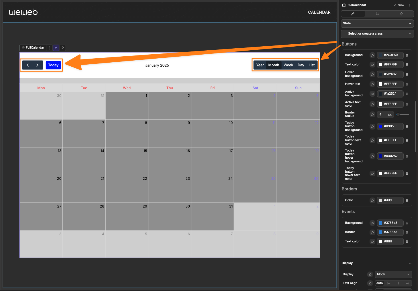
Buttons
Customize the appearance of all navigation and view selection buttons:
| Property | Description |
|---|---|
| Background | Background color for calendar buttons |
| Text Color | Color for button text |
| Hover Background | Background color when hovering over buttons |
| Hover Text | Text color when hovering over buttons |
| Active Background | Background color for the active button |
| Active Text | Text color for the active button |
| Border Radius | Roundness of button corners |
| Today Button Background | Background color of the Today button |
| Today Button Text Color | Text color of the Today button |
| Today Button Hovor Background | Background color on hover of the Today button |
| Today Button Hovor Text Color | Text color on hovor of the Today button |
Borders
Configure the border appearance throughout the calendar:
| Property | Description |
|---|---|
| Color | Color of borders in the calendar |
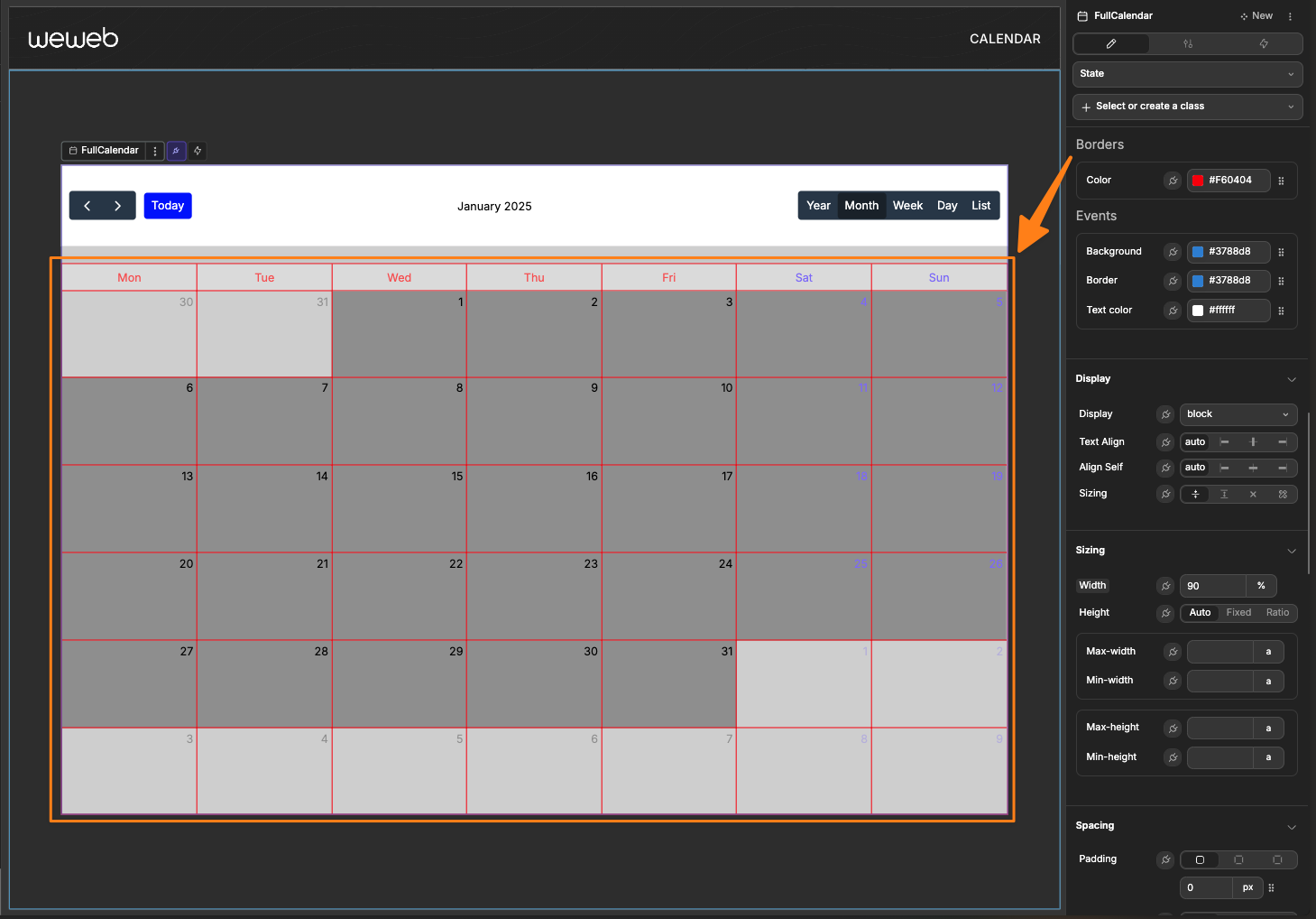
Events
Style the appearance of event blocks on the calendar:
| Property | Description |
|---|---|
| Background | Default background color for events |
| Border | Default border color for events |
| Text Color | Default text color for event titles |
Component Actions
| Action | Description | Parameters |
|---|---|---|
| Change view | Changes the calendar view | viewName: "multiMonthYear", "dayGridMonth", "timeGridWeek", "timeGridDay", or "listWeek" |
| Go to date | Navigates to a specific date | date: Date string in YYYY-MM-DD format |
| Next period | Advances to the next period | None |
| Previous period | Goes back to the previous period | None |
| Go to today | Jumps to the current date | None |
Exposed Variables
| Variable | Type | Description |
|---|---|---|
| currentView | String | The currently active view type |
| selectedEvent | Object | The most recently clicked event data |
Event Triggers
The calendar provides the following events you can use to trigger workflows:
| Event | Description | Payload |
|---|---|---|
| On event click | Triggered when an event is clicked | Event data object |
| On view change | Triggered when the view or date range changes | View information object |
| On event created | Triggered when a time slot is selected | New event time range |
| On event updated | Triggered when an event is updated | Updated event data |
| On event drag start | Triggered when event dragging begins | Event data object |
| On event drag end | Triggered when event dragging ends | Event data object |
| On event drop | Triggered when an event is dropped in a new position | Event data with delta |
| On event resize start | Triggered when event resizing begins | Event data object |
| On event resize | Triggered when an event is resized | Event data with deltas |
Example Event Trigger Payloads
On event click
json
{
  "id": "event1",
  "title": "Meeting with Team",
  "start": "2025-04-15T10:00:00Z",
  "end": "2025-04-15T11:00:00Z",
  "allDay": false,
  "backgroundColor": "#3788d8",
  "borderColor": "#3788d8",
  "textColor": "#ffffff",
  "content": "Discuss Q2 planning",
  "groupId": "team-meetings",
  "data": {
    "roomId": "A101",
    "organizer": "John Smith"
  }
}
On view change
json
{
  "view": "dayGridMonth",
  "start": "2025-04-01T00:00:00Z",
  "end": "2025-05-01T00:00:00Z",
  "title": "April 2025"
}
On event created
json
{
  "start": "2025-04-15T14:00:00Z",
  "end": "2025-04-15T15:00:00Z",
  "allDay": false
}
On event updated
json
{
  "id": "event1",
  "title": "Updated Meeting",
  "start": "2025-04-15T10:00:00Z",
  "end": "2025-04-15T11:00:00Z",
  "allDay": false,
  "backgroundColor": "#3788d8",
  "borderColor": "#3788d8",
  "textColor": "#ffffff",
  "content": "Discuss Q2 planning - Updated"
}
On event drag start
json
{
  "id": "event1",
  "title": "Meeting with Team",
  "start": "2025-04-15T10:00:00Z",
  "end": "2025-04-15T11:00:00Z",
  "allDay": false
}
On event drag end
json
{
  "id": "event1",
  "title": "Meeting with Team",
  "start": "2025-04-15T10:00:00Z",
  "end": "2025-04-15T11:00:00Z",
  "allDay": false
}
On event drop
json
{
  "id": "event1",
  "title": "Meeting with Team",
  "start": "2025-04-16T10:00:00Z", // Notice the date changed
  "end": "2025-04-16T11:00:00Z",   // Notice the date changed
  "allDay": false,
  "delta": {
    "days": 1,
    "milliseconds": 0
  }
}
On event resize start
json
{
  "id": "event1",
  "title": "Meeting with Team",
  "start": "2025-04-15T10:00:00Z",
  "end": "2025-04-15T11:00:00Z",
  "allDay": false
}
On event resize
json
{
  "id": "event1",
  "title": "Meeting with Team",
  "start": "2025-04-15T10:00:00Z", // Start time unchanged
  "end": "2025-04-15T12:00:00Z",   // End time changed
  "allDay": false,
  "startDelta": {
    "days": 0,
    "milliseconds": 0
  },
  "endDelta": {
    "days": 0,
    "milliseconds": 3600000  // Extended by 1 hour (3,600,000 milliseconds)
  }
}